Get Indexology® Blog updates via email.

In This List

The Gold:Oil Ratio Is Speaking

Actively Managed Bond Funds Should Outperform Their Benchmarks, Right?

Canada Yields Hit Low And Go Higher

Inside Factors: Value Investing

Global Factors Have Been Driving the Mexican Bond Market

The Gold:Oil Ratio Is Speaking

Contributor Image
Jodie Gunzberg

Former Managing Director, Head of U.S. Equities

S&P Dow Jones Indices

As a believer in the power of diversification and inflation protection a basket of commodities can provide in a passive index framework, it is hard to grasp how much investors love oil and gold. It must be that oil is the biggest, most economically significant commodity, and gold is the shiniest, most prized metal – arguably a currency in its own right. From the largest pensions in the world to the smallest mom-and-pop retail investors, oil and gold dominate the conversation.

In Taipei this week, gold and oil were louder than ever. It is an exciting time for greater China as the first commodity futures ETFs are soon to be launched. This opens the possibility for investors in this region to get access more easily to the commodities they love, but for the commodity lady that loves passive, singling out gold and oil is a difficult task. Besides the star-power of these two commodities, why are they worth highlighting differently than the rest?

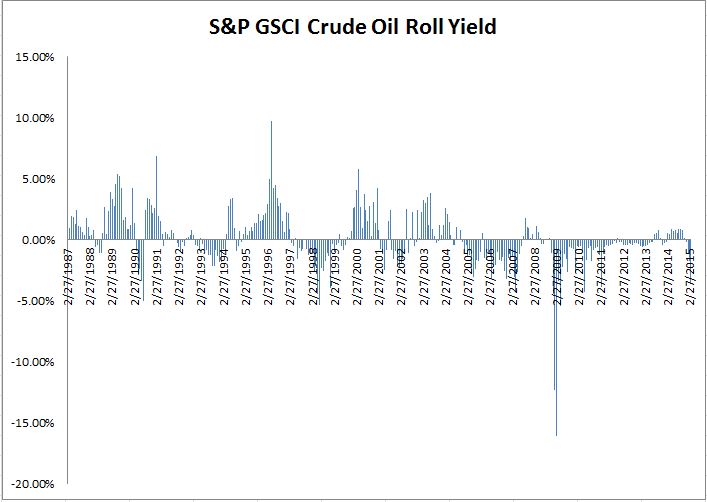
Gold lost -28.3% in 2013, its worst drop since 1981, and it has been relatively flat since. Oil clearly is top of mind from the price drop of 58.4% that most analysts did not expect. Taken together these historical drops, for some, create the buying opportunity of a lifetime. While these two commodities may not represent the entire asset class, (Brent and WTI) crude oil is most heavily weighted at about 40%, and has provided the most inflation protection of any commodity since it is the most volatile component of the Consumer Price Index (CPI) and is required to produce other commodities. Further, oil has had little correlation of 0.3 to the S&P 500 in the past 10 years while gold has had almost zero correlation to the S&P 500 – plus oil and gold have had only 0.2 correlation with each other. There is a diversification and inflation case using gold and oil if an investor is only buying two commodities.

However, understanding the implications of the ratio of gold to oil is important if choosing to use only the two commodities. Comparing the relative value of the two has revealed some interesting insights as I discussed in a video with Bluford Putnam, Managing Director and Chief Economist of the CME Group. The gold:oil ratio now suggests the oil price collapse may be more driven by supply than demand and that fears of deflation may be exaggerated.

Below is a chart of the ratio of the S&P GSCI Gold in terms of the S&P GSCI Crude Oil with the index levels overlaid. Notice the red arrows showing that gold is remaining stable while oil falls.

Source: S&P Dow Jones Indices LLC. All information presented prior to the index launch date is back-tested. Back-tested performance is not actual performance, but is hypothetical. The back-test calculations are based on the same methodology that was in effect when the index was officially launched. Past performance is not a guarantee of future results.  Please see the Performance Disclosure at http://www.spindices.com/regulatory-affairs-disclaimers/ for more information regarding the inherent limitations associated with back-tested performance.
Source: S&P Dow Jones Indices LLC. All information presented prior to the index launch date is back-tested. Back-tested performance is not actual performance, but is hypothetical. The back-test calculations are based on the same methodology that was in effect when the index was officially launched. Past performance is not a guarantee of future results. Please see the Performance Disclosure at http://www.spindices.com/regulatory-affairs-disclaimers/ for more information regarding the inherent limitations associated with back-tested performance.

This in conjunction with the changing term structure of oil from contango to backwardation in 2013-14 suggests the recent oil price drop oil is more of a production story than a consumption one.

Source: S&P Dow Jones Indices LLC. All information presented prior to the index launch date is back-tested. Back-tested performance is not actual performance, but is hypothetical. The back-test calculations are based on the same methodology that was in effect when the index was officially launched. Past performance is not a guarantee of future results.  Please see the Performance Disclosure at http://www.spindices.com/regulatory-affairs-disclaimers/ for more information regarding the inherent limitations associated with back-tested performance.
Source: S&P Dow Jones Indices LLC. All information presented prior to the index launch date is back-tested. Back-tested performance is not actual performance, but is hypothetical. The back-test calculations are based on the same methodology that was in effect when the index was officially launched. Past performance is not a guarantee of future results. Please see the Performance Disclosure at http://www.spindices.com/regulatory-affairs-disclaimers/ for more information regarding the inherent limitations associated with back-tested performance.

It follows that if deflation is mostly due to production increases, including commodities, then a mild deflation may not indicate a future global recession. Still many believe with the decelerating growth in China, the slow growth in emerging markets and stagnation in Europe that the demand side is weak.

Even with a growth of around 6.5%, China’s real GDP growth rate still exceeds virtually all other major mature industrial countries. The world is not in a global recession, and with the exception of the oil-producing emerging market countries, there are signs of incremental increases in real GDP growth for 2015, according to Blu in this paper.

If oil prices remain low versus gold for an extended period of time, as was the case in the 1986-88 period, the elevated gold:oil ratio may indicate that the energy production boom (whether U.S. or Saudi Arabia) is much more responsible for oil’s price collapse than fears of global deflation, lack of demand, and recession, which probably would have caused the gold price to fall too. That said, it doesn’t mean gold is protected from the pressures of economic growth, an interest rate hike, and the highly accommodative monetary policies of Europe and Japan.

The posts on this blog are opinions, not advice. Please read our Disclaimers.

Actively Managed Bond Funds Should Outperform Their Benchmarks, Right?

Contributor Image
J.R. Rieger

Former Head of Fixed Income Indices

S&P Dow Jones Indices

The facts are that over the long term actively managed bond funds don’t outperform their benchmark and in the short term, only some asset classes outperformed their benchmarks.

This is all counter intuitive.  Actively managed bond funds have the people, data and tools for credit selection, can adjust for term structure and duration risk and have control over the timing of bond purchases and sales. Based on this the majority of actively managed bond funds should be consistently outperforming their benchmarks over both the short and long term.  A quick look at performance trends according to the most recent S&P Dow Jones Indices SPIVA U.S. Scorecard for year-end 2014 gives us a reality check.

The Scorecard shows:

  • 2014 was a period of strength for the long end of the bond curve as interest rates moved lower.  It would make sense that high quality long term bond funds would also show strength as well.  That is not what happened.   Over 97% of long term U.S. Treasury bond funds and over 98% of long term investment grade bond funds underperformed their benchmarks for the 2014 calendar year.  Over longer periods of time such as a 5 and 10 year periods the statistics are equally telling with over 95% of long term bond funds underperforming.
  • High yield bond funds have consistently underperformed their benchmarks for the 1, 3, 5 and 10 year periods of time.  Over 73% of high yield bond funds underperformed their benchmark in 2014.  Over the 5 and 10 year periods that underperformance was 88% and 92% respectively.
  • Actively managed senior loan funds haven’t done much better.  60% of actively managed loan funds underperformed their benchmark in 2014.  Over a 3 year period, over 69% of those funds underperformed their benchmark.
  • Investment grade intermediate bond funds had good results with only 30% of the actively managed funds underperforming verses their benchmark in 2014.  Still over the 10 year period 49% of those funds have underperformed.
  • The over the counter and less liquid U.S. municipal bond market could be an area where actively managed funds shine.  Over 39% of the actively managed municipal bond funds underperformed their benchmark in 2014.  It seems to be hit or miss in the 5 year period as over 45% of those funds underperformed.  However, over a 10 year period of time over 70% of those funds have underperformed their benchmark.

The posts on this blog are opinions, not advice. Please read our Disclaimers.

Canada Yields Hit Low And Go Higher

Contributor Image
Kevin Horan

Former Director, Fixed Income Indices

S&P Dow Jones Indices

The yield-to-worst of the S&P Canada Aggregate Bond Index touched a low of 1.53% on February 2, 2015 after 10 years of history in which the index’s yield had been as high as 4.96% back in June 2007.  After a solid total return of 4.35% in January, the index gave up a little ground and returned -0.11% for February.  March has come in like a lion, as it has wiped out 2% of returns as of March 6, 2015.  As of the same date, the index is returning 2.15% YTD.

The components of the S&P Canada Aggregate Bond Index are all wider by an average of 29 bps as of March 6, 2015; S&P Canada Sovereign Bond Index (28 bps), S&P Canada Provincial & Municipal Bond Index (32bps), S&P Canada Investment Grade Corporate Bond Index
(26 bps), and  S&P Canada Collateralized Bond Index (32 bps).

Last week, Canadian bonds sold off for the entire week.  The Bank of Canada held its policy interest rate unchanged at 0.75%, and backed up the no action with statements that the level is the appropriate rate.  This is in contrast to the Jan.  21, 2015 cut of 25 bps from the 1% level in response to lower oil prices.  The rate cut was a complete reversal of policy and tone for the BOC.

After a stellar 2014 in which the S&P Canada Provincial & Municipal Bond Index returned 10.48%, this index is still out in front as of March 6, 2015, returning 2.76% YTD.  Provincials & Municipals Index had a strong January (+5.58%), although they are getting hit the hardest in March, at -2.57% as of March 6, 2015.

The best performer in the recent downtrend has been the S&P Canada Collateralized Bond Index losing only -0.39% of return MTD.
Canada Yield-to-Worst History

Source: S&P Dow Jones Indices LLC.  Data as of March 6, 2015.  Past performance is no guarantee of future results.  Charts and graphs are provided for illustrative purposes.

The posts on this blog are opinions, not advice. Please read our Disclaimers.

Inside Factors: Value Investing

Contributor Image
Sunjiv Mainie

Managing Director, Chief Design Officer

S&P Dow Jones Indices

The godfathers of value investing, Graham and Dodd, pioneered the approach back in the 1930s. Since then, academics and practitioners have documented the value effect. However, given its widespread adoption and implementation, there is still no single consensus as to why value stocks provide above-market returns. Explanations broadly fall into two camps: the rational and the behavioural.

Rational theories explain how the value premium arises from investors requiring compensation for bearing higher systemic risk in the form of financial distress (Fama and French 1996).[1] For example, in recessionary environments, value firms (like manufacturing) find it difficult to shift their activities to more profitable ones. By contrast, growth firms (such as technology) can disinvest relatively easily, as a large proportion of their capital is human capital. Hence, value firms are perceived as being riskier than their growth counterparts and, as such, should command a premium.

Behavioural theories argue that the value risk premium might be driven by investors incorrectly extrapolating the past earnings growth rates of companies (Lakonishok et al. 1994).[2] High profile, glamorous stocks that have high valuations are bought by naïve investors expecting continued high growth rates in earnings. This pushes up their prices and, as a consequence, lowers their rates of return. At the same time, value stocks are cheap, as investors underestimate their future growth rates. Their cheapness does not arise from the fact that they are fundamentally riskier.

There are many ways to define value. For example, cash-flow yield and earnings yield examine cheapness while emphasizing profitability. Dividend yield provides insight into management’s assessment of future profitability. Using the balance sheet item of net assets (book) gives a measure of liquidation value. Other value measures include predicted earnings yield and EBITDA[3]-to-enterprise value. Equity products that aim to harvest the value premium can be constructed by using one or a combination of these measures.[4]

The soon-to-be-launched S&P Enhanced Value Indices* are an example of indices seeking to capture the value risk premium. They combine price-to-book, price-to-earnings, and price-to-sales (using the Z-score method) and select the top quintile of cheapest stocks. Constituent weights are computed as the product of the overall value score and the float-adjusted market capitalisation. Exhibit 1 displays the Sharpe ratios of the S&P Enhanced Value Indices and the relevant S&P BMI Indices over the past 15 years.

Capture

Exhibit 1 shows the successful capture of the value risk premium over the analyzed period.

For further insights, please register for one of our complimentary European seminars, entitled “Is Factor Investing a New Haven?

*Index launch expected no later than April 2015.

[1] Fama, E.F. and French, K.R., (1996). Multifactor Explanations of Asset Pricing Anomalies. Journal of Finance. 51, 55-84.

[2] Lakonishok, J., Shleifer, A.,Vishny, R. W., (1994). Contrarian Investment, Exptrapolation, and Risk. Journal of Finance. Vol 69 (5), 1541-1578.

[3]   EBITDA: earnings before interest, tax, depreciation, and amortization.

[4]   Combining different factors (measures) can be achieved through the Z-score method. A Z-score is a stock’s standardized exposure to a factor. For each stock in an investment universe, subtract the universe’s mean factor exposure from the individual stock’s factor exposure. Then divide this number by the standard deviation of the factor exposures for the universe. Z-scores can then be added to derive an overall score and subsequent exposure to a set of factors.

The posts on this blog are opinions, not advice. Please read our Disclaimers.

Global Factors Have Been Driving the Mexican Bond Market

Contributor Image
Jaime Merino

Former Director, Asset Owners Channel

S&P Dow Jones Indices

There is a Mexican saying about the weather, “Febrero loco, Marzo otro poco,” which means, “February is crazy and March is even more”.  I didn’t think about applying this to financial markets until now, with the European Central Bank (ECB) announcement, economic data in the U.S., inflation in Mexico, and last but not the least, the Fed’s monetary policy announcement.

Having announced that the ECB will stimulate its economy through additional purchases, bonds have seen increased demand recently.  Then, all eyes were on U.S. employment data, with the positive economic news that non-farm payrolls were up 25% more than expected (the estimate was for 235,000 jobs, and the actual level was 295,000).  One business day later, Mexico published its CPI for February that showed a 3.00% annual change, versus the 3.03% estimate; remember, the objective of the Mexican Central Bank (Banxico) is between 2% and 4%.  A few days ago, the Fed’s “patience” was over.  The question is: will Banxico take action before or after the Fed?  Looking at the CPI and level of the Mexican peso could point in that direction.

In March 2015, the Mexican 10-year reference bond has increased 25 bps to 5.88% from 5.63% (with a 19 bps average in the whole curve), with a closing high of 6.10% on March 10, 2015, with a 6.26% intraday level that day, causing the S&P/Valmer Mexico Government MBONOS Index to lose 0.97% (17.44% annualized).  Real rates also have moved significantly in March 2015, increasing 24 bps and causing the S&P/Valmer Mexico Government Inflation-Linked UDIBONOS Index to lose 1.59% (28.55% annualized).

The Mexican peso has depreciated by 2.13% since the start of the month, from 14.95 to the March 19, 2015, close of 15.27.  On March 20, 2015, the currency is down 1.52% (15.04).  Continued currency depreciation of the peso means that the strength of the U.S. dollar has helped the return of the S&P/Valmer Mexico Government International 1+ Year UMS Index to be less of a loss, at 17.05% annualized.

Of note, this week’s auction of government bonds had its highest bid-to-cover ratio since November 2014; it seems that depreciation of the currency hasn’t stopped the inflows.

With all that is happening, don’t forget to watch the movements and thoughts of the analysts in the Banamex Survey of Economists was published on March 20.

Capture

The posts on this blog are opinions, not advice. Please read our Disclaimers.