Get Indexology® Blog updates via email.

In This List

Energy Bonds Are Now One of the Riskiest Sectors

A Strong U.S. Dollar Isn't Bad For All Commodities

The Rest of the Story

Global Forces At Work

Observations on January Release of S&P Claims Based Indices (Allowed Charge Trends): Part 1

Energy Bonds Are Now One of the Riskiest Sectors

Contributor Image
J.R. Rieger

Former Head of Fixed Income Indices

S&P Dow Jones Indices

Data as of January 6, 2015

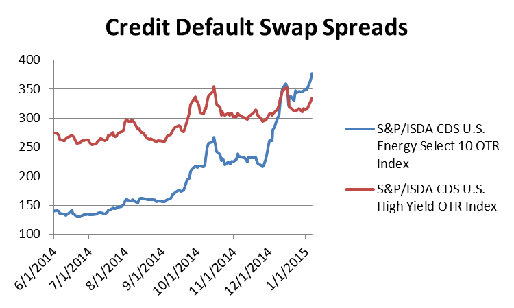
As oil prices have tumbled, the cost of buying default protection on the debt of energy companies has skyrocketed.  The cost of buying default protection tracked in the S&P/ISDA CDS U.S. Energy Select 10 Index has nearly tripled from a low point in June 2014.  As a result, default spreads for the energy sector are now higher than spreads for junk bonds indicating the energy sector is one of the riskiest sectors in the bond markets.

The S&P/ISDA CDS U.S. Energy Select 10 Index ended at 377bps up from 130bps in June 2014.  Translated into dollars, the annual cost of buying default protection on $10million of debt on these entities has risen from $139,000 to $377,000. The S&P/ISDA CDS U.S. High Yield Index ended at 334bps.

Source: S&P Dow Jones Indices LLC.  Data as of January 6, 2015.
Source: S&P Dow Jones Indices LLC. Data as of January 6, 2015.

The ten companies tracked in the S&P/ISDA CDS U.S. Energy Select 10 Index are:

  • Anadarko Petroleum Corp.
  • Apache Corp
  • Chesapeake Energy Corp.
  • ConocoPhillips
  • Devon Energy Corporation
  • Forest Oil Corp.
  • Halliburton Company
  • Peabody Energy Corporation
  • Valero Energy Corp.
  • Williams Companies, Inc. (The)


The posts on this blog are opinions, not advice. Please read our Disclaimers.

A Strong U.S. Dollar Isn't Bad For All Commodities

Contributor Image
Jodie Gunzberg

Former Managing Director, Head of U.S. Equities

S&P Dow Jones Indices

A strong US dollar is generally bad news for commodities since historically as the U.S dollar strengthens, goods priced in dollars become more expensive for other currencies. The historical negative relationship between the U.S. dollar and the S&P GSCI is shown below.

Source: S&P Dow Jones Indices and Bloomberg. Monthly data from 1/70 - 6/13. Charts and graphs are provided for illustrative purposes only.  Indices are unmanaged statistical composites and their returns do not include payment of any sales charges or fees an investor would pay to purchase the securities the index represents.  Such costs would lower performance.  It is not possible to invest directly in an index.  Past performance is not an indication of future results. The inception date for the S&P GSCI was May 1, 1991, at the market close.  All information presented prior to the index inception date is back-tested. There are inherent limitations associated with back-tested data.
Source: S&P Dow Jones Indices and Bloomberg. Monthly data from 1/70 – 6/13. Charts and graphs are provided for illustrative purposes only. Indices are unmanaged statistical composites and their returns do not include payment of any sales charges or fees an investor would pay to purchase the securities the index represents. Such costs would lower performance. It is not possible to invest directly in an index. Past performance is not an indication of future results. The inception date for the S&P GSCI was May 1, 1991, at the market close. All information presented prior to the index inception date is back-tested. There are inherent limitations associated with back-tested data.

While the broad based indices are negatively correlated with the U.S. dollar, some commodities are more negatively correlated with the US dollar than others.  In the long term, since the inception of each single commodity index, ten commodities have a lower than -0.3 correlation to the U.S. dollar: lead, copper, aluminum, nickel, gold, Kansas wheat, Brent, WTI, unleaded gasoline and gasoil with the lead leading the pack with the biggest negative relationship at -0.52.

Commodity Dollar Inc

When reducing the time period to ten years for all commodities, a different pattern appears. The first observation is that with the exception of feeder cattle, all correlations became more strongly negative.  However, some much more than others. Cocoa, corn, heating oil, WTI, silver, soybeans and unleaded gasoline all has greater than -0.3 decreases in correlation, implying a stronger negative relationship with the U.S. dollar.  The five commodities of the petroleum complex have the greatest inverse sensitivity, ranging from -0.62 to -0.67.  On the other hand, it is not surprising to see zinc, natural gas, live cattle, lean hogs, sugar and feeder cattle with almost no correlation. With the exception of zinc, these commodities are highly sensitive to weather.  Other factors like transportability and the global usage (natural gas is local) may influence the relationship.10 yr USD Commodities


The posts on this blog are opinions, not advice. Please read our Disclaimers.

The Rest of the Story

Contributor Image
Craig Lazzara

Former Managing Director, Index Investment Strategy

S&P Dow Jones Indices

This morning’s Wall Street Journal offered a partial explanation for the failure of most active managers to outperform their cap-weighted index benchmarks in 2014.  The proffered explanation is that “the rally in U.S. stocks was generally led by giant-company shares, such as Apple Inc., which rose 40%.”  Since most active funds are underweight most mega-cap stocks, the argument goes, “it’s logical the S&P [500] would outperform most active funds.”

Apple’s 40.6% total return far outpaced that of the S&P 500 as a whole (13.7%), so an underweighted position in the Index’s largest holding would clearly have hurt in 2014.  The argument is fine as far as it goes — but it doesn’t go very far.  If it’s fair to note that Apple outperformed, it’s also fair to note that Exxon Mobil — the second largest holding in the S&P 500 — recorded a total return of -6.1%.  The impact of underweighting mega-caps depends on which mega-cap a manager chose to underweight.

An easy way to understand the overall impact of capitalization is to compare the total return of the S&P 500 (13.7%) with that of the S&P 500 Equal Weight Index (14.5%).  Since the two indices comprise the same stocks, the superior return of the equal weight version tells us that, in 2014, weighting by capitalization hurt performance — in other words, that Apple was the exception, not the rule.  That said, the 80 basis points spread is exceptionally narrow in historical terms.   Since 2002, the average spread between the equal- and cap-weighted S&P 500 has been 3.8%, with positive results in 10 out of 13 years.  This means that in most years, picking stocks randomly from among the constituents of the S&P 500 would have been a winning strategy.  The same was true in 2014, although to a lesser extent than typically.

In 2014 as in most prior years, the underperformance of the average active manager is striking.  And when random selection beats actual portfolio managers, their performance was even worse than you think.

The posts on this blog are opinions, not advice. Please read our Disclaimers.

Global Forces At Work

Contributor Image
Kevin Horan

Former Director, Fixed Income Indices

S&P Dow Jones Indices

Global yields have started the new year lower, as the yield of the S&P Global Developed Sovereign Bond Index was  1.05% as of Jan. 5, 2015.  The index did touch a low of 0.94% at the end of November before bouncing up to close 2014 at 1.08%.  Looking back 10 years, the yield was as high as 3.74% in July 2007.  For 2014, the total return of the index was 7.09%.

European sovereign bonds, as measured by the S&P Eurozone Developed Sovereign Bond Index, returned 12% for 2014.  The yield of this index as of Jan. 5, 2015, was 0.97%, a historic low given the available index history.  The bond rally and forex drop in value have been driven by fears of deflation and speculation that the European Central Bank will need to continue, if not increase, the purchasing of debt to stimulate the region’s economy.

The S&P/BGCantor Current 10 Year U.S. Treasury Index closed 2014 returning 11.10% for the year.  Similar to the global picture, the yield of the index began the year at 3.03% and closed the year at a 2.22%.  Since Dec. 31, 2014,  the yield of this index has moved down to 2.04% as of Jan. 5, 2015.  The slowing global economic growth and deflationary forces are driving overall demand for debt.  The increasing strength of the U.S. economy and the Fed’s message of higher rates are being overshadowed by the bigger global picture.

The S&P U.S. Issued Investment Grade Corporate Bond Index outshined the lower-credit S&P U.S. Issued High Yield Corporate Bond Index, as the search for yield remained important throughout the year, but was eventually overshadowed by risk-off trades in response to the drop in oil prices.  These indices closed 2014 returning 7.71% and 2.66%, respectively.

Senior bank loans, as measured by the S&P/LSTA U.S. Leveraged Loan 100 Index, struggled throughout the year.  Continued active issuance, which added to supply, and the same energy names that were affected by the drop in oil prices in the high-yield index combined to detract from the performance of the leveraged loan sector.  The S&P/LSTA U.S. Leveraged Loan 100 Index ended 2014 with a return of 1%.
S&P Global Developed Sovereign Bond Index-Yield History


The posts on this blog are opinions, not advice. Please read our Disclaimers.

Observations on January Release of S&P Claims Based Indices (Allowed Charge Trends): Part 1

Contributor Image
John Cookson

Principal, Consulting Actuary

Milliman

The overall medical trend rates covering all services have continued to be modest in the S&P data through the 3rd quarter of 2014—increasing up to 3.5% on a 12-month moving average basis as of September[1].

Milliman uses the S&P claims based indices to create a Health Cost Index Claims Based Forecast that uses economic factors and scenarios to project these indices out three years.  The economy has continued to pick up with a robust real GDP of 5% in the 3rd quarter after 4.6% in the 2nd quarter, but dropping off to 2.6% on the advance GDP estimate for the 4th quarter[2].  Beyond the time lag in inflation used in our forecasts, our longer inflation scenario reflects inflation moving to 2.1% by 2017, which reflects the Philadelphia Federal Reserve December 2014 Livingston Survey of forecasters.  In recent months our hospital forecasts continue to come in somewhat lower than expected.  We believe this is at least partially due to the Medicare penalties on excess hospital readmission rates, which has a spill-over effect on commercial business[3].  Not only are the readmission rates dropping, but also initial admission rates may be declining due to longer observation times (due to the 72 hour rule) in the ER—thus eliminating some admissions.  At the same time, reduced admissions appear to be pushing up practitioner trends to some degree, partially offsetting the hospital slow down.  As a result of these Medicare mandated changes in the hospital sector, hospital employment and wages have been growing slower than population growth for some time.  A comparison of hospital wages per capita (on an 18 month smoothed moving average basis) vs. S&P hospital trends is shown in Chart A below.  The dip in 2010-2011 was likely due to the effects of the recession and loss of medical coverage by individuals being laid off after the government COBRA subsidy ended.

Chart A

Capture

With respect to our future trend forecasts, we expect trends to continue to rise steadily over the next few years reflecting the strengthening economy and the impact of new drugs.  Also, once the hospital programs to reduce readmissions and the impact of longer ER observation times mature, the removal of this source of downward pressure is likely to further put upward pressure on trends.


THE REPORT IS PROVIDED “AS-IS” AND, TO THE MAXIMUM EXTENT PERMITTED BY APPLICABLE LAW, MILLIMAN DISCLAIMS ALL GUARANTEES AND WARRANTIES, WHETHER EXPRESS, IMPLIED OR STATUTORY, REGARDING THE REPORT, INCLUDING ANY WARRANTY OF FITNESS FOR A PARTICULAR PURPOSE, TITLE, MERCHANTABILITY, AND NON-INFRINGEMENT.
[1] We track the LG/ASO trends as representative of underlying trends, since Individual and Small Group are impacted more significantly by the Affordable Care Act (ACA).  Keep in mind that actual trends experienced by plans are likely to be higher than as reported in S&P data.  Trends experienced by large employers on plans that have not changed in the previous year could be higher by as much as 2% or more on bronze level plans and higher by 1% or more on gold level plans due to the effects of deductible and copay leverage.  So risk takers need to take this into account.  In addition, the S&P Indices do not reflect the impact of benefit buy-downs by employers (i.e., higher deductibles, etc.), since the indices are based on full allowed charges.  As noted above, actual trends experienced by employers and insurers in the absence of benefit buy-downs can be expected to be higher than reported S&P trends due to plan design issues such as deductibles, copays, out-of-pocket maximums, etc.   Benefit buy-downs do not represent trend changes since they are benefit reductions in exchange for premium concessions, but they can have a dampening effect on utilization due to higher member copayments, and this can have a dampening effect on measured S&P trends compared to plans with no benefit changes, further pushing up experienced trends relative to those reported in the indices.
[2] The long time lag between real personal income growth (highly correlated with real GDP) and the impact on healthcare trends defer the impact on healthcare costs for 2½ to 3½ years, and are reflected in our forecasts.  The lag on inflation is much shorter with a range of 1 to 1½ years.
[3] Readmission rates are much higher on the Medicare population than the commercial and Medicare has seen significant admission rate reductions in recent years.  Medicare 30 day readmission rates have dropped from an average of 19.0%-19.5% four to seven years ago to under 18% in early 2014.

The posts on this blog are opinions, not advice. Please read our Disclaimers.