Get Indexology® Blog updates via email.

In This List

Muni Minutes – A Changing of the Seasons

Ouch. That’s gonna leave a mark.

Next Week’s FOMC Decision A Watershed Event? High Yield Doesn’t Seem To Think So.

The VIX Takes a Hairpin Turn

The Great Barrier To Commodities Down Under

Muni Minutes – A Changing of the Seasons

Contributor Image
Tyler Cling

Senior Manager, Fixed Income Indices

S&P Dow Jones Indices

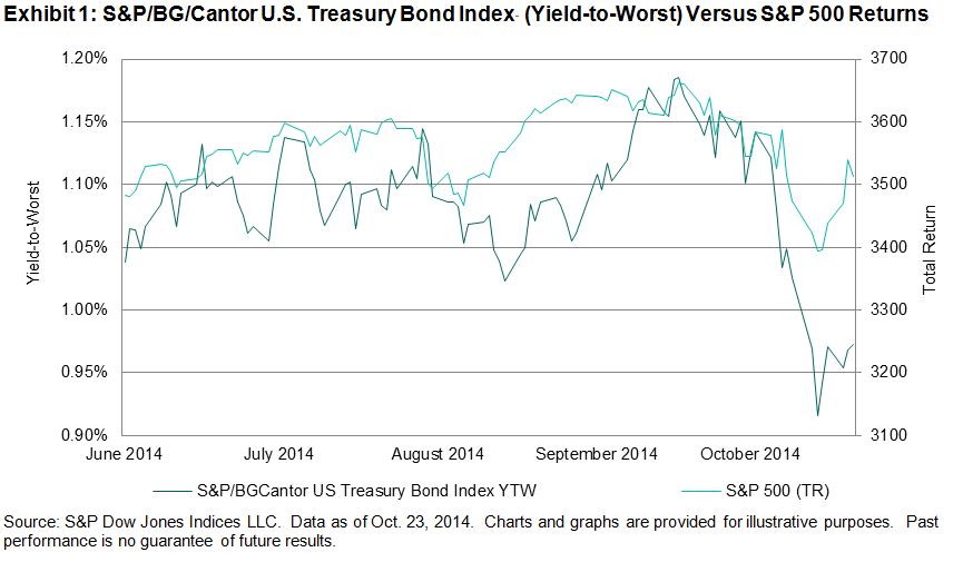
Following in suit with the colors of the trees, investor sentiment appears to be cycling. While the market may not be trading high-yield junk for investment-grade positions as quickly as New Yorkers are trading in their flip-flops and shorts for scarves and umbrellas last week, market demand has shifted in October. The S&P/BGCantor U.S. Treasury Bond Index, which tracks over USD 7 trillion of outstanding treasury debt, responded to October’s equity volatility with investors moving toward quality. Wednesday, Oct. 15, 2014, risk adverse demand drove up the price of T-bonds; bringing yields down to the lowest end-of-day close in over a year, at 0.92% (see Exhibit 1). The shift in tide was not lost on the municipal bond market.

Capture

Thus far, 2014 has seen investors clamoring for yields in a low interest and low supply muni market. High-yield munis have outperformed their investment-grade counterparts. Bonds from the Tobacco Master Settlement Agreement of 1998, tracked by the S&P Municipal Bond Tobacco Index have performed outstandingly this year, up 13.36% YTD. However, up to this point of Q3 2014, high-yielding tobacco bonds have remained flat, at 0.03% (see Exhibit 2).

Capture

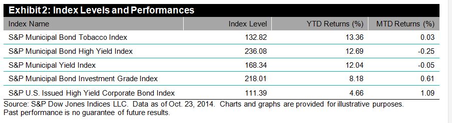
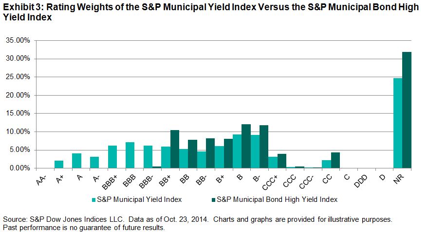
The S&P Municipal Bond High Yield Index, with a 12.69% return YTD, saw returns go the other way in October, down 0.25% for the month after a mild rebound. A similar trend occurred with the S&P Municipal Yield Index, down 12.04% YTD and down 0.05% MTD, although not as dramatically. The S&P Municipal Yield Index implements a weighted investment strategy based on blended quality (see Exhibit3). The S&P Municipal Bond Investment Grade Index only returned 8.18% YTD, yet saw a jump of 0.61% in October.

Capture

The S&P 500 has recovered from the drop off from the week of Oct. 13, 2014, and the sun came out this weekend, however the market is far from a consensus on what the future will hold. The municipal bond market has many variables to consider, along with a multitude of viewpoints. On November 5, 2014, S&P Dow Jones Indices will be hosting their annual Municipal Bond Forum live online and in New York. Industry leaders from top Wall Street firms will be debating the central issues and solutions facing both the economy and municipal bond market. For more information, please attend our Third Annual Municipal Bond Forum—Rising Rates? How to Deal With “Maybe”.  The event will also be live streamed.

The posts on this blog are opinions, not advice. Please read our Disclaimers.

Ouch. That’s gonna leave a mark.

Contributor Image
Jamie Farmer

Former Chief Commercial Officer

S&P Dow Jones Indices

By my reading, the recent tone in the investment press and blogosphere has been decidedly, shall we say, anti-active.  Index-based investing has won, active has lost, time for stock pickers and portfolios managers to find new careers.  It’s over.

One of the sharper summations of the zeitgeist comes by way of a recent post from The Banker’s Umbrella.  The author takes a sardonic jab at the life of an equity fund manager:  track the index, naively over/under weight a few names, sit back and collect a performance-be-damned paycheck.  Yes, it’s harsh and perhaps the passive-aggressive (sorry, couldn’t help myself) tack warrants a flag for unnecessary roughness.  But underlying the jab are real trends supported by real research.

Perhaps the most succinct example of that research is William F. Sharpe’s “Arithmetic of Active Management,” which says the average active dollar, after costs, must underperform the average passive dollar.  The proof case for Sharpe’s work is S&P Dow Jones’ regularly-published SPIVA researchSPIVA demonstrates that the majority of active managers underperform their benchmarks, especially over longer time periods.  SPIVA’s companion piece, the Persistence Scorecard, shows that it’s nigh impossible for any manager to remain among the top performing segment over time.

Trends can shift and it is possible that the anti-active wave may one day swing back to a more favorable view of professional asset managers.  Regardless of prevailing sentiments, however, there remain sound reasons for the superiority of index investing.

The posts on this blog are opinions, not advice. Please read our Disclaimers.

Next Week’s FOMC Decision A Watershed Event? High Yield Doesn’t Seem To Think So.

Contributor Image
Kevin Horan

Former Director, Fixed Income Indices

S&P Dow Jones Indices

Unlike Treasuries and investment grade corporates, the high yield market as measured by the S&P U.S. Issued High Yield Corporate Bond Index touch a low point for yield earlier in the month at a 5.87% on October 6th.  This market was in the process of selling off and had a yield of 6.51% on October 15th, up 65 basis points from the 6th and 38-basis point higher than the 6.13% start to the month.   High yield’s reaction posts October 15th was “risk on” as yields since then moved 60 basis points lower to a current level of 5.91%.  Month-to-date the total return of the index is 1.09% and for the year has returned 4.66%.

After having dropped to a low of 2.13% on October 15th, the yield of the U.S. 10-year as measured by the S&P/BGCantor Current 10 Year U.S. Treasury Bond Index has risen by 14 basis points to its current 2.28%.  Year-to-date yields are 75 basis points lower than the start of the year.  Though 2.13% is the lowest point for 2014, it is not the lowest for the index which was 1.39% back on July 25th of 2012.  If the trend is your friend, then expect lower yields in the near future.  If however you think next week’s FOMC meeting will be the event that turns the tides then now would be the inversion point.
Yield-to-Worst History of the S&P-BGCantor Current 10 Year U.S. Treasury Bond Index

Like Treasuries, the yield of the S&P U.S. Issued Investment Grade Corporate Bond Index (2.77%) is 14-basis point higher than the 15th of the month.  At mid-month, the year-to-date total return of investment grade corporates was at 8.02% but has dropped down to its current 7.03% with the slight move up in yield.  The index is still comparable in return to recent years past, which have ended the year up above 8% except for 2013 in which the index spend most of the year in negative territory.

Source: S&P Dow Jones Indices, 10/23/2014

The posts on this blog are opinions, not advice. Please read our Disclaimers.

The VIX Takes a Hairpin Turn

Contributor Image
Reid Steadman

Former Managing Director, Global Head of ESG & Innovation

S&P Dow Jones Indices

I have a neighbor who is cooler than me. He is braver than me. He also has more expansive and expensive medical and auto insurance than I do. How do I know all this? Well, he races street motorcycles.

The other day I asked him what was the fastest he had ever gone. His answer: “Very fast, but that’s not where the thrill is. The adrenaline rush comes from handling and powering through the curves.”

The movements in the CBOE Volatility Index (VIX) the past few weeks have made me reflect on this conversation. We know the VIX’s approximate top speed — somewhere around 80 — but it’s the changes in direction, the twists and turns, which test your skill.

Recently, the VIX took investors on a treacherous hairpin turn. It looked like this:

VIX Price

Did you get thrown off your motorcycle? It seems that many investors handled this deftly, seeing this jump in the VIX as a wicked but ultimately short-term movement. We know this by the performance of the VIX futures market.

VIX Futures in Times of Big Crises
First, to get some context, let’s look at the behavior of the VIX futures during the standard for all recent crises, the 2008 meltdown. In that time, when the whole market went to heck, the VIX shot up and the futures term structure went into backwardation across all maturities.

Capture

The VIX futures term structure assumed a similar shape during the standoff over the government debt ceiling in 2011.

Capture

The Hairpin Turn
Now let’s see what happened during the recent shakes and tremors in the market. The term structure shifted up and developed a kink around the second and third months, after which the rest of the term structure remained upward sloping, in contango. The shift up indicated that investors expected greater volatility across all periods, but the kink showed that they didn’t necessarily expect the very high levels the VIX had reached to persist.

Capture

Over the next few days, investors became even less worried about high volatility in the S&P 500 continuing. The VIX futures curve shifted downward and adjusted back into its most typical shape, which is contango across all maturities.

Capture

The investors betting on volatility subsiding to a degree have turned out to be right, at least for now. But there will undoubtedly be more turns on the way – both hairpin and more traditional curves – to test their driving skills.

The posts on this blog are opinions, not advice. Please read our Disclaimers.

The Great Barrier To Commodities Down Under

Contributor Image
Jodie Gunzberg

Former Managing Director, Head of U.S. Equities

S&P Dow Jones Indices

This week I am in Australia meeting with investors about commodities.  Usually when I visit a heavy natural resource producing country, the conversations flow easily since the locals understand commodities.  We have been discussing farms, coal, iron ore and tin – subjects that engulf the culture of the locals.  The Australians seem to know all about the public companies and private deals and are comfortable about the commodity exposure in their portfolio via their stock market, the S&P ASX 200.  You can see in the chart below that 16.4% of the Australian stock market is in Materials and 6.5% is in Energy.

Based on GICS® sectors The weightings for each sector of the index are rounded to the nearest tenth of a percent; therefore, the aggregate weights for the index may not equal 100%. AS OF SEP 30, 2014
Source: S&P Dow Jones Indices. Based on GICS® sectors. The weightings for each sector of the index are rounded to the nearest tenth of a percent; therefore, the aggregate weights for the index may not equal 100%. AS OF SEP 30, 2014

Given this profile, many Australian investors dismiss commodities as an asset class since they feel they already have exposure through equities.  Although the local commodities consist mainly of dry bulks like coal and iron ore that are not yet part of the global futures markets that make up the asset class, there is a great barrier to overcome the perception that the Australian stock market is highly correlated to global commodities.

In order to test the potential benefits of commodities to Australian investors, we evaluated diversification and inflation protection, the benefits many international and domestic US investors realize.  The results were different than what I expected.

First, the correlations of commodities to two major stocks BHP and RIO were only 0.16 and 0.18, respectively. That is not terribly surprising since these companies don’t produce agriculture or crude oil and also since coal and iron ore are not in the commodity benchmarks.  What was surprising is that the US stock market is over 3 times more correlated to commodities than the Australian stock market and that Australian stocks never saw a correlation spike from the global financial crisis.

Great Barrier correlation spike

Australian Commodity Correlation

The next question is whether the low correlation of 0.135 between the S&P ASX 200 and the S&P GSCI can overcome the low returns of commodities post the global financial crisis for an increase in portfolio efficiency.  While commodities didn’t add much to the Australian stock portfolio, they didn’t hurt. That is impressive even with a major allocation of 10% through the worst drawdown in history.

AUD Portfolio

Notice the heavier oil in the S&P GSCI helped more than the more well diversified S&P GSCI Light Energy.  Another question around oil is whether the global commodity basket hedges inflation in Australia given the market doesn’t produce much crude oil. This answer wasn’t so surprising since it it not quite as strong as the inflation protection for Europe or the US, but for a small investment, it is still possible to get a great inflation protection as shown by its inflation beta.

Australian Inflation

SOURCE: S&P Dow Jones Indices

In conclusion, commodities as an asset class as represented by the global futures market has historically provided the diversification and inflation protection specifically to the Australian market.  The great barrier to commodity investing in Australia shouldn’t be so great, especially with the offering of products that enable the locals to access this market.

The posts on this blog are opinions, not advice. Please read our Disclaimers.