Get Indexology® Blog updates via email.

In This List

How Commodities Might Do Under Clinton, Trump

Quiet Before the Storm

2016 Presidential Election: Can Put Options Help Reduce Portfolio Volatility?

Examining Low Volatility’s Performance in Various Market Environments

The Price of Retirement

How Commodities Might Do Under Clinton, Trump

Contributor Image
Jodie Gunzberg

Former Managing Director, Head of U.S. Equities

S&P Dow Jones Indices

In October, the S&P GSCI Total Return (TR) lost 1.5% but the Dow Jones Commodity Index (DJCI) TR gained 0.1%.  The performance disparity was mainly due to the weighting difference in energy since crude oil in the indices slid near 10% from its mid-month high, on doubts over OPEC’s ability to agree on production cuts and the report from the American Petroleum Institute (API) showing U.S. crude stocks rose by 9.3 million barrels in the last week.

Performance was split with positive total returns from 3 of 5 sectors and 10 of 24 commodities. Livestock gained 4.2%, the most of any sector, and precious metals lost 3.8%, the most of any sector.  Energy, industrial metals and agriculture returned -3.5%, 1.1% and 2.4%, respectively. Despite the strong month for livestock, it is down 18.4% year-to-date – that is the sector’s 2nd worst year on record going back to 1970, only behind 2008, when it lost 22.8% through Oct. YTD. Also, energy and industrial metals are up 4.9% and 12.5% Oct YTD, respectively that is the most since 2009.  Agriculture and precious metals are up 1.3% and 20.2% Oct YTD,  positive year-to-date through Oct. for the first time since 2012.

Lean hogs performed best of all the single commodities, gaining 9.1%, giving pork producers something extra to celebrate this October along with their already designated “Pork Month“. On the other hand, silver performed the worst, losing 7.4%, mostly from the dollar strength and growth optimism that happened at the beginning of the month. Despite this, it is still having its 6th best Oct YTD (+27.6%) going back to 1974, and is on pace for its best year since 2010. (Zinc is also having a record year so far, up 51.3% Oct. YTD, its 3rd best in history since 1992, only behind 2006 and 2009.)  If the dollar falls, silver may be one of the most positively impacted commodities, gaining on average about 6% for every 1% fall in the US dollar. Moreover, election uncertainty may drive the precious metals even higher as investors flee to the safe-haven metals, much like they did around the relatively recent events of Brexit, the Chinese stock market volatility and last Fed rate hike.

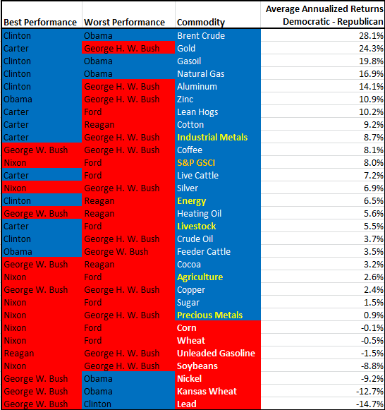
While volatility and fear generally have supported gold around election uncertainty (in fact, this year through Oct. gold in the index is posting its 6th best year ever going back to 1979 (+19.3%) and is on pace for its best year since 2011,) gold does significantly better under the historical Democratic presidencies, adding 24.3% on average in Democratic terms versus Republican ones since 1978.  Like gold, most commodities do better on average under Democratic rule, but the majority of highs and lows for commodities are under the Republican presidencies.  Of the 24 commodities, 14 have had their best performance and 18 have had their worst performance with Republican presidents. However, 17 single commodities have had better performance on average under Democratic Presidents.  Although all sectors do better on average under Democratic presidents, all the commodities inside the S&P GSCI Grains including corn, wheat, Kansas wheat and soybeans do better under Republican presidencies.

Source: S&P Dow Jones Indices


The posts on this blog are opinions, not advice. Please read our Disclaimers.

Quiet Before the Storm

Contributor Image
Fei Mei Chan

Former Director, Core Product Management

S&P Dow Jones Indices

Quiet Before the Storm?

Global markets seemingly remain unperturbed—despite homing in on Election Day in the U.S.  Although dispersion ticked up globally from September month-end levels, it is still sitting at below average levels as of October 31 in the U.S. Similarly, correlation is also well below average. Together these coordinates are pointing to particularly peaceful times for U.S. equity markets on the dispersion-correlation map. On the international front, the story is similar. Though dispersion is above average in the Europe region, correlation is below average and is at the lowest level in more than 2 years. In Asia, both dispersion and correlation are close to record low levels.

Times of crisis are typically characterized by higher dispersion levels, as witnessed by years 2000 (tech bust) and 2008 (financial crisis). While dispersion has increased across the globe it is nowhere near crisis levels in the U.S. and Asia and somewhat higher in Europe.

Things could very well change—and change quickly. But for now, it’s all quiet around the world.

quiet-before-the-storm1

quiet-before-the-storm2

quiet-before-the-storm3

The posts on this blog are opinions, not advice. Please read our Disclaimers.

2016 Presidential Election: Can Put Options Help Reduce Portfolio Volatility?

Contributor Image
Berlinda Liu

Former Director, Multi-Asset Indices

S&P Dow Jones Indices

No other recent presidential elections have been as divided as this year’s.  As the objectivity and credibility regarding poll numbers and media coverage of the candidates are being questioned, the U.S. economy and the capital market are facing an unusual level of political risk.  Market participants may seek various tools to hedge the downside risk, such as put options.  The question is: to what degree a long put position can help to reduce overall portfolio volatility?  To help answer this, we examine a hypothetical portfolio that already has a risk control mechanism in place.

Let’s consider a typical multi-asset portfolio invested in the S&P 500® and five-year U.S. Treasuries (UST) with a fixed volatility budget.  When the realized volatility of the equity market exceeds the volatility budget, the portfolio is partially allocated to UST to keep the volatility under control; when the realized volatility of the equity market falls below the volatility budget, the portfolio is fully allocated to the S&P 500 to get 100%  equity market participation.  When the yield curve is inverted, all fixed income allocation will be shifted to cash.  We can further assume that there is no shorting and no borrowing.  The portfolio is rebalanced only when its realized volatility deviates more than 0.5% from the pre-specified volatility budget.

Overlaying this portfolio with a self-financed five-year synthetic put option on the portfolio struck at 80%, or in other words, assuming that we are able to pay x amount to buy a five-year put to protect 80% of the remaining portfolio (portfolio value minus x), we can observe the level of volatility reduction derived from this put overlay.

Exhibit 1 shows the statistics of the portfolio’s realized volatility before and after the put overlay.  The delta of the synthetic put drives risk reduction.  Higher volatility budge usually results in a more volatile portfolio and a higher delta of the put option, which, in turn, reduces more risk in ratio terms (1-Before/After Ratio).

Exhibit 2 shows the time series of the realized volatilities before and after the put overlay for a portfolio with a volatility budget of 22%.

As a rule of thumb, overlaying a put option on a ~20% volatility portfolio reduces about 6%-8% of the realized volatility over a 26-year period.  The good old put protection strategy has been working for decades, and it could still be a powerful volatility reduction tool no matter who becomes the next president.

capture

capture

Note: Realized volatility is defined as the maximum of the long-term volatility and short-term volatility in the S&P Risk Control Indices Model.  This is because this is usually the volatility that is used to adjust the portfolio allocation to meet the volatility budget.  For more information about the calculation, please refer to S&P Risk Control Indices.

The posts on this blog are opinions, not advice. Please read our Disclaimers.

Examining Low Volatility’s Performance in Various Market Environments

Contributor Image
Nick Kalivas

Senior Equity Product Strategist

Invesco

Rates, volatility and a broad market rally have contributed to the factor’s late-summer slump

Late summer has not been fruitful for the low volatility factor. From July 6 to Sept. 9, the S&P 500 Low Volatility Index has fallen by 4.67%, while the S&P 500 Index gained 1.70%.1 This is in sharp contrast to the second quarter, when the low volatility index returned 6.75%, and the broad-market index returned 2.46%.1 Naturally, some investors are wondering what’s behind the shift.

Looking at market conditions during this time, I see three headwinds that were working against the low volatility factor:

  • Interest rates rose. The 10-year Treasury yield rose from 1.31% on July 6 to a close of 1.67% on Sept. 9.1
  • Volatility was relatively flat. The CBOE Volatility Index (the VIX) was 14.96 on July 6 and was 12.51 on Sept. 8. before finishing at 17.5 on Sept. 9.1
  • The S&P 500 Index rallied. While the index gave back much of its earlier gains on Sept. 9, it had rallied for most of July and August.

When has low volatility outperformed?
The low volatility factor has tended to shine when interest rates are flat to lower, stock prices are falling and volatility is rising.  We can see this in the table below, which examines the performance of the S&P 500 Low Volatility Index during extreme moves in the S&P 500 Index, the VIX and 10-year Treasury yields from May 2011 through August 2016. In that time frame, there were 64 months of returns. The table examines low volatility performance during the most extreme months (the top 25%) in terms of the largest increases and decreases in each index.

capture

Examining low volatility results

  • By volatility. During the 16 months when the VIX had its largest percentage increases, the S&P 500 Low Volatility Index outperformed the S&P 500 Index 62.5% of the time, with an excess return of 51 basis points (bps). In contrast, during the 16 months when the VIX had its largest percentage drops, the low volatility index outperformed the broad market just 25% of the time, with an average lag of 107 bps.
  • By rates. During the 16 months when the 10-year Treasury yield had its largest percentage increases, the S&P 500 Low Volatility Index outperformed the S&P 500 Index just 25% of the time, trailing by an average of 169 bps. During the top months of yield declines, the low volatility index outperformed the broad market 87.5% of the time, with an average excess return of 241 bps.
  • By market performance. During the 16 months when the S&P 500 Index had its largest declines, the S&P 500 Low Volatility Index outperformed 87.5% of the time, with an average excess return of 176 bps. In contrast, during months when the S&P 500 Index gained the most, the low volatility index outperformed 12.5% of the time, with an average underperformance of 156 bps.

Bottom line: Low volatility is performing as expected|
When you look at the market conditions experienced in late summer, it’s no surprise that low volatility shares underperformed the broad market. This is by design. However, it’s important to remember that the low volatility factor does occasionally outperform in up markets and occasionally lag in down markets.  And while higher rates and a lower VIX have been headwinds for low volatility, the results are not absolute. There are exceptions. Understanding market trends and the potential for exceptions can help investors set proper expectations for low volatility performance.

The posts on this blog are opinions, not advice. Please read our Disclaimers.

The Price of Retirement

Contributor Image
Philip Murphy

Former Managing Director, Global Head of Index Governance

S&P Dow Jones Indices

In my last post, I discussed variability in cost and affordability of retirement income.  I used some data from S&P STRIDE, our new benchmark that provides a cradle-to-grave yardstick for wealth accumulation and income generation.  This week, I will look a little closer at how we measure retirement income, as well as its present value or cost.  To begin with, defined contribution retirement plan participants and IRA investors must convert their accumulated savings into an income stream when they enter retirement.  Things may be simpler for people with defined-benefit pensions that pay out monthly benefits according to the plan’s vesting schedule and benefit formula.  However, even though defined benefits are expressed as monthly income, they have a present value, which is simply the stream of their expected future cash flows expressed as a discounted lump sum.

If you were to ask people of my parent’s generation, “What is your net worth?” they probably would not count the present value of their pension benefits.  They may view it as part of their personal income statement but not their balance sheet.  However, if you asked people in my generation the same question, I bet they would include the value of their 401(k).  They are thinking of it as a balance sheet item, but many have not yet considered that it needs to become an income statement item upon retirement.

When considering the convertibility of lump sums into income streams and vice versa, it may help to think about how the bond market works.  When you buy a bond, you convert a given amount of liquid funds into future cash flows, and when you sell a bond, you convert future cash flows into readily available capital.  As we know, bond prices vary with interest rates, and the same applies to future retirement income.  The bond market analogy is relevant because at S&P DJI, we calculate the value of retirement income exactly like the value of a bond.  However, we define a special “bond” called the generalized retirement income liability (GRIL) as a particular set of cash flows.  Specifically, GRIL is defined as USD 1 per year of inflation-adjusted income starting at age 65 and continuing for 25 years.  We discount GRIL’s cash flows using the U.S. Treasury Inflation-Protected Securities (TIPS) yield curve.  This results in a transparent, precise method for evaluating the cost of future inflation-adjusted (real) income.  We calculate the present value of GRIL for various starting points, each corresponding to specific target years within the S&P STRIDE Indices.  Currently, they range from 2005 to 2060.  For example, if you plan to retire around 2035, you can find the cost of retirement income as we calculate it on our website under the “additional info” menu.  Exhibit 1 shows the cost of 2035 GRIL since January 2016:

capture

What does Exhibit 1 tell us?  GRIL is 25 US dollars of inflation-adjusted retirement income spread over 25 years—USD 1 per year.  To buy that income stream at the end of January 2016 would have cost USD 17.40, but as of September 2016, its cost increased to USD 20.68.  Therefore if you held $1 million in US T-Bills (potentially the safest investment one can find, from the perspective of investment volatility), in January 2016, you could have acquired $57,471 of today’s US dollars per year starting in 2035 and lasting until 2060.  The calculation is USD 1 million / USD 17.40.  However, because real interest rates trended down since the start of the year, increasing the cost of income, as of September 2016 that same $1 million T-Bill portfolio would only have bought $48,356 of future income (USD 1 million / USD 20.68).  When viewed through the lens of income affordability, it is therefore clear that investing in T-Bills and other short-term obligations is not risk free.

The posts on this blog are opinions, not advice. Please read our Disclaimers.