Get Indexology® Blog updates via email.

In This List

Rieger Report: Mismatch - State Pension Short Falls & Muni Bond Market Returns

Consistency: What Rolling Returns Say About Dividend Aristocrats

When Smart Beta Fails

Gold & Silver: Fed Rate Hike Vs Mine Supply

Rising Rates Revisited...

Rieger Report: Mismatch - State Pension Short Falls & Muni Bond Market Returns

Contributor Image
J.R. Rieger

Former Head of Fixed Income Indices

S&P Dow Jones Indices

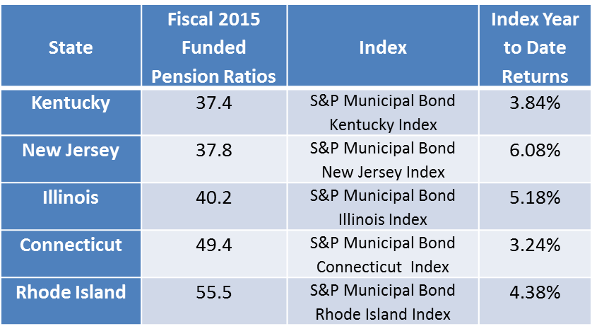
S&P Global Ratings released a report on September 12th 2016 U.S. State Pensions: Weak Market Returns Will Contribute to Rise in Expense.  Importantly, the report identified the five worst and best funded state pensions.  You might think that an underfunded pension liability would mean the market would avoiding the municipal bonds issued by or within those states.  The market has determined otherwise.

Of the five states with the worst-funded pension ratios, three have outperformed the S&P Municipal Bond Index which has returned 4.16% year-to-date.   Limited supply of bonds and the ever present hunger for yield have a lot to do with the returns.

  • New Jersey, Illinois and Rhode Island municipal bonds started the year with impressive incremental yields over bonds from other states drawing attention from the yield starved market place.    As a result, the S&P Municipal Bond New Jersey Index has returned over 6% and the S&P Municipal Bond Illinois Index has returned over 5.1% year-to-date .
  • Kentucky has the worst-funded pension fund.  However, the lack of supply of bonds from Kentucky, including no state general obligation bonds,  keep any bonds from Kentucky in the sites of mutual funds seeking to further diversify away from the larger issuers.  The S&P Municipal Bond Kentucky Index has only modestly underperformed returning 3.88% year-to-date.

Table 1) Fiscal 2015 Five Worst-Funded Pension Ratios and Bond Returns (YTD)

Sources: S&P Global Ratings and S&P Dow Jones Indices, LLC. Data as of September 26, 2016. Table is provided for illustrative purposes. It is not possible to invest directly in an index. Past performance is no guarantee of future results.
Sources: S&P Global Ratings and S&P Dow Jones Indices, LLC.  Total return data as of September 26, 2016. Table is provided for illustrative purposes. It is not possible to invest directly in an index. Past performance is no guarantee of future results.

Bonds from only one of the five states with the best-funded pension ratios have outperformed the S&P Municipal Bond Index.  The S&P Municipal Bond South Dakota Index has seen a return of over 4.8% year-to-date with the lack of supply being a major factor.

Table 2) Fiscal 2015 Five Best-Funded Pension Ratios and Bond Returns (YTD)

Sources: S&P Global Ratings and S&P Dow Jones Indices, LLC. Data as of September 26, 2016. Table is provided for illustrative purposes. It is not possible to invest directly in an index. Past performance is no guarantee of future results.
Sources: S&P Global Ratings and S&P Dow Jones Indices, LLC. Total return data as of September 26, 2016. Table is provided for illustrative purposes. It is not possible to invest directly in an index. Past performance is no guarantee of future results.

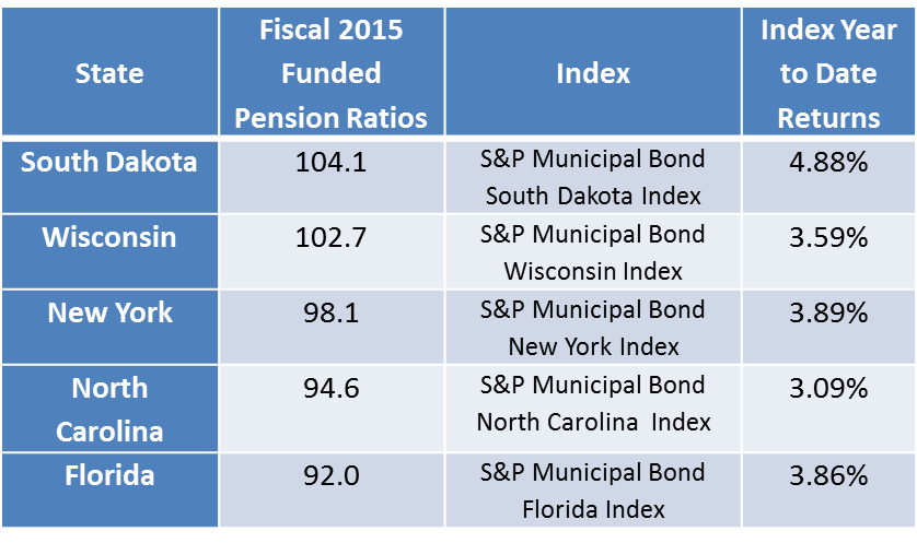
Bottom line: supply and demand imbalances and yield hungry markets appear to be outweighing the fundamental factor of potential pension shortfalls.

Additional perspectives on this phenomenon in the municipal bond market are encouraged and welcomed.


The posts on this blog are opinions, not advice. Please read our Disclaimers.

Consistency: What Rolling Returns Say About Dividend Aristocrats

Contributor Image
Leks Gerlak

CFA, Investment Strategist

ProShares

Historically, three-year rolling returns have revealed consistent outperformance from the S&P 500® Dividend Aristocrats® Index, which is composed of quality companies with at least 25 consecutive years of dividend growth.

Why look at rolling returns?
Rolling returns offer a more robust way to show performance than traditional one-, three-, five- and ten-year trailing returns. Rolling returns present numerous overlapping (rolling) increments, versus fixed trailing calendar periods that only let you see points in time. Since investors rarely buy and sell strictly by a calendar, rolling returns may help investors better assess historical performance.

Consistent Outperformance
When we chart 99 three-year rolling return periods (rolled monthly) for the S&P 500 Dividend Aristocrats Index since its inception (May 2005), we see it consistently outperformed the S&P 500 under almost all market conditions:

  • The Dividend Aristocrats outperformed during 95% of rolling periods from May 2, 2005–June 30, 2016.
  • The Dividend Aristocrats had lower relative volatility than the S&P 500 92% of the time.
  • And the Dividend Aristocrats produced excess returns over the S&P 500 during the financial crisis of 2008, in the subsequent rally and during the majority of the periods since then.

capture

The Takeaway
The S&P 500 Dividend Aristocrats Index invests in a select group of high-quality companies within the S&P 500—those that have grown their dividends for at least 25 consecutive years. The Dividend Aristocrats currently includes 50 well-known companies, over half of which have grown their dividends for an impressive 40 years or more.

Since its inception in 2005, this index has had an impressive track record of outperforming the broader S&P 500—with lower volatility—under a variety of market conditions. The index’s three-year rolling returns reveal the consistency of the index’s risk-adjusted return.

This information is not meant to be investment advice. There is no guarantee dividends will be paid. Companies may reduce or eliminate dividends at any time, and those that do will be dropped from the indexes at reconstitution. Past performance does not guarantee future results.

The posts on this blog are opinions, not advice. Please read our Disclaimers.

When Smart Beta Fails

Contributor Image
Craig Lazzara

Former Managing Director, Index Investment Strategy

S&P Dow Jones Indices

How should an investor in a factor (or “smart beta”) index judge its performance?  In this respect at least, smart beta is like any other strategy: you should evaluate it against the claims that its vendors made before you bought it.

This requires some subtlety.  Smart beta methodologies pick stocks based on fundamental or technical characteristics, and performance claims are derived from the historical behavior of those characteristics.  It’s the performance claims that gain or lose investor dollars.  For example, we pick the constituents of our low volatility indices based on their historical volatility; the record demonstrates that such stocks provide investors with protection in falling markets and participation in rising markets.  But investors buy low vol primarily because they like the idea of protection and participation, not because they care about how we get there.

That said, how often does low vol “fail?”  If we look strictly at the index’s fundamental characteristics, the answer is “hardly ever.”  Using daily data and a three-month lookback horizon, the S&P 500 Low Volatility Index is less volatile than the S&P 500 97% of the time; if we lengthen the time horizon to a year or more, Low Vol’s success rate is 100%.  So Low Vol is virtually always less volatile than its parent index.  These data, of course, ignore investment performance.

In performance terms, low volatility strategies can fail in two ways: by underperforming falling markets (a failure of protection), and by falling when the market goes up (a failure of participation).  Underperforming a rising market is not a failure – low vol strategies were never intended to outperform in all environments.  Here the record is still very strong.  The S&P 500 Low Volatility Index rises in 86% of the months when the S&P 500 rises.  In 83% of the months when the S&P 500 falls, Low Vol falls by less.  There have never been more than two consecutive monthly failures (and that rarely), which may be a function of the index’s quarterly rebalancing schedule.

The financial press has recently featured a surfeit of suggestions that defensive strategies will soon underperform.  They’ve all benefited, some more than others, from income-seeking bond refugees, which leads some observers to argue that when interest rates finally begin to rise, defensive equities will suffer as their advantage over bonds diminishes.  It’s a plausible argument, but it’s also a hypothetical, which means that no one can confirm or deny it definitively.  What we can say is that the historical record of defensive indices in rising rate environments is strong — and that periods when defensive indices fail have been rare and short.

The posts on this blog are opinions, not advice. Please read our Disclaimers.

Gold & Silver: Fed Rate Hike Vs Mine Supply

Contributor Image
Erik Norland

Executive Director and Senior Economist

CME Group

Two factors tend to consistently influence gold and silver — interest rate expectations and mining supply.  Changes in interest rate expectations typically exert a short-term, day-to-day influence that is exogenous to the metals market while mining supply has a long-term, year-to-year influence that is endogenous.

Precious metals prices seem to exert little to no influence on the U.S. Federal Reserve’s (Fed) monetary policy, but changes in market expectations for Fed rates often have a strong impact on gold and silver. If one compares the day-to-day correlation of the changes in the Fed Fund futures rate (100 minus the Fed Fund futures price) with the changes in precious metals prices, one finds a strong and persistently negative correlation for gold and silver.  Since the Fed hiked rates in December 2015, those correlations have grown stronger.

Gold appears to be more sensitive to changes in interest rate policy than silver.  This is probably because gold is the more truly precious of the two — it is widely used in investment and in jewelry, which can also be seen as an investment.  While silver is also used in investment and in jewelry, it is more widely used in industrial and other applications.  The reason why gold and silver prices react negatively to higher interest rates may be simple.  The metals do not pay interest.  As such, higher interest rates tend to make fiat currencies like the U.S. dollar appear more attractive to investors than gold or silver.

Growing expectations earlier in the year for an interest rate hike appear to have halted the rally in the gold and silver for the time being.  Gold peaked in early July, and silver in early August, but the subsequent declines have been modest.  One factor that might be limiting the declines and is also one of the most overlooked is — supply.  According to the GFMS Gold Survey Q2 report, gold mining supply fell by 2.2% in the second quarter of 2016 from a year earlier after having barely grown during the first quarter.

The U.S. economy is doing reasonably well.  Despite low productivity growth and declining corporate profit growth, the labor market appears to be strong.  According to the Bureau of Labor Statistics, the total number of people working has risen by 1.9% during the past year and average hourly earnings have increased by 2.6%.  All told, this equates to a 4.5% growth in total labor income.  GDP growth has been stagnant perhaps mainly due to a decline in corporate profits (from very high levels), falling inventories (a good sign going forward) and deterioration in the U.S. trade balance.  Inflation has been subdued in part as a result of falling energy prices but this won’t last forever, and the core rate of inflation has been perking up.  As such, our view is that the Fed will gradually adjust interest rates higher, and that the boost gold and silver prices got from diminished expectations for a rate hike is mainly behind them.

From our point of view, neither the interest rate picture nor mining production trends are likely to be supportive for gold and silver prices in late 2016 or in 2017.  Of course, events could prove us wrong, especially if the Fed decides to further delay its next rate increase or if mining supply contracts further.

capture

The posts on this blog are opinions, not advice. Please read our Disclaimers.

Rising Rates Revisited...

Contributor Image
Fei Mei Chan

Former Director, Core Product Management

S&P Dow Jones Indices

The prospect for and ramifications of rising interest rates have surfaced time and again in recent years. Whether and when the Fed will raise rates next is anyone’s guess. But as we’ve noted before, the correlation between higher interest rates and equity declines has grown tenuous in recent history.  Since 1991, the S&P 500 has risen roughly twice as often as it declined.  In 124 (of a total 307) months the 10-Year Treasury Yield increased; in those months, the S&P 500 declined only 27% of the time.   Though conventional wisdom is that stocks decline when rates rise, for the last 25 years, things haven’t been very conventional.

This is critical in understanding the prospects for defensive strategy indices.  These indices, as the name suggests, are designed to attenuate the market’s volatility. When times are good, they won’t participate fully in the market’s performance, but they provide some protection in falling markets. They’ve also been very popular since the financial crisis in 2008.

What would be the impact of a rate rise on these strategies?  The yield/performance matrix below shows the performance of the S&P 500 and the differential returns of several defensive strategies in various combinations of interest rate and market environments. Consistently, defensive strategies outperformed in down markets and underperformed in up markets. This relationship holds regardless of whether interest rates were up, down or static. Defensive equity strategies are much more dependent on the direction of the equity market than the direction of the bond market.

rising-rates-revisited

The posts on this blog are opinions, not advice. Please read our Disclaimers.