Get Indexology® Blog updates via email.

In This List

Are Active Funds Better at Managing Risks? Not Really.

ESG Factors Are Built on Peter Drucker’s Philosophy

Not Melting Yet

Ford Layoffs and the S&P 500 LinkUp Jobs Consumer Discretionary Index

Large-Cap Real Estate Was the Top U.S. Segment in May

Are Active Funds Better at Managing Risks? Not Really.

Contributor Image
Berlinda Liu

Former Director, Multi-Asset Indices

S&P Dow Jones Indices

In investing, risk and return are two sides of the same coin; the expected returns of an asset must be accompanied by variation or uncertainty around the outcome of those returns. All else equal, higher-risk assets should be compensated, on average, by higher returns. The same philosophy applies to performance evaluation. The performance of both active and passive funds should be evaluated in proportion to the risks taken to achieve those returns.

Our Risk-Adjusted SPIVA® Scorecard examines the performance of actively managed funds against their benchmarks on a risk-adjusted basis, using both net-of-fees and gross-of-fees returns. We used the standard deviation of monthly returns over a given period to define and measure risk. The return/risk ratio looks at the relationship and the trade-off between risk and return. All else equal, a fund with a higher ratio is preferable since it delivers a higher return per unit of risk taken. To make our comparison relevant, we also adjusted the returns of the benchmarks used in our analysis by their volatility.

After adjusting for risk, the majority of actively managed domestic funds in all categories underperformed their benchmarks, net-of-fees, over mid- and long-term investment horizons. Although the risk-adjusted performance of active funds improved compared to their benchmarks on a gross-of-fees basis, real estate was the only fund category that generated a higher ratio than the benchmark over the five-year period. Overall, the majority of active domestic equity managers in most categories underperformed their benchmarks on a gross-of-fees basis.

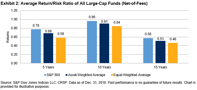
Asset-weighted return/risk ratios of active managers were higher than their equal-weighted counterparts, indicating that larger firms tend to take on better compensated risk than smaller firms (see Exhibit 2). When comparing average ratios against their benchmarks, all domestic equity categories had lower ratios across all investment horizons when they were equally weighted on a net-of-fees basis. However, asset-weighted ratios of real estate funds (over the 5-, 10- and, 15-year periods), large-cap value funds (over the 10- and 15-year periods), mid-cap growth funds (over the 5-year period), and mid-cap value funds (over the 10-year period) were higher than the benchmarks.

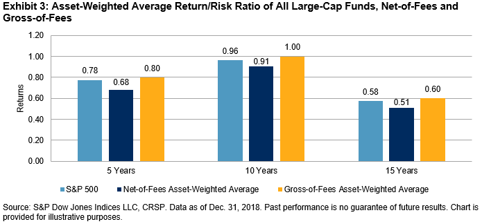
The impact of fees on active managers’ risk-adjusted returns was substantial. For example, on a gross-of-fees basis, the asset-weighted average return/risk ratios of all large-cap funds exceeded the benchmarks across all investment horizons. However, the advantage diminished quickly when fees were taken into consideration (see Exhibit 3).


Our analysis dispels the myth that active management possesses better risk-management skills than passive indices. Moreover, any perceived advantage in higher risk-adjusted returns quickly disappears once fees are accounted for.

For more information on the risk-adjusted performance of actively managed funds compared with their benchmarks in 2018, read our latest Risk-Adjusted SPIVA Scorecard.

The posts on this blog are opinions, not advice. Please read our Disclaimers.

ESG Factors Are Built on Peter Drucker’s Philosophy

Contributor Image
Zachary First

Executive Director

Drucker Institute, Claremont Graduate University

Do you ever wonder where environmental, social, and governance (ESG) factors—now used in more than 25%[1] of all assets under management—come from? The short answer is: Mainly from the good-practices checklists maintained by a handful of big ratings agencies.

But where did those agencies get their checklists? Mainly from the fruits of a handful of turn-of-the-millennium sources, including John Elkington’s “Triple Bottom Line,” the “100 Best Companies to Work For” list, and the United Nations Principles for Responsible Investment.

But where did these sources come from?

Sixty-five years ago, Peter Drucker wrote in his landmark book, The Practice of Management, “What is most important is that management realize that it must consider the impact of every business policy and business action upon society.”

While Drucker would have applauded the rise of ESG investing, he would have encouraged it as one piece of a broader, holistic view of “social responsibility.” For Drucker, social responsibility begins with the customer. After all, he wrote, “it is to supply the consumer that society entrusts wealth-producing resources to the business enterprise.” Drucker also held that a corporation must take care of its employees, maintaining that if “worker and work are mismanaged” it is “actually destructive of capital.” He counseled that companies must constantly pursue innovation, not merely to grow revenue but in service of their basic function as society’s “specific organ of growth, expansion and change.” In all of this, Drucker was decades ahead of his time, anticipating an age in which 80% of a company’s value[2] would take the form of intangibles not shown on a balance sheet.

Not that Drucker considered financial strength unimportant. Business’s “first responsibility,” Drucker declared, “is to operate at a profit,” so as to fulfill its role as “the wealth-creating and wealth-producing organ of our society.” Ultimately, Drucker saw that social responsibility would be the highest expression of business purpose rather than a feel-good sideshow—a harbinger of today’s concept of “shared value” and the basis of the S&P/Drucker Institute Corporate Effectiveness Index. “It is management’s…responsibility,” Drucker wrote, “to make whatever is genuinely in the public good become the enterprise’s own self-interest.”

The evidence that investors and executives are still catching up to Drucker’s foresight is, sadly, all around. Pleas to fix capitalism before it breaks beyond repair aren’t only coming from dissatisfied workers and customers or political ideologues; they’re coming from the power elite at Davos and the Milken Institute.[3]

Here again, we find ESG’s roots in Drucker’s philosophy. Sixty-five years before today’s headlines about worried billionaires, Drucker wrote, “capitalism is being attacked not because it is inefficient or misgoverned but because it is cynical. And indeed, a society based on the assertion that private vices become public benefits cannot endure, no matter how impeccable its logic, no matter how great its benefits.”

The rising concern for capitalism’s social viability comes alongside booms in both ESG investing and ESG products and services. That’s no accident. In Peter Drucker, we have the same person to thank for laying ESG’s foundation, sounding the alarm about its importance, and prescribing it as a solution.

[1]   Bernow, Sara, Klempner, Bryce, and Magnin, Clarisse. “From ‘why’ to ‘why not’: Sustainable investing as the new normal.” McKinsey & Company. October 2017.

[2]   EY – The Embankment Project for Inclusive Capitalism Report.

[3]   Jaffe, Greg. “Capitalism in crisis: U.S. billionaires worry about the survival of the system that made them rich.” The Washington Post. April 20, 2019.

The posts on this blog are opinions, not advice. Please read our Disclaimers.

Not Melting Yet

Contributor Image
Fei Mei Chan

Former Director, Core Product Management

S&P Dow Jones Indices

Despite the hovering cloud of geopolitical menace as we entered 2019, the U.S. equity market enjoyed an almost seamless rise through the first four months of the year. May’s retreat reacquainted investors with volatility and served as a reminder that the market is near all-time highs, having enjoyed a more or less sustained increase for 10+ years, and that any number of unpredictable circumstances could adversely affect the economy.  Should investors accordingly reduce equity exposure?

Three years ago we introduced the dispersion-correlation map as a guide to understanding market dynamics.  Exhibit 1 graphs each year’s average dispersion and correlation, along with the year’s total return for the S&P 500.  Dispersion, as the graph shows, tends to cluster in the neighborhood of 20%.  The exceptions to this rule are typically years of dramatic market action, including such meltdown years as 2000-03 or 2008.  In our (admittedly limited) data history, very high dispersion has been a necessary, but not sufficient, condition for very bad markets.  For the 12 months ended May 31, 2019, dispersion crept slightly higher than its long term median but is well below “very high” territory.

EXHIBIT 1: DISPERSION-CORRELATION MAPS (RETURNS)

All of the data in Exhibit 1 are 12-month averages.  Shifting to one-month data, Exhibit 2 compares May 2019 to the 24 months of two notably-bad years, 2001 and 2008.  The conclusion is the same – today’s dispersion level is well below those typically found in market meltdowns.

EXHIBIT 2: S&P 500 MONTHLY DISPERSION & CORRELATION

The posts on this blog are opinions, not advice. Please read our Disclaimers.

Ford Layoffs and the S&P 500 LinkUp Jobs Consumer Discretionary Index

Contributor Image
Molly Moseley

COO

LinkUp

Last month, in collaboration with S&P Dow Jones Indices (S&P DJI), LinkUp launched the S&P 500® LinkUp Jobs Index and related sector indices. The Index measures labor demand for companies within the S&P 500 at an aggregate, sector, and individual company level and serves as an indicator of the health of the labor market and economy as a whole.

Because the Index is constructed from job openings in LinkUp’s job search engine that are sourced directly from corporate websites daily, it provides real-time insight into the labor demand of the 500 companies and their subsidiaries in the S&P 500. Using the Index and data behind it, Molly Moseley of LinkUp explored the recently announced Ford Layoffs in relation to the consumer discretionary sector as a whole. You can view more about the launch of the Index here

Discretionary spending is up in 2019. However, while people might be buying plenty of things, it appears cars aren’t on their must-have-it-now list.

Slow Q1 sales have been commonplace for major automotive retailers since 2016.  (See below chart.) As sales lag, it’s interesting that Ford just announced it will be laying off 7,000 people by the end of August. Most of the reductions are expected overseas, with an estimated 2,300 layoffs in the United States impacting mostly managers and other salaried employees, not hourly factory workers. Ford had similar layoffs almost exactly two years ago in an effort to reduce costs and run leaner overall.

Large layoffs like these can typically be seen in job opening data. Companies often remove job openings from their website and off their “books” in order to meet layoff goals. The graph below shows Ford’s job openings in relation to fellow automaker GM, in the context of the S&P 500® LinkUp Jobs Consumer Discretionary (Sector) Index in which it falls, within the S&P 500 LinkUp Jobs Index. You’ll see that while the S&P 500 LinkUp Jobs Consumer Discretionary Index from 2016 to date is up overall (gray line), job listings at Ford and GM are down (dotted lines).

If we look at Ford data specifically, it can provide interesting insights into the current scenario. In the below graph, Ford job openings are broken out by occupation. You can see that management positions (blue) decreased mid-2017 due to the layoffs two years ago. It will be interesting to see if the same decrease in management positions will occur this year due to the new announcements.

This close look at management positions over time makes it even easier to see the dramatic dip in 2017. Keep in mind, layoffs were announced in May that year.

Job listings data may provide insight into the health of a company today and what may be just around the corner.

The posts on this blog are opinions, not advice. Please read our Disclaimers.

Large-Cap Real Estate Was the Top U.S. Segment in May

Contributor Image
Louis Bellucci

Senior Director, Index Governance

S&P Dow Jones Indices

After four consecutive months of gains by the S&P 500®, the U.S. equity market broadly declined in May. The S&P 500, S&P MidCap 400®, and S&P SmallCap 600® declined 6.6%, 8.1%, and 8.9%, respectively. The primary catalyst was the renewed trade tension between the U.S. and China, which reversed course from the optimism coming out of March and April negotiations. On May 10, 2019, President Trump followed through on earlier threats to increase tariffs to 25% on USD 200 billion of Chinese products. This move was promptly thereafter reciprocated with tariffs raised on USD 60 billion of U.S. goods, effective June 1, 2019. Investors were left mulling the short- and long-term effects this would have on the global economy.

Large-cap Real Estate was the only segment of the U.S. equity market to post a gain in May. The 41 other U.S. equity segments were negative. The S&P 500 Real Estate finished May up 0.9%. The Real Estate sector consists of real estate investment trusts (REITs) and real estate management and development companies. The sector benefited in May from its relatively low exposure to foreign markets. Utilities, which was the best performer in May within the mid- and small-cap segments, was the only sector with lower average foreign revenue exposure than Real Estate. The Energy sector had the worst returns across all three size segments.

As of May 31, 2019, the Real Estate sector was the top-performing sector year-to-date. The price return of S&P 500 Real Estate year-to-date was 17%. The S&P 500 as a whole returned 9.8%. With strong price performance and an index dividend yield well above 3%, large-cap Real Estate was a clear winner through the first five months of 2019.

May 2019 marked the 11th time since January 2009 that the U.S. equity market declined this broadly. In the 10 previous instances when only 1 or 0 of the segments across U.S. equities were positive for the month, the S&P 500 average return was -5.6%. Only twice did the S&P 500 fully recover in the immediately following month, although the index had a positive return for 6 out of 10, averaging 1.9%, with a maximum increase of 10.8% and decrease of 11.0% (see Exhibit 3).

The posts on this blog are opinions, not advice. Please read our Disclaimers.