Inflation in the US averaged 1.5% annually for the last five years with a peak of 2.9%. Despite today’s low and stable inflation numbers, anxiety that the price level will leap up is driving a search for the reasons it seems low. Today’s inflation is a bit lower than the average since 1914 of 3.2% but is certainly not extremely low. Over the last 105 years, the inflation rate has been 5% or less about 80% of time. Months when prices rose faster than that were either wars, oil crises or rebounding from severe economic downturns. In normal economic times, inflation has not been a problem. In the decade of the 1970’s (1971-80) – everyone’s inflation nightmare – the average inflation rate was 7.9%. Moreover, that period included the last four years of the Vietnam War and two oil crises.
A review of the last 100 years of data shows that wars and oil crises were largely responsible for inflation rates beyond a range of about zero to 5%. The first chart shows the Consumer Price Index since 1914 with the oil crises in 1973-4 and 1979, World War I, World War II, the Korean War and the Vietnam War all marked. Inflation tended to rise during and immediately after these events.

The highest inflation level shown was in June 1920. World War I ended in November 1918 and the economy rebounded from the War in 1919-1920 before falling into a deep recession in 1921 when inflation collapsed to -15.3% a year later. Following World War II the economy paused briefly and then surged, pushing inflation to almost 20%. Since the end of the Korean War in 1953, oil crises more than war created spikes in the inflation rate. The second chart adds shading showing recessions to show how inflation responds to business cycle movements.

Some analysts argue that inflation depends on growth in the money supply – that prices will rise whenever the Federal Reserve cuts interest rates and expands the money supply. Classic studies on hyperinflation periods between the world wars reveal a strong link between money and prices. However, the experience of the last ten years when the Fed pushed interest rates down to almost zero and measures of the money supply ballooned suggests that the price level-money linkage is not working. The chart compares the growth in the M-2 money supply measure with the inflation rate since 1960. In the mid-1960’s to mid-1970’s inflation appears to follow growth in M-2 with a lag of about two to three years. This pattern disappeared after the early 1980’s. Moreover, data before 1960 using the Monetary Base instead of M-2 does not show a consistent connection between prices and money.

The cost of housing – both rent and the cost of home ownership – together represent one-third of the Consumer Price Index. With home prices rising since 2012 and recent data pointing to a rebound in housing activity, some are worried that housing will boost inflation beyond 5% in 2019 or 2020. Housing-related inflation rose from zero in 2009 to almost 4% in the beginning of 2017. Since then it has come down slightly. Housing does not seem to threaten a surge in inflation.
Sources: Inflation and growth rates are calculated as the percentage change over the trialing 12 months for all the charts. Data are from the St. Louis Federal Reserve Bank FRED data bank. Inflation is measured as the Consumer Price Index for All Urban Consumers (CPI-U) published by the Bureau of Labor Statistics. The Money Supply (M-2) is published by the Federal Reserve. Recession dates are defined by the National Bureau of Economic Research.
The posts on this blog are opinions, not advice. Please read our Disclaimers.


 Source: S&P Dow Jones Indices LLC. Data as of Apr. 19, 2019. Data has been based at 100. Past performance is no guarantee of future results. Chart is provided for illustrative purposes.
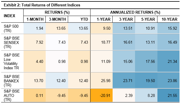 Source: S&P Dow Jones Indices LLC. Data as of Mar. 29, 2019. Past performance is no guarantee of future results. Table is provided for illustrative purposes.