Get Indexology® Blog updates via email.

In This List

Puerto Rico Bonds: A Surging Force

Equal-Weight Versus Equal-Risk-Contribution Strategies – Performance Comparison

Debt and Recovery Ten Years Later

Equal-Weighting Versus Equal-Risk-Weighting Strategies

Real Estate Gains Prominence in the S&P 500 Low Volatility Index

Puerto Rico Bonds: A Surging Force

Contributor Image
Kevin Horan

Former Director, Fixed Income Indices

S&P Dow Jones Indices

After wreaking havoc on the municipal bond markets, Puerto Rico bonds have recently been adding value through their recovery. Bonds rallied after the latest debt restructuring deal was struck between the commonwealth and the bond holders. Additional supporting news, as mentioned in an article from Reuters,[1] was a federal court ruling affirming the budgetary powers and enforcement of fiscal discipline by the federal oversight board that was created by the 2016 federal PROMESA Act.

These recent developments have led to positive returns for indices containing Puerto Rico bonds. As of Aug. 20, 2018, the S&P Municipal Bond Puerto Rico Index returned 25.4% YTD and the S&P Municipal Bond Puerto Rico & Defaulted Index returned 61% YTD.

The S&P Municipal Bond High Yield Index, which contains Puerto Rico bonds (with a weight of 9.3%), returned 5.72% YTD, while the S&P Municipal Bond High Yield ex Puerto Rico Index returned 3.64% YTD—2% less for excluding Puerto Rico bonds.

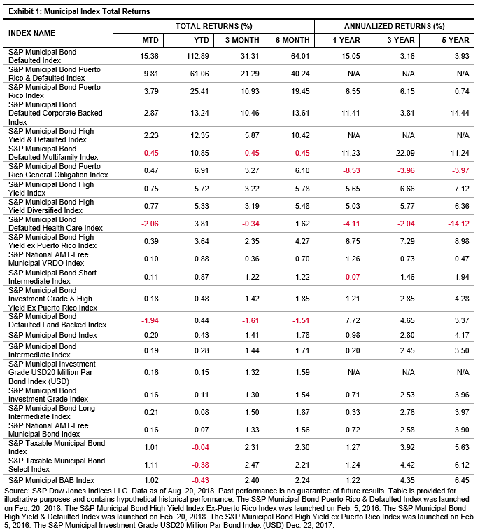
The S&P Municipal Bond Defaulted Index is a universe of bonds considered to be in monetary or technical default. Defaults are currently 0.70% of the broad benchmark S&P Municipal Bond Index, averaging 0.26% over the history of the two indices. This ratio has been as low as 0.09% during the summer of 2015 and as high as 0.79% from Sept. 13 to Sept. 18, 2017.

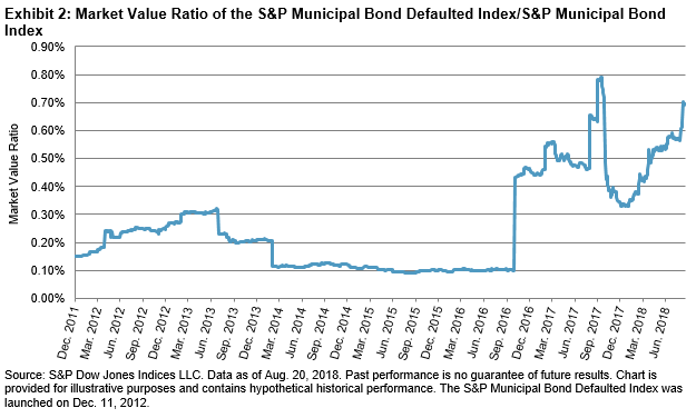
The month-end rebalance for September 2016 saw the market value of the default index jump from USD 1.7 billion to USD 7.6 billion, as 110 bonds (92 of which were Commonwealth of Puerto Rico bonds) moved into the default realm. Index rebalancings similar to September 2016 also occurred Jan. 31 and July 31, 2017.

Currently Puerto Rico bonds account for 92% of the default index, so as Puerto Rico bond prices go, so goes the S&P Municipal Bond Defaulted Index, which is up 15.4% MTD as of August 20, 2018.

As mentioned in a Seeking Alpha article, “Muni bonds, in general, are second only to U.S. Treasuries in terms of perceived safety. Headline-grabbing though the above cases may be, municipal bond defaults remain extremely rare. In the period from 1970 through the end of 2015, out of the thousands of muni bonds issued across the country, there were just 99 defaults. That translates into an annual default rate of 0.09% for all-rated municipal bonds throughout the 46-year period. In fact, investment grade “Aaa” and “Aa” rated munis experienced zero defaults.”[2]

[1]   Reuters, “Puerto Rico bond prices surge as restructuring deals struck

[2]   Seeking Alpha, “Municipal Defaults, While Rare, Do Occur

The posts on this blog are opinions, not advice. Please read our Disclaimers.

Equal-Weight Versus Equal-Risk-Contribution Strategies – Performance Comparison

Contributor Image
Phillip Brzenk

Managing Director, Global Head of Multi-Asset Indices

S&P Dow Jones Indices

As we highlighted in a prior blog post, the risk decomposition of a multi-asset equal-weight portfolio showed that equities and commodities were the main contributors to total portfolio volatility. We then went on to explore what the weights would have been if we were to form an equal-risk-contribution portfolio consisting of the same assets.

In this post, we review the performance of an equal-weight portfolio against an equal-risk-contribution portfolio, starting in 2000. Exhibit 1 shows historical annualized return and annualized volatility for both portfolios for several lookback time horizons.

When determining the weights in the equal-risk-contribution portfolio, we set the target portfolio volatility to be equal to the realized portfolio volatility of the equal-weight portfolio from the prior year, subject to a maximum of 10%. Hence, the realized historical volatilities of the two portfolios are similar. This is particularly interesting given the fact that the equal-risk-contribution portfolio’s total nominal weights averaged over 200%.[1]

We can see that the returns for the equal-risk-contribution portfolio were higher than those of its equal-weight counterpart across all measured periods. The long-term horizons (10 years and 17 years), covering periods of bear market(s) in equities and commodities, show relatively high return spreads, which led to substantially higher risk-adjusted returns. We also compute the rolling three-year annualized returns (see Exhibit 2).

The two portfolios performed similarly in some periods, while in others the equal-risk portfolio noticeably outpaced the equal-weight portfolio. In fact, the equal-risk portfolio outperformed the equal-weight portfolio 84% of the time, by an average of 5.51%.

Over the last several posts, we have demonstrated the merits of constructing multi-asset risk parity portfolios. Compared to an equal-weight multi-asset portfolio, a risk parity portfolio can potentially lead to superior returns on an absolute and risk-adjusted basis. In related future posts, we will take a deeper dive into the S&P Risk Parity Indices.

[1] See Equal-Weighting Versus Equal-Risk-Weighting Strategies

The posts on this blog are opinions, not advice. Please read our Disclaimers.

Debt and Recovery Ten Years Later

Contributor Image
David Blitzer

Former Managing Director and Chairman of the Index Committee

S&P Dow Jones Indices

Debt – actually too much debt – played a leading role in the 2008 financial crisis.  A mortgage borrowing binge and a flood of mortgage backed securities set the stage for the collapse of Lehman Brothers and recession that followed. In the immediate aftermath almost every part of the economy went through a period of belt tightening as debts were paid down.

Ten years after the financial turmoil, the economy is feeling good but people are still wondering if, or when, we will face another severe downturn or credit collapse.  One place to gauge the risks whether debt levels are lower and we as borrowers have learned from experience.

Outstanding mortgage debt accelerated going into the financial crisis and then sharply reversed as consumers began paying down debt. From a peak of $10.7 trillion in the spring and summer of 2008, mortgages dropped to $9.4 trillion in the 2014 third quarter before starting to creep up. As of last March, mortgages had not reached a new high. The drop in consumer credit was much less pronounced and reversed to resume climbing much faster than mortgages did. Reflecting the currently strong economy, consumer credit outstanding is now 45% higher than its 2008 peak.

In the mortgage sector, the dollar-weighted share of new loans to the most credit worthy borrowers rose from about 25% before the financial crisis to around 55% in the last few years.  The share of new loans accounted for by the least credit worthy groups dropped slightly while declines in the middle group accounted for the rising share among the best credit risks.

Financial sector debt followed a similar pattern, peaking in the third quarter of 2008 at $18.2 trillion, sliding until the 2012 second quarter when it fell to $14.7 trillion and then beginning to climb again. However, the climb since 2012 has been quite bumpy with some quarters seeing financial sector debt outstanding drop.

The recent pattern of Federal government debt is just upward.  Rather than measuring by dollars, we look at federal debt held by the public as a percentage of GDP to scale the debt to the size of the economy. Debt held by the Federal Reserve or other federal government agencies is excluded. The debt fell from 1998 to 2001 as the government enjoyed a surplus. It remained roughly flat until the financial crisis. Then debt climbed rapidly from 2008 to 2013 as higher federal spending combated the recession. Since 2014, federal debt is rising at a more modest pace. Unlike both consumer and financial sector debt patterns, there was no pay down.  Currently federal debt as a percentage of GDP is about 78%.

The Congressional Budget Office (CBO) estimates it will keep gaining to an average of 98% over 2019-2028 and breaking 120% in the late 2020s or early 2030s. Those levels would be higher than the levels seen in the Second World War. CBO doesn’t predict a decline in federal debt.

The posts on this blog are opinions, not advice. Please read our Disclaimers.

Equal-Weighting Versus Equal-Risk-Weighting Strategies

Contributor Image
Phillip Brzenk

Managing Director, Global Head of Multi-Asset Indices

S&P Dow Jones Indices

In a prior post, we reviewed the asset class risk contributions of a two-asset portfolio with varying weights. For an equal-weighted portfolio consisting of equities and bonds, we observed that nearly all contribution to total portfolio risk came from equities. To achieve equal risk contribution, the nominal weights in the portfolio would need to be closer 20% equities and 80% bonds. In this post, we extend the analysis by including the commodities asset class, and we observe how risk contributions change over time.

Commodities have relatively low correlations to traditional asset classes such as equities and bonds,[1] thereby potentially increasing diversification when added to a multi-asset portfolio. Moreover, commodities generally perform well in periods of high growth and rising inflation.

Like equities, commodities have historically had relatively high return volatility.[2] Hence, when combined in a three-asset portfolio with bonds, we anticipate that equities and commodities would contribute most to total portfolio volatility. For a portfolio that is equally weighted across the three asset classes, Exhibit 1 shows the risk contributions of each asset class on an annual basis, starting in 2000.

For 2017, commodities contributed most to portfolio volatility, at 71%, significantly higher than its one-third weight allocation. Next, equities contributed second most, at 28%, while fixed income contributed just 1%. For the whole period, we observe that equities and commodities were the dominant contributors to total portfolio risk. On average, equities contributed 53% and commodities 48%—therefore, bonds negatively contributed (-1%) to the total risk. However, contributions varied from year to year; equities contributed as much as 84% to portfolio volatility in 2002, fixed income contributed 6% in 2004, and commodities contributed 71% in 2006 and 2017.

In order for the portfolio to be equal-risk weighted instead of equal weighted, the weight assigned to bonds would need to be markedly higher than the riskier asset classes. In fact, it is often necessary to incorporate leverage into the portfolio, where nominal weights of asset classes would sum to be more than 100%.

Next, we construct a basic equal-risk-contribution portfolio. The portfolio rebalances on an annual basis, with a target volatility level set to be equal to the equal-weighted portfolio volatility from the prior year.[3]

Exhibit 2 shows why leverage is needed for the portfolio, as the weight of the fixed income asset class often hovers above 100%. As the individual volatilities and cross-correlations of the asset classes vary, the nominal weights of the portfolio ranged from 149% to 324% over the entire period.

In a following post, we will review the performance differences between an equal-weighted three-asset portfolio and an equal-risk-weighted one.

[1]   See Asset Class Correlations Affect Portfolio Volatility and Return.

[2]   From Dec. 31, 1999 to Dec. 29, 2017, the annualized volatility of monthly returns were 14.5% for equities (S&P 500®), 16.2% for commodities (Dow Jones Commodity Index), and 3.6% for bonds (S&P U.S. Aggregate Bond Index).

[3]   To construct the equal-risk-contribution portfolio, at the beginning of each calendar year, we used the past one year of daily returns to compute the marginal contribution to risk for each asset class. We employed an optimizer to determine the final set of weights such that each asset class contributed approximately one-third of the total portfolio volatility, subject to several constraints. We set the target portfolio volatility to be equal to the realized portfolio volatility of the equal-weight portfolio from the prior year, subject to a maximum of 10%. The portfolio is constrained to be long only (no negative weights or shorting). Lastly, using the three-month U.S. Treasury Bill as the borrow cost, leverage was allowed for fixed income. Hence, the total nominal weight of the portfolio exceeded 100%.

The posts on this blog are opinions, not advice. Please read our Disclaimers.

Real Estate Gains Prominence in the S&P 500 Low Volatility Index

Contributor Image
Fei Mei Chan

Former Director, Core Product Management

S&P Dow Jones Indices

Year to date, the S&P 500 Low Volatility Index® has underperformed its parent S&P 500, up 5.52% compared to a 7.55% (through Aug. 16, 2018 close) increase for the benchmark. Those who are familiar with low volatility strategies will recognize that this performance is consistent with the historical pattern of returns and in line with its objective. Volatility in 2018 has been higher than in the remarkably sleepy year in 2017. While there’s no denying that volatility has been on an uptrend, current levels are still far below those seen during major calamities.

Rolling 252-Day Volatility for the S&P 500

In the latest rebalance (effective after market close Aug. 17, 2018), the S&P 500 Low Volatility Index added 5% to its allocation in Real Estate, bringing the sector’s weight to 18% (the second largest weight in the index after Utilities). This came at the cost of Industrials, whose weight was reduced by half (primarily due to a reduction of stocks from the Aerospace and Defense industry). Surprisingly, Technology added slightly more weight, maintaining a historically-unprecedented position in the Low Volatility Index for more than a year.

Real Estate is the Second Largest Allocation in the S&P 500 Low Volatility Index Behind Utilities

For insight into the latest rebalance, consider the trailing one-year volatility of sectors within the S&P 500. Volatility crept up across all sectors, by generally similar amounts. Surprisingly, despite the recent turmoil in Technology, volatility there was relatively subdued, inching up only slightly. While the Industrials sector experienced relatively more volatility compared to other sectors, the difference seemingly was not commensurate with the significant weight drop in the S&P 500 Low Volatility Index. Given that the increase in volatility were somewhat evenly distributed across all sectors, it would seem that the allocations from the latest rebalance were driven more by idiosyncrasies at the stock level.

252-Day Volatility Crept Up Across All S&P 500 Sectors Compared to Three Months Ago

The posts on this blog are opinions, not advice. Please read our Disclaimers.