Get Indexology® Blog updates via email.

In This List

Risk-Adjusted SPIVA® Scorecard: The Evaluation of Active Managers’ Performance Through a Risk Lens

Q2 Commodity Performance and the Notable Spread Between Brent and WTI Crude

How Low Volatility Could Make You “King of the Mountains”

The Use of Index Derivatives in Portfolio Management

Small Cap Premium Is 5th Biggest In History

Risk-Adjusted SPIVA® Scorecard: The Evaluation of Active Managers’ Performance Through a Risk Lens

Contributor Image
Aye Soe

Former Managing Director, Global Head of Core and Multi-Asset Product Management

S&P Dow Jones Indices

Evaluating active managers’ performance through a risk lens is rooted in modern portfolio theory (MPT), which states that the expectation of returns must be accompanied by risk—the variation (or volatility) around the expected return. MPT assumes that higher risk should be compensated, on average, by higher returns.

Institutional investors tend to be interested in risk-adjusted returns. In addition to the performance of managers hired to manage their assets, institutional investors also look at the risks managers take to achieve those returns.

With that in mind, we initiated the first Risk-Adjusted SPIVA Scorecard, which seeks to establish whether actively managed funds are able to generate higher risk-adjusted returns than their corresponding benchmarks over a long-term investment horizon.

In our analysis, we used the standard deviation of monthly returns over a given period to define and measure risk. The monthly standard deviation was annualized by multiplying it by the square root of 12. The risk/return ratio looks at the relationship and the trade-off between risk and return. All else equal, a fund with a higher ratio is preferable since it delivers a higher return per unit of risk taken. To make our comparison relevant, we also adjusted the returns of the benchmarks used in our analysis by their volatility.

Given that indices do not incur costs, we also present gross of fees performance figures by adding the expense ratio back to net of fees returns. In this way, all else equal, higher risk taken by a manager should be compensated by higher returns.

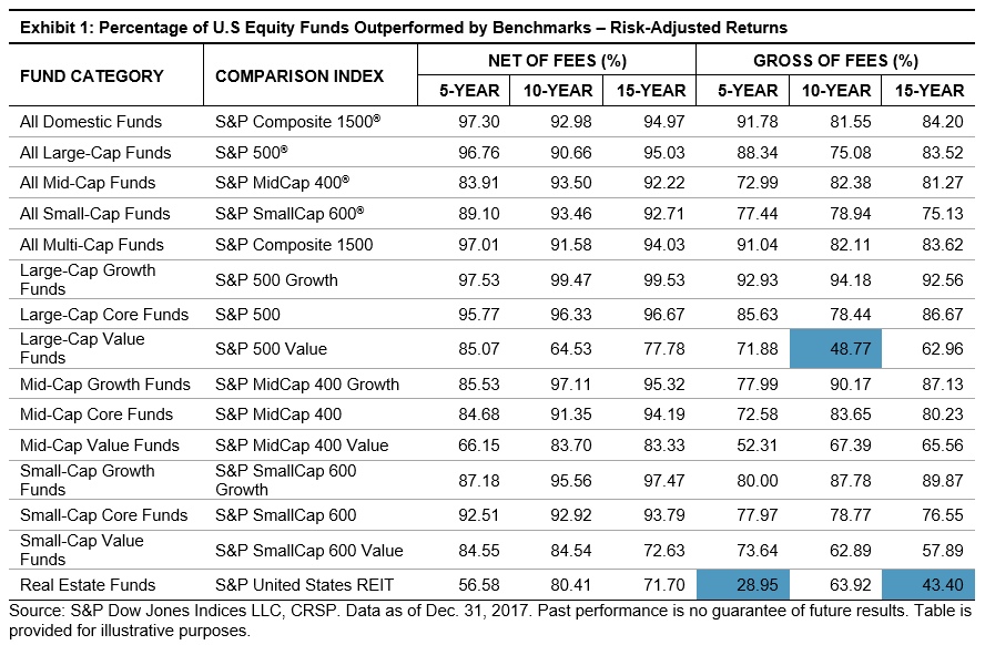
Exhibits 1 and 2 look at the percentage of domestic and international managers outperformed by benchmarks, using risk-adjusted returns on gross of fees and net of fees bases over 5-, 10-, and 15-year investment horizons. We observe that large-cap value funds (over 10 years) and real estate funds (over 5 and 15 years) outperformed their respective benchmarks when using gross of fees risk-adjusted returns, indicating that fees played a major role in those categories.

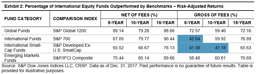
Similarly, in international equities, we find that fees contributed meaningfully to the underperformance of international and international small-cap funds. For example, when using gross of fees returns in the risk-adjusted performance analysis, funds in those two categories outperformed the benchmarks over 5- and 10-year periods. When net of fees returns were used, the majority of managers across all categories underperformed the benchmarks.

The evaluation of active managers’ performance through a risk lens is an integral part of the investment decision-making process. However, as our study highlights, actively managed domestic and international equity funds across almost all categories did not outperform the benchmarks on a risk-adjusted basis. The figures improved for some categories when gross of fees returns were used. Therefore, we did not see evidence that actively managed funds were better risk managed than passive indices.

See the full report here: Risk-Adjusted SPIVA Scorecard.

The posts on this blog are opinions, not advice. Please read our Disclaimers.

Q2 Commodity Performance and the Notable Spread Between Brent and WTI Crude

Contributor Image
Marya Alsati

Former Product Manager, Commodities, Home Prices, and Real Assets

S&P Dow Jones Indices

The S&P GSCI was up 8.0% for the Q2 2018, with agriculture being the worst-performing sector in the index, and energy the best (see Exhibit 1). Of the 24 commodities tracked by the index, 14 finished the quarter on a positive note. Soybeans was the worst-performing commodity in the index, and Brent crude was the best.

Exhibit 2 depicts the monthly and quarterly performance of the 24 commodities tracked by the indices.

Soybeans was the worst-performing commodity in the index on both a monthly and quarterly basis, down 15.3% for the month and 18.0% for the quarter. The tensions in the trade relationship between China and the U.S. have led to uncertainty about whether China, one of the largest buyers and consumers of U.S. soybeans, will purchase the grain in the fall.

WTI crude oil was the best-performing commodity on a monthly basis, up 10.9%, while Brent crude was the best-performing commodity for the quarter, up 16.5%. The spread of 8.2% between Brent and WTI was the fourth-highest month-end spread in the history of the indices (the S&P GSCI Brent Crude Oil launched in 1999). Exhibit 3 depicts the absolute values of the spread between Brent and WTI based on the indices and representative of the contracts.

In June, WTI benefited from reduced crude flows to Cushing, Oklahoma, caused by an outage in the largest producer of crude oil in Canada, and the Trump administration warning companies from buying Iranian oil. However, Brent outpaced WTI for the quarter, due to high production and inventory levels for WTI Crude oil, compared with Brent, which has been moderated by OPEC and Russia’s collaboration to control production, a deal that was announced in March 2018.

Exhibit 4 shows the commodities that presented June monthly returns that were in the opposite direction of their quarterly returns.

Cocoa was the only positive agricultural commodity in June, up 1.1%, benefiting from Cote d’Ivoire and Ghana (which produce about 60% of the world’s cocoa) announcing plans to work together in order to strengthen the cocoa sector and set price floors to better manage global prices, which were weighed down over the past two years by higher-than-expected levels of production. Cotton and wheat were hurt by high production levels, and aluminum, nickel, and lead were hurt by a rising U.S. Dollar Index. Gasoil prices declined as the Canadian regulatory and appeals commission lowered the price of petroleum products in mid-June, while natural gas was weighed down by high inventory levels.

The posts on this blog are opinions, not advice. Please read our Disclaimers.

How Low Volatility Could Make You “King of the Mountains”

Contributor Image
Hamish Preston

Head of U.S. Equities

S&P Dow Jones Indices

The world’s most prestigious cycling race, the Tour de France, begins tomorrow.  The tour lasts three weeks and comprises a series of one-day stages.  Although the main prize – the yellow jersey – is awarded to the rider that takes the minimum amount of time to complete the entire tour, there are plenty of races (and prizes) up for grabs along the way.  Some cyclists aim to prove themselves as the best sprinter, while others hope to wear the polka-dot jersey awarded to the “King of the Mountains” – the fastest cyclist over the tour’s stages in the Alps, Pyrenees, and the Massif Central.

Each rider’s particular talents are important in determining the stages to which their style of racing is most suited.  However, not all talents are rewarded equally: one of the interesting facts about the Tour de France is that the yellow jersey is typically captured by a rider who excels in the mountainous stages.  This is because – generally speaking – there is a greater degree of variation in completion times in the mountain stages than the sprint stages.  Since the overall winner is based on the total time, outperformance in the mountain stages is more valuable than outperformance on the flats, even though there are more of the latter.  Said differently, the greater dispersion in rider’s times during the mountain stages mean the rewards to outperformance are higher compared to stages when everyone sprints at similar speeds to a bunched finish.

The relative value of sprinting and mountain-climbing in the Tour de France has analogies in financial markets.  Over time, investors will encounter calm, smooth gains in some periods, and more challenging, volatile returns in others.  Extending the analogy further, just as performance in the mountainous stages often determines the yellow jersey, the performance of equity portfolios during the most volatile periods goes a long way in determining long-term returns, because there are typically greater differences between the relative winners and losers during periods of elevated volatility.

As we showed in our recent practitioner’s guide, low volatility indices tend to underperform in less volatile, rising markets and outperform in more volatile, falling markets.  The table below summarizes this empirically through the monthly “capture ratios” for a number of our low volatility indices.  Each monthly downside capture ratio is less than one, meaning the low volatility indices were typically better insulated in months when their benchmark fell.  The higher upside capture ratios indicate that the low volatility indices stayed closer to the pack when the benchmark rose. 

Exhibit 1: Low Volatility Indices Have Provided Downside Protection And Upside Participation

Source: “Low Volatility: A Practitioner’s Guide”; Edwards, Lazzara & Preston (2018), S&P Dow Jones Indices LLC.  Data based on monthly total returns from January 2001 to April 2018.  Past performance is no guarantee of future results.  Table is provided for illustrative purposes and reflects hypothetical historical performance.

Just as the race for King of the Mountains is a key determinant of who takes home the yellow jersey, the pattern of upside participation and downside protection offered by low volatility indices can help to explain how many of them have recorded market-beating performance in the longer term, historically.  And in a year when momentum, growth and information technology have dominated headlines, low volatility may presently offer a way to avoid a crowded finish.

The posts on this blog are opinions, not advice. Please read our Disclaimers.

The Use of Index Derivatives in Portfolio Management

Contributor Image
Alka Banerjee

Former Managing Director, Product Management

S&P Dow Jones Indices

Index derivatives exist for all asset classes, and over time their use has grown exponentially for a variety of purposes. Still, many myths abound that their chief function is for speculative activity. The ability to leverage by investing a small amount to gain exposure to a much larger investment is the key benefit of index derivatives. While index futures have a symmetric impact on portfolio returns, index options can have an asymmetric impact. Both are valuable, cost-efficient tools for a number of reasons for a portfolio manager.

A large exposure can be obtained in a portfolio with a small amount of margin investment, and the potential for returns is magnified with a far smaller investment, making them quite cost-effective. Their liquid nature and ease of trading make them the number one tool for hedging and managing exposure. Derivatives can cover for downside risk when large exposure exists in a portfolio long on equities. On the other hand, if an investor has shorted a large number of single securities, then a single index call option can provide a great hedge against an inverse market move. If an investor has large cash holdings that he or she wants to use for buying stocks after further research, a quick and easy way to deploy the funds is to go long on an index futures contract or buy a call option. This provides the exposure the investor is ultimately looking to gain, buys time to do the research, costs far less, and manages the price impact of large trading in a short time frame. Small purchases over time would reduce the effect over prices and avoid creating a market impact.

Similarly, when a large number of securities needs to be sold off, buying an index future gives time to ease in the selling over time and to dampen price pressure. As cash positions are built over time, the index future maintains the overall security exposure until further investment decisions are made. This approach makes sense for active and passive investors, where large trades can be counterbalanced with the use of index futures or options bought at a low cost by the investor to avoid having large price-affecting shifts in exposure. Another interesting use of derivatives is when the portfolio has a gap in exposure to a particular sector or size. For example, if the portfolio lacks small-cap investments or exposure to a specific sector, index futures or options can be bought to cover those gaps rather than trading single small assets in this space at a much higher trading cost. In sum, index derivatives are cost-effective and are a great tool for tactical use of assets in a portfolio. Trading them for speculative activity is actually riskier and a less-effective use of this financial tool.

The posts on this blog are opinions, not advice. Please read our Disclaimers.

Small Cap Premium Is 5th Biggest In History

Contributor Image
Jodie Gunzberg

Former Managing Director, Head of U.S. Equities

S&P Dow Jones Indices

Small caps are outperforming large caps (S&P 600 (TR)S&P 500 (TR)) in H1 2018 by the most in eight years, since H1 2010, from growing  concerns over rising tariffs and general U.S. foreign trade policy. In the past four months, the smaller companies have outperformed larger companies by 10.1%, contributing to the 5th biggest realized small cap premium in the first half of any year in history.

Source: S&P Dow Jones Indices.

The smaller cap stocks are less sensitive to international relations generally from the higher percentage of revenue generated in the U.S., though they are still impacted by sector fundamentals and the percentage of exports of foreign output since the U.S. economy is largely driven by consumer spending.  Overall, U.S. small caps in the S&P 600 generate nearly 80% of revenue domestically, whereas U.S. large caps in the S&P 500 only generate just over 70% domestically.  However, this varies by sector which can explain some of the small cap premium.

Source: S&P Dow Jones Indices and Factset. Sales weighted revenue S&P 500 is from Exhibit 10 by Brzenk, P. “The Impact of the Global Economy on the S&P 500®”, S&P Dow Jones Indices, March 2018.

For some sectors like financials and industrials that are showing relatively large small cap premiums, the revenues generated from the U.S. are significantly higher for small caps.  For example, financials have 17% more of revenues coming domestically, driving the small caps to outperform by 11% year-to-date through Jun. 29, 2018 that has been helped by rising interest ratesgrowth, inflation and the rising dollar.  Historically, financials have done best with GDP growth of any sector, rising on average 6.9% for every 1% rise in GDP growth.

Industrials, one of the sectors that may be most impacted by fears of tariff and trade, also have a relatively greater portion of revenues, 14% more, coming domestically for small caps than large caps.  The rising dollar increases the small cap industrials 84 basis points on average for every 1% dollar increase, whereas the large caps only rise 67 basis points for the same dollar move.  Also for every 100 basis point rise in interest rates, the small cap industrials have risen 8.6% on average versus just 4.8% for large cap industrials.  The result has been a 10% small cap premuim for the sector this year.

However, for some sectors like health care, consumer staples and energy, the industry fundamentals have been more powerful for the small cap outperformance than the percentage of revenues coming domestically for the small caps versus the large caps.  For example health care and consumer staples each has nearly the same percentage of revenues generated domestically as internationally but the small cap premiums have been high of 29% and 15%, respectively.  Small health care companies are outperforming large caps in health care from increased expectations for acquisition of smaller companies, stronger innovation from smaller companies and that smaller companies may be more immune to concerns about regulatory pressures in healthcare.  Also in energy, the performance between sizes has been nearly even despite the gains in oil price.  This is since oil hedging by the larger companies is more prevalent than in smaller companies, offsetting some of the gains from the rising oil and domestic tailwinds.

Additionally, consumer staples have shown a strong small cap premium despite similar portions of revenue generated domestically despite size. This seems to be driven mainly by fear of uncertainty in the market, making it the second best performing small cap sector in June.  It outperformed the more economically sensitive consumer discretionary sector in two consecutive months for the first time since July and Aug 2017, and the small cap consumer staples have been outperforming the small cap consumer discretionary by 11.2% more than the large cap consumer staples have been outperforming the large cap consumer discretionary.  This is the biggest consumer staples -discretionary differential between the sizes in a quarter since Q2 2001, and the most in 3 months since the period ending in Nov. 2015.  Some may view this as a bearish signal.

Moreover, the consumer staples rise more historically with rising rates than consumer discretionary does considering more expensive financing for consumers as they make optional purchases.  For every 100 basis points rise in rates, the small consumer staples rise on average 7.2% versus just 2% for large caps, and the consumer discretionary small caps rise 6.2% on average as compared to the 5.5% gain in the large caps on average.  The large cap consumer discretionary sector is one of the few sectors that consistent outperforms its small cap counterpart, likely helped by the purchasing power of large companies in the sector that may be adversely impacted by higher tariffs or  trade restrictions.

Lastly, in June seven of the sectors added onto their small cap premiums for total returns of 0.6% for the S&P 500, 1.1% for the S&P Small Cap 600 and 0.4% for the S&P Mid Cap 400 for the month.  This added onto the year-to date gains of 2.6% for the S&P 500, 9.4% for the S&P Small Cap 600 and 3.5% for the S&P Mid Cap 400, and again widening the small cap premium this year to the 5th biggest ever.

Surce: S&P Dow Jones Indices


The posts on this blog are opinions, not advice. Please read our Disclaimers.