Get Indexology® Blog updates via email.

In This List

Takeaways From the SPIVA® India Year-End 2017 Scorecard

How Equal Weight Avoided Japan's "Lost Decades"

No Longer Calm but Not Chaotic

ESG and Supply Chain: Why Both Matter

Evolution of Canadian REITS

Takeaways From the SPIVA® India Year-End 2017 Scorecard

Contributor Image
Akash Jain

Director, Global Research & Design

S&P BSE Indices

In a year with strong equity returns in India, the S&P BSE 100 ended in the black with a 33.3% annual return. However, the S&P Indices Versus Active (SPIVA) India Year-End 2017 Scorecard shows that a majority of active funds in the Indian Equity Large-Cap and Mid-/Small-Cap categories lagged their respective benchmarks over the one-year period ending in December 2017.

The biannual SPIVA India Scorecard attempts to capture the performance of active funds (both equity and bond funds) domiciled in India against the S&P BSE benchmarks over different time horizons. The study revealed that over the one-year period ending in December 2017, 59.4% of Indian Equity Large-Cap funds, 27.9% of Indian ELSS funds, and 72.1% of Indian Equity Mid-/Small-Cap funds underperformed their respective benchmark indices. Additionally, the majority of the Indian Composite Bond funds underperformed the S&P BSE India Bond Index over the 3-, 5-, and 10-year periods, and the majority of Indian Government Bond funds underperformed the S&P BSE India Government Bond Index over the 1-, 3-, 5-, and 10-year periods (see Exhibit 1). 

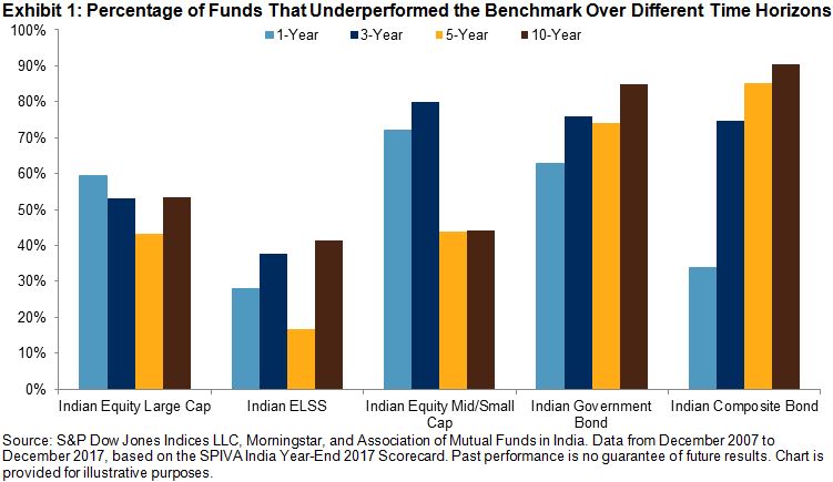
In the three equity fund categories—Indian Equity Large-Cap, Indian ELSS, and Indian Equity Mid-/Small-Cap—the asset-weighted average fund returns were higher than their respective equal-weighted average fund returns over the 10-year horizon. This difference was most pronounced in the Indian Equity Large-Cap category (87 basis points) among the three equity categories, indicating that the larger funds by AUM in this category performed better over the 10-year period (see Exhibit 2). However, an opposing trend was observed for the one-, three-, and five-year periods, when the equal-weighted average fund returns exceeded their respective asset-weighted average returns, in the Indian Equity Mid-/Small-Cap category, which implies that the alpha generation from mid- and small-cap selection was more constrained for the large funds, due to the low investment capacity of mid- and small-cap stocks in recent years.

Exhibit 2: Difference Between Asset-Weighted and Equal-Weighted Fund Returns 
FUND CATEGORY 1-YEAR (%) 3-YEAR ANNUALIZED (%) 5-YEAR ANNUALIZED (%) 10-YEAR ANNUALIZED (%)
Indian Equity Large-Cap -0.16 -0.09 0.29 0.87
Indian ELSS -0.33 -1.03 -0.32 0.53
Indian Equity Mid-/Small-Cap -2.40 -0.68 -1.00 0.12

Source: S&P Dow Jones Indices LLC, Morningstar, and Association of Mutual Funds in India. Data from December 2007 to December 2017, based on the SPIVA India Year-End 2017 Scorecard. Past performance is no guarantee of future results. Chart is provided for illustrative purposes.

In the year-end 2017 report, the number of Indian Equity Large-Cap active funds at the start of the three-year period shrunk to 100 from 155, a drop of 55 funds in the universe compared with the figures reported in the SPIVA India Mid-Year 2017 Scorecard. This drop was mainly caused by the introduction of a new fund category, Flexicap, by Morningstar in the second half of 2014. The Flexicap category includes funds that invest at least 65% of their total assets in Indian equities but invest no more than 65% of total assets in either large-cap stocks or small-/mid-cap stocks. Of these 55 large-cap funds, 46 were reclassified to Flexicap while the seven other funds were merged during this six-month period.

Additionally, the number of Indian Equity Large-Cap active funds at the start of the one-year period in the SPIVA India Year-End 2017 Scorecard decreased to 64 from 87, a drop of 23 funds in the universe compared with the figures reported in the SPIVA India Mid-Year 2017 Scorecard. This drop was due to a change in the definition of large-cap funds in the second of 2016 by Morningstar. The minimum requirement for percentage of assets in large-cap stocks for large-cap funds was changed from 65% to 75%. As a result, 20 large-cap funds were reclassified to Flexicap funds.

To discover more about the performance of Indian active funds versus their benchmarks, check out the SPIVA India Year-End 2017 Scorecard.


The posts on this blog are opinions, not advice. Please read our Disclaimers.

How Equal Weight Avoided Japan's "Lost Decades"

Contributor Image
Hamish Preston

Head of U.S. Equities

S&P Dow Jones Indices

S&P Dow Jones Indices recently launched the S&P Japan 500 Equal Weight Index, an equal-weight version of the S&P Japan 500.  Over the 15-year period ending in February 2018, encompassing the latter part of Japan’s so-called “lost decades” of stagnant equity returns, the equal-weight index would have outperformed the cap-weighted Japanese equity benchmark by a stonking 7.41%, annualized.  This compares quite favorably with the 2.2% and 2.1% outperformance of equal-weight indices in Europe and the U.S., respectively (see our recent paper).  So what explains incremental returns of this magnitude?

Exposure to smaller stocks is important for equal-weight.  To examine the impact of size we construct a hypothetical “Size Match” portfolio using a combination of the S&P/TOPIX 150 and the S&P Japan SmallCap 250 Index that matches the equal-weight index’s average exposure to larger and smaller companies.  (The exhibits in this post are constructed following the process outlined in the paper linked above.)  Exhibit 1 shows how the smaller size bias could explain 76% of the variation in the relative returns of the S&P Japan 500 Equal Weight Index.

Exhibit 1: Smaller size explained a majority of the variation in equal-weight excess returns.

Anti-Momentum also helped, particularly in Japan.  Equal-weight indices have an intuitive relationship with (anti-) momentum effects.  Specifically, equal-weight indices rebalance by selling those stocks that have outperformed the average, and by purchasing those that have underperformed the average.  This is opposite of what a trend-following strategy seeks to do.  Momentum, generally speaking, is considered to be a rewarded strategy in equities.  However, quite famously, it isn’t so-well rewarded in Japan.  So what role did momentum play in the relative performance shown in Exhibit 1?

Exhibit 2 shows the negative relationship between the returns to equal-weight not explained by smaller size exposure and the relative performance of the S&P Momentum Japan LargeMidCap Index to the S&P Japan LargeMidCap Index.  According to the relationship evidenced in Exhibit 2, 53% of the excess returns not accounted for by size effects can be attributed to anti-momentum effects.  (Again, we present only the results of a standardized attribution process described more fully in the paper).

Exhibit 2: Anti-momentum effects in Japan

Through the perspectives of its size and momentum exposures, around 89% of the outperformance of equal-weight in Japan over the past 15 years might accordingly be “explained”, or at least understood through the familiar concepts of size and rebalancing effects.

And what of the future?  Of course, there is no way of telling if the S&P Japan 500 Equal Weight Index will outperform its cap-weighted parent over the next 15 years.  However, at least one additional perspective may be useful:  if smaller stocks outperform larger stocks, the overall concentration of market benchmarks logically decreases.  Exhibit 3 evidences this relationship as applied to the S&P Japan 500.  Notably, the Herfindahl-Hirschman Index concentration of the S&P Japan 500 has declined considerably over the period we are examining – from a peak of 160 down to a level of 70 at the end of December 2017.  The hypothetical minimum concentration that a 500-stock portfolio can display is 20 – achieved when every stock has the same weight – which suggests that a similar “boost” from declines in concentration levels may not be repeated.

Whatever the future brings, market participants may be well-served to consider multiple perspectives on equal-weight indices when trying to explain their characteristics and potential applications.

Exhibit 3: S&P Japan 500 concentration and the relative performance of Equal Weight

The posts on this blog are opinions, not advice. Please read our Disclaimers.

No Longer Calm but Not Chaotic

Contributor Image
Fei Mei Chan

Former Director, Core Product Management

S&P Dow Jones Indices

Although market volatility has retreated somewhat since the spike in early February, it has remained elevated. In the last 30 trading sessions, the S&P 500 moved by more than 1% (in either direction) 14 times.

VOLATILITY FOR S&P 500 (21-Day Rolling)

Volatility manifests itself in both dispersion (a measure of the magnitude of differences among an index’s constituent returns) and correlation (the tendency of assets to move in the same direction at the same time).  This means that observing combinations of dispersion and correlation can give us some insight into the dynamics of market volatility.

In February, we put the markets’ record decline—and spike in volatility—in the context of the dispersion-correlation map. The chart below provides an update of where we currently stand in this framework. Immediately following the S&P 500’s 4.1% drop on February 5th, both dispersion and correlation jumped significantly. In the days following, both measures climbed further before they started to retrace. Currently, correlation remains elevated but dispersion is much closer to the levels we saw in January.

ROLLING 21-DAY DISPERSION-CORRELATION YEAR TO DATE

In context of broader history, dispersion is below the median measured from 1991 through 2017 (annual levels are averages of monthly figures), though correlation is still well above median. Things are no longer tranquil like they were in 2017, but we’re also far removed from tumultuous years like 2000 and 2008 when dispersion levels were much higher.

DISPERSION-CORRELATION MAP

The posts on this blog are opinions, not advice. Please read our Disclaimers.

ESG and Supply Chain: Why Both Matter

Contributor Image
Byford Tsang

Senior Analyst

Trucost, part of S&P Global

There has been a rapid shift in the world of corporate disclosure. In the past 12 months, we have seen investment giants writing to CEOs urging them to report on their long-term strategies and socio-environmental goals and the world’s first gender pay gap reporting regulation coming into effect. Companies are responding to the growing need to report environmental, social, and governance (ESG) related information. Research by Trucost found that the number of companies that disclose greenhouse gas emissions increased by 33% from 2012 to 2016. More than 6,000 companies now report to CDP, an investor-led environmental data disclosure initiative.

While these are encouraging signs, the ESG disclosure of most companies focuses on direct operations and largely overlooks their supply chains, where the majority of the risks can lie. Trucost analyzed 19 industry sectors and found that, for most, nearly all of the environmental impacts occurred outside company operations. A CDP study also shows that greenhouse gas emissions in supply chains are, on average, four times as high as those from a company’s direct operations. Companies failing to manage ESG issues in the supply chain are left exposed to reputational, operational, and financial risks.

Growing awareness of the environmental and social impact of companies, and government regulations in response to it, are leaving companies more exposed to disruptions in their supply chains. In 2016, IOI Group, a Malaysian palm oil producer, lost some of its biggest buyers, including prominent international consumer brands such as Unilever and Nestlé, after an investigation found that its suppliers were breaching sustainable sourcing standards. Recently, China’s decision to ban importation of all plastic and mixed paper waste has taken the world by surprise. The share price of Biffa, one of the UK’s largest waste management companies, plunged 12% as investors expected an increase in the cost of locating alternative destinations for recycled goods.

Companies are increasingly being scrutinized not only by shareholders, but also by civil society. An investigation by Amnesty International in 2016 found that Kellogg’s used palm oil produced by child workers in its products. In response to the report, Kellogg’s quickly set up a dedicated team to rectify the issue, established an executive training program on human rights, and reported the progress in its 2017 corporate sustainability report. A newspaper exposé on slavery caused a top British supermarket to pull its beef products from JBS, the largest meat processing company in the world, off the shelves.

Quantifying ESG impact in the supply chain is a valuable first step that companies can take in order to understand their total risk profile. Trucost’s supply chain service helps companies to efficiently measure their environmental and social impact across diverse supply chains. Our analysis draws on a validated database of socio-environmental performance data from more than 13,000 companies and fills any data gaps with our granular environmentally extended input-output (EEIO) model.

Quantified metrics allow companies to prioritize suppliers or products to manage and track progress over time. Companies can also make use of supply chain ESG data to identify opportunities to reduce costs. A group of leading purchasing organizations reported 551 million metric tons of greenhouse gas savings from their supply chain in 2017, which translated to USD 14 billion in cost savings.

Knowing your supply chain is the key to managing and reducing your overall ESG risks. As investors, regulators, and the civil society continue to push for further corporate disclosure, supply chain ESG risks will likely come into the spotlight in the near future.

The posts on this blog are opinions, not advice. Please read our Disclaimers.

Evolution of Canadian REITS

Contributor Image
Smita Chirputkar

Former Director, Global Research & Design

S&P Dow Jones Indices

The Canadian REITs industry will mark its 25th anniversary in June 2018. In light of this milestone event, it is worthwhile to review the evolution of the market as well as the characteristics of the asset class.

Canadian REITs were born after the recessionary period in the late 1980s and early 1990s. There were five REITs in the Canadian market by late 1996. From 1998 to 2000, when technology stocks were soaring, REITs were trading at a discount in Canada. After the burst of the technology bubble, market participants were searching for companies that owned the hard assets, and REITs became a widely accepted vehicle, as they owned or managed the physical assets and satisfied the income needs of investors at that time. The total market capitalization of Canadian REITs grew from CAD 16 billion in June 2005 to over CAD 57 billion by December 2017, as measured by the S&P Canada REIT.

REITs Have Low Correlation With Traditional Asset Classes

In Canada, REITs have outperformed the equities and fixed income asset classes on an annualized return basis over the past 20 years. Despite higher returns, the risk over the test period was similar to that of equities (see Exhibit 2). Over the period studied, the average rolling 12-month correlation of REITs against equities was 0.43, while that of fixed income was 0.21. Correlations of REITs with traditional asset classes are time varying, and the correlation with equities reached a peak of 0.89 shortly after the 2008 financial crisis (September 2009) and gradually fell to 0.29 by December 2010.

REITs Have Low Correlation With Other Dividend-Paying Equity Sectors

Utilities and telecommunication services are typically regarded as high-dividend-paying sectors. Over the period observed, REITs had average correlations of 0.41 and 0.26 with the utilities and telecommunication services sectors, respectively. The correlation with utilities peaked at 0.88 in June 2003, while the correlation with telecommunication services peaked at 0.8 in October 2009, when the Canadian market experienced downturns. Given the low average rolling correlations to other income-producing sectors, REITs and stocks from the utilities and telecommunication services sectors could potentially offer diversification benefits for market participants seeking income.

In the next blog, we will explore in detail the S&P TSX Capped REIT Income Index, which is designed to serve as an income-producing strategy.

The posts on this blog are opinions, not advice. Please read our Disclaimers.