Get Indexology® Blog updates via email.

In This List

Assessing Single-Stock Risk in South African Indices

Spending Too Little In Retirement?

The Skew Is Not New

Can High Concentrations Lead to Equal-Weight Outperformance?

Decomposing Recent Volatility Events Part 1

Assessing Single-Stock Risk in South African Indices

Contributor Image
Michael Orzano

Head of Global Exchanges Product Management

S&P Dow Jones Indices

Investing in stocks can be risky. However, investing in a single stock tends to be far riskier than investing in a diversified basket of stocks. South African investors received a jarring reminder of this in early December, when Steinhoff International Holdings dropped more than 80% in the two days following the international retailer’s disclosure of accounting irregularities.

Mitigating the impact of these idiosyncratic risk events through the use of broad-based indices is one of the reasons that many market participants have turned to index-based investing over the years. However, all indices are not created equal when it comes to the extent of risk posed by single companies. Even among seemingly similar indices, it’s important to look under the hood to understand precisely how the index measures the market segment it seeks to represent.

South Africa’s large-cap equity indices provide an interesting case study in this. Over the past several years, the tremendous growth of Naspers has resulted in the company representing nearly a quarter of the market-cap-weighted FTSE/JSE Top 40. However, because the S&P South Africa 50 incorporates a single-stock cap of 10%, the influence of Naspers (or any other company for that matter) is reduced (see Exhibit 1).

The potentially devastating impact of a large portfolio holding sharply dropping in price is obvious in a general sense. However, Exhibit 2 provides a simple illustration of the quantitative impact for a range of hypothetical scenarios. For example, if a company represents 50% of an index and its price drops 75%, the impact on the index—holding all else equal—would be a loss of 37.5%.

While Steinhoff is a component of the S&P South Africa 50, the overall impact was mitigated by the company’s relatively small weight. Prior to the accounting disclosure, the company represented less than 2% of the S&P South Africa 50, so its 80% decline translated to a loss of roughly 1.4% for the index.

However, what if Steinhoff was much larger and had a 25% weight in the index? An 80% decline in a stock that represents 25% of an index would have resulted in a much larger 20% overall index loss. In light of recent events, perhaps now might be a good time to check how much exposure there is to any one company in your index.

The posts on this blog are opinions, not advice. Please read our Disclaimers.

Spending Too Little In Retirement?

Contributor Image
Jodie Gunzberg

Former Managing Director, Head of U.S. Equities

S&P Dow Jones Indices

Yes, you read that right.  You might not be spending enough in retirement.  It seems impossible after rigorously following savings plans during the course of your career in order to achieve that golden nest-egg to provide just what you need to retire.  However, a problem arises when “what you need to retire” might not be defined by the nest-egg you built.

People have advanced considerably in saving for retirement with the help of tools from the defined contribution industry.  Even without paying much attention, workers have been “nudged” not only into saving but “saving more tomorrow” by getting automatically enrolled in plans with escalating payments into saving accounts.  In fact, plan participants have become so good at saving for retirement that by the time they retire, all they know is how to save for retirement.  This commonly leads to much confusion when one day, at retirement, a new retiree has one million dollars (or however much) to spend.

Most people entering retirement have never had to manage that amount of money before, so it is meaningless.  In fact, it can create an illusion of wealth causing people to feel they have so much money that they just start spending – and they end up over spending.  The flip side of this coin is that people have been so beaten into a saving mentality that it is psychologically difficult to go into a spending mode.  This causes people to under spend in retirement and miss their goal of continuing to live a lifestyle equivalent to what was in their working years.

Recently experts Warren Comier, Executive Director at DCIIA (Defined Contribution Institutional Investment Association) Retirement Research Center, and Tim Kohn, Head of Defined Contribution Services at Dimensional Fund Advisors joined S&P Dow Jones Indices in this video to discuss how to provide better solutions that bridge the gap from saving to spending by focusing on retirement income.

The first step is to communicate income in a familiar way.  When retirees are thinking day to day about whether they can afford a cup of coffee or a certain car, they are not necessarily thinking in terms of income but rather about the current amount in their checking account.  However, by changing the mindset back into an income-like framework to project an amount of money to spend monthly, according to an “annual salary,” and showing how long it can last, it liberates retirees mentally to start spending money at a rational and intelligent pace.  This may help participants feel better about their move from accumulation (when saving for retirement) to decumulation (when spending through retirement.)

In the case where maintaining a standard of living in retirement is the goal, it is an outcome like a consumption level, or an income level or a withdrawal rate.  This creates a need to balance the trade-off between growth assets and appropriate risk management assets throughout a participant’s life cycle both during the accumulation phase and the decumulation phase.

The growth side is generally easy for managers to get right, (broadly diversified, low-cost, transparent), but the risk management side is more difficult since participants face market risk, interest rate risk and inflation risk in retirement.  Many traditional wealth-based programs only address the market risk by reducing equities in favor of short-term fixed income that creates a disconnect between the risk management framework and the goal.  The short-term fixed income only makes sense when exhausting the portfolio on something like a car, a boat or a big vacation since it will likely control the variability of the income for that purpose. However, most people will probably not spend their portfolio immediately in one or two years but rather may take decades to exhaust their funds.  So, they need to model interest rate risk and inflation risk to avoid spending too much or too little.

Communicating in the right income terms helps the cultural challenge associated with moving from a lifetime of saving to a lifetime of spending.  Behavioral finance can continue to help investors not just in the saving phase for retirement but in the spending phase by removing myopic loss aversion, framing and other jargon to clarify the shift in conversation from an account balance to an income stream.  By providing a proper benchmark and retirement income calculator that is tied to the underlying investment, participants may more easily understand what they can spend in retirement; and ultimately that’s what everyone wants to know – how much can I reasonably expect from my retirement savings throughout retirement?


The posts on this blog are opinions, not advice. Please read our Disclaimers.

The Skew Is Not New

Contributor Image
Craig Lazzara

Former Managing Director, Index Investment Strategy

S&P Dow Jones Indices

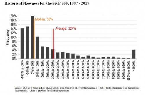
Market observers have noted that the S&P 500’s performance so far this year has been dominated by a small number of technology stocks.  This observation is certainly correct, although it’s fair to question the relevance of a statistic based on fewer than two months’ data.  What’s more important is to bear in mind that this is not unusual.  For most equity indices, skewed returns are the rule, not the exception.

One technical measurement of skewness is that a distribution’s mean is greater than its median.  Unlike in Lake Wobegon, where all the children are above average, in the real world of positively skewed returns, most stocks are below average.  Graphically, there’s a long tail to the right, as pictured here:

The chart covers a 20 year period, but we don’t need long time horizons to detect skewed results.  For the S&P 500, e.g., returns have been positively skewed in 23 of the past 27 years.  Results are similar for other markets.

Why should investors care about skewness?

If skewed returns continue for the balance of 2018, it would be unsurprising to see active underperformance and equal-weight outperformance continue as well.

The posts on this blog are opinions, not advice. Please read our Disclaimers.

Can High Concentrations Lead to Equal-Weight Outperformance?

Contributor Image
Tim Edwards

Managing Director, Index Investment Strategy

S&P Dow Jones Indices

Assigning equal weights to each constituent, such as in the S&P 500 Equal Weight Index, historically would have offered material outperformance over capitalization-weighted benchmarks across a range of markets.  Earlier this year, we published a paper examining how this occurred.

There are several perspectives one can take, ranging from factor or sector exposures all the way down to the pattern of contributions from each individual constituent stock.  However, one of the most interesting aspects of equal weight outperformance is that it arises primarily not through the differences between equal and cap-weighted sector exposures, but rather through the consequences of equally weighting within each sector.

So, what is going on?  We suggest that successful competition within each industry provides a mechanism for outperformance within equal weight indices.

Within a competitive industry setting, if a firm secures an advantage and begins to outperform, then three things will likely follow in consequence.  The first is that market capitalization of that firm will likely increase, relative to its peers.  The second is that – supposing such outperformance continues – the related sector index will become more concentrated into the outperforming company.  The third and final consequence – assuming a high level of competitiveness – is that the peers of that company will find ways to catch up with the prior leader, and reverse the prior concentration.

These consequences should be observable through the relative performance of equal weight indices.  If the largest companies in a sector outperform their peers, then a capitalization weighted index will outperform an equal weight index.  If the smaller companies in a sector outperform, then the equal weight index will outperform.

High levels of concentration might therefore provide a potential indicator for the future outperformance of equal weight indices in highly competitive sectors, since unusually high concentration in a sector may indicate significant potential for smaller firms to catch up – either through restrictions (regulatory or otherwise) placed on the larger firms, or organically as those smaller firms act catch up with the leaders.

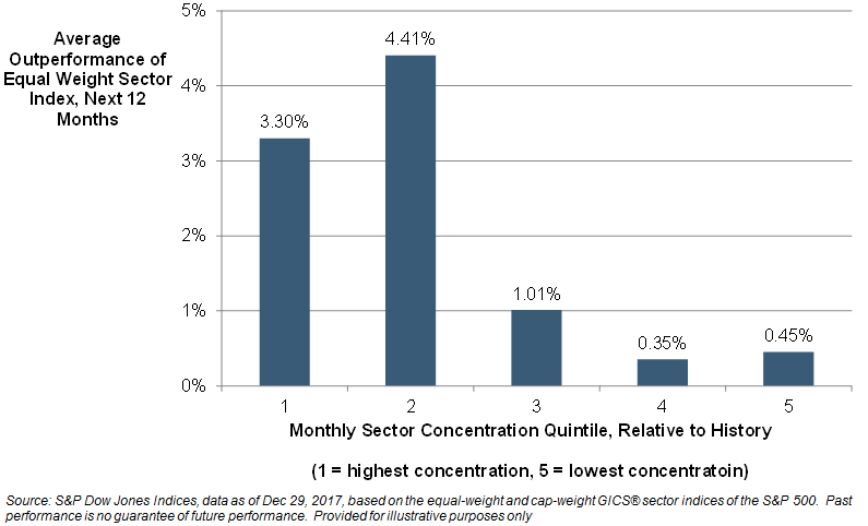
We test this idea by comparing the relative level of historical concentration in each sector to the subsequent performance of equal weight indices.  In particular, for every month from December 1995 to December 2016, we first calculate the percentile rank in HHI concentration for each of 10 S&P 500 sectors compared to its (monthly) history since 1990.   We then examine the relative total return of the respective equal weight sector index, relative to its capitalization-weight sector counterpart, over the next 12 months.  The chart shows the results, split by quartile of relative concentration:

Concentration Versus Subsequent Equal Weight Outperformance in S&P 500 Sectors, 1995-2017

As the chart shows, on average, the strategy of equally weighting within a sector appeared to have been most attractive when that sector was unusually concentrated.  With the increasing availability of products linked to equal weight sector or market indices, investors might therefore consider “backing competitiveness” by adopting equal weight strategies in sectors or industries that appear to be more concentrated than usual.

The posts on this blog are opinions, not advice. Please read our Disclaimers.

Decomposing Recent Volatility Events Part 1

Contributor Image
Berlinda Liu

Former Director, Multi-Asset Indices

S&P Dow Jones Indices

After a strong January 2018, the U.S. equity market started February with a roller coaster ride. The CBOE Volatility Index® (VIX®), which has been relatively quiet over the past couple years, spiked up and crossed the 50 mark intraday on Feb. 5, 2018. On the same day, the S&P 500® VIX Short Term Futures Inverse Daily Index and its linked exchange-traded products (ETPs) lost more than 90% in value. In light of this significant drop, it is worthwhile to review the mechanics of an inverse volatility index, and how the index value is established. In this two-part blog, we examine factors potentially contributing to the recent spike in volatility and significant negative performance in the S&P 500 VIX Short Term Futures Inverse Daily Index. In this first part of the blog series, we demonstrate that an inverse volatility index is not a “true short” of the underlying reference index.

An Inverse Index Is Not a “True Short”

Before we look into the S&P 500 VIX Short Term Futures Inverse Daily Index, we need to understand that an inverse index is designed to provide daily inverse return to a benchmark. In other words, an inverse index is designed to deliver the opposite of the performance of the benchmark on a daily basis. Its performance over longer periods of time can differ significantly from the “true short” of the underlying benchmark during the same period of time. This effect can be magnified in volatile markets.

Exhibit 1 illustrates the performance of a hypothetical benchmark index and its inverse over a two-day period. As the examples demonstrate, an inverse index that is set up to deliver the inverse of the performance of a benchmark every day will not necessarily achieve that goal over weeks, months, or years due to the compounding effect. If the benchmark index moves around a lot and then ends up in the same place, an inverse index will lose value while a “true short” would not. However, an inverse index does not always underperform. If the benchmark index is trending down, an inverse index can possibly deliver better performance than -1x cumulative performance.

Due to the power of compounding as illustrated in Exhibit 1 and the low volatility regime we have had in the past a couple of years, the S&P 500 VIX Short Term Futures Inverse Daily Index has outperformed the “true short” of its benchmark, the S&P 500 VIX Short-Term Futures Index. In 2017 alone, the S&P VIX Short Term Futures Inverse Daily Index returned 186%, while the S&P VIX Short-Term Futures Index lost 72%. The underlying mechanism for an inverse index (not limited to this example) to achieve this outperformance over a “true short” is to increase its position while it’s rising and decrease its position while it’s dropping. In the case of the S&P VIX Short Term Futures Inverse Daily Index, this would theoretically translate to increasing the number of VIX futures to short, while its benchmark is dropping. Given that each VIX futures contract has a constant vega exposure of 1000, the S&P VIX Short Term Futures Inverse Daily Index has been gradually increasing its vega exposure over the past couple of years. Many market participants may not necessarily be aware of the jump in the vega exposure of the ETPs linked to this index. The size of the index-linked, short-volatility ETP market (which stood around USD 2.7 billion at the peak[1]) may call for even more hedging in light of this increased vega exposure should another VIX jump happen.

In the next blog, we will analyze how the mechanics of a VIX futures index, as well as hedging by market participants, may have contributed to the Feb. 5, 2018, after-hour spike of VIX futures.

[1] Source: Bloomberg.

The posts on this blog are opinions, not advice. Please read our Disclaimers.