Get Indexology® Blog updates via email.

In This List

The Consequences of Concentration: 4 - More Underperformers

Rieger Report: Muni Bonds - the States Leading and Lagging 2016

The Consequences of Concentration: 3 - Higher Costs

Rieger Report: Muni G.O.'s or Revenue Bonds in 2016?

Party like it's 2007

The Consequences of Concentration: 4 - More Underperformers

Contributor Image
Craig Lazzara

Former Managing Director, Index Investment Strategy

S&P Dow Jones Indices

Can active managers improve performance by moving from relatively diversified to relatively concentrated portfolios?  Doing so is likely to increase risk, shift the relative importance of luck and skill, and raise trading costs.  A fourth consequence is that the probability of active underperformance is likely to increase.

A simple example provides some insight.  Imagine a market with five (equally weighted) stocks, whose performance in a given year is shown below.  The market’s return is 18%, driven by the outstanding performance of stock E.Hypothetical five stock market
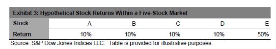
We can form portfolios of various sizes from these five stocks.  There are five possible one-stock portfolios, four of which underperform the market as a whole.  Alternatively, there are also five possible four-stock portfolios, four of which outperform the market as a whole.  The expected return of the complete set of one-stock and four-stock portfolios is the same 18%, but the distribution of portfolio returns is different.  In this case, holding more stocks increases the likelihood of outperformance.

Of course, this stylized example only “worked” because our hypothetical returns were skewed to the right; formally, the average return was greater than the median return.  A different return pattern among the individual stocks would have produced a different result at the portfolio level — so the usefulness of our example hinges on an empirical question: to what degree are real-life stock returns skewed to the right?

We might suspect that there is a natural tendency toward a right skew in equities — after all, a stock can only go down by 100%, while it can appreciate by more than that.   We confirmed this intuition by plotting the distribution of cumulative returns for the constituent stocks of the S&P 500 for the 20 years ended May 2016.  The median return was 141%, far less than the average of 377%.Cumulative returns for S&P 500 constituents

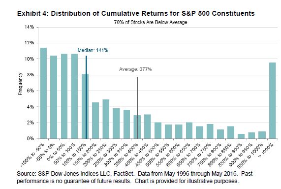
This positive skew in equity returns is not simply a long-term phenomenon: in the 25 years between 1991 and 2015, the average S&P 500 stock outperformed the median 21 times.

If stock returns are skewed to the right, portfolios with fewer stocks are more likely to underperform than portfolios with more stocks, because larger portfolios are more likely to include some of the relatively small number of stocks that elevate the average return.  Indeed, the logic of skewed returns is that it is more sensible to focus on excluding the least desirable stocks than on picking the most desirable — the opposite of what a concentrated portfolio will do.

The posts on this blog are opinions, not advice. Please read our Disclaimers.

Rieger Report: Muni Bonds - the States Leading and Lagging 2016

Contributor Image
J.R. Rieger

Former Head of Fixed Income Indices

S&P Dow Jones Indices

The municipal bond market tracked by the S&P Municipal Bond Index has seen a 4.11% year-to-date return.  Investment grade municipal bonds tracked in the S&P National AMT-Free Municipal Bond Index have seen a 3.95% return.

What states are leading the pack?  The answer includes some of the states that have been performance drags in the past.  Municipal bonds issued within Puerto Rico, New Jersey and Illinois are in the top five at this point in 2016.  Puerto Rico revenue bonds have held on to their bounce off the bottom despite Puerto Rico’s default earlier this month.  As for bonds from other states, the demand for bonds with any incremental yield over other bonds has helped push up the prices of bonds issued within states such as New Jersey and Illinois.

Throwing anchor at the bottom of the pack are bonds issued from Virgin Islands which represent a relatively small segment of the municipal bond market but a lot of debt to carry for a small population. As a result, bonds from Virgin Islands are suffering in the shadow of Puerto Rico’s struggles. Municipal bonds from oil states such as New Mexico and North Dakota remain in positive return territory but are beginning to show the impact of the economic drag low priced oil has created.

Table 1) Top five state municipal bond indices sorted by year-to-date total returns:

Source: S&P Dow Jones Indices, LLC. Data as of July 22, 2016. Table is provided for illustrative purposes. It is not possible to invest directly in an index. Past performance is no guarantee of future results.
Source: S&P Dow Jones Indices, LLC.  Data as of July 22, 2016. Table is provided for illustrative purposes. It is not possible to invest directly in an index. Past performance is no guarantee of future results.

Table 1) Bottom five state municipal bond indices sorted by year-to-date total returns:

Source: S&P Dow Jones Indices, LLC. Data as of July 22, 2016. Table is provided for illustrative purposes. It is not possible to invest directly in an index. Past performance is no guarantee of future results.

Please join me on Twitter @JRRieger  and LinkedIn


The posts on this blog are opinions, not advice. Please read our Disclaimers.

The Consequences of Concentration: 3 - Higher Costs

Contributor Image
Craig Lazzara

Former Managing Director, Index Investment Strategy

S&P Dow Jones Indices

Some active managers argue that the remedy for widespread active underperformance is more aggressive, more concentrated portfolios.  If this is the correct prescription, it has a number of adverse side effects — for example, risk is likely to increase, and the relative importance of skill and luck in decision making is likely to shift in luck’s favor.

A third consequence is that trading costs are likely to increase significantly.  This is because — with more concentrated portfolios — both fund turnover and cost-per-trade should rise. Here’s a simplified example:  Two managers share the same security rankings but construct their portfolios differently.  The first manager selects the top-ranked 10% of the universe, and operates the more concentrated fund. The second manager excludes the bottom-ranked 10% of the universe (and therefore holds the top-ranked 90%).  Suppose that in each quarter there is X% turnover in the securities ranked in the top 10% and the same X% turnover among the worst 10%.

Consider the turnover required for each manager, assuming that their portfolios are equally weighted and that they both rebalance once per quarter:

  • The concentrated manager holds the top 10% of the universe.  His turnover will therefore be X%.
  • The diversified manager holds everything but the bottom 10%. There is X% turnover in the stocks he doesn’t own, which leads to a turnover of (X/9)% in those he does.

In this scenario, the concentrated manager’s turnover is nine times higher than the diversified manager’s turnover.  Of course, the specifics depend on what fraction of the universe each manager chooses to hold.  (With quintiles instead of deciles, the concentrated manager’s turnover would be “only” four times higher than the diversified manager’s.)  But it’s difficult to escape the conclusion that turnover will rise as concentration rises.

Moreover, transaction costs per trade are also likely to rise.  Transaction costs are not linear: it typically costs more to trade a higher percentage of the outstanding float in a security.  Otherwise said, a manager is likely to be able to purchase 10,000 shares in each of 100 companies with less market impact than he could buy 1,000,000 shares of a single company.

Thus, higher concentration can deliver a double blow to returns: higher turnover and a higher unit cost of execution.

The posts on this blog are opinions, not advice. Please read our Disclaimers.

Rieger Report: Muni G.O.'s or Revenue Bonds in 2016?

Contributor Image
J.R. Rieger

Former Head of Fixed Income Indices

S&P Dow Jones Indices

The debate over which sector of municipal bonds, general obligation bonds (G.O.’s) or revenue bonds can provide a better return is a constant one.  So far in 2016, the S&P Municipal Bond Revenue Index has outperformed verses the S&P Municipal Bond General Obligation Index.

Peeling the onion back a bit may help provide more insights.

  • In general, revenue bonds have a higher coupon and higher yield than general obligation bonds so that is a factor in return performance under normal market conditions.  Year to date the G.O.’s have returned 3.49% while revenue bonds have returned 4.7%.
  • While revenue bonds have indeed outperformed, the bond issues that are below investment grade revenue bonds are also a contributing factor.  The S&P Municipal Bond High Yield Ex-Puerto Rico Index is up over 7.3% year-to-date and the majority of those bonds are revenue bonds and not general obligation bonds.  In contrast, the S&P Municipal Bond Investment Grade Index which includes both G.O.’s and revenue bonds has returned over 3.8% year-to-date.  (Note: Selected the S&P Municipal Bond High Yield Ex-Puerto Rico Index as Puerto Rico revenue bonds have seen a significant rebound in 2016 and would further skew the results).

Select municipal bond indices, their yields and total returns:

Source: S&P Dow Jones Indices, LLC. Data as of July 21,2016. Table is provided for illustrative purposes. It is not possible to invest directly in an index. Past performance is no guarantee of future results.

Please join me on Twitter @JRRieger  and LinkedIn

The posts on this blog are opinions, not advice. Please read our Disclaimers.

Party like it's 2007

Contributor Image
David Blitzer

Former Managing Director and Chairman of the Index Committee

S&P Dow Jones Indices

House sales and prices are rising.  Home sales in June were 5.57 million at annual rates, the highest since February 2007 when national home prices peaked.  Currently prices as measured by the S&P/Case-Shiller National Home Price Index are climbing at a 5% annual rate and are a mere 3% from their all-time peak.

What next?  The next S&P/Case-Shiller Home Price Index report will be released on Tuesday morning at 9 AM – check to see if the advance continues.  The data will be posted at www.spdji.com.

The posts on this blog are opinions, not advice. Please read our Disclaimers.