Get Indexology® Blog updates via email.

In This List

India ETFs Wrap-up: 2017

What a Portfolio Might Look Like After Adding a Pinch of Real Assets

Vectors of Volatility

What just happened in VIX ... and is it over yet?

Lack of Performance Persistence Continues for Actively Managed U.S. Equity Funds

India ETFs Wrap-up: 2017

Contributor Image
Mahavir Kaswa

Former Associate Director, Product Management

S&P BSE Indices

Until 2013, the exchange-traded fund (ETF) industry in India was in a nascent stage, with negligible assets under manager (AUM). As of Dec. 31, 2013, the total AUM for ETFs was INR 8,000 crores (or USD 1.2 billion), out of which commodities-based ETFs tracking gold noted the largest share, with total AUM of INR 6,500 crores (USD 1 billion). Starting with such a small base, the ETF industry noted exponential growth over the past four years, primarily driven by a decision from the Employee Provident Fund Organization (EPFO, one of the largest pension houses in India) to start investing in equities-based ETFs, including those tracking the S&P BSE SENSEX, as well as the Government of India’s decision to disinvest its holdings via ETFs.

As of Dec 31, 2017, the total AUM of the ETF industry stood at INR 78,000 crores (USD 12 billion), with an annualized growth rate of 76.6% during the past four years. The industry saw four new product launches in 2017, including the Bharat 22 ETF, which tracks the S&P BSE Bharat 22 Index and had the largest (by AUM) single ETF launch ever worldwide. This ETF was part of the disinvestment of listed government-owned companies in India.

Exhibit 1: Growth of ETF AUM – India 


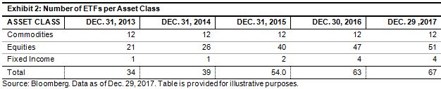
Among the three asset classes, equities noted the highest increase, with an annualized growth of 213% over the past four years. The exponential growth was also supported by a sustained bull run in Indian and global markets, with the S&P BSE SENSEX, S&P BSE MidCap Select, and S&P BSE SmallCap Select increasing 29.56%, 53.23%, and 51.13%, respectively over calendar year 2017.

The posts on this blog are opinions, not advice. Please read our Disclaimers.

What a Portfolio Might Look Like After Adding a Pinch of Real Assets

Contributor Image
Marya Alsati

Former Product Manager, Commodities, Home Prices, and Real Assets

S&P Dow Jones Indices

In December 2015, S&P Dow Jones Indices launched the S&P Real Assets Index, the first index of its kind, which is designed to measure global property, infrastructure, commodities, and inflation-linked bonds, using liquid and investable component indices that track public equities, fixed income, and futures.

The S&P Real Assets Index includes global infrastructure (35%), property (25%), natural resources (35%), and inflation-linked bonds (5%), using stocks (50%), bonds (40%), and futures (10%). It is constructed as an index of indices, using the components and weights shown in Exhibit 1.

Why Use Real Assets?

The two main reasons market participants might consider using real assets are diversification and inflation protection. The S&P Real Assets Index design incorporates both equities and fixed income to more fully represent companies, and it adds commodity futures for more direct exposure to natural resources. The result is that market participants may achieve more diversification and inflation protection than with just equities or with any single asset inside the index.

As shown in Exhibit 2, the S&P Real Assets Index has provided relatively strong inflation protection, with an inflation beta of 4.46, as measured by monthly and year-over-year returns of the index and the CPI, compared with 2.4 for the S&P 500® and the negligible inflation protection of the S&P U.S. Aggregate Bond Index. Inflation beta can be interpreted as a 1% increase in inflation resulting in a 4.46% increase in the return of the S&P Real Assets Index.

Real assets are moderately correlated to each other, since their underlying characteristics are alike in many ways, and, while they have a strong correlation to the S&P 500 (83.0%), they have a more modest correlation to the S&P U.S. Aggregate Bond Index (28.1%). In addition, including real assets in a portfolio offers access to a larger spectrum of assets.

Exhibit 3 depicts two hypothetical portfolios—one with an allocation of 60% to equity and 40% to bonds, and the second with a 50/40/10 allocation to stocks, bonds, and real assets, respectively.

While the annualized return for the one-year period dropped slightly from 14.0% for the equity/bond portfolio to 12.9% for the portfolio that includes real assets, the annualized risk declined as well. The numbers are not mediocre, considering the historical drawdown natural resources have suffered over the past 10 years and the rally of U.S. equities in 2017. It is important to note that analysis up until the end of 2015 showed that the Sharpe ratio increased from 0.47 for the equities benchmark to 0.68 for the equity/bond portfolio and to 0.7 for the portfolio that included real assets.

The posts on this blog are opinions, not advice. Please read our Disclaimers.

Vectors of Volatility

Contributor Image
Fei Mei Chan

Former Director, Core Product Management

S&P Dow Jones Indices

Risk is once again part of investors’ vocabulary. Through yesterday’s close, the S&P 500 lost a total of 6%, made all the more jarring by the practically straight line rise in most of 2018 prior to the losses. Volatility has, of course, ticked up, but in the context of the broader 27 year history, not dramatically so.

ROLLING 21-DAY VOLATILITY FOR S&P 500

While the stock market’s recent declines seem quite traumatic (in point terms, the Dow Jones Industrial Average’s decline was a record), insight into the factors that contribute to volatility may alleviate some worries.  The dispersion-correlation map below gives us a way to put the recent jump in market volatility into context.  A rolling 21-day look at the dispersion and correlation levels so far this year shows a general trend of increasing dispersion.  As of the market’s close on February 5th, dispersion had increased to slightly higher than median levels, and correlation made a significant jump.

ROLLING 21-DAY DISPERSION-CORRELATION YEAR-TO-DATE

The longer-term dispersion-correlation map below shows that 2017 was among the sleepiest of years and, in the context of stock dispersion and correlation, was similar to the boom years of the mid 1990s when volatility was also subdued.  Current conditions are at approximately the same levels as in 2011 (a year that experienced significant volatility mid-year but ended more or less flat).

Years of extreme market distress such as 2000 and 2008 witnessed dispersion levels that were much higher than the current environment.  If the past is any gauge, therefore, what has happened in the last week hasn’t propelled us to crisis levels.

DISPERSION-CORRELATION MAP

The posts on this blog are opinions, not advice. Please read our Disclaimers.

What just happened in VIX ... and is it over yet?

Contributor Image
Tim Edwards

Managing Director, Index Investment Strategy

S&P Dow Jones Indices

In recent years, strategies selling volatility (and VIX® futures in particular) garnered substantial attention due to the low levels of VIX and the eye-watering returns achieved by associated benchmarks such as the S&P 500® VIX Short-Term Futures Inverse Daily Index (we’ll call it the “short VIX index” here for convenience).   At the end of last week, the short VIX index could boast of a 10-year total return of 1,518%.

We’ve previously warned that short VIX strategies should be exclusive to the courageous, especially in times of low volatility.  The past 24 hours remind us why this must be so: by the end of Monday’s trading, as both VIX and VIX futures recorded their largest ever one-day percentage increases, the 10-year total return of the short VIX index had fallen from a 15-multiple gain, to a loss of 3.6%. 

So, what just happened?

One candidate explanation for the remarkable swings in VIX futures yesterday relates to a phenomenon similar in spirit to a combination of a classic “short squeeze” with the types of trading patterns generated by portfolio insurance strategies.  It is best illustrated by the hypothetical example of an investor following a strategy selling VIX futures in equal proportion to their invested capital.

Let’s suppose that – at the market’s open on Monday morning – an investor had a collateralized position in futures (or other index-linked products) tracking the short VIX index, with a notional position size of $100.

By the end of the Monday’s trading, as VIX futures rose by a total 96%, the value of the futures which our investor was short rose from $100 to $196.  The $96 increase in the VIX futures position necessitates an equal and opposite decline in the value of our investor’s position: from $100 down to $4.

In order to maintain his short position at a fixed proportion of capital, the investor would have to reduce the size of his exposure from $196 to $4; in other words to purchase $192 of VIX futures.  This adjustment would naturally have had the effect of putting further upward pressure on VIX levels.

It is not clear how many investors were following such a strategy overall, but a lower bound might be approximated  by the $3bn of assets in ETPs (exchange-traded notes and exchange-traded funds) that were tracking the short VIX index as of Friday’s close.  From that approximation, we would have anticipated a little under $6bn of “short covering” in VIX futures into yesterday’s close – an amount that may have indeed exacerbated the market’s moves.

And is it over yet?

There are plenty of other candidate explanations for the market’s movements yesterday.  However, if the primary driver was indeed the rebalancing flows (and short-covering) from investors who were short volatility, the good news is that it’s quite possible the market will return to normal.  The same $3bn of assets tracking short volatility at Friday’s close would be worth only $0.12bn after yesterday’s losses, which is far less likely to move the market.  Of course, if the real reason for the market moves lay elsewhere, higher volatility may well continue.  At any rate, we suspect that after such a lesson in the possibility of sharp spikes in the volatility market, investors will approach short VIX strategies with renewed caution.

The posts on this blog are opinions, not advice. Please read our Disclaimers.

Lack of Performance Persistence Continues for Actively Managed U.S. Equity Funds

Contributor Image
Ryan Poirier

Former Senior Analyst, Global Research & Design

S&P Dow Jones Indices

The results are in for the latest S&P Persistence Scorecard. Based on data as of Sept. 30, 2017, the results again highlight the lack of performance persistence among actively managed equity funds. Produced semiannually, the S&P Persistence Scorecard highlights the degree of difficulty faced by active managers to stay at the top of their peer group consistently.

Of the 222 large-cap managers that were in the top quartile as of September 2013, zero could retain this mark for the subsequent four periods. Similarly, for mid- and small-cap managers, within their respective starting universes, no manager was able to maintain their performance. Furthermore, it only took mid- and small-cap managers three years to reduce the universe to zero in the top quartile (see Exhibit 1).

The S&P Persistence Scorecard also provides transition matrices for managers in various quartiles. The transition matrices track the path of managers across different quartiles over time, and therefore present the probability of where a fund may end up. Exhibit 2 shows a direct relationship between the starting group and the probability of being liquidated in the next five-year period. We observe that funds starting in the top quartile, based on the past five-year period, have a 10.24%, 8.96%, 11.11%, and 10.23% change of being merged for All Domestic, All Large, All Mid, and All Small-Cap mutual fund categories, respectively. Furthermore, when the fund was in the bottom quartile to start, these statistics rise to 31.81%, 31.34%, 33.33%, and 37.5%, respectively. This means that a fund is roughly three times as likely to disappear if it started in the bottom quartile versus in the top quartile.

We can also note that with the exception of mid-cap managers, the relationship is strictly increasing. The implication for market participants is such that they should be aware of (and consider) the increased probability that a manager might not be around given their relative performance ranking over a certain period. While past performance does not have an impact on future performance, past performance has some correlation with the likelihood of being liquidated or not.

Past performance is often viewed as a way to select an investment going forward, even though the body of research suggests it to be a poor indicator of future results. The S&P Persistence Scorecard has repeatedly shown that past performance is not a robust metric to use when selecting active managers. Analysis such as that in Exhibit 1 shows that if a market participant were to select a manager based only on performance, there would be less than a random chance that the manager would stay in the first quartile.

The posts on this blog are opinions, not advice. Please read our Disclaimers.