Get Indexology® Blog updates via email.

In This List

Is Trump Making Commodities Great Again In His First 100 Days?

Gold Just Did This for Its First Time Ever in April

The First 100 Days

Natural Resources, a Potential “Natural” Play on Higher Inflation Expectations

Skewered

Is Trump Making Commodities Great Again In His First 100 Days?

Contributor Image
Jodie Gunzberg

Former Managing Director, Head of U.S. Equities

S&P Dow Jones Indices

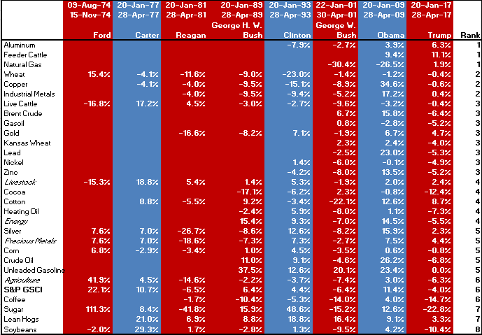
The short answer is no.  The S&P GSCI (Spot) is down 4.0% since Jan 20, which is the 6th worst start of the 8 presidencies measurable by the S&P GSCI.  Besides Trump, the data covers the start of the presidencies for Ford, Carter, Reagan, George H. W. Bush, Clinton, George W. Bush and Obama. However, not all the commodities and sectors have data going back to the start of Ford’s presidency but there are three sectors (precious metals only contained silver) and six single commodities with the full data set.

The table below shows that for the commodities with a full history,  Trump has not done well.  While silver is positive since Trump took office, its performance thus far only ranks 5th of the 8 presidents, performing better under all the democrats plus Ford.  Though wheat and live cattle are negative, they are the only two commodities performing in the top half of their performance under the starts of other presidents.  Wheat only did better under Ford and live cattle did better under Carter and Reagan. Like live cattle, livestock is also performing better under Trump than most presidents. On the other hand soybeans are performing the worst under Trump as compared to past presidents and sugar is worse under Trump than all others besides Reagan.

Source: S&P Dow Jones Indices. (spot version – to give the benefit of the doubt by excluding negative roll yield caused by excess inventories since only gold is in backwardation now)

Again, the overall commodity performance under Trump is ranking only 6th of 8 presidents.  However, Trump may be making aluminum, feeder cattle and natural gas great again as they are doing best under him; though, feeder cattle has only been included long enough to be measured under the start of Obama.  Industrial metals are positive, up 0.4%, which may show market participants are optimistic about growth, but copper, if one believes is indicative of growth, is under-performing with a spot return of -0.6% since Trump took office, which is still better than copper’s performance under every president but Obama.  Also, although natural gas is doing relatively well, energy is down 5.5% since Jan. 20 with its only negative start besides under George W. Bush.  This mainly driven by the worst performance under Trump’s start than for any other president for (WTI) crude oil, down 6.8%, and Brent crude down 6.4%.  Last, coffee, sugar and soybeans are all experiencing double digit losses under the start of Trump, and are severely under-performing versus their time under the beginnings of past presidents.
Source: S&P Dow Jones Indices.


The posts on this blog are opinions, not advice. Please read our Disclaimers.

Gold Just Did This for Its First Time Ever in April

Contributor Image
Jodie Gunzberg

Former Managing Director, Head of U.S. Equities

S&P Dow Jones Indices

Commodities have continued their slump in April with the S&P GSCI Total Return losing 2.1% and Dow Jones Commodity Index (DJCI) Total Return losing 1.7% for year to date performance of -7.1% and -3.6%, respectively.  Only 2 of 5 sectors and 7 of 24 commodities were positive in April.  In the S&P GSCI, livestock gained 8.6%, its best monthly performance since July 2007, making it the best performing sector, while energy was the worst performing sector, losing 3.6%.  Feeder cattle posted its biggest monthly gain ever of 15.1%, making it the best performing commodity in the index, while cocoa was the worst performer, losing 12.9%.  All metals except gold lost in April, which hasn’t happened since May 2010 and has only happened 6 times in history (since lead, the last metal was added in Nov. 1994.)

Gold was not just the only positive metal in April, but was the only commodity of all 24 in the S&P GSCI in backwardation.  This is the first time in history that gold was the only backwardated commodity (since 1978 when gold was added into the index.)  Backwardation is a condition describing the forward curve where the contract with a nearer expiration date is priced higher than the contract with a later expiration date. It is profitable for market participants rolling out of expiring contracts and into later dated ones, and it reflects a shortage where demand is greater than supply.  Gold’s forward curve has only been backwardated in 28% of months historically since it is relatively abundant.

So, what does this mean?  The backwardation in gold reflects high demand for the metal, which many investors flock to as a safe haven.  Since gold has historically zero correlation to the S&P 500 (0.02) and very little to the S&P GSCI (0.18) (using monthly data since Jan. 1978,) it has provided a diversification benefit to investors using equities and other commodities.  However, since the correlation is not negative, the high demand for gold may or may not reflect fear in risky assets like equities and other commodities.  That said, gold has performed relatively well in the equity downturns during 2000-2002 (-44.7%, +15.3%,) 2007-2009 (-50.9%, +18.5%,) and also in shorter ones like in 2011 (-16.3%, +4.2%,) Aug.-Sep. 2015 (-8.4%, +1.8%) and Dec. 2015-Feb. 2016 (-6.6%, +15.9%.)  Another interesting observation in the chart below is that there was higher frequency of backwardation (32% of the months) before the global financial crisis than after (25% of the time,) but the market is much further from equilibrium, showing about 3.6x more backwardation, or in other words, 3.6x greater relative demand to supply.  Perhaps the market is not as frequently jittery but when it fears, it fears more than it has in the past, adding to the gold demand.

Source: S&P Dow Jones Indices. Roll yield is the monthly return of excess return minus the monthly return of spot return indices. The result is multiplied by 1000 in this chart for scaling purposes.


The posts on this blog are opinions, not advice. Please read our Disclaimers.

The First 100 Days

Contributor Image
Jamie Farmer

Former Chief Commercial Officer

S&P Dow Jones Indices

In 100 days one can:

  1. Sequentially boil 48,000 three minute eggs
  2. Enjoy nearly 1,372 viewings of The Usual Suspects (a tally I’ll admit to being embarrassingly close to achieving)
  3. Assemble evidence to render an arbitrary judgment on the accomplishments of a newly-elected US President

Tomorrow marks the end of Donald Trump’s first 100 days in office.  In 1933, FDR pioneered the concept of the first 100 days.  And though Roosevelt was actually referring to the first 100 days of the 73rd U.S. Congress – rather than those of his administration – the milestone has become a common reference point to judge the successes(?) of a new President.

So in the spirit of arbitrary judgments, listed below is the performance of the Dow Jones Industrial Average over the first 100 days of every Presidential administration since FDR introduced the concept.  Much has been written about the advance of the US equity markets in the early days of the Trump administration – so how does it measure up historically?

The overwhelming winner is FDR’s first First 100 Days.  As always, context is key.  Roosevelt and Congress were working feverishly to confront a banking panic and the markets clearly benefited from their efforts.  The recent advance under Trump ranks 6th on the list trailing:  FDR #1, Obama #2, G.H.W. Bush, JFK and FDR #4.  More often than not (~60% of the time) the DJIA posts a positive return during a President’s early days.

Note that the early days of administrations that came to power due to tragic (i.e. Truman #1 and LBJ #1) or ignominious (i.e. Ford) circumstances are not included here.

Lastly, banking panic notwithstanding it’s remarkable that FDR and Congress worked together to pass 15 major pieces of legislation in such a short time.  Those were the days, huh?

The posts on this blog are opinions, not advice. Please read our Disclaimers.

Natural Resources, a Potential “Natural” Play on Higher Inflation Expectations

Contributor Image
Tianyin Cheng

Former Senior Director, ESG Indices

S&P Dow Jones Indices

As the economy expands and inflation ticks up in the post-election world, fueled by a pledge by President Trump to increase fiscal spending with improvements to America’s crumbling infrastructure, market participants will have to keep in mind the negative effects of increasing prices.  They may want to consider hard-asset-related investments to help maintain the purchasing power of their portfolios.  Stocks of companies in natural resource industries such as industrial materials, agriculture, and energy can potentially help market participants mitigate inflation, as these stocks may directly benefit from increases in the underlying prices.

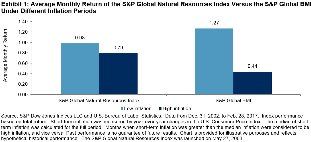
Over the 14–year period ending Feb. 28, 2017, the S&P Global Natural Resources Index, which is designed to provide market participants with an equity-based approach to natural resource investments through its three commodity-related sectors (agribusiness, energy, and metals & mining), has outperformed the S&P Global BMI by a monthly average of 36 bps in high-inflation months.  The index has underperformed the S&P Global BMI by 29 bps in low-inflation months (see Exhibit 1).

Therefore, for market participants seeking to harness these inflationary trends, carving out a portion of an equity allocation for global natural resource stocks may warrant consideration.

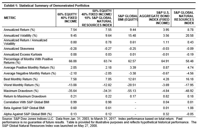
Exhibit 2 illustrates how the characteristics of a conventional 60% equity/40% fixed income portfolio is affected by the addition of the S&P Global Natural Resources Index.  The decline of the S&P Global Natural Resources Index at the start of 2015 did have a negative impact on the portfolio performance, but it has been steadily increasing since January 2016.

The posts on this blog are opinions, not advice. Please read our Disclaimers.

Skewered

Contributor Image
David Blitzer

Former Managing Director and Chairman of the Index Committee

S&P Dow Jones Indices

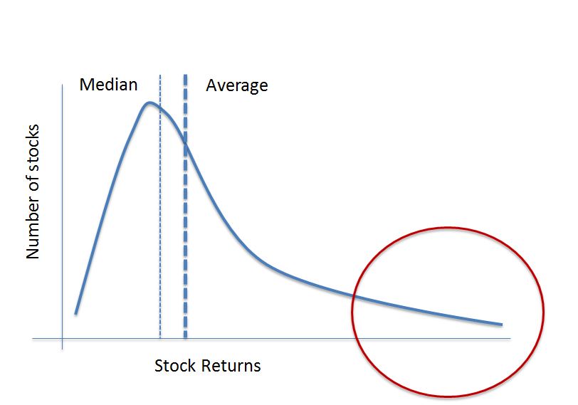
When an investor buys a stock her largest possible loss is the money invested while the gain is unlimited.  Most investors avoid losing their entire investment, few investors make as much as they hoped. One result of this favorable bias is that the distribution of stock returns is usually skewed to the right. The sketch shows what the distribution would look like.

The skew explains why an equally weighted version of an index often outperforms the cap- or value-weighted version of the same index. It also provides a reason unrelated to fees for active managers’ difficulty in beating their index benchmarks.  If the distribution of prices is skewed to the right with a long right hand tail, the average return across all the stocks will be greater than the median return.  Why? Because a few very high return stocks at the extreme right pull up the average. An investor who owns the stocks in the right hand tail will do much better than either the median or the average. The equal weight S&P 500 returned 12.2% from Election Day to April 26th.  The average return across all the stocks – because of the equal weighting – is close to the 12.2% return. However, in the right hand tail are six stocks that each returned more than 50%.

An active manager would probably hold far fewer than all 500 stocks in the S&P 500.  With each stock he selects for his portfolio there is a 50/50 chance it is below the median and a less than 50/50 chance it is above the average.  There is a much smaller chance he selects a stock in the right hand tail. The active manage must be very skilled, or very lucky, to find those in the tail. But without a few names at the extreme right end of the distribution, it will be difficult to beat the index.  The longer the tail the more important it is to hold those stocks.

A manager who buys all the stocks in the index is assured of owning the right hand tail as well as the worst performing stocks on the left edge — he will be an index manager except for the way the stocks are weighted.

The skew explains one reason why an equal weighted index will typically out performs a cap-weighted index.  In a cap weighted index, the larger the stock the larger its weight in the index and the larger the proportion of money invested in large stocks. In a portfolio tracking the cap-weighted S&P 500, more than half the money is in the 50 largest stocks. If all stocks have an equal chance being among the best performers but half the money is in only 10% of the stocks, a lot of the money is likely to be in the wrong place and miss the best performers. An equal weighted index is different – an equal amount of the funds track each stock so that gives each dollar has an equal chance of being the right place.

Portfolios tracking equal weighted indices also benefit from the small cap effect. Small cap stocks tend to outperform large cap stocks more often than not; and, small caps get more weight in equally weighted than cap-weight portfolios.


The posts on this blog are opinions, not advice. Please read our Disclaimers.