Get Indexology® Blog updates via email.

In This List

Is China a Building Block in Your Portfolio?

Active Versus Passive Through Municipal Bonds

Fallen Gold May Help India's Diwali and Monetisation Plan Shine

How Have South African Active Fund Managers Performed?

WTI Reclaims No.1 Spot As The Benchmark Oil In 2016

Is China a Building Block in Your Portfolio?

Contributor Image
Ellen Law

Former Associate Director, Asia Pacific Market Development

S&P Dow Jones Indices

After China’s stock plunge in Q3 2015, many investors have had two different views toward China.  The bearish camp avoids buying Chinese stocks, as they think the Chinese market is volatile, and that the earlier stock market bubble has not fully burst when it comes to the problems of shadow banking, margin lending, and an overheating property market.  The bullish camp holds a different view, claiming that Chinese stocks are cheap now and that the panic sell-off had been exaggerated.  It claims that the valuation of China is getting lower, which presents a potential buying opportunity, especially for long-term investors.

No matter which view you take, either bearish or bullish on China, one cannot simply ignore China, considering its size and importance in the world economy and long-term economic growth.  For this reason, it may not come as a surprise that some indices and investment products were launched for a pure play in China after the recent sell off, such as the S&P China 500, which seeks to track all Chinese share classes, including A-shares and offshore listings.

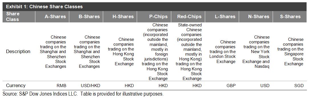
Alphabet Soup of Chinese Share Classes
To capture the complete Chinese story, investors may invest in different Chinese share classes.  However, Chinese share classes are often seen by foreign investors as being quite complex.  A-, B-, H-, L-, N-, and S-shares are just like the different letters mixed in alphabet soup.  In reality, only a handful of share classes, namely A-, H-, and N-shares, represent around 99% of the total market capitalization of the Chinese equities market.  A-shares are Chinese companies trading on the Shanghai and Shenzhen exchanges in renminbi.  International access to these domestic shares has been limited, but they have become more open due to the market liberalization supported by the Chinese government.  H-shares are similar to A-shares, but they trade on the Hong Kong Stock Exchange in Hong Kong dollars.  They are open to international investors without any restriction.  N-shares are Chinese companies trading on the New York Stock Exchange and NASDAQ in U.S. dollars.  Some of them are fast-growing internet and technology stocks, such as Alibaba and Baidu.  For the list of Chinese share classes, please refer to Exhibit 1.

Capture

Liberalization of China’s A-Share Market
It is worth noting that the historically restricted A-share market has now been made more readily available to international investors, and thanks to the launch of the Qualified Foreign Institutional Investor (QFII), Renminbi Qualified Foreign Institutional Investor (RQFII), and Shanghai-Hong Kong Stock Connect (Stock Connect) programs, both QFII and RQFII allow approved applicants to access to the A-share market via a quota system.  The total QFII and RQFII quotas have reached USD 78.97 billion and RMB 419.5 billion (USD 66.3 billion), respectively.[1]  The Stock Connect is a significant measure that links the Shanghai and Hong Kong stock exchanges, allowing mainland Chinese investors to purchase selected eligible shares listed in Hong Kong, and, at the same time, letting foreign investors (both institutional and retail) buy eligible Chinese A-shares listed in Shanghai.  The Stock Connect is expected to expand to the Shenzhen stock exchange soon, since both the Hong Kong and Shenzhen bourses have said the launch preparations had been completed and were waiting regulatory approval.

[1]   State Administration of Foreign Exchange, data as of Oct. 29, 2015.

The posts on this blog are opinions, not advice. Please read our Disclaimers.

Active Versus Passive Through Municipal Bonds

Contributor Image
Todd Rosenbluth

Director of ETF and Mutual Fund Research

S&P Capital IQ Equity Research

Municipal bond mutual funds gathered USD 2.8 billion in the four-week period ending Oct. 28, 2015, according to the Investment Company Institute, while muni bond ETFs added USD 593 million of inflows in October, according to SSGA.  Despite this low number, at the recent S&P Dow Jones Indices Municipal and Global Bond Forum, various panelists highlighted the relative benefits of municipal bond ETFs.

For example, J.R. Rieger, Managing Director of Fixed Income Indices for S&P Dow Jones Indices, highlighted that just one-third of all active national municipal bond funds outperformed the S&P Municipal Bond Index in the three-year period ending June 2015.  Further, just 16% of those funds that were in the top-quartile of their muni bond peer group in the 12-month period ending March 2013 retained that ranking in the subsequent period.  Both observations come from S&P Dow Jones Indices Index versus Active and Persistence Scorecard.

Similarly, a fellow panelist at the S&P Dow Jones Indices forum acknowledged one advantage index-based ETFs have over active mutual funds is explicit parameters that are not subject to a manager’s view of the world.  We think a look at a popular active New York municipal bond fund compared to an S&P Dow Jones index makes this point clear.

The S&P New York AMT-Free Municipal Bond Index consists of investment-grade general obligation bonds and essential purpose revenue bonds issued within New York.  As of the end of October 2015, 99% of the bonds were rated ‘A’ or higher by Standard & Poor’s Ratings Services.  Meanwhile, Oppenheimer Rochester AMT-Free New York Municipals (OPNYX) has a 20% stake in Puerto Rico bonds that incur greater credit risk in exchange for a higher yield, as of September 2015.

Bonds issued by Puerto Rico are exempt from federal, state, and local income taxes for individual investors.  In September 2015, Standard & Poor’s Ratings Services downgraded Puerto Rico-backed debt to ‘CC,’ citing that the bonds are highly vulnerable to nonpayment.

A separate difference between municipal bond ETFs and mutual funds is that ETFs trade on an exchange, allowing investors the liquidity to make intra-day trades.  Yet, at the same S&P Dow Jones Indices’ forum, a panelist reminded attendees that municipal bond ETFs net asset values (NAVs) are a best estimate.  Unlike Treasury bonds, it is rare for muni bonds to trade on a daily basis.  As such, according to our research, muni ETFs that hold these securities can, at times, trade at relatively wider premiums or discounts compared with NAVs.

S&P Capital IQ has researched 33 municipal bond ETFs, 22 of which have price/NAV premiums or discounts greater than 10 bps.  Meanwhile, just two of the 22 U.S. Treasury ETFs trade as widely relative to their net asset value.

—————————————————————————————————–

S&P Capital IQ operates independently from S&P Dow Jones Indices.
The views and opinions of any contributor not an employee of S&P Dow Jones Indices are his/her own and do not necessarily represent the views or opinions of S&P Dow Jones Indices or any of its affiliates.  Information from third party contributors is presented as provided and has not been edited.  S&P Dow Jones Indices LLC and its affiliates make no representations or warranties of any kind, express or implied, regarding the completeness, accuracy, reliability, suitability or availability of such information, including any products and services described herein, for any purpose.

The posts on this blog are opinions, not advice. Please read our Disclaimers.

Fallen Gold May Help India's Diwali and Monetisation Plan Shine

Contributor Image
Jodie Gunzberg

Former Managing Director, Head of U.S. Equities

S&P Dow Jones Indices

Could India’s gold obsession be over? The Indian government seems to think so, since they are betting that their people are willing to part with their precious metal to earn just 2.5% interest. Last Thursday, Prime Minister Narendra Modi launched three programmes aimed at reducing physical gold demand and luring tonnes of gold from households into the banking system. That’s a big bet considering gold in India is a status symbol of wealth, and is widely used for wedding gifts, religious donations and as an investment.

However, it is possible Indian investors might follow the sentiment of investors in in other parts of the world that have already given up on gold. The record selloff in 2013 happened for a reason. Some place the main blame on the strong U.S. dollar, but the historical correlation of gold to the U.S. dollar is relatively weak measuring only about -0.3 to -0.4. So, it’s not only a strong dollar that is hurting gold but also the missing inflation and interest rates with the lack of demand for the physically backed ETF. It has caused the S&P GSCI Gold index to lose almost half its value, -43%, since Aug. 2011. Even after gold lost 28% in 2013, posting its biggest annual decline since 1981, it never bounced back but lost an additional 10%.

Source: S&P Dow Jones Indices

This loss has changed the perception of gold as a safe haven – and that is crucial. After all, the last two bull runs were driven by gold as a safe haven. When Nixon took the dollar off the gold standard in 1973, inflation tripled, the dollar crashed and years of erratic monetary policy followed, investors piled into gold as a safe haven. Again in 2001, fear rippled through the market, triggering the flight to safety into gold. The drivers of inflation and a weak dollar that supported gold through the 1970’s bull run were back. These factors plus the global financial crisis and worries about government reform led gold to a record high. Such forces in addition to the growing popularity of the gold ETF as a new way for investors to access gold sent gold soaring more than 600% over the next ten years, until its peak in Aug. 2011. If gold is not the safe haven it was thought to be, one might even question if another bull run is possible.

Since gold’s role as a safe haven is so seemingly important as a catalyst for a bull market, it is a legitimate concern as to whether gold has actually protected investors in past market crises. Since many investors use the S&P 500, let’s start with that as the market proxy. Using rolling 12-month returns (monthly year-over-year) from Jan 1979 – Sep 2015, the result shows that whether there was a bull, bear or flat stock market, gold was positive at least half the time. The stock market condition didn’t necessarily say anything about gold returns, but gold performed well when there were bear market conditions. It was positive the highest percentage of the time, 74%, in bear markets that lost more than 20%, an on average gold gained 6.5% historically in this condition.  Based on this, the case can be made that gold has protected in down markets and has been a good diversifier.

Source: S&P Dow Jones Indices

Unfortunately for Indian investors, this does not hold true. The same analysis using the S&P BSE Sensex  with the time period starting in Sep. 1996 shows gold performs far better in Indian stock bull markets than in Indian stock bear markets. Gold was only positive 43% of the time in the worst bear markets, and on average, lost 1.8%.

Source: S&P Dow Jones Indices

Is that enough to steer Indian gold buyers away from large purchases during Diwali? Probably not – and based on historical behavior, regardless of portfolio protection, diversification or future bull-run potential, the low prices have driven more gold buying.  The below chart shows that when gold prices increased (decreased), jewelry demand decreased (increased):

http://www.kitco.com/commentaries/2015-07-24/Does-Jewelry-or-Central-Bank-Demand-Drive-the-Gold-Price.html

Then if low gold prices increase gold buying for Diwali, will the buyers turn their gold over to the banking system? The lower value may make it more likely if gold loses its power to boost status and wealth in India.

The posts on this blog are opinions, not advice. Please read our Disclaimers.

How Have South African Active Fund Managers Performed?

Contributor Image
Daniel Ung

Former Director

Global Research & Design

The performance of the South African equities market has been lackluster as a result of poor employment data, weak consumer confidence, and continued power shortages.  This has led to an underperformance of approximately 5% in ZAR-denominated domestic equities, as measured by the S&P South Africa Domestic Shareholder Weighted (DSW) Index, compared with global equities.

Equities:

  • Over a five-year period, about 91% of domestic funds underperformed the benchmark.
  • Over the same period, over 96% of global funds underperformed the S&P Global 1200.

Fixed Income:

  • Over a five-year period, over 74% of diversified and aggregate funds underperformed the benchmark.
  • Over the same period, the majority of the active short-term bond funds outperformed the benchmark.

For more details on the report, please click here.

Capture

The posts on this blog are opinions, not advice. Please read our Disclaimers.

WTI Reclaims No.1 Spot As The Benchmark Oil In 2016

Contributor Image
Jodie Gunzberg

Former Managing Director, Head of U.S. Equities

S&P Dow Jones Indices

S&P Dow Jones Indices today announced the composition and weights for the 2016 S&P GSCI and Dow Jones Commodity Index. The two indices have the same constituents by definition but the weighting methodologies are different. The DJCI is equally weighted with 1/3 of its weight to each sector – energy, metals, and agriculture and livestock, then the constituents inside are liquidity weighted by the 5-year average of the total dollar value traded. The more interesting weighting of the two flagships happens in the world-production weight of the S&P GSCI. This is because the world production is a reflection of the relative significance of each of the constituent commodities to the world economy.

2015 was a historically significant year for oil in indexing since it was the first time Brent overtook WTI as the biggest commodity in the S&P GSCI since Brent Crude was added in 1999. Please see the graph below for the historical weight difference between WTI Crude Oil and Brent Crude in the S&P GSCI:

Source: S&P Dow Jones Indices. All weights prior to 2015 are actual index weights after the rebalance that may differ from the target weights due to price fluctuations.

Notice the Brent significantly caught up to WTI in 2013, but now WTI is set to outweigh Brent in 2016 by even more than in 2013, putting into question Brent’s ability to hold as a real oil benchmark. Although the brent field only produces about 1,000 of 94 million barrels per day, volumes of the contract have more than doubled since 2009 to more than a million contracts per day. It is this volume (in addition to price) that catapulted brent to compete with WTI as the global heavyweight in the S&P GSCI. The index uses a world production for the entire petroleum component (WTI, Brent, Gasoil, heating Oil and Unleaded Gasoline) then adjusts the individual constituents by a 12 month average of total dollar value traded based on price and volume from the current year’s August through the prior year’s September. Based on this, the index is now reflecting what the rest of the world already suspects – that is brent is drying up too quickly to remain a global oil benchmark. For example, below is a chart from our commodity conference in 2012 questioning the viability of Brent.

Source: Wood Mackenzie, Aug 2012. Presented at S&P Dow Jones Commodity Conference. Sept, 2012. Jan-Hein Jesse, JOSCO Energy Finance & Strategy Consultancy.

A bigger question for benchmark pricing and index weight is how the composition of the brent contract may change to stay competitive. The brent field’s output used to be 100% of the brent contract but is now only at 0.1%. Please see the chart below of the decline from a WSJ blog:

BCG Falling Brent

Further, the WSJ reports in this article that changes may need to happen sooner rather than later by adding oil into the benchmark from West Africa, Central Asia or possibly from Brazil. This is because the there is a huge market based on the benchmark pricing where businesses, such as refineries, price the crude they process into gasoline and diesel, influencing prices at the pump. It has a great potential impact.

Brent decline WSJ

Finally, notice how the spread of WTI to Brent has narrowed. It is hard to argue there is an unfair value. Even if production is rising, the relative volume decline of brent to WTI is the prevailing force of brent’s futility.

Source: S&P Dow Jones Indices


The posts on this blog are opinions, not advice. Please read our Disclaimers.