Get Indexology® Blog updates via email.

In This List

Lower Oil, Lower Yields

Sukuk 2014 in Review

Ports in the Storm

These Assets Mix With Oil Like Water

Fear of Fear Itself Reaches Crisis Levels

Lower Oil, Lower Yields

Contributor Image
Kevin Horan

Former Director, Fixed Income Indices

S&P Dow Jones Indices

The unprecedented drop in oil prices has been a driver of global economic worries.  As of Jan. 16, 2015, the total return of the S&P GSCI Crude Oil is down 8.89% MTD, after closing out 2014 down 42.5%.

As of the same date, the S&P U.S. Issued Investment Grade Corporate Bond Index has returned 1.76% MTD, as the energy sector accounts for only 8% of market value for this index.  In comparison, the energy sector of the S&P U.S. Issued High Yield Corporate Bond Index has returned 14% MTD and reached 17.6% in October 2014.

The S&P U.S. Issued High Yield Corporate Bond Index has returned 0.08% MTD as of Jan. 16, 2015, but the index would be returning 0.32% without its energy sector.  In regard to credit ratings and issuers, this index is similar to the S&P/LSTA U.S. Leveraged Loan 100 Index, which has returned 0.16% MTD.

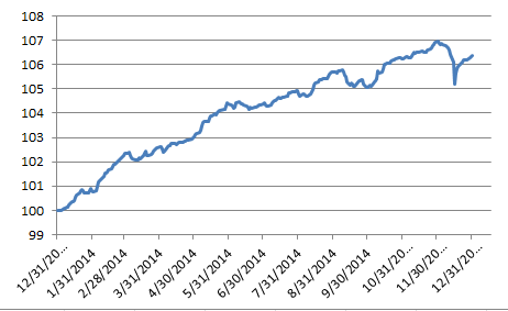
The yield on the U.S. 10-year Treasury bond, as measured by the S&P/BGCantor Current 10 Year U.S. Treasury Index, tightened by 13 bps to close at 1.83% on Jan. 16, 2015.  This closing rate, before the U.S. holiday on Monday, was in stark contrast to the prior day’s yield of 1.74%.  To match a 1.74% yield on the U.S. 10-year Treasury bond, we would have to look all the way back to May 2013.

Recently, the U.S. 10-year Treasury bond has been trading at 1.76%, as the market speculates that the European Central Bank (ECB) will start buying more bonds as part of its stimulus package.  Relative to European bonds, yields in the U.S. look attractive for European investors, as their domestic yields have been reaching record lows.  The yield of a German 10-year treasury bond is approximately 0.44% at this time, while the forex quote on U.S. dollar-to-euro rate is USD 1.156.  The currency exchange, which had dropped from USD 1.39 in March 2014 to a year-end value of USD 1.209, has continued its trend as the U.S. dollar continues to strengthen.

Exhibit 1: S&P/BGCantor Current 10 Year U.S. Treasury Index Yield-to-Worst
S&P BGCantor Current 10 Year U.S. Treasury Bond Index YTW Chart


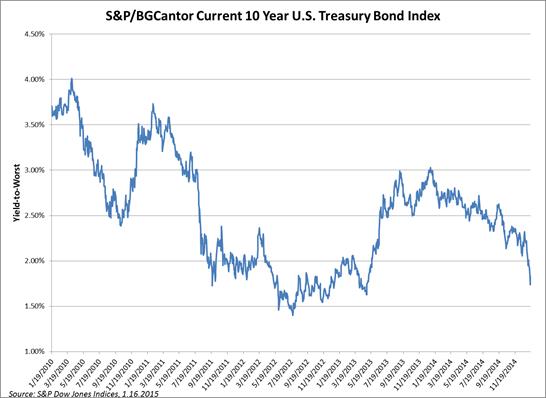
Source: S&P Dow Jones Indices LLC.  Yield-to-worst levels as of Jan. 16, 2015.  Charts and tables are provided for illustrative purposes only.  Past performance is no guarantee of future results.

The posts on this blog are opinions, not advice. Please read our Disclaimers.

Sukuk 2014 in Review

Contributor Image
Michele Leung

Former Director, Fixed Income Indices

S&P Dow Jones Indices

The Dow Jones Sukuk Total Return Index (Ex- Reinvestment) delivered a total return of 6.37% in 2014, which outperformed its 0.23% gain in the prior year; see Exhibit 1 for the index performance.

Exhibit 1: Total Return Performance of the Dow Jones Sukuk Total Return Index (Ex-Reinvestment)

Source: S&P Dow Jones Indices. Data as of December 31, 2014.  Charts are provided for illustrative purposes.
Source: S&P Dow Jones Indices. Data as of December 31, 2014. Charts are provided for illustrative purposes.

With the continued growth in the sukuk market, the total market value tracked by the index rose 32% to USD 48 billion, as of December 31, 2014.  Comparing the new issues in 2013 and 2014, both the count and the size grew; the average sukuk deal size reached 880k, see Exhibit 2 for the comparison.

Exhibit 2: New Issues Comparison

2013

2014

Total  Count

13

16

Total Par Amount

   10,800,000,000

          14,100,000,000

Total Market Value

   10,714,815,969

          14,655,559,089

Average Deal Size

830,769,231

                881,250,000

Source: S&P Dow Jones Indices. Data as of December 31, 2014.  Charts are provided for illustrative purposes.

Looking at the new issues in 2014, the biggest sukuk issuer was IDB Trust, totaling 3 billion, followed by Saudi Electric, totaling 2.5 billion.  There were new entrants in the sovereign sukuk space, such as South Africa (issued 500mio) and Hong Kong (issued 1 billion), and the returning issuer Indonesia (issued 1.5 billion).

The posts on this blog are opinions, not advice. Please read our Disclaimers.

Ports in the Storm

Contributor Image
Craig Lazzara

Former Managing Director, Index Investment Strategy

S&P Dow Jones Indices

Since last fall, the S&P 500 has gone through three distinct downdrafts.  Between September 18 and October 15, the index fell by 7.3%.   It recovered that lost ground, and then some, rising

500 18_Sept_14 to 14_Jan_15

11.8% through December 5.  Then a second, less severe, decline began, as the index fell 4.9% between December 5 and December 16, followed by a 6.0% recovery through December 29.  This brought the S&P 500 to its (so far!) all-time high.  From December 29 through yesterday’s close, the index is down an additional 3.7%.  Patterns in the S&P MidCap 400 and S&P SmallCap 600 Indices have been very similar to those in the 500.

The net of these gyrations is a total return of 0.6% in the 82 days since September 18, but with heightened volatility; the standard deviation of daily returns for the S&P 500 was 14.5%.  In the 82 days prior to September 18, the standard deviation of daily returns was only 8.0%.  So we have just come through a period that is relatively directionless but quite choppy; investors who are preoccupied by the chop may not even notice that their total returns are still positive.

One of the notable things about directionless, choppy markets is that defensive strategies tend to do surprisingly well.  The S&P 500 Low Volatility Index, e.g., rose by 8.7% since September 18 — mitigating the three periods of decline, while lagging the S&P 500 during its rebounds.  This pattern of protection in down markets and participation in up markets is typical of low volatility strategies, and seems to occur on a global basis.   The low volatility flavors of the S&P 400 and S&P 600 also provided protection in the recent down periods and participation in the up moves.  It’s not perfect protection, obviously, and it’s not full participation, but the record shows that all three low vol indices performed as we would have expected.

Low vol vs. vanillas

We’re dealing with only four months of data, of course, and past performance is never a guarantee of future results.  And it’s fair to say that low vol strategies have historically lagged in a strong market advance.  But for investors who want equity exposure, would prefer a smoother ride, and are willing to underperform in a strong market — low volatility strategies may offer a comfortable port in the storm.


The posts on this blog are opinions, not advice. Please read our Disclaimers.

These Assets Mix With Oil Like Water

Contributor Image
Jodie Gunzberg

Former Managing Director, Head of U.S. Equities

S&P Dow Jones Indices

While many assets have some relationship with oil, there are varying degrees of correlation and even a few surprises. For example, Canadian equities are more correlated with oil than are the emerging markets and the US equities; Australian equities are barely correlated with oil, and China who is not nearly as big a producer as a consumer is moderately correlated with oil.

Gold and (Brent) oil are not as oppositely related as many think but have a weak-moderately positive correlation of 0.32. (Correlation of +1.0 is perfectly positive, indicating assets move in lockstep, correlation of 0 indicates no relationship, and correlation of -1.0 is perfectly negative, indicating opposite movement. Generally the more negatively correlated the assets, the more diversification.) While gold straddles the line between a low and moderately positively correlated relationship, a few other asset show more diversification historically.

Real estate and bonds show little relationship with oil with correlations of 0.18 (REITs), 0.07 (S&P Case Shiller) but VIX is the one asset with even moderately negative correlation with oil of -0.32.

Oil Correlation


The posts on this blog are opinions, not advice. Please read our Disclaimers.

Fear of Fear Itself Reaches Crisis Levels

Contributor Image
Reid Steadman

Former Managing Director, Global Head of ESG & Innovation

S&P Dow Jones Indices

Franklin Delano Roosevelt would be disappointed. The US fear index, officially named the CBOE Volatility Index (VIX), has ticked up, averaging 16.4 since the beginning of Q4 2014, compared to 13.5 in the first three quarters of last year. If the story stopped there, we might still be able to look FDR in the eye. But we are in an even worse condition. Contrary to his advice, we are fearing “fear itself,” and doing so at levels typical of major crises, including the financial meltdown of 2008.

How do we know we are this anxious? The “VVIX” tells. The VVIX is an index that measures the volatility of VIX – in other words, the volatility of volatility.

I have seen people shake their heads in disbelief that the quants at CBOE would afflict us with an index so perplexing. If you think the same, it’s worth putting your reaction aside and getting to know this index. It says something interesting.

Here’s what you need to know about VVIX:

  1. It uses the same methodology as VIX, but instead of communicating the 30-day implied volatility of the S&P 500, it tells you the 30-day implied volatility of VIX itself.
  2. Instead of using options based on the S&P 500 in its calculation, this index uses VIX-based options.
  3. In terms of performance, VVIX and VIX are not as closely tied as VIX and the S&P 500. VVIX has spiked at different times when VIX has jumped, but when VIX is low, VVIX bounces around more than you would expect.
  4. Like VIX, VVIX is mean reverting, but it reverts to a much higher level. The average for the VVIX since 2007 – the first year when VVIX posted values for every trading day – is 86.1, compared to 21.8 for VIX for the same period.

With all this in mind, let’s take a look at a chart.

vvix

What jumps out is that VVIX in recent weeks and months is significantly up, even as VIX has stayed near its average. Why would this be? My honest answer is that I don’t know, but it could stem from the nature of the issues we are facing.

In many of the past crises, we have encountered challenges that were difficult to resolve but easy to define, in terms of timetable and influencing factors. An example would be the US government debt crisis of 2011. We were caught between two familiar political parties butting heads and creating uncertainty around the US national budget. Though we didn’t know the outcome at the time, the source of the uncertainty and the decision points that would determine what would happen in this crisis were widely known.

The challenges we are facing now are different. The drop in the oil price and the tensions between Russia and Ukraine are open ended – there is no known timetable for resolving these two issues – and they are much more complex in nature. The actions of many governments, companies, and individuals will determine how these crises evolve. To channel Donald Rumsfeld, all of this ambiguity creates worry about “unknown unknowns” and fear of fear itself.


The posts on this blog are opinions, not advice. Please read our Disclaimers.