Get Indexology® Blog updates via email.

In This List

The Great Barrier To Commodities Down Under

Asia Fixed Income: Dim Sum – What is on the Menu?

Active vs. Passive: How to keep score of the ongoing debate

Gold: Its History and Recent Trends

A Lesson in Last Week's Turmoil

The Great Barrier To Commodities Down Under

Contributor Image
Jodie Gunzberg

Former Managing Director, Head of U.S. Equities

S&P Dow Jones Indices

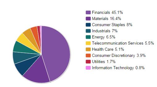
This week I am in Australia meeting with investors about commodities.  Usually when I visit a heavy natural resource producing country, the conversations flow easily since the locals understand commodities.  We have been discussing farms, coal, iron ore and tin – subjects that engulf the culture of the locals.  The Australians seem to know all about the public companies and private deals and are comfortable about the commodity exposure in their portfolio via their stock market, the S&P ASX 200.  You can see in the chart below that 16.4% of the Australian stock market is in Materials and 6.5% is in Energy.

Based on GICS® sectors The weightings for each sector of the index are rounded to the nearest tenth of a percent; therefore, the aggregate weights for the index may not equal 100%. AS OF SEP 30, 2014
Source: S&P Dow Jones Indices. Based on GICS® sectors. The weightings for each sector of the index are rounded to the nearest tenth of a percent; therefore, the aggregate weights for the index may not equal 100%. AS OF SEP 30, 2014

Given this profile, many Australian investors dismiss commodities as an asset class since they feel they already have exposure through equities.  Although the local commodities consist mainly of dry bulks like coal and iron ore that are not yet part of the global futures markets that make up the asset class, there is a great barrier to overcome the perception that the Australian stock market is highly correlated to global commodities.

In order to test the potential benefits of commodities to Australian investors, we evaluated diversification and inflation protection, the benefits many international and domestic US investors realize.  The results were different than what I expected.

First, the correlations of commodities to two major stocks BHP and RIO were only 0.16 and 0.18, respectively. That is not terribly surprising since these companies don’t produce agriculture or crude oil and also since coal and iron ore are not in the commodity benchmarks.  What was surprising is that the US stock market is over 3 times more correlated to commodities than the Australian stock market and that Australian stocks never saw a correlation spike from the global financial crisis.

Great Barrier correlation spike

Australian Commodity Correlation

The next question is whether the low correlation of 0.135 between the S&P ASX 200 and the S&P GSCI can overcome the low returns of commodities post the global financial crisis for an increase in portfolio efficiency.  While commodities didn’t add much to the Australian stock portfolio, they didn’t hurt. That is impressive even with a major allocation of 10% through the worst drawdown in history.

AUD Portfolio

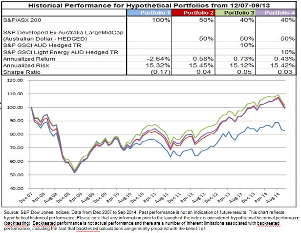
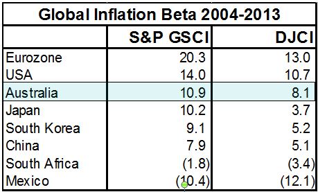
Notice the heavier oil in the S&P GSCI helped more than the more well diversified S&P GSCI Light Energy.  Another question around oil is whether the global commodity basket hedges inflation in Australia given the market doesn’t produce much crude oil. This answer wasn’t so surprising since it it not quite as strong as the inflation protection for Europe or the US, but for a small investment, it is still possible to get a great inflation protection as shown by its inflation beta.

Australian Inflation

SOURCE: S&P Dow Jones Indices

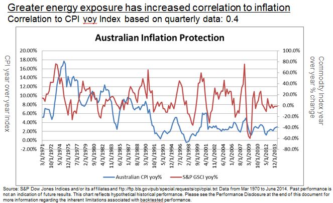
In conclusion, commodities as an asset class as represented by the global futures market has historically provided the diversification and inflation protection specifically to the Australian market.  The great barrier to commodity investing in Australia shouldn’t be so great, especially with the offering of products that enable the locals to access this market.

The posts on this blog are opinions, not advice. Please read our Disclaimers.

Asia Fixed Income: Dim Sum – What is on the Menu?

Contributor Image
Michele Leung

Former Director, Fixed Income Indices

S&P Dow Jones Indices

As tracked by the S&P/DB ORBIT Index, the size of the offshore renminbi bond market rose 66% year-to-date (YTD) and reached CNY 280 billion*, which reflected the robust supply in 2014. And if we look at the index exposure by issue year, the new issues in 2014 represent 53% of the index.

Exhibit 1: Index Exposure by Issue Year: The S&P/DB ORBIT Index

Source: S&P Dow Jones Indices. Data as of October 22, 2014. Charts are provided for illustrative purposes

While it is not surprising to see the index is dominated by Chinese issuers at 89%, there is a continuous trend of country diversification within the index. For example, some of the new index inclusions this year are Fonterra, a multinational dairy company from New Zealand and Cagamas, the national mortgage corporation from Malaysia.

There are also signs that the offshore renminbi bond market is developing into a more matured market. Bonds with longer tenors tapped into the market, i.e. the Beijing Enterprise, the Export and Import Bank of China and the Chinese government all issued with 10-year. In terms of the rating profile, 46% of index exposure is rated by at least one of international rating agencies, whereas the investment grade rated bonds account for 41% of the index.

Looking at the index performance, the S&P/DB ORBIT Index delivered a total return of 2.32% YTD, or 1.23% in USD. On the sector level, the S&P/DB Orbit Credit Index rose 2.40% YTD, which outperformed the S&P/DB ORBIT Sovereign and Quasi-Sovereign Index that gained 2.19% in the same period.

*Data are as of Oct 22, 2014.

The posts on this blog are opinions, not advice. Please read our Disclaimers.

Active vs. Passive: How to keep score of the ongoing debate

Contributor Image
Aye Soe

Former Managing Director, Global Head of Core and Multi-Asset Product Management

S&P Dow Jones Indices

At the heart of the active versus passive management debate lays the theoretical underpinning that the average return of both actively and passively managed assets must equal the aggregate market, thereby making it a zero-sum game. Since the costs of active management typically exceed those of passive management, the average actively managed dollar will underperform the average passively managed dollar after accounting for costs (Sharpe 1991). Over the past few decades, this debate has inspired many passionate believers on both sides, exhibiting its staying power as one of the more hotly contested financial theories.

As a way to keep score of the ongoing debate, S&P Dow Jones Indices (S&P DJI) started publishing the S&P Indices Versus Active (SPIVA®) Scorecard for the U.S in 2002. The scorecard measures the performance of actively managed domestic equity funds across various market capitalizations and styles, as well as fixed income funds, relative to their respective benchmarks. Results can vary on a year-over-year basis due to market conditions, with indices losing out to active funds in one year but winning in a subsequent year. However, the scorecard shows that over a longer-term investment horizon, most active managers have a difficult time outperforming their respective benchmarks. The five-year performance figures show the consistent losing pattern across most equity and several fixed income categories. In addition, the report dispels myths surrounding “inefficient” markets such as small caps and the emerging markets equities, the two areas in which active investing is perceived to offer opportunities due to the mispricing of securities.

Join us for a webinar on Wednesday, “Are Low-Cost, Passively Managed ETFs the Solution to Performance Challenges?” for an opportunity to hear in-depth discussion around active versus passive debate and the SPIVA Scorecard results from various global markets.

The posts on this blog are opinions, not advice. Please read our Disclaimers.

Gold: Its History and Recent Trends

Contributor Image
Utkarsh Agrawal

Associate Director, Global Research & Design

S&P Dow Jones Indices

During festivals such as Diwali, the demand for gold in India increases because it is considered auspicious.  Traditionally, people invested in physical gold bars, coins and jewelry.  However, after the introduction of the gold ETF, the option to invest in gold also became popular.  There was a huge growth in the assets under management for gold ETFs compared with ETFs in other asset classes.

Investors purchased gold as a way to preserve value and hedge against inflation and recession.  Gold was in a bull run until the year 2012, and the average asset under management in gold ETFs peaked at INR 119 billion in Q1 2013, but since then it has declined.

Exhibit 1: Average Assets in Gold ETF’s in India 

Gold 1

Source: Association of Mutual Funds of India.  Data as of Sept. 30, 2014 

The Federal Reserve introduced tapering after confidence of the sustained improvement in the U.S. economy was restored.  Tapering led to the strengthening of the U.S. dollar, which exerted downward pressure on the price of gold.  The import restrictions in India, the second largest consumer of gold, exacerbated the situation.

The Indian government and the Reserve Bank of India introduced a series of measures in 2013 in an effort to curb the import of gold and improve the current account balance of payments of India.  The introduction of the 80:20 rule, under which 20% of the imports must be re-exported, and an increase in import tariffs has reduced the amount of gold imported, and it has increased gold’s premium in the local market compared with that of the global market.

Looking at Exhibit 2, we can see that the S&P GSCI® Gold TR, which measures the returns accrued from investing in fully collateralized gold futures contracts, has been in a declining trend.  It has lost nearly 8.91% and 9.78% over the one- and three-year periods ending in September 2014, respectively.

There has also been a shift in the sentiment toward investments in equity and bond markets because of higher returns.  These all are included as some of the reasons for the decline in the price of gold after the 11-year bull run.  However, with the ongoing economic crisis in Europe and among the emerging markets, gold may still benefit as a safe haven hedging tool.

Exhibit 2: S&P GSCI Gold TR 

Gold 2

Source: S&P Dow Jones Indices LLC.  Data as of Oct. 15, 2014.  Charts and tables are presented for illustrative purposes.  Past performance is no guarantee of future results.


The posts on this blog are opinions, not advice. Please read our Disclaimers.

A Lesson in Last Week's Turmoil

Contributor Image
David Blitzer

Former Managing Director and Chairman of the Index Committee

S&P Dow Jones Indices

The market action in US stocks and Treasuries last week, especially on Wednesday, may be an experience that many investors would like to forget.  On Wednesday volume in US treasuries set a record as yields collapsed, stocks nose-dived and VIX topped 30 after opening the week at about 20.  As horrifying, or exciting, as it was, there may be lessons buried in the numbers.

Rarely does one specific event cause this kind of market turmoil; rather many sources of investor anxiety crowd together.  Among the protagonists were Ebola fears, slow European economies, weak US retail sales, and the Middle East.  Over-riding all of this was the growing conviction that the markets were surely in a correction, if not something worse, and no one would even guess where the bottom might be. As downward momentum gains strength it persuades investors that they should be getting out.  When that happens, investors want to sell the dogs — their least attractive unwanted and illiquid holdings.   But these are exactly the positions that are hardest sell if there is a market and impossible to unload if the market vanishes into the turmoil.

The response? Investors have no choice but to sell what they can sell, not what they want to sell.  What can they sell in the midst of the storm?  Anything in the deepest markets:  either US stocks or US Treasuries.  Last week the focus of fear was on equities and the answer was selling US stocks.  Hedging also may have been driving the market.  Equity investors who wanted a hedge for down side protection would have chosen the liquidity in S&P 500 futures.  Short futures positions can be read as a sign that stocks will fall further and may add to downward momentum.

While Wednesday’s action in US Treasury notes was more of a buying panic, the week’s events could be a hint of what might happen when the Fed finally does raise interest rates.   Some time, probably next year, the FOMC meeting notes will announce that monetary policy is being tightened and interest rates will rise.  Investors in a rush to sell unwanted bonds will find the only liquid market is 10 year Treasuries; they will be forced to keep junk bonds and sell, or short, treasuries. Others simply looking for a hedge will also short treasuries.  Those illiquid unwanted bonds will then be re-priced at lower levels consistent with the falling prices on over-sold US treasuries.   Fixed income prices could cascade downward.  It has happened before in the early 1990s when the Fed tightened more aggressively than expected and mortgage-backed bond traders got caught in a rush to the exit.

The posts on this blog are opinions, not advice. Please read our Disclaimers.