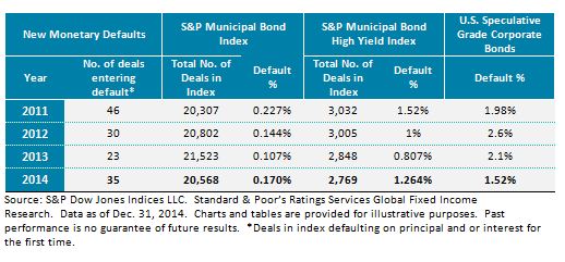
In 2014, the default rate of the S&P Municipal Bond Index rose for the first time since 2011, finishing the year at 0.17%. In 2013, the overall default rate fell to 0.107% from 0.144% in 2012. The corporate bond sector of the municipal bond market has historically been one of the sectors where bonds have a higher propensity to default. That was the case in 2014. The Energy Future Holdings Corporation default (previously TXU) accounted for over 17% of the deals entering default in 2014.
Based on the index data, the high-yield municipal bond default rate also jumped from 0.807% to 1.264% in 2014. In comparison, according to Standard & Poor’s Ratings Services Global Fixed Income Research estimates, the 2014 U.S. speculative-grade corporate bond default rate was 1.52%. Combining this data reveals a definitive trend: Historically, municipal bonds have had a lower propensity to default. Default data from 2014 suggest that this trend may be correcting itself in the high yield space.
The number of deals tracked in the index has declined in 2014 as the pace of new issues qualifying for the index did not outpace bonds maturing.
The S&P Municipal Bond Index has been a live benchmark since Dec. 31, 2000. The index tracks over 79,000 bonds from over 22,000 different issuers, and it represents a market value of more than USD 1.5 trillion. Some unique features of the index are that it is designed to measure bonds throughout their “lifetime,” meaning from issuance to maturity (as of the index rebalancing date, the bond must have a minimum term to maturity or complete call date greater than or equal to one calendar month), and it includes bonds that range in quality from “AAA” to “Default.” By keeping bonds in the benchmark even when a default occurs, the index has become a living timeline, allowing us to track the municipal bond default rate. The vast swath of the municipal bond market tracked by the S&P Municipal Bond Index makes this analysis possible.


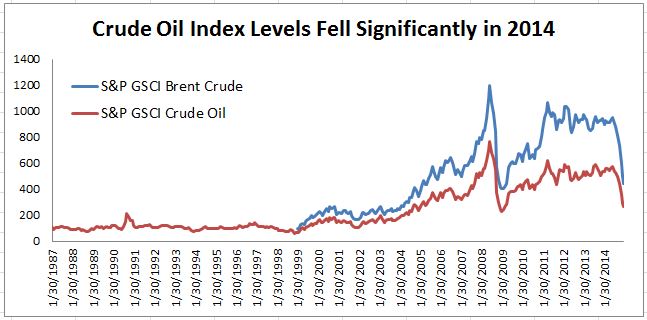 Source: S&P Dow Jones Indices. Data from Jan 30, 1987 to Jan 8, 2015. Past performance is not an indication of future results.