Get Indexology® Blog updates via email.

In This List

Low Chinese CPI: A Commodity Catalyst?

How Do You Communicate Risk Management in a Year When it Doesn’t Matter?

A Comparison in Market Performance for First Six Months of Modi in 2014 versus First Six Months of Manmohan in 2009

Crisis and Opportunity

Déjà Vu All Over Again

Low Chinese CPI: A Commodity Catalyst?

Contributor Image
Jodie Gunzberg

Former Managing Director, Head of U.S. Equities

S&P Dow Jones Indices

Following weak Chinese economic data, several headline stories broke about commodities crashing although the only sectors with consistent losers are energy and grains.  One news story stated, “Copper prices resumed their decline on Wednesday, after data showed that inflation in China slowed to the lowest level in five years, underling concerns over a slowdown in the world’s second largest economy.”

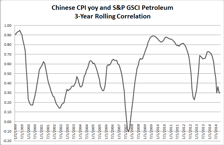
This might seem backwards given the CPI is a reflection of historical prices rather than an expectation of future prices. However, despite Dr. Copper’s lack of smarts and historical evidence showing very little predictive ability of copper prices on GDP growth not only from China but around the world, maybe Chinese CPI holds a secret about the behavior of commodity prices. The chart below shows Chinese CPI yoy% versus the S&P GSCI Gold, Copper and Petroleum. It is no surprise to see a relationship between Chinese CPI and supposedly economically sensitive commodities, copper and oil.

Source: S&P Dow Jones Indices LLC. All information presented prior to the index launch date is back-tested. Back-tested performance is not actual performance, but is hypothetical. The back-test calculations are based on the same methodology that was in effect when the index was officially launched. Past performance is not a guarantee of future results.  Please see the Performance Disclosure at http://www.spindices.com/regulatory-affairs-disclaimers/ for more information regarding the inherent limitations associated with back-tested performance.

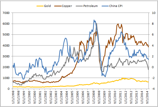
CPI (Consumer Price Index), despite the region, is a measure of prices of a basket of goods. It makes sense to see a relationship between commodity prices and CPI since the same food and energy that is in CPI is in the commodity indices.  Given the energy price drop, the lower than expected Chinese CPI shouldn’t be much of a surprise, but if it is a surprise, it might not be a negative surprise for the future of commodity prices.

A slowdown in Chinese inflation could be a catalyst for commodities if the chance of rate cuts and monetary easing increases. Historically back to 1999, the S&P GSCI Petroleum has had a generally positive correlation to Chinese CPI.

Source: S&P Dow Jones Indices LLC. All information presented prior to the index launch date is back-tested. Back-tested performance is not actual performance, but is hypothetical. The back-test calculations are based on the same methodology that was in effect when the index was officially launched. Past performance is not a guarantee of future results.  Please see the Performance Disclosure at http://www.spindices.com/regulatory-affairs-disclaimers/ for more information regarding the inherent limitations associated with back-tested performance.

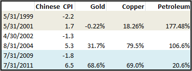
If Saudi continues to pump oil to hold its market share, then maybe oil has further to drop (and Chinese CPI) but since the troughs of Chinese CPI, commodities have performed well. The chart below shows the time periods of trough negative Chinese CPI to peaks in history with generally large returns of commodities following the low inflation. On average in these three periods, the S&P Gold, Copper and Petroleum returned 33.3%, 55.6% and 101.6%, respectively.

China CPI Returns

Source: S&P Dow Jones Indices LLC. All information presented prior to the index launch date is back-tested. Back-tested performance is not actual performance, but is hypothetical. The back-test calculations are based on the same methodology that was in effect when the index was officially launched. Past performance is not a guarantee of future results. Please see the Performance Disclosure at http://www.spindices.com/regulatory-affairs-disclaimers/ for more information regarding the inherent limitations associated with back-tested performance.

The posts on this blog are opinions, not advice. Please read our Disclaimers.

How Do You Communicate Risk Management in a Year When it Doesn’t Matter?

Contributor Image
Shaun Wurzbach

Managing Director, Head of Commercial Group (North America)

S&P Dow Jones Indices

The S&P Dow Jones Indices Financial Advisor Channel has followed the progress of Exchange Traded Fund (ETF) Strategists with interest for over four years. In fact, we have developed close working relationships with many of those firms. They are often champions of indexing; power-users of ETF use in portfolio management. Whether one tracks ETF strategists by assets under management (AUM) or inflows, the last four years have shown that business has been good for these firms as a collective body in asset management. That track record of double-digit growth hit a speed-bump in Q3 2014. According to Ling-Wei Hew of Morningstar, AUM for ETF strategists fell 6% in Q3, a reversal taking them back to 2013 levels.

Why the outflows? Blame it on the long bull run of the S&P 500. Ling Wei Hew reports in Q3 2014 ETF Managed Portfolio Landscape that 33% of ETF strategists follow a US equity strategy. In this year and last, many of these strategies have underperformed the S&P 500.

Is the S&P 500 a fair benchmark for these ETF Strategists? Many that I have spoken with would prefer a different benchmark. The ubiquity of the S&P 500 as a benchmark means they end up choosing it themselves anyway or it is forced on them by default in the way they are ranked and analyzed. Being benchmarked against the S&P 500 is appropriate if the objective of the fund or portfolio is US large cap exposure. S&P DJI has proposed that kind of benchmarking and comparison for years in our S&P Index vs Active (SPIVA) US scorecard. But benchmarking tactical or risk-managed portfolios against the S&P 500 fails to provide the same level of “apples to apples” comparison which is the hallmark of our SPIVA and Persistence Scorecard research.

Why isn’t the comparison of the S&P 500 to a US risk-managed portfolio an “apples to apples” comparison? The Chief Investment Officers and portfolio managers of a risk-managed portfolio seek to provide risk-managed exposure to equity markets. Risk-managed usually means having a goal of limiting asset loss during protracted or recessionary downturns or preventing Black Swan-type risks of loss. This goal of risk management is sought simultaneously with the goal of capturing as much equity market growth as possible. By contrast, the S&P 500 seeks to be the best single gauge of large cap US equities. So do the outflows in US Tactical and risk-managed ETF portfolios suggest that clients have changed their mind about the value of risk-management embedded in these strategies? The S&P 500 Total Return Index (dividends included) has returned 76.83% over the last 3 years and 122.2% over the last 5 years. The timing of these outflows suggests an emergence of a second risk that investors may be concerned about – the risk of missing out.

The cost of risk-managed portfolios can be compared to the cost of insurance. In a similar way, one can imagine that the more risk-sensitive an investor is, the more “insurance” they might want. To carry the insurance analogy one step further, imagine an auto driver looking back at his past five years of safe driving and thinking that 5 years of insurance premiums were paid for with no benefit. With no laws or regulations requiring “insurance” for portfolios, an investment in a risk-managed portfolio must be perceived by the investor as more of a benefit than a cost. The value of risk management must be hard to communicate after years when protecting against that risk didn’t seem to matter…in hindsight.

This is the first post in our risk management series. Stay tuned for more posts from guest bloggers on this topic.

The posts on this blog are opinions, not advice. Please read our Disclaimers.

A Comparison in Market Performance for First Six Months of Modi in 2014 versus First Six Months of Manmohan in 2009

Contributor Image
Mahavir Kaswa

Former Associate Director, Product Management

S&P BSE Indices

As of Nov. 26, 2014, Modi “Sarkar” (Modi’s government) has completed six months of leading the central government.  Since Mr. Modi assumed office, there have been high expectations from the corporate community, not just in India, but across the world.  This is represented by the barometer of the market in India: the S&P BSE SENSEX.  Over the past few months, the S&P BSE SENSEX has repeatedly recorded new all-time highs.  A similar atmosphere was seen in 2009, when it became clear that there would not be a hung parliament and that the UPA would form the government; the S&P BSE SENSEX recorded a steady increase, recovering from the bottom of the financial crisis.

The recent strong performance of the S&P BSE SENSEX has prompted close study of the market performance during the initial period of both of these Indian governments.  For this analysis, we have taken a base date of six months from the date of formation of each government.  As elections are announced, the market tends to be more sentimental, which is why we chose to begin measuring the performance from the election announcement date.  Exhibit 1 shows the key dates of comparison, from the election announcement until six months after the formation of the government.

ResultSource: Asia Index Private Ltd.  Charts and tables are provided for illustrative purposes.

The S&P BSE SENSEX showed higher returns during the initial period of Manmohan’s government (UPA 2009) than during the same period of Modi’s government (NDA 2014) (see Exhibit 2).  What is more interesting to note is that in 2009, from the announcement of the election results until the completion of six months of Manmohan government, S&P BSE SENSEX almost doubled.  During the same period of Modi’s government in 2014, the S&P BSE SENSEX had total returns of approximately 35%.

Exhibit 2: Total Returns 

Source: Asia Index Private Ltd.  Total Returns in INR.  Charts and tables are provided for illustrative purposes.  Past performance is no guarantee of future results.

Another interesting statistic to note here is that for the period from the election announcement through the completion of six months in office for each prime minister, the GICS® financials has contributed the most to the total returns generated by S&P BSE SENSEX out of any sector (see Exhibit 3).

Exhibit 3: Returns from Election Announcement versus Financial Sector

Results 2Source: Asia Index Private Ltd & Bloomberg.  Total Returns in INR. Charts and tables are provided for illustrative purposes.  Past performance is no guarantee of future results.

Furthermore, during the same measurement period for Manmohan’s government in 2009, there were 15 trading sessions in which the S&P BSE SENSEX closed above 3% (by total return).  Meanwhile, during the same period for Modi’s government in 2014, there was no trading sessions that closed above 3%.

Could these levels of performance simply be contributed to the expectations of the ruling government?  We believe the answer is no.  It would be unfair to attribute market performance exclusively to sentiments toward the expected or ruling government.  However, this is certainly one of the many factors.  Other factors that may affect the market may include growth rate, inflation, past market performance, growth of major economies across the world and more.

The posts on this blog are opinions, not advice. Please read our Disclaimers.

Crisis and Opportunity

Contributor Image
Craig Lazzara

Former Managing Director, Index Investment Strategy

S&P Dow Jones Indices

Last Saturday’s Wall Street Journal carried an excellent list of “16 Rules for Investors to Live By.”  I was particularly impressed by rule #1: “All past market crashes are viewed as opportunities, but all future market crashes are viewed as risks.”  Serendipitously, the 16 rules followed close on the heels of our latest white paper, which deals with many of the same concepts.  In particular, volatility rises when markets crash, and volatility and opportunity are closely related.

It’s comparatively well-understood that changes in volatility are negatively correlated with returns; it’s less well-known that higher levels of volatility are also negatively correlated with returns.  Below we’ve charted the average monthly change in the Dow Jones Industrial Average against its concurrent monthly volatility.   Although there’s no relationship to speak of in the middle quintiles, the lowest quintile of volatility shows the highest average returns, and the highest quintile of volatility shows the lowest average returns.

Vol levels and returns
Source: S&P Dow Jones Indices LLC, The Landscape of Risk, 2014. Data from July 1896 to July 2014. Charts and tables are provided for illustrative purposes. Past performance is no guarantee of future results.

These data make the connection between volatility and return on a short-term basis.  But is there opportunity in high volatility?  For investors willing and able to look beyond a one-month holding period, perhaps so; if volatility indicates distress for existing investments, it may signal an attractive entry point for new ones.   We tested this hypothesis by calculating returns for holding periods of various lengths, conditioned on whether volatility is above or below the 85th percentile of the distribution.  Given the relationship between high volatility and low returns, it’s not surprising that investments made during periods of lower volatility outperform over short holding periods (up to about 11 months).  After that, however, fortune favors the bold:

Source: S&P Dow Jones Indices LLC, The Landscape of Risk, 2014.  Data from July 1896 to September 2012.  Charts and tables are provided for illustrative purposes.  Past performance is no guarantee of future results.
Source: S&P Dow Jones Indices LLC, The Landscape of Risk, 2014. Data from July 1896 to September 2012. Charts and tables are provided for illustrative purposes. Past performance is no guarantee of future results.

The J curve illustrates why investing in periods of high volatility has been compared to “catching a falling knife.”  The risk of short-term loss is significant (and bottoms at about the 8-month point).  Thereafter, the advantage goes increasingly to investors who bought during periods of high volatility.

There’s a reason why the British financier Nathan Mayer Rothschild is reputed to have said “Buy when there’s blood in the streets, even if the blood is your own.”  It may be true that all future market crashes will be viewed as risks when they are happening.  But it’s equally true that they may appear, in retrospect, as opportunities.

The posts on this blog are opinions, not advice. Please read our Disclaimers.

Déjà Vu All Over Again

Contributor Image
Kevin Horan

Former Director, Fixed Income Indices

S&P Dow Jones Indices

The end of 2014 feels a lot like the end of 2013 in regard to fixed income market sentiment.  As the Yogi Berra quote goes: “it’s déjà vu all over again”.

The yield of the S&P/BGCantor Current 10 Year U.S. Treasury Index reached a high of 3.03% on December 31st as investors debated the impact of the Fed’s eventual reduction in stimulus which now is commonly known as the “Taper Tantrum”.  The current level of yield for the index is nowhere near 3% at its current level of 2.31%, though it has increased by 17 basis points from the year’s low of 2.13% (10/15/2014).

When looking ahead to 2015, again the Fed will play a big role in the direction of the fixed income markets.  Investors are looking ahead to an expected rate increase.  The question is how soon and how aggressively will the Fed act and to what impact will such action have on both short and long term investments.

In the near term the need for yield will continue and if healthy economic growth continues, the balance sheets of these speculative rated companies should remain intact.  The S&P/LSTA U.S. Leveraged Loan 100 Index which currently yields 4.85% had an October positive returns of 0.61% and 0.36% for November which helped this index return 1.9% year-to-date.

Bank Loans are likely to be hurt less by higher market rates than their high yield fixed rate counterparts.  The average floor on a loan is 1% so Libor would have to move up significantly from its current level of 0.24%, but once the floor is breeched, the instrument become more floating in nature moving up with rates.


The posts on this blog are opinions, not advice. Please read our Disclaimers.