Below are some quotes from the latest Oil Market Report from the IEA that may overpower Chinese slowing demand growth – even with a surprise interest rate cut.
“there is a degree of opacity”
“The Chinese administration does not routinely disclose information… thus little up‐to‐date official information is available”
“A particular uncertainty concerns the division between commercial and government storage”
“unreported stock building could be occurring at unreported commercial sites”
What are these quotes referencing? The Strategic Petroleum Reserve (SPR). Although China does not report what analysts are seeing as strategic buying on the oil price dip, (S&P GSCI Brent Crude is -31.2% off its peak Jun 19- Nov 21, 2014), the IEA guesses China added 13.5 million barrels in September as extra cargoes from Saudi Arabia, Kuwait, Iraq and Oman were imported. This brings the 2014 YTD total to an estimated 105 million barrels of unreported stock build that is far more than the 89 mb posted in 2012 when a portion of Phase 2 SPR capacity was filled.
Now the question remains how much more capacity does China have to fill up their strategic reserve sites. Construction delays may inhibit imports but if oil prices remain low, the government may put extra resources toward speeding up the build of reserve sites.
However, it is not all about oil. China has a powerful capability to stockpile commodities and deploy resources when they need them by taking off inventory or increasing production where possible. Especially in non-perishable commodities like cotton, nickel, lead, zinc and copper. It is easy to blame the commodity price drops (as shown in the chart below) on slowing Chinese demand but by examining a few commodities that have fallen far from their peaks, the secret becomes apparent.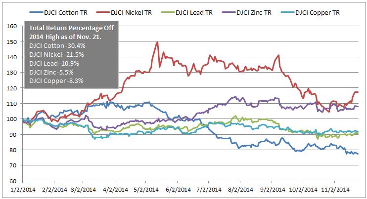
Source: S&P Dow Jones Indices LLC. All information presented prior to the index launch date is back-tested. Back-tested performance is not actual performance, but is hypothetical. The back-test calculations are based on the same methodology that was in effect when the index was officially launched. Past performance is not a guarantee of future results. Please see the Performance Disclosure at http://www.spindices.com/regulatory-affairs-disclaimers/ for more information regarding the inherent limitations associated with back-tested performance.
Chinese supply is a key factor, especially in an inventory sensitive environment that is mean reverting. Nickel, which was coined the new gold for the year, is now down 21.5% from its peak. It’s not from slowing Chinese demand nor is it from Indonesia lifting its ban. The metal is pouring out of Chinese warehouses into the LME system, and what no-one expected was that the Philippines would partner with China to lift production and exports to the extent that it has.
Also, according to the LME (London Metal Exchange), the latest zinc data suggests while demand is positive that there may be unreported stock building and that China is the key wild card. Further, they report that China is responsible for keeping the aluminum market in surplus. Last, the growth in refined output of copper is said to be driven by capacity additions and start-ups in China that is projected to lead China to have the lowest net imports in 2015 since 2008.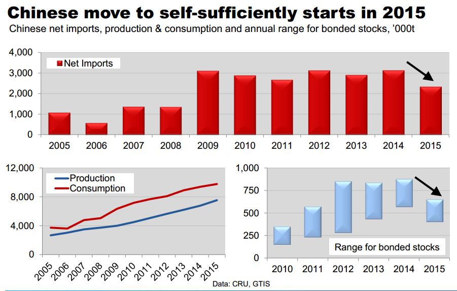
The posts on this blog are opinions, not advice. Please read our Disclaimers.


 Like Preferreds, the difference in yield between the