Get Indexology® Blog updates via email.

In This List

15 Years of SPIVA – Where Does the Active Versus Passive Debate Go From Here?

Managing Risk While Heading for Returns

Multi-Factor Merits: Are You Putting All Your Eggs in One Single-Factor Basket?

Is Trump Making Commodities Great Again In His First 100 Days?

Gold Just Did This for Its First Time Ever in April

15 Years of SPIVA – Where Does the Active Versus Passive Debate Go From Here?

Contributor Image
Aye Soe

Former Managing Director, Global Head of Core and Multi-Asset Product Management

S&P Dow Jones Indices

In the inaugural publication of the Journal of Portfolio Management in 1974, Nobel Laureate Paul Samuelson wrote that there is no “brute fact” that “there could exist a subset of decision makers in the market capable of doing better than the averages on a repeatable, sustainable basis.”[1]  That article partly inspired John Bogle to launch the first index mutual fund.[2]  Even though over four decades have passed since Paul Samuelson penned the article, his words remain relevant to today’s world of investing.

This year marks the 15th anniversary of S&P Dow Jones Indices publishing the SPIVA® U.S. Scorecard.  A lot has changed in the asset management industry since we started reporting on the active versus passive debate.  The proliferation of index-linked investment products and the low-cost, efficient ways they can provide exposure to desired asset classes and markets have been disruptive, adding a tremendous amount of pressure on active managers in terms of fees and performance.  At the same time, the line between what has traditionally been considered beta versus alpha has blurred, with the passive side continuing to innovate and replicate strategies that once sat predominantly in the active realm.

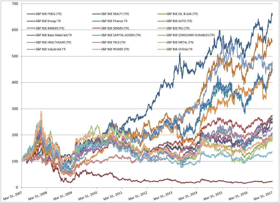
Amid that shifting landscape, the SPIVA Scorecard has maintained its objective voice as an independent scorekeeper of the active versus passive debate.  It has demonstrated that over a long-term investment horizon, average active managers across market cap segments and styles have underperformed their respective benchmarks.  Exhibit 1 shows the rolling three-year relative performance of actively managed domestic large-, mid-, and small-cap funds against their respective benchmarks[3].

Moreover, the outperformance that winning active managers have generated has been shown to be fleeting.  Through a number of studies, we have found that managers that outperform their benchmarks in a given year or are in the top quartile of their peer groups are unlikely to repeat their winning streak repeatedly.[4]  For example, we studied over 789 large-cap, 383 mid-cap, and 511 small-cap funds on average on a rolling quarterly basis from March 31, 2003, to Sept. 30, 2016 (see Exhibit 2).  We found that out of the 20%-30% of funds that outperformed their benchmark in a given year, only a small subset were able to repeat that outperformance in the subsequent three years (see Exhibit 2).[5]

Taken together, these findings indicate that market participants may face substantial difficulty in identifying a winning manager in advance.  They also pose the challenging question of how one should go about measuring the success of active management.  If net-of-fees returns (and, in many equity markets, gross-of-fees returns)[6] are not high enough to overcome benchmark returns across all market cycles and the outperformance produced is fleeting, what should constitute the evaluation framework for active management?

With that, the active versus passive debate turns a new chapter.  Given that fees contribute partly to managers’ underperformance,[7] it seems clear that closet indexing at high costs cannot be sustainable.  For active management to add value and separate themselves from passive strategies, focusing on differentiated portfolio construction or strategies in which managers take compensated bets, along with outcome-oriented investment solutions, can serve as ways to promote their skills.

Only time will tell whether these differentiated strategies can deliver higher risk-adjusted returns than their passive counterparts.  It seems clear that the active versus passive debate is evolving and heading in a new direction in which active management could become more active.

[1]   Paul Samuelson, “Challenge to Judgement”. The Journal of Portfolio Management 1974.

[2]   John C Bogle, “Lightning Strikes: the Creation of Vanguard, the First Index Mutual Fund, and the Revolution It Spawned”. The Journal of Portfolio Management. Special 40th Anniversary Issue

[3] See the SPIVA U.S Year-End 2016 Scorecard

[4]   See the Persistence Scorecard.

[5]   See Fleeting Alpha: Evidence from the SPIVA and Persistence Scorecards.

[6]   See Institutional SPIVA Scorecard – How Much Do Fees Affect the Active Versus Passive Debate?

[7]   See Institutional SPIVA Scorecard – How Much Do Fees Affect the Active Versus Passive Debate?

The posts on this blog are opinions, not advice. Please read our Disclaimers.

Managing Risk While Heading for Returns

Contributor Image
Koel Ghosh

Former Head of South Asia

S&P Dow Jones Indices

Returns are definitely one of the key influencers of investment decisions.  However, poor governance can result in failures, as too much emphasis on returns may result in ignoring the need to understand and manage the potential risk.  It is important to understand the risks associated with an investment strategy.  Risk can have different interpretations depending on the situation; it could be seen as an opportunity for one and an avoidable situation for another.  Many portfolio strategies target the dual objective of growth and prevention of loss of capital.  Hence, it is imperative to adopt superior risk management processes.

Assessing the risks associated with portfolio strategies or investment decisions has multiple benefits. Risk can be quantitative or qualitative in nature, and assessing the different types can help manage volatility or limit downside potential.  A well-defined risk management approach is beneficial during market turbulence, when impulsive decisions can lead to losses and overlooking the scope of long-term wealth restoration or creation.

There are various tools that are used for risk management, such as diversification, balanced asset allocation, and monitoring of the goals and the portfolio.  Diversification is not considered a guarantee or a perfect solution, but rather it is a tool to manage risk and reward by choosing a mix of assets to help spread the risk, compared with a concentrated strategy that can be overweight in certain asset classes or sectors.

Passive, or index-based, investing can be a great way to diversify a portfolio or strategy.  Indices can be used to represent an asset class in the asset allocation process, and historical index data helps in probability analyses.  To demonstrate diversification via sectors, we can view the various sectors of the S&P BSE Indices that display trends over the past 10 years.  The S&P BSE SENSEX, a well-diversified market benchmark, is designed to measure 30 stocks that represent all 10 key economic sectors in India.[1]  This is where we can observe a diversified strategy.  There are sectors that have outperformed the diversified S&P BSE SENSEX, but some sectors have underperformed.  A historical analysis helps to identify the underperforming sectors, but when portfolio management strategies are constructed, we cannot know what certain sectors, regions, or strategies may outperform in the future.  Therefore, diversification can be a useful tool to help balance a strategy.

Strategies that bear investment and longevity risk because they hold funds for a longer amount of time may need to adopt sound risk management practices in order to obtain better protection against potential risk.

Exhibit 1: S&P BSE Sector Indices

Source: Asia Index Private Limited.  Data from March 2007 to March 2017.  Past performance is no guarantee of future results.  Chart is provided for illustrative purposes.

Exhibit 2: S&P BSE Sector Indices 

Indices Returns (%)   Annualized Returns (%)
Total Returns 1 MTH 3MTH YTD 1 Year 3 Year 5 Year 10 Year
S&P BSE Finance TR 5.55 20.24 20.24 39.21 21.68 17.73 15.60
S&P BSE Fast Moving Consumer Goods TR 5.36 14.07 14.07 22.21 11.60 17.38 20.44
S&P BSE Healthcare TR -0.44 4.04 4.04 1.45 15.55 18.98 16.34
S&P BSE Basic Materials TR 3.55 20.53 20.53 54.31 20.12 12.05 9.80
S&P BSE Consumer Discretionary Goods & Services TR 5.21 17.15 17.15 31.17 24.72 20.07 11.16
S&P BSE Energy TR 2.91 16.04 16.04 39.01 15.24 13.09 9.29
S&P BSE Telecom TR -3.29 11.48 11.48 -2.69 1.59 2.28 -3.04
S&P BSE Information Technology TR -0.10 2.06 2.06 -7.16 7.90 13.45 9.66
S&P BSE BANKEX (TR) 4.00 17.70 17.70 34.07 19.95 17.19 15.55
S&P BSE AUTO (TR) 2.61 8.87 8.87 23.07 19.50 18.22 18.01
S&P BSE Industrials TR 5.94 15.32 15.32 26.64 15.26 12.58 8.14
S&P BSE Utilities TR 2.56 13.19 13.19 33.51 14.88 5.68 6.67
S&P BSE POWER (TR) 3.58 15.36 15.36 30.18 11.29 3.51 2.83
S&P BSE METAL (TR) 0.95 18.76 18.76 60.33 9.32 3.95 5.67
S&P BSE OIL & GAS (TR) 0.94 13.86 13.86 53.19 15.76 13.68 9.78
S&P BSE CAPITAL GOODS (TR) 7.28 20.51 20.51 29.15 12.04 11.64 7.13
S&P BSE REALTY (TR) 7.02 26.59 26.59 30.38 3.73 -1.22 N/A
S&P BSE CONSUMER DURABLES (TR) 10.74 35.78 35.78 32.98 33.51 19.81 16.56
S&P BSE TECK (TR) 0.21 5.24 5.24 -3.73 7.54 12.00 6.52
S&P BSE SENSEX (TR) 3.19 11.50 11.50 18.46 11.43 12.96 10.08

Source: Asia Index Private Limited.  Data as on 31 March 2017.  Past performance is no guarantee of future results.  Table is provided for illustrative purposes.

[1]   Note: The S&P BSE Indices sectors are based on the BSE sector classification.

The posts on this blog are opinions, not advice. Please read our Disclaimers.

Multi-Factor Merits: Are You Putting All Your Eggs in One Single-Factor Basket?

Contributor Image
Andrew Innes

Head of Global Research & Design

S&P Dow Jones Indices

It is undeniable that an individual investor would need considerable skill (or luck) to navigate optimally between the various single-factor equity strategies.  If the goal is to outperform the benchmark, then simply choosing between a quality, value, momentum, or low volatility strategy may present the biggest risk.  While they all have been shown to hold a unique systematic risk premium that may provide returns over the long term, how can the shorter-term drawdowns of each be avoided?  How could an individual investor expect to have the foresight to know which single factor will outperform in the coming years—especially since they all tend to perform differently depending on the market environment and economic cycle?

One solution to this conundrum could be in choosing not to choose.  Diversification is often described as the only free lunch in finance, so why not grab a plate and help yourself to a multi-factor buffet?  The results are compelling.

Because the active returns of single-factor strategies often tend to have negative or low correlations, a simple equal-weight allocation to the four key single-factor strategies of the S&P 500® can lead to significantly higher probabilities of outperformance.  Using a simple multi-factor “index of indices” approach, we can show that the frequency of risk-adjusted outperformance can be just as good, if not better, than picking the best-performing, single-factor strategy.

If this simple, yet effective, multi-factor index of indices approach is not satisfactory, an investor could decide to go one step further; choosing to combine multiple factor scores at the stock level.

This approach selects the top quintile of the S&P 500 based on the average of its multi-factor scores, targeting stocks that have the highest combination across the desired factors.  In practice, some compromises may be necessary; stocks with high exposures to all factors are rare.  However, the stock-level approach seeks to select the stocks with highest attainable factor combinations in an attempt to improve the portfolio’s overall factor exposures.

The new S&P 500 Quality, Value & Momentum Multi-Factor Index is an example of this type of stock-level approach.  Exhibit 3 shows the average risk/return figures over 15-year rolling windows for both multi-factor approaches and their corresponding single-factor strategies.  Take a look at the top-left of Exhibit 3, where the highest returns and lowest risk are represented; you may stop to re-think putting all your eggs in just one single-factor basket.


For a more detailed overview on S&P DJI’s approach to multi-factor indices, please see “The Merits and Methods of Multi-Factor Investing.”

The posts on this blog are opinions, not advice. Please read our Disclaimers.

Is Trump Making Commodities Great Again In His First 100 Days?

Contributor Image
Jodie Gunzberg

Former Managing Director, Head of U.S. Equities

S&P Dow Jones Indices

The short answer is no.  The S&P GSCI (Spot) is down 4.0% since Jan 20, which is the 6th worst start of the 8 presidencies measurable by the S&P GSCI.  Besides Trump, the data covers the start of the presidencies for Ford, Carter, Reagan, George H. W. Bush, Clinton, George W. Bush and Obama. However, not all the commodities and sectors have data going back to the start of Ford’s presidency but there are three sectors (precious metals only contained silver) and six single commodities with the full data set.

The table below shows that for the commodities with a full history,  Trump has not done well.  While silver is positive since Trump took office, its performance thus far only ranks 5th of the 8 presidents, performing better under all the democrats plus Ford.  Though wheat and live cattle are negative, they are the only two commodities performing in the top half of their performance under the starts of other presidents.  Wheat only did better under Ford and live cattle did better under Carter and Reagan. Like live cattle, livestock is also performing better under Trump than most presidents. On the other hand soybeans are performing the worst under Trump as compared to past presidents and sugar is worse under Trump than all others besides Reagan.

Source: S&P Dow Jones Indices. (spot version – to give the benefit of the doubt by excluding negative roll yield caused by excess inventories since only gold is in backwardation now)

Again, the overall commodity performance under Trump is ranking only 6th of 8 presidents.  However, Trump may be making aluminum, feeder cattle and natural gas great again as they are doing best under him; though, feeder cattle has only been included long enough to be measured under the start of Obama.  Industrial metals are positive, up 0.4%, which may show market participants are optimistic about growth, but copper, if one believes is indicative of growth, is under-performing with a spot return of -0.6% since Trump took office, which is still better than copper’s performance under every president but Obama.  Also, although natural gas is doing relatively well, energy is down 5.5% since Jan. 20 with its only negative start besides under George W. Bush.  This mainly driven by the worst performance under Trump’s start than for any other president for (WTI) crude oil, down 6.8%, and Brent crude down 6.4%.  Last, coffee, sugar and soybeans are all experiencing double digit losses under the start of Trump, and are severely under-performing versus their time under the beginnings of past presidents.

Source: S&P Dow Jones Indices.


The posts on this blog are opinions, not advice. Please read our Disclaimers.

Gold Just Did This for Its First Time Ever in April

Contributor Image
Jodie Gunzberg

Former Managing Director, Head of U.S. Equities

S&P Dow Jones Indices

Commodities have continued their slump in April with the S&P GSCI Total Return losing 2.1% and Dow Jones Commodity Index (DJCI) Total Return losing 1.7% for year to date performance of -7.1% and -3.6%, respectively.  Only 2 of 5 sectors and 7 of 24 commodities were positive in April.  In the S&P GSCI, livestock gained 8.6%, its best monthly performance since July 2007, making it the best performing sector, while energy was the worst performing sector, losing 3.6%.  Feeder cattle posted its biggest monthly gain ever of 15.1%, making it the best performing commodity in the index, while cocoa was the worst performer, losing 12.9%.  All metals except gold lost in April, which hasn’t happened since May 2010 and has only happened 6 times in history (since lead, the last metal was added in Nov. 1994.)

Gold was not just the only positive metal in April, but was the only commodity of all 24 in the S&P GSCI in backwardation.  This is the first time in history that gold was the only backwardated commodity (since 1978 when gold was added into the index.)  Backwardation is a condition describing the forward curve where the contract with a nearer expiration date is priced higher than the contract with a later expiration date. It is profitable for market participants rolling out of expiring contracts and into later dated ones, and it reflects a shortage where demand is greater than supply.  Gold’s forward curve has only been backwardated in 28% of months historically since it is relatively abundant.

So, what does this mean?  The backwardation in gold reflects high demand for the metal, which many investors flock to as a safe haven.  Since gold has historically zero correlation to the S&P 500 (0.02) and very little to the S&P GSCI (0.18) (using monthly data since Jan. 1978,) it has provided a diversification benefit to investors using equities and other commodities.  However, since the correlation is not negative, the high demand for gold may or may not reflect fear in risky assets like equities and other commodities.  That said, gold has performed relatively well in the equity downturns during 2000-2002 (-44.7%, +15.3%,) 2007-2009 (-50.9%, +18.5%,) and also in shorter ones like in 2011 (-16.3%, +4.2%,) Aug.-Sep. 2015 (-8.4%, +1.8%) and Dec. 2015-Feb. 2016 (-6.6%, +15.9%.)  Another interesting observation in the chart below is that there was higher frequency of backwardation (32% of the months) before the global financial crisis than after (25% of the time,) but the market is much further from equilibrium, showing about 3.6x more backwardation, or in other words, 3.6x greater relative demand to supply.  Perhaps the market is not as frequently jittery but when it fears, it fears more than it has in the past, adding to the gold demand.

Source: S&P Dow Jones Indices. Roll yield is the monthly return of excess return minus the monthly return of spot return indices. The result is multiplied by 1000 in this chart for scaling purposes.


The posts on this blog are opinions, not advice. Please read our Disclaimers.