Get Indexology® Blog updates via email.

In This List

How Have South African Active Fund Managers Performed?

WTI Reclaims No.1 Spot As The Benchmark Oil In 2016

What's Brewing In The Commodities Cauldron?

How Indexing Works in Financial Literacy

The FOMC and GDP: Not As Confusing As It Looks

How Have South African Active Fund Managers Performed?

Contributor Image
Daniel Ung

Former Director

Global Research & Design

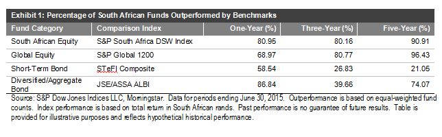
The performance of the South African equities market has been lackluster as a result of poor employment data, weak consumer confidence, and continued power shortages.  This has led to an underperformance of approximately 5% in ZAR-denominated domestic equities, as measured by the S&P South Africa Domestic Shareholder Weighted (DSW) Index, compared with global equities.

Equities:

  • Over a five-year period, about 91% of domestic funds underperformed the benchmark.
  • Over the same period, over 96% of global funds underperformed the S&P Global 1200.

Fixed Income:

  • Over a five-year period, over 74% of diversified and aggregate funds underperformed the benchmark.
  • Over the same period, the majority of the active short-term bond funds outperformed the benchmark.

For more details on the report, please click here.

Capture

The posts on this blog are opinions, not advice. Please read our Disclaimers.

WTI Reclaims No.1 Spot As The Benchmark Oil In 2016

Contributor Image
Jodie Gunzberg

Former Managing Director, Head of U.S. Equities

S&P Dow Jones Indices

S&P Dow Jones Indices today announced the composition and weights for the 2016 S&P GSCI and Dow Jones Commodity Index. The two indices have the same constituents by definition but the weighting methodologies are different. The DJCI is equally weighted with 1/3 of its weight to each sector – energy, metals, and agriculture and livestock, then the constituents inside are liquidity weighted by the 5-year average of the total dollar value traded. The more interesting weighting of the two flagships happens in the world-production weight of the S&P GSCI. This is because the world production is a reflection of the relative significance of each of the constituent commodities to the world economy.

2015 was a historically significant year for oil in indexing since it was the first time Brent overtook WTI as the biggest commodity in the S&P GSCI since Brent Crude was added in 1999. Please see the graph below for the historical weight difference between WTI Crude Oil and Brent Crude in the S&P GSCI:

Source: S&P Dow Jones Indices. All weights prior to 2015 are actual index weights after the rebalance that may differ from the target weights due to price fluctuations.

Notice the Brent significantly caught up to WTI in 2013, but now WTI is set to outweigh Brent in 2016 by even more than in 2013, putting into question Brent’s ability to hold as a real oil benchmark. Although the brent field only produces about 1,000 of 94 million barrels per day, volumes of the contract have more than doubled since 2009 to more than a million contracts per day. It is this volume (in addition to price) that catapulted brent to compete with WTI as the global heavyweight in the S&P GSCI. The index uses a world production for the entire petroleum component (WTI, Brent, Gasoil, heating Oil and Unleaded Gasoline) then adjusts the individual constituents by a 12 month average of total dollar value traded based on price and volume from the current year’s August through the prior year’s September. Based on this, the index is now reflecting what the rest of the world already suspects – that is brent is drying up too quickly to remain a global oil benchmark. For example, below is a chart from our commodity conference in 2012 questioning the viability of Brent.

Source: Wood Mackenzie, Aug 2012. Presented at S&P Dow Jones Commodity Conference. Sept, 2012. Jan-Hein Jesse, JOSCO Energy Finance & Strategy Consultancy.

A bigger question for benchmark pricing and index weight is how the composition of the brent contract may change to stay competitive. The brent field’s output used to be 100% of the brent contract but is now only at 0.1%. Please see the chart below of the decline from a WSJ blog:

BCG Falling Brent

Further, the WSJ reports in this article that changes may need to happen sooner rather than later by adding oil into the benchmark from West Africa, Central Asia or possibly from Brazil. This is because the there is a huge market based on the benchmark pricing where businesses, such as refineries, price the crude they process into gasoline and diesel, influencing prices at the pump. It has a great potential impact.

Brent decline WSJ

Finally, notice how the spread of WTI to Brent has narrowed. It is hard to argue there is an unfair value. Even if production is rising, the relative volume decline of brent to WTI is the prevailing force of brent’s futility.

Source: S&P Dow Jones Indices


The posts on this blog are opinions, not advice. Please read our Disclaimers.

What's Brewing In The Commodities Cauldron?

Contributor Image
Jodie Gunzberg

Former Managing Director, Head of U.S. Equities

S&P Dow Jones Indices

Overall in October, the gassy hogs (natural gas -15.3%, lean hogs -11.3%) cast a spell over the sweet meat (sugar +12.7%, all cattle +8.5%) for a flat brew of commodities that were neither a trick nor treat. Although the S&P GSCI was up just 23 basis points and the Dow Jones Commodity Index was down only 87 basis points, commodities in October may be waking from the dead.

This past July, just three months ago, every single commodity was negative except for one. Commodities have made a remarkable comeback with more than half (13 of 24) posting positive returns in October. There has never been a time in history where 12 single commodities went from posting a negative month to a positive month this quickly after 23 were negative together. However, in January 2009, 11 single commodities came back, just before the S&P GSCI hit its bottom, the next month in February 2009. That month, 8 commodities were positive but by May 2009, 13 additional commodities posted gains so that almost all were positive (21 of 24.) Also, in August 1999, 18 single commodities were positive after just 4 were positive in May that year, following its bottom, just a couple months earlier in February.

Source: S&P Dow Jones Indices

A few other scary statistics in October are the following:

  • S&P GSCI Total Return is -19.3% YTD through October 30, 2015, the 4th worst on record since 1970.  Worse YTD returns through Oct happened in 2008, 2001 and 1998, down 27.5%, 27.1% and 25.6%, respectively.
  • S&P GSCI Total Return is on pace for the 6th worst year on record since 1970. 2008,1998, 2014, 2001 and 1981 were worse, losing 46.5%, 35.8%, 33.1%, 31.9% and 23.0%, respectively.
  • S&P GSCI is on pace to set the 1st 3-year consecutive negative annual return. 2013 and 2014 lost 1.2% and 33.1%, respectively.
  • S&P GSCI is set to have the worst back-to-back 2-year loss in history since 1970, but 2008’s loss alone, is still worse by 51 basis points – even with 2013 included.
  • This is the 3rd worst October on record for number of commodities in contango. 17 of 24 commodities in the S&P GSCI were in contango in October, compared to just 12 in October 2014. Only October 2001 and October 2009 had more commodities in contango with 18 and 20 in contango, respectively.
  • S&P GSCI Natural Gas Total Return lost 15.3% in October 2015, recording its 3rd worst October in history (since Feb 1994) and worst October in 10 years. October 1998 lost 15.9% and October 2005 lost 15.3%.


The posts on this blog are opinions, not advice. Please read our Disclaimers.

How Indexing Works in Financial Literacy

Contributor Image
Shaun Wurzbach

Managing Director, Head of Commercial Group (North America)

S&P Dow Jones Indices

It is encouraging and inspiring to see that organizations and professional bodies are willing to roll up their sleeves and help for a good cause.  The good cause in this case is financial literacy, and the organizing body was the New York Public Library during their semi-annual Financial Planning Day on October 23rd.

McGraw Hill Financial (MHFI), the parent company of S&P Dow Jones Indices, supports the New York Public Library’s Science, Industry, and Business Library (SIBL) in their Financial Literacy campaign.  MHFI’s Corporate Responsibility and Sustainability team Co-Sponsored this event with the Financial Planning Association (FPA) of New York.  More than a dozen other organizations participated with volunteers and information for attendees.  Counselors from FPA NY, Community Service Society of NY, and the Health Insurance Information and Counseling and Assistance Program were on hand to provide advice.  MHFI was asked by the organizers to provide an information session to attendees on how indexing works.

To do that, I invited Dr. David Blitzer, Chairman of our S&P DJI Index Committees, and Todd Rosenbluth, Head of ETF and Mutual Fund Evaluation at S&P Capital IQ, to collaborate and present on this topic together.  Our approach was to combine index education from S&P DJI with fund education from S&P Capital IQ to help the audience better understand some of the investment choices they might find in everyday life such as investing with funds in an Individual Retirement Account (IRA) or through a 401K plan.  Here are some of the key points that David and Todd communicated:

Dr David Blitzer, S&P DJI:

  • Historically, over any period of a year or more, about 2 out of 5 mutual funds outperform and three of five underperform their benchmark
  • Good performance does not persist for many active mutual funds – our data has shown a 40% chance of beating an S&P benchmark in 1 year, 16% for two years in a row, 6% in three consecutive years
  • Why? Index products typically have lower fees than active products – better to keep as much of your money as you can, not give it away to manager fees.

Todd Rosenbluth, S&P Capital IQ / SNL:

  • Finding actively managed funds that outperformed the S&P 500 index over the short and long term is hard. This is why investors pulled $150 billion out of active mutual funds and ETFs in the 12 months ended September 2015 and added $461 billion to passive products according to Morningstar data.
  • Those that want active management should seek out funds with a below-average expense ratio and an experienced management team, and that have generated strong returns with below average volatility.
  • If investors do their homework they may reduce the likelihood of holding a below-average fund, but it may still end up in their portfolio.

The audience of 75 was interested, attentive, and asked very good questions, such as “why use an equally weighted index rather than the S&P 500?” and “Can an index keep pace with rapidly adopted innovations in an economy, or is it too passive to do that?”  David and Todd answered all questions and stayed afterwards with attendees who lined up to ask more questions.

The posts on this blog are opinions, not advice. Please read our Disclaimers.

The FOMC and GDP: Not As Confusing As It Looks

Contributor Image
David Blitzer

Former Managing Director and Chairman of the Index Committee

S&P Dow Jones Indices

The statement issued by the FOMC, the Fed’s policy making unit, following its meeting on Wednesday sent a clear message that the central bank expects to raise interest rates at its next sit-down in December.  Thursday morning at 8:30 AM the Bureau of Economic Analysis published the advance estimate of third quarter GDP showing a 1.5% real (inflation adjusted) annual growth rate for the economy, down by more than half from the second quarter’s 3.9% pace.  Is the Fed right to be bullish on the economy or were they as disappointed by the GDP report as most other people?

First, the FOMC’s statement: the key change was dropping the warning, “Recent global economic and financial developments may restrain economic activity somewhat and are likely to put further downward pressure on inflation in the near term” from September’s statement.  The current statement goes on to reiterate that “economic activity will expand at a moderate pace with labor market indicators continuing to move towards levels the Committee judges consistent with its dual mandate.”  Finally, the statement makes mention of raising interest rates and notes that any action will be based on both actual data and expected developments: “In determining whether it will be appropriate to raise the target range [for the Fed funds rate] its next meeting, the Committee will assess progress – both realized and expected – towards its objectives of maximum employment and two percent inflation.”

In simple terms, unless the economy is a lot worse than we think, we will raise interest rates by Christmas.

The top line GDP number looks weak, but a glance at the details shows that the Fed’s position is consistent the GDP release.   If one ignores inventories and imports and looks at the growth in real final sales of domestic product, the third quarter figure is 3.0%, down from 3.9%, a modest drop.  There were some soft spots in third quarter GDP, but nothing alarming. Personal consumption expenditures were up 3.2% at real annual rates compared to 3.6% in the second quarter, total government expenditures and investment (which excludes transfer payments like social security) slowed as did construction. Imports – which reflect buying by domestic purchasers and reduces GDP – grew faster in the third than the second quarter.  Exports grew, but less rapidly, than in the previous quarter.

All in all, the GDP report was reasonably good even if the headline was a cause for concern. In any event, it will be revised at the end of November, before the next FOMC meeting. Most revisions generate a small improvement.

The chart compares GDP growth with the growth in final sales of domestic product. The latter excludes volatile inventory moves and may give a more accurate picture of the economy.  Growth rates throughout are seasonally adjusted real annual rates.

The posts on this blog are opinions, not advice. Please read our Disclaimers.