Get Indexology® Blog updates via email.

In This List

At 50 cents on the dollar can Puerto Rico cause more pain for the muni bond market?

Data Driven Decisions Replace Forward Guidance

How Some Financial Advisors Embrace SPIVA: Part 2

COMMODITY MADNESS

A Tale of Two Benchmarks: S&P SmallCap 600® vs. Russell 2000®

At 50 cents on the dollar can Puerto Rico cause more pain for the muni bond market?

Contributor Image
J.R. Rieger

Former Head of Fixed Income Indices

S&P Dow Jones Indices

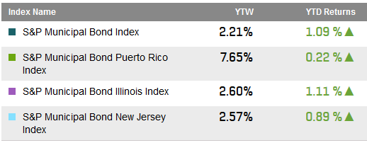
The S&P Municipal Bond Puerto Rico Bond Index has barely eked out a positive return so far in 2015. Meanwhile, bond prices in the Index are averaging 50 cents on the dollar.  The low point for the average bond price in Puerto Rico was July 8th 2014 at 47.27 cents on the dollar.  Just as a comparison, the average price of bonds in the S&P Municipal Bond High Yield Index is over 57 cents and that includes bonds from Puerto Rico.  The average price of investment grade bonds in the S&P National AMT-Free Municipal Bond Index is over 107. 

So how much more pain is there?  That “four letter word”, uncertainty, continues to hang over the market.  The possible restructuring of the debt of the larger revenue bond issuers in Puerto Rico makes for a trying time for the Puerto Rico Senate. Needed tax reform is hotly debated and probably harder to implement. Another question weighing on the market is this: How much more underperformance will state funds that own Puerto Rico bonds and the hedge funds that bought Puerto Rico bonds in the downturn tolerate before flooding the market with bonds? While the market may have already adjusted for this, with the S&P Municipal Bond Puerto Rico Index tracking over $73billion of bonds by par value, it is after all a significant portion of the bond market.

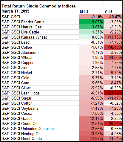
A quick look at performance:

Select Municipal Bond Index Yields and Returns:

Muni Yields & Returns 3 19 2015

Source: S&P Dow Jones Indices LLC.  Data as of March 19, 2015.


The posts on this blog are opinions, not advice. Please read our Disclaimers.

Data Driven Decisions Replace Forward Guidance

Contributor Image
David Blitzer

Former Managing Director and Chairman of the Index Committee

S&P Dow Jones Indices

Since the financial crisis, the Fed gave clear signals and advance warnings about shifts in monetary policy. Even the “taper tantrum” in May, 2013 was widely heralded in advance.  Early warnings will soon be a thing of the past.  Instead the Fed will watch the economic reports and will set policy at each meeting based on the best available information at that time.  For Fed watchers, analysts and investors this means doing your own work, not just listening to the Fed chair or reading the FOMC minutes.

The FOMC statement published yesterday notes, “In determining how long to maintain this target range, the Committee will assess progress – both realized and expected – toward its objectives of maximum employment and two percent inflation. This assessment will take into account a wide range of information, including measures of labor market conditions, indicators of inflation pressures and inflation expectations, and readings on financial and international developments.”  In other words, policy will be set based on a review of the domestic and global economies and markets.  In a last bit of forward guidance, the statement did pretty much rule out any rate increase in April, but in the same sentence the statement adds, “the forward guidance does not indicate that the Committee has decided on the timing of the initial increase in the target range.”

The Fed’s move away from forward guidance is another step in normalizing monetary policy. Before the financial crisis, the Fed provided general comments on the employment, inflation and the economy but rarely announced policy changes in advance – and even then the announcement was a day or two ahead, not weeks or months.  One of the post-crisis experiments in monetary policy was forward guidance and long lead time announcements to reassure markets and reduce any turmoil from policy adjustments.  The experiment was successful. Now it seems that the Fed believes the markets are sufficiently stable that the early warnings and guidance are not necessary.  Forward guidance was also risky: had the Fed ever needed to change policy after it had promised not to, it would have lost credibility and trust from the markets.  Eliminating forward guidance is a return to the pre-crisis normality — more work for analysts and more disagreements among forecasters.

The posts on this blog are opinions, not advice. Please read our Disclaimers.

How Some Financial Advisors Embrace SPIVA: Part 2

Contributor Image
Shaun Wurzbach

Managing Director, Head of Commercial Group (North America)

S&P Dow Jones Indices

In my last post, I wrote about how we approached financial advisors with SPIVA.  In that effort to share SPIVA results, we were pleasantly surprised to find that some financial advisors were already embracing SPIVA.  Here are two more examples of that to add to Phil Dodson’s example presented in the last post.

Todd Green and Chris Mirrione represent Alesco Advisors, a Registered Investment Advisor (RIA) firm in Pittsford, New York.  They have used SPIVA and Persistence data for years as part of their new business presentations and as reference material when reviewing portfolios with current clients.  Use of SPIVA and Persistence support their investment approach, which includes constructing a strategic asset allocation, broadly diversifying risk, and controlling costs. They employ this strategy as a consultant and investment manager for institutional accounts as well as with high net worth clients. In their view, establishing a proper asset allocation is essential to helping clients meet their investing goals. They believe that implementing a portfolio using passive investments to ensure participation in the long-term returns of the market is the most effective way for their clients to experience the benefits of their asset allocation structure.  SPIVA and Persistence data support their choice to use ETFs and passively-managed mutual funds to obtain market returns within each asset class instead of attempting to generate alpha or chase managers who have had strong recent returns.

Rick Ferri, Founder and Managing Partner of Portfolio Solutions, an RIA based in Troy, Michigan, is a long-time proponent of indexing.  Rick has written books about the power of indexing and in his blog for Forbes about how SPIVA and Persistence pertain to financial advisors as data in support of indexing for low-cost investing.  In June 2013, Rick co-wrote a paper titled A Case for Index Fund Portfolios with Alex Benke of Betterment.  In that paper, the co-authors extended research beyond SPIVA and S&P Persistence Scorecard’s case for index effectiveness to determine if a portfolio of index funds would outperform a portfolio of actively managed funds. The authors modeled and analyzed data from three consecutive periods of five years and the entire 15-year period to find that a portfolio of index funds outperformed in all four scenarios. The complete results of their research can be seen at https://us.spindices.com/resource-center/thought-leadership/spiva/.

These three examples (including Phil Dodson’s example from my previous post) are representative of a growing body of wealth managers who are using SPIVA and Persistence to their advantage.  Their practices may differ, but they have in common that they reject the seeking of alpha as their objective.  They also reject the practice of picking managers.  What they retain is the ability to construct portfolios for high net worth clients where they themselves manage the asset allocation.  Informed by SPIVA, their method is to use index-based tools as the most efficient building blocks for that asset allocation.

Our 2014 end of year US SPIVA report, published last week, breaks new ground.  For the first time, we present 10-year numbers.  This new section of our US SPIVA analysis will enable financial advisors to perform robust analysis across business cycles of comparative performance of index vs active.

The posts on this blog are opinions, not advice. Please read our Disclaimers.

COMMODITY MADNESS

Contributor Image
Jodie Gunzberg

Former Managing Director, Head of U.S. Equities

S&P Dow Jones Indices

If we’re talking about the worst performing months for commodities, March 2015 should be dominating the conversation. The S&P GSCI Total Return is down 9.1% month-to-date (as of 3/17/15) and is on track to post the 4th worst March in history of the index since 1970; only 2003 (-14.4%), 1980 (-14.0%) and 1974 (-11.5%) lost more. All 24 of the benchmark’s commodities are negative for the year with just four positive performers for the month: feeder cattle, natural gas, live cattle and Kansas wheat.madness

In the history of the index there have only been 11 of 545 months with as few positive performers as shown in the table below.

negative commodities

To add more to the madness, commodities have been the most volatile this March (annualized 90-day volatility of 27.1%) in almost six years – that is since December, 2009.  This is after the index experienced annualized 90-day volatility of just 8.3% in August 2014, its lowest since December, 1995.

Volatility

However, there might be a few bright spots in this March “Commodity” Madness. One statistic is that of the 24 commodities, 10 are currently in backwardation: live cattle, heating oil, feeder cattle, gasoil, unleaded gasoline, copper, wheat, silver, cocoa and Kansas wheat. Gasoil, unleaded gasoline, silver and Kansas wheat have flipped from contango with gasoil moving enough to produce a positive roll return for the year thus far.

Finally, we can’t ignore the Fed, especially today. They dropped the word “patient” and 15 of the bank’s top 17 officials think the Fed will raise rates sometime this year but with the economy seeming somewhat unsettled, at least temporarily, the Fed chairwoman effectively ruled out a rate increase in April and perhaps longer.

If the central bank starts to raise rates in June, analysts said that the U.S. dollar could be close to its peak and such an outcome would be supportive for dollar commodity prices. The good news for commodities is that when rates rise, it has been generally supportive of prices.

Source: S&P Dow Jones Indices LLC. All information presented prior to the index launch date is back-tested. Back-tested performance is not actual performance, but is hypothetical. The back-test calculations are based on the same methodology that was in effect when the index was officially launched. Past performance is not a guarantee of future results.  Please see the Performance Disclosure at http://www.spindices.com/regulatory-affairs-disclaimers/ for more information regarding the inherent limitations associated with back-tested performance.

The posts on this blog are opinions, not advice. Please read our Disclaimers.

A Tale of Two Benchmarks: S&P SmallCap 600® vs. Russell 2000®

Contributor Image
Aye Soe

Former Managing Director, Global Head of Core and Multi-Asset Product Management

S&P Dow Jones Indices

This is a series of blog posts relating to the in depth analysis of performance differential between the S&P SmallCap 600 and the Russell 2000.

Benchmarks are designed to represent a passive strategy in a given universe. Given that purpose, the risk/return profiles among various benchmarks in the same universe should be relatively similar in nature. This similarity appears to be borne out in the U.S. large-cap equity universe when comparing the returns of the Russell 1000® and the S&P 500®. Using monthly total returns from 1994 to 2014, Exhibit 1 charts the growth of a hypothetical investment of USD 1.00 in the S&P 500 and the Russell 1000, as well as in the S&P SmallCap 600 and the Russell 2000. In the U.S. large-cap universe, USD 1.00 invested in the S&P 500 and the Russell 1000 from January 1994 through December 2014 would have returned USD 6.63 and USD 6.80, respectively. However, in the small-cap universe, the returns of the Russell 2000 and the S&P SmallCap 600 are considerably different. An investment of USD 1.00 in the S&P SmallCap 600 over the same time period would have returned USD 8.59, while it would have returned USD 6.18 if invested in the Russell 2000.

Since its launch in 1994, the S&P SmallCap 600 has outperformed the Russell 2000 in 14 of 21 calendar years. From January 1994 through December 2014, the returns of the S&P SmallCap 600 exceeded those of the Russell 2000 by 1.72% on an annualized basis. It is also important to note that the S&P SmallCap 600 has exhibited lower volatility than the Russell 2000 historically, leading to a higher Sharpe Ratio. These results are similar to what was seen in the previous research paper on this topic (2%), when the time range reviewed was from 1994 to 2009. Exhibit 2 highlights the risk/return profiles of the two indices.

The continued return differential between the two small-cap indices merits further study, and an understanding of the factors contributing to the divergence. We will be covering those in detail in upcoming blog posts!

Capture

Capture


The posts on this blog are opinions, not advice. Please read our Disclaimers.