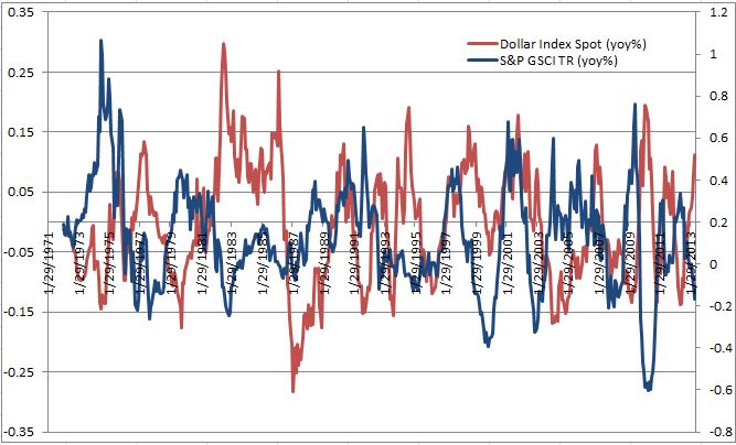
A strong US dollar is generally bad news for commodities since historically as the U.S dollar strengthens, goods priced in dollars become more expensive for other currencies. The historical negative relationship between the U.S. dollar and the S&P GSCI is shown below.
While the broad based indices are negatively correlated with the U.S. dollar, some commodities are more negatively correlated with the US dollar than others. In the long term, since the inception of each single commodity index, ten commodities have a lower than -0.3 correlation to the U.S. dollar: lead, copper, aluminum, nickel, gold, Kansas wheat, Brent, WTI, unleaded gasoline and gasoil with the lead leading the pack with the biggest negative relationship at -0.52.
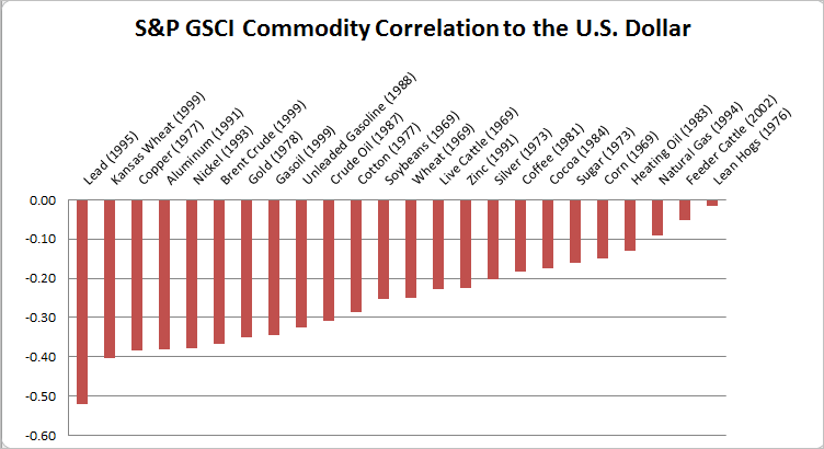
When reducing the time period to ten years for all commodities, a different pattern appears. The first observation is that with the exception of feeder cattle, all correlations became more strongly negative. However, some much more than others. Cocoa, corn, heating oil, WTI, silver, soybeans and unleaded gasoline all has greater than -0.3 decreases in correlation, implying a stronger negative relationship with the U.S. dollar. The five commodities of the petroleum complex have the greatest inverse sensitivity, ranging from -0.62 to -0.67. On the other hand, it is not surprising to see zinc, natural gas, live cattle, lean hogs, sugar and feeder cattle with almost no correlation. With the exception of zinc, these commodities are highly sensitive to weather. Other factors like transportability and the global usage (natural gas is local) may influence the relationship.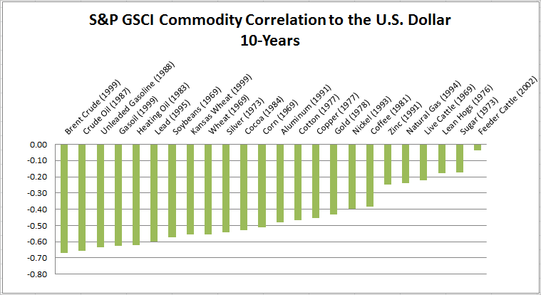
The posts on this blog are opinions, not advice. Please read our Disclaimers.