Get Indexology® Blog updates via email.

In This List

Average Performance

To Have and to Hold in Residential Real Estate

Back When I Was A Kid…

Inflation Fears and the Fed

High Yield Bonds: Can more juice get squeezed out of the junk bond sector?

Average Performance

Contributor Image
Craig Lazzara

Former Managing Director, Index Investment Strategy

S&P Dow Jones Indices

This morning’s Wall Street Journal advised us that the performance of many large institutional investors has lagged that of the equity market since the beginning of the recovery five years ago.  The Journal attributed this performance gap to institutions’ moves into alternative investment categories such as hedge funds and private equity.  The explanation may be even simpler than that.  Any large endowment or pension fund will be diversified across a number of asset classes, and by definition the whole portfolio must underperform its best-performing component.

The most striking part of the article was a short quotation from Yale Professor William Goetzmann: “Alternative asset classes are expensive, especially if you have to live with the average fund instead of stellar funds.”  Of course, at the end of the day, the average fund is exactly what the average investor has to live with.

This is a direct consequence of what Sharpe called “The Arithmetic of Active Management.”  All asset owners own all the assets there are to be owned.  Therefore the weighted average return of all asset owners will be the weighted average return of all assets — in other words, the capitalization-weighted market return.

As a group, passive managers accept the market’s return, which means that as a (weighted) group, active managers must also accept the market’s return.  But the cost of running an active strategy means that the average active manager will typically underperform an index appropriate to his investment style, as our SPIVA reports have long demonstrated.  All the children in Lake Woebegon may be above average.  The average active investor is not.

The posts on this blog are opinions, not advice. Please read our Disclaimers.

To Have and to Hold in Residential Real Estate

Contributor Image
Marya Alsati

Former Product Manager, Commodities, Home Prices, and Real Assets

S&P Dow Jones Indices

Homeowners choose the time to sell their home for various personal and socioeconomic reasons but also for financial considerations such as mortgage rates, tax consequences, current property values, and the holding period. The holding period is the time frame between the day the residential property was purchased to the day it was sold. The general belief is that the longer the holding period the larger the gains and the smaller the losses.

In this post, we will analyze this assumption using the S&P/Case-Shiller Home Price Indices.  The indices use the repeat sales method for index calculation. The repeat sales method analyzes data on single family properties that have two or more recorded sales transactions. This arm’s length view can be used to capture the holding period.

The analysis was performed on the S&P/Case-Shiller 10-City Composite Home Price Index, which measures the change in the value of residential real estate in 10 metropolitan areas of the U.S.

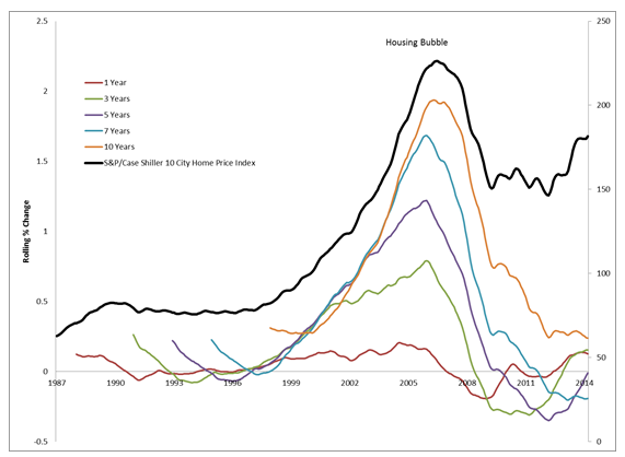
The left axis in the chart below depicts rolling returns of the 10-City Composite Index on 1-year, 3-year, 5-year, 7-year, and 10-year holding period durations. The rolling returns refer to the mathematical process of comparing one year of data to the previous period’s data. For example, the 10 year holding period returns compares January 2010 with January 2000, February 2010 with February 2000 and so on.  The right axis of the chart depicts index levels of the composite index.

Capture

It can be seen from the graph above that the 10-year holding period  yields larger gains and smaller declines than the shorter periods.

The table below shows summary statistics on different holding periods for the 1987-2014 timeframe. The 20-year and 10-year holding periods have the largest gains and smallest declines and the 10-year and 7-year holding periods have the largest deviation from the mean.  This means there is a large variance in the highest and lowest returns one can earn during the holding period.

The table below shows summary statistics on different holding periods for the 1987-2014 timeframe. The 20-year and 10-year holding periods have the largest gains and smallest declines and the 10-year and 7-year holding periods have the largest deviation from the mean.  This means there is a large variance in the highest and lowest returns one can earn during the holding period.

Capture

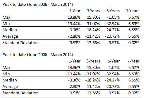
The table below portrays the gains and losses earned if the holding period began during the 2006 peak.

Capture

While the longer 7-year holding period fared better than the shorter duration periods, the 3-year period performed better that the 5-year period during that time frame, likely due to the trough being in 2012.

By comparing the 3-year, 5-year, and 7-year holding periods across the two holding periods, it can be seen that a long holding period results in larger gains and smaller declines. This, however, is dependent on when the holding period actually starts.  For example, the average gain or loss for a  5-year holding period that spans the entire length of the data is 30.67%, and is however -20.72% for the peak to present holding period.  It can be concluded that longer holding periods do yield better results, but depending on when the holding period begins one might have to have and to hold their property a little longer.

The posts on this blog are opinions, not advice. Please read our Disclaimers.

Back When I Was A Kid…

Contributor Image
Kevin Horan

Former Director, Fixed Income Indices

S&P Dow Jones Indices

On my daily commute to New York City via New Jersey Transit today I overheard a conversation on the train that started with “Back when I was a kid”.  Though the start of the conversation had grabbed my attention, the rest became a blur as the statement had triggered memories that related to the current article I was reading on my IPad.  The combination of a fellow commuter’s overheard statement and E.S. Browning’s article Inflation Is Back on Wall Street Agenda got me thinking about being a kid in the 1970’s.

Back then news was not a major focus of mine as I had more important things like Little League Baseball and CYO basketball to occupy my time.  Though there are memories of newscasts on our black and white television or overheard radio reports from the back seat of my dad’s Ford Fairlane.  Even as a kid I knew the economy was a mess.  Oil prices never went down, gold was a hot commodity and Inflation sounded more like a monster than an economic concept.  Now I’m not saying we are due for a 1970’s economy, just that the idea of inflation has had a long lasting impact on me and others of the time.

In addition to my memories of the past, Mr. Browning’s article made for an interesting read to fill the time of my commute.  Lightly touched upon in the article was the financial product of TIPS (Treasury Inflation Protection Securities).  These securities did not exist “back then” but were issued by the U.S. Treasury in 1997, specifically to protect against the eroding effects of inflation upon the principal of fixed income securities.  The S&P U.S. TIPS Index has returned 4.88% year-to-date, though longer indices such as the S&P 10+ Year US Treasury TIPS Index are returning 10.10% year-to-date.

Another addition to the U.S. Treasury’s portfolio of products, which would be beneficial to investors in a rising rate environment, is the recently issued floating rate product.  On July 31, 2013, the U.S. Treasury published amendments to its marketable securities auction rules to accommodate the auction and issuance of a Floating Rate Note (FRN).  Treasury FRNs are indexed to the most recent 13-week Treasury bill auction.  $15 billion of 2-year FRN was first issued on January 23rd, 2014.  The S&P U.S. Floating Rate Treasury Index is returning 0.04% month-to-date and is made up of the originally issued January 2016 maturity along with a more recent April 2016 issue.

Source: S&P Dow Jones Indices, Data as of 6/20/2014

The posts on this blog are opinions, not advice. Please read our Disclaimers.

Inflation Fears and the Fed

Contributor Image
David Blitzer

Former Managing Director and Chairman of the Index Committee

S&P Dow Jones Indices

Last week’s Consumer Price Index (CPI) release spooked a few people with a month to month change of 0.4%, the largest since February 2013; food prices were up 0.7% and the CPI ex-food & energy up 0.3% with both rising the most since August, 2011.  To top it all, the twelve month change in the CPI was 2.1%, above the Fed’s 2% target. The immediate responses were (1) the Fed is going to raise interest rates a lot sooner than anyone expects and (2) the Fed will still wait for at least a year before raising rates and by that time the central bank will be “behind the curve” and inflation will have returned with a vengeance. Anxious bond holders believe the first story while unreconstructed monetarists (who are still waiting for inflation after five years of quantitative easing) put their faith in the second story.

The Fed chair, Janet Yellen, doesn’t believe either story. Rather, she is far less concerned about inflation and less worried about last week’s CPI report than most.  First, the CPI may, or may not, be a reliable gauge of inflation, but it is not the gauge the Fed follows.  The Fed bases its policy guidelines on the personal consumption expenditures (PCE) implicit price deflator.  The twelve month increase in that measure in April was 1.6%. (The May number isn’t available yet.) While that is higher than recent figures, it is comfortably below the Fed’s 2% target and it is in the range of the Fed’s economic projections published last week. Using the right numbers, inflation is exactly where the Fed’s policy guidelines expect it to be.    The Fed’s projections for the PCE Deflator are 1.5% to 1.6% for 2014; 1.6% to 2.0% for 2015 and 1.7% to 2.0% for 2016.

Other inflation measures do not point to a jump, or even a modest rising trend, in inflation. The Cleveland Federal Reserve Bank publishes a range of inflation indicators.  The Median CPI is one of the more reliable figures and it was 0.3% per month in April and May compared to 0.2% in January through March.  Both major consumer and professional forecaster surveys do not expect any increase in inflation.

What does all this mean for Fed policy? Very little.  However, we are likely to hear a lot more nervous talk about inflation during the summer. Gasoline prices may rise – they usually do in the summer driving season whether or not there is a war in the Middle East. Food prices may also climb since drought and fire conditions in California haven’t improved much.  Other prices – and hopefully wages — could also creep up as the economy continues to improve.  Janet Yellen is correct that inflation is volatile; anxiety about inflation is even more volatile.  These days that may be the only real volatility in the financial markets.

The posts on this blog are opinions, not advice. Please read our Disclaimers.
High Yield Bonds: Can more juice get squeezed out of the junk bond sector?

Contributor Image
J.R. Rieger

Former Head of Fixed Income Indices

S&P Dow Jones Indices

Lipper reports high yield bond funds have seen the first cash outflow in 7 weeks which might be a sign that junk bonds could run out of gas.

Over the last five years the S&P U.S. Issued High Yield Corporate Bond Index has seen annualized returns of over 13.6%. Year to date the index has returned 5.43% as yields have ended at 4.84% impacted by a 55bp drop since year end. By comparison, safer 10 year US Treasury bonds have seen yields drop by 40bps and have returned 5.17% year to date.

Can more juice get squeezed out of the junk bond sector? Looking at incremental yields of different asset classes can be revealing:

  • The yield of the S&P U.S. Issued High Yield Corporate Bond Index is 4.84% or 203bps higher yield than investment grade corporate bonds.
  • This is the lowest spread differential seen during the last two and half years of quantitative easing. During that time this spread has gotten as high as 317bps in June 2013.
  • High yield bonds are now only 221bps higher in yield than yield of the 10 year U.S. Treasury bonds.
  • High yield bonds are only 61bps higher in yield than the yield on senior loans tracked in the S&P/LSTA U.S. Leveraged Loan 100 Index.
  • High yield bonds are 135bps lower in yield than the yield of high yield municipal bonds tracked in the S&P Municipal Bond High Yield Index.

HY Bond Yields Returns 6 20 2014

The posts on this blog are opinions, not advice. Please read our Disclaimers.