Get Indexology® Blog updates via email.

In This List

But Will They Return?

Risk On, Risk On

Gas Guzzling Clunkers Driving Up Costs

Quality: A Distinct Equity Factor?

Is 3% The New Black?

But Will They Return?

Contributor Image
Howard Silverblatt

Senior Index Analyst, Product Management

S&P Dow Jones Indices

The key bar-room conversation this week has not been the stock market highs, or concern over elevated P/Es, or when a correction might arrive (the last one being in 2011 for big-caps), or even the increased M&A premiums being paid. It was stock splits, inspired by Apple’s 7-for-1 and the recollection, for those who have been on the Street for a few decades or more, and those newcomers who listened in, that in the 80s and prior, stock splits were money makers. Back then you actually paid cash for a service that sent a message (pre-twitter) to your beeper that a company had announced a planned split – and you would then purchase the stock – because it would go up (most likely).

The situation back then was that companies liked to keep their stock in a comfort zone, say $50 (for illustration), where investors felt comfortable buying and holding it. Additionally, old lots were inefficient in price and high in commissions (commissions were de-regulated in 1975, when brokerage consolidation slowly started and regulatory review was very show and long). Companies liked a broad base of individuals, which many felt gave support to the company; as compared to institutions which could be difficult (to put it nicely), or down-right unfriendly (Gulf & Devour). So when a stock reached a certain level, the company would split it, returning it to the comfort level (note: if $50 was the desired level, a 2-for-1 would most likely take place at $110 or higher, giving the company some protection in case the stock experienced a downdraft after the split – either because of company events or just market conditions). That thought process declined as quick trades came in along with the concept of capital appreciation only. Higher priced stocks were also becoming more acceptable, and the ability to purchase a dollar amount was made easier via brokerage consolidation, discount houses, and of course – the internet. Once we got past Y2K two recessions kept splits at bay (with the market sometimes splitting your stock in price, even though you did not get the extra shares).

Which brings us to Apple’s 7-for-1. There are many reasons why Apple split, but many believe it was to make its stock price, which was $646 per share before the split and $94 now, more attractive to individual investors, and broaden its investor base. Some even joked about a rebate program – buy a full-priced iPhone and get a share (not sure how that would work with disclosure or compliance). Also accepted was the idea that a border individual investor base could insulate the company from institutions and activists, who have been a bit more busy as company assets (especially cash) have grown. So, the question is – IF, yes IF, the lower price brings in more individuals (which would also add to buying and support the stock), and ‘assists’ with ‘dealing’ with certain holders, will more companies do it? Don’t know the answer, but as the Fed told the banks – I’ll be watching you.

pic14

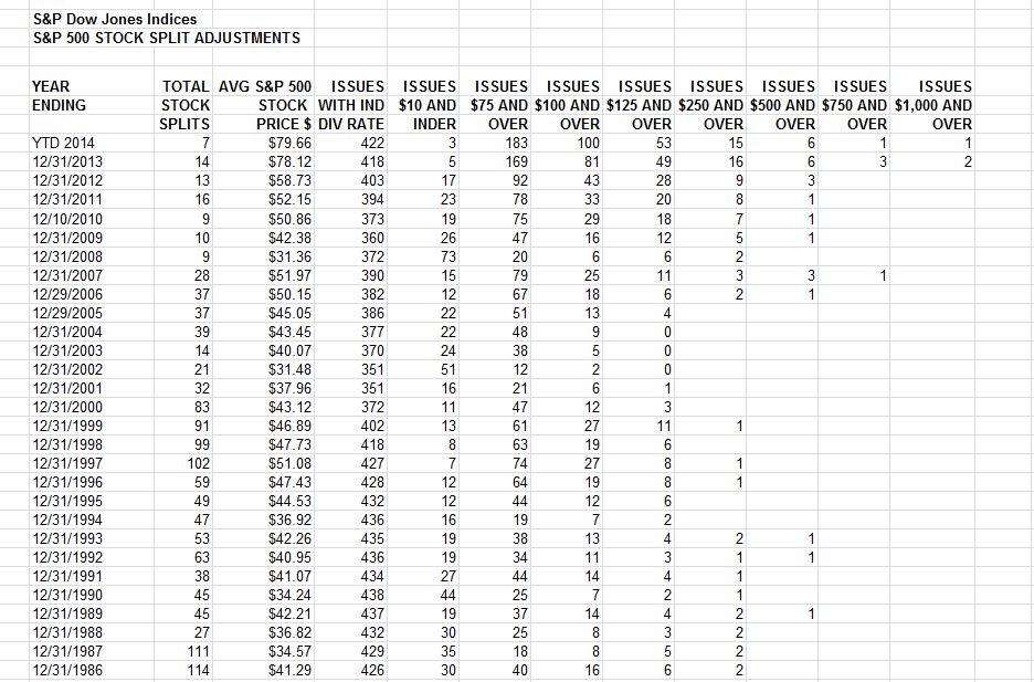
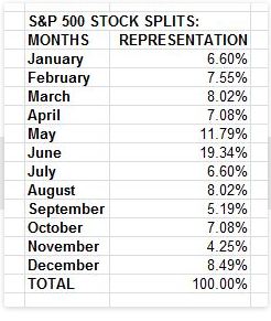
And while we all know that June is the most popular wedding month, it also appears to be the most popular split month (don’t know about divorces – still happy with my first)
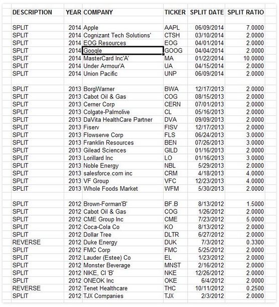
 Recent Splits:

Capture

Capture


The posts on this blog are opinions, not advice. Please read our Disclaimers.

Risk On, Risk On

Contributor Image
David Blitzer

Former Managing Director and Chairman of the Index Committee

S&P Dow Jones Indices

Central banks do more than set interest rates in an attempt to guide the economy. They also push and prod market psychology to move the economy in the direction they think best. Easy money and low interest rates send messages to take risks, spend money, boost a slow economy and be confident that the central bank might help out. Tight money and rising interest rates send the reverse messages: be wary, pull back, don’t over heat the economy, don’t push prices up. This game of market psychology has been nick-named Risk On-Risk off.

The game isn’t new.  It dates at least back to a Scottish economist, John Law (1671-1729) who defied the reputation that the Scots are skillful at managing money when he introduced a version of central banking to France with disastrous results.  It was all Risk On, but Law managed to evade the consequences for a time.  A more modern analysis comes from another economist, Hyman Minsky (1919-1996).  Minsky’s saw economic growth, rising securities prices and government support and bailouts as encouraging optimism and risk taking.  As the good times roll, markets forget their fears.  Forgetfulness leads to Risk On all the time. The Great Moderation (1982-20070 of rising stock and bond prices, low unemployment and low inflation set the stage for the financial crisis.  Banks became leveraged to the extreme and people borrowed money with no idea of how they would repay the debts.  The result was the financial crisis of 2007-8.

We may have too much Risk On optimism and not enough Risk Off fear today.  As widely noted, volatility is very low, VIX seems stuck in the basement and similar volatility measures for non-US equity markets, oil and other investments are similarly low.  Stock prices keep rising, defying both the skeptics and the bears.  Common sense suggests that VIX can’t fall and the S&P 500 and the Dow can’t rise forever — but experience keeps challenging this. Herbert Stein, another economist, commented, “If something can’t go one forever, sooner or later it will end.”

How will it end?  Certainly no one knows either the How or the When.  The S&P 500 could sail through 2000 to 2500 or beyond or collapse as it did twice in this young century.   Out of the infinite possibilities consider two:

A collapse and sharp drop cannot be ruled out.  Some of the tech stock stories heard today are eerie echoes of March 2000.  Technology is again the largest sector in the S&P 500, but far below the third of the total index seen some 14 years ago. Moreover, the index itself is less top heavy than it was then.

Things could crumble.  The Fed has hinted that sooner or later it will raise interest rates and a minority on the FOMC is leaning in that direction.  In just about every major reversal of Fed policy, analysts knew it was coming but were surprised (shocked?) when it happened.   When the Fed raises interest rates, markets are likely to drop. It could be a bigger bang than the tapering announcement in May 2013.

While the Fed’s monetary policy since 2009 has been largely successful,  no one will argue for perfection.  The same is true of its ability to guide market psychology.

The posts on this blog are opinions, not advice. Please read our Disclaimers.

Gas Guzzling Clunkers Driving Up Costs

Contributor Image
Jodie Gunzberg

Former Managing Director, Head of U.S. Equities

S&P Dow Jones Indices

Think you’re saving money by holding onto that old car? Think again.

Since the recession, Americans have gradually held onto their cars for longer and longer because they have not wanted to spend money on new cars. Therefore, the average age of cars on the road has accelerated according to a recent survey from IHS Automotive. Also according to R.L. Polk, for 11 consecutive years ending in 2013, the average age of cars on the road has been increasing and is now 11.4 years old. Unfortunately, the intention of saving money by holding onto old cars may not be met since old cars may actually cost more.

Below is a list of America’s Top Ten Used Cars and their fuel economy estimates by MPG of the current 2014 models compared with 2002 models, to capture the gas usage from old cars versus new. Notice today’s models give on average 2.5 more MPG, so it may not be worth hanging onto an old clunker.

Sources: http://wallstcheatsheet.com/stocks/americas-10-most-popular-used-cars.html/?a=viewall, http://www.fueleconomy.gov/,
Sources: http://wallstcheatsheet.com/stocks/americas-10-most-popular-used-cars.html/?a=viewall, http://www.fueleconomy.gov/

Not only might older cars have lower fuel efficiency but the price of gasoline as measured by the S&P GSCI Unleaded Gasoline has increased five-fold since the end of 2001.

Source: S&P Dow Jones Indices. Data from Dec 2001 to May 2014. Past performance is not an indication of future results. This chart reflects hypothetical historical performance. Please note that any information prior to the launch of the index is considered hypothetical historical performance (backtesting).  Backtested performance is not actual performance and there are a number of inherent limitations associated with backtested performance, including the fact that backtested calculations are generally prepared with the benefit of hindsight.

Although the biggest price spikes historically occur in the winter from the transportation difficulty of petroleum, the prices typically heat up in the summer.  The hottest summer month for gas prices is historically in July with an average monthly return of 2.8% since 2002.

Source: S&P Dow Jones Indices. Data from Jan 2002 to May 2014. Past performance is not an indication of future results. This chart reflects hypothetical historical performance. Please note that any information prior to the launch of the index is considered hypothetical historical performance (backtesting).  Backtested performance is not actual performance and there are a number of inherent limitations associated with backtested performance, including the fact that backtested calculations are generally prepared with the benefit of hindsight.

Despite this, since 2002, the prices have gone up through time regardless of seasonality.  See below the chart that measures prices by month through time. From Jan 2002- May 2014, prices have increased whether looking at every February, July or October.

Source: S&P Dow Jones Indices. Data from Jan 2002 to May 2014. Past performance is not an indication of future results. This chart reflects hypothetical historical performance. Please note that any information prior to the launch of the index is considered hypothetical historical performance (backtesting).  Backtested performance is not actual performance and there are a number of inherent limitations associated with backtested performance, including the fact that backtested calculations are generally prepared with the benefit of hindsight.

With generally rising gas prices and lower fuel efficiency that are costly in terms of dollars, holding onto an old car may not be an optimal choice.

Further, keeping an old car with less gas mileage may be bad for the environment.  According to the U.S. Department of Energy, one gallon of gasoline creates 20 pounds of carbon dioxide. With cars of an average age of 11.4 years, that use 2.5 MPG less than the new models of today, that adds up to 50 incremental pounds on average of carbon dioxide per mile. Given, there are 252.7 million cars on the road today, that is a lot of additional carbon dioxide. See below for annual tons of carbon dioxide per MPG. Just another reason to by a new car (or just ride a bike like I do.)

http://www.fueleconomy.gov/feg/climate.shtml

*Source: S&P Dow Jones Indices. Data from Dec 2001 to May 2014. Past performance is not an indication of future results. This chart reflects hypothetical historical performance. Please note that any information prior to the launch of the index is considered hypothetical historical performance (backtesting). Backtested performance is not actual performance and there are a number of inherent limitations associated with backtested performance, including the fact that backtested calculations are generally prepared with the benefit of hindsight.


The posts on this blog are opinions, not advice. Please read our Disclaimers.

Quality: A Distinct Equity Factor?

Contributor Image
Daniel Ung

Former Director

Global Research & Design

Size, momentum, volatility and value have all been shown to be partly responsible for explaining equity returns over the long run but they do not seem to fully capture the returns of some companies. This has therefore given credence to the idea that a fifth factor – quality – exists and, when combined with other risk factors, acts as a good diversifier in investment portfolios. Click here to read our latest research on this topic or sign up for our webinar via this link: http://bit.ly/1ikwEDv

What is Quality?

There isn’t much agreement on what ‘quality’ is or how it should be measured. Some simply equate it to profitability and others, believing it to be a multi-faceted concept, use more complex measures (e.g. the Piotroski’s F score). Regardless of the approach taken, the aim of any quality measure should help estimate a company’s future profitability and understand its source of risk. Broadly speaking, high-quality companies should generate higher revenue and enjoy more stable growth than the average company. This is why we believe that any good quality measure should take into account profitability generation, earnings quality and financial robustness.

How Does Its Performance Stack Up?

Quality strategies broadly outperformed their benchmarks, both on an absolute and risk-adjusted basis. Among all the regions we examined, the out-performance was highest in the US. In addition, quality strategies held up well in bear markets and although their performance lagged in bull markets, they nonetheless participated in bull market rallies (such as 2003 and 2004).

In What Macroeconomic Environment Does It Do Well?

Quality stocks are sensitive to economic growth and tend to deliver higher excess return when the economy slows. That said, their attractiveness diminishes when the economy experiences above-trend growth, although they still deliver positive excess returns. In comparison with the S&P 500, S&P 500 Quality is exposed to industrial production and the narrowing of credit spreads. However, the quality index does not have any significant tilt towards oil prices, inflation, housing starts or the slope of the yield curve.

quality 1

Source: Figures based on monthly USD total returns between December 1994 and December 2013 on the S&P 500 Quality Index.  Charts and graphs are provided for illustrative purposes.  Past performance is no guarantee of future results.  These charts and graphs may reflect hypothetical historical performance.

OK… There Is Out-performance But Where Does It Come From?

Compared to the S&P 500, S&P 500 Quality has a tilt towards value stocks, lower debt, lower earnings volatility and higher earnings growth – which are attributes usually associated with ‘good quality’ companies.

quality 2

Source: Figures based on monthly USD total returns between December 1994 and December 2013 on the S&P 500 Quality Index.  Charts and graphs are provided for illustrative purposes.  Past performance is no guarantee of future results.  These charts and graphs may reflect hypothetical historical performance.

More Powerful Together Than Apart?

On the face of it, low volatility and high quality strategies seem very similar but there are important differences between their sources of return. Similarly, because quality strategies also have some tilt towards value stocks, there may be the belief that they are analogous concepts. Results have shown that while quality strategies already perform well by themselves, they appear to be good companions of other alternative beta strategies.

Combination of Quality and Value Strategies
Metric Value Strategy 1: 50% Value /50% Quality Equal Weight Strategy 2: Quality on a Value Universe
Annualized Return (%) 5.58 6.94 11.98
Annualized Risk (%) 16.63 14.93 15.13
Return per Unit Risk 0.31 0.46 0.79

Source: Figures based on monthly USD total returns between December 1994 and December 2013 on the S&P 500 Quality Index and S&P 500 Value Index.  Charts and graphs are provided for illustrative purposes.  Past performance is no guarantee of future results.  These charts and graphs may reflect hypothetical historical performance.

The posts on this blog are opinions, not advice. Please read our Disclaimers.

Is 3% The New Black?

Contributor Image
Kevin Horan

Former Director, Fixed Income Indices

S&P Dow Jones Indices

As with each summer’s fashion a new color of dress becomes the “new black”.  Pink, green, orange, you make the choice.  In regard to the bond markets the question could be is 3% the new black?  Bill Gross seems to think so, he is calling for economic growth and yields to remain slow and low, not returning to the levels seen prior to 2008.  Global central banking monetary policy has been highly accommodative.  Actions last week seem to support Mr. Gross’s view as the European Central bank followed through with a much expected cut in rates moving the benchmark rate from 0.25% to 0.15% and the Deposit facility from 0% to -0.10%.

Last week provided plenty of information and enough commentary to heat the debate of the direction of interest rates.  The reaction to German unemployment, unwinding of shorts and the expectations for an ECB rate cut that brought the US 10-year down to a 2.40% just prior to month end eased as rates have crept back upwards.  The yield of the S&P/BGCantor Current 10 Year U.S. Treasury Index started the week at a 2.53% and continued upward to a 2.60%.  Currently 2.6% is 40 basis points below the beginning of the year’s 3%.

The U.S. economic calendar for this week starts tomorrow with Wholesale Inventories for April expected at a 0.5% versus the prior 1.1%.  Wednesday’s MBA Mortgage Applications (-3.1% prior) and Thursday’s Retail Sales (0.6% expected), Initial Jobless Claims (310k exp.) and Business Inventories (0.4% exp.) will all be announced.  Friday will close the week with May’s PPI (0.1% exp.) and the University of Michigan Confidence from which an 83 is expected, up from the prior 91.9.

The search for yield has put a spotlight on the higher yielding credits like senior loans and high yield bonds but what about investment grade credits?  The demand for corporate bonds has been very high and corporate issuers have met demand as mentioned in Tim Sturrock’s article Global Fixed Income Investors Flock to Corporate Bonds.  According to Tim, “corporate bonds in particular, are drawing the bulk of new assets, while government bond strategies are bleeding assets.” The S&P U.S. Issued Investment Grade Corporate Bond Index has returned 4.75% year to date.

After lagging the year-to-date total return of investment grade corporates, the S&P U.S. Issued High Yield Corporate Bond Index surpassed its investment grade counterpart by closing the week with a return of 4.89% YTD.  New Issuance by names such as Advanced Micro Devices, Cascades Inc., DFC Finance, Outerwall, Polymer Group and TRI Pionte Homes having fed the demand for high yield paper.

The S&P/LSTA U.S. Leveraged Loan 100 Index returned 0.16% month-to-date and now has returned 2.08% for the year.  Issuance totals mounted quickly this week as borrowers eyed climbing rates ahead of potentially abetting inputs from ECB policy. A total of 23 issuers placed roughly $26 billion of new supply from Monday to Wednesday, with slower conditions expected late in the week.

The S&P U.S. Preferred Stock Index (TR) was down for the week and the start of the month returning -0.65%.  The year-to-date high of 9.86% reached on May 19th has shrunk to 9.68% while strength in the equity markets may have seen investor reallocating funds as the year-to-date return of the S&P 500 has gone from 2.8% to 6.43% over the same time frame.


Source: S&P Dow Jones Indices, Data as of 6/6/2014, Leveraged Loan data as of 6/8/2014.

The posts on this blog are opinions, not advice. Please read our Disclaimers.