Get Indexology® Blog updates via email.

In This List

Gas Guzzling Clunkers Driving Up Costs

Quality: A Distinct Equity Factor?

Is 3% The New Black?

Leveraged Loans: Not so obscure anymore

Weighted earnings: they don't add up... and you may get burned

Gas Guzzling Clunkers Driving Up Costs

Contributor Image
Jodie Gunzberg

Former Managing Director, Head of U.S. Equities

S&P Dow Jones Indices

Think you’re saving money by holding onto that old car? Think again.

Since the recession, Americans have gradually held onto their cars for longer and longer because they have not wanted to spend money on new cars. Therefore, the average age of cars on the road has accelerated according to a recent survey from IHS Automotive. Also according to R.L. Polk, for 11 consecutive years ending in 2013, the average age of cars on the road has been increasing and is now 11.4 years old. Unfortunately, the intention of saving money by holding onto old cars may not be met since old cars may actually cost more.

Below is a list of America’s Top Ten Used Cars and their fuel economy estimates by MPG of the current 2014 models compared with 2002 models, to capture the gas usage from old cars versus new. Notice today’s models give on average 2.5 more MPG, so it may not be worth hanging onto an old clunker.

Sources: http://wallstcheatsheet.com/stocks/americas-10-most-popular-used-cars.html/?a=viewall, http://www.fueleconomy.gov/,
Sources: http://wallstcheatsheet.com/stocks/americas-10-most-popular-used-cars.html/?a=viewall, http://www.fueleconomy.gov/

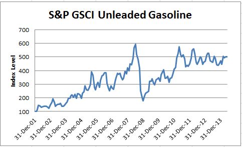
Not only might older cars have lower fuel efficiency but the price of gasoline as measured by the S&P GSCI Unleaded Gasoline has increased five-fold since the end of 2001.

Source: S&P Dow Jones Indices. Data from Dec 2001 to May 2014. Past performance is not an indication of future results. This chart reflects hypothetical historical performance. Please note that any information prior to the launch of the index is considered hypothetical historical performance (backtesting).  Backtested performance is not actual performance and there are a number of inherent limitations associated with backtested performance, including the fact that backtested calculations are generally prepared with the benefit of hindsight.

Although the biggest price spikes historically occur in the winter from the transportation difficulty of petroleum, the prices typically heat up in the summer.  The hottest summer month for gas prices is historically in July with an average monthly return of 2.8% since 2002.

Source: S&P Dow Jones Indices. Data from Jan 2002 to May 2014. Past performance is not an indication of future results. This chart reflects hypothetical historical performance. Please note that any information prior to the launch of the index is considered hypothetical historical performance (backtesting).  Backtested performance is not actual performance and there are a number of inherent limitations associated with backtested performance, including the fact that backtested calculations are generally prepared with the benefit of hindsight.

Despite this, since 2002, the prices have gone up through time regardless of seasonality.  See below the chart that measures prices by month through time. From Jan 2002- May 2014, prices have increased whether looking at every February, July or October.

Source: S&P Dow Jones Indices. Data from Jan 2002 to May 2014. Past performance is not an indication of future results. This chart reflects hypothetical historical performance. Please note that any information prior to the launch of the index is considered hypothetical historical performance (backtesting).  Backtested performance is not actual performance and there are a number of inherent limitations associated with backtested performance, including the fact that backtested calculations are generally prepared with the benefit of hindsight.

With generally rising gas prices and lower fuel efficiency that are costly in terms of dollars, holding onto an old car may not be an optimal choice.

Further, keeping an old car with less gas mileage may be bad for the environment.  According to the U.S. Department of Energy, one gallon of gasoline creates 20 pounds of carbon dioxide. With cars of an average age of 11.4 years, that use 2.5 MPG less than the new models of today, that adds up to 50 incremental pounds on average of carbon dioxide per mile. Given, there are 252.7 million cars on the road today, that is a lot of additional carbon dioxide. See below for annual tons of carbon dioxide per MPG. Just another reason to by a new car (or just ride a bike like I do.)

http://www.fueleconomy.gov/feg/climate.shtml

*Source: S&P Dow Jones Indices. Data from Dec 2001 to May 2014. Past performance is not an indication of future results. This chart reflects hypothetical historical performance. Please note that any information prior to the launch of the index is considered hypothetical historical performance (backtesting). Backtested performance is not actual performance and there are a number of inherent limitations associated with backtested performance, including the fact that backtested calculations are generally prepared with the benefit of hindsight.


The posts on this blog are opinions, not advice. Please read our Disclaimers.

Quality: A Distinct Equity Factor?

Contributor Image
Daniel Ung

Former Director

Global Research & Design

Size, momentum, volatility and value have all been shown to be partly responsible for explaining equity returns over the long run but they do not seem to fully capture the returns of some companies. This has therefore given credence to the idea that a fifth factor – quality – exists and, when combined with other risk factors, acts as a good diversifier in investment portfolios. Click here to read our latest research on this topic or sign up for our webinar via this link: http://bit.ly/1ikwEDv

What is Quality?

There isn’t much agreement on what ‘quality’ is or how it should be measured. Some simply equate it to profitability and others, believing it to be a multi-faceted concept, use more complex measures (e.g. the Piotroski’s F score). Regardless of the approach taken, the aim of any quality measure should help estimate a company’s future profitability and understand its source of risk. Broadly speaking, high-quality companies should generate higher revenue and enjoy more stable growth than the average company. This is why we believe that any good quality measure should take into account profitability generation, earnings quality and financial robustness.

How Does Its Performance Stack Up?

Quality strategies broadly outperformed their benchmarks, both on an absolute and risk-adjusted basis. Among all the regions we examined, the out-performance was highest in the US. In addition, quality strategies held up well in bear markets and although their performance lagged in bull markets, they nonetheless participated in bull market rallies (such as 2003 and 2004).

In What Macroeconomic Environment Does It Do Well?

Quality stocks are sensitive to economic growth and tend to deliver higher excess return when the economy slows. That said, their attractiveness diminishes when the economy experiences above-trend growth, although they still deliver positive excess returns. In comparison with the S&P 500, S&P 500 Quality is exposed to industrial production and the narrowing of credit spreads. However, the quality index does not have any significant tilt towards oil prices, inflation, housing starts or the slope of the yield curve.

quality 1

Source: Figures based on monthly USD total returns between December 1994 and December 2013 on the S&P 500 Quality Index.  Charts and graphs are provided for illustrative purposes.  Past performance is no guarantee of future results.  These charts and graphs may reflect hypothetical historical performance.

OK… There Is Out-performance But Where Does It Come From?

Compared to the S&P 500, S&P 500 Quality has a tilt towards value stocks, lower debt, lower earnings volatility and higher earnings growth – which are attributes usually associated with ‘good quality’ companies.

quality 2

Source: Figures based on monthly USD total returns between December 1994 and December 2013 on the S&P 500 Quality Index.  Charts and graphs are provided for illustrative purposes.  Past performance is no guarantee of future results.  These charts and graphs may reflect hypothetical historical performance.

More Powerful Together Than Apart?

On the face of it, low volatility and high quality strategies seem very similar but there are important differences between their sources of return. Similarly, because quality strategies also have some tilt towards value stocks, there may be the belief that they are analogous concepts. Results have shown that while quality strategies already perform well by themselves, they appear to be good companions of other alternative beta strategies.

Combination of Quality and Value Strategies
Metric Value Strategy 1: 50% Value /50% Quality Equal Weight Strategy 2: Quality on a Value Universe
Annualized Return (%) 5.58 6.94 11.98
Annualized Risk (%) 16.63 14.93 15.13
Return per Unit Risk 0.31 0.46 0.79

Source: Figures based on monthly USD total returns between December 1994 and December 2013 on the S&P 500 Quality Index and S&P 500 Value Index.  Charts and graphs are provided for illustrative purposes.  Past performance is no guarantee of future results.  These charts and graphs may reflect hypothetical historical performance.

The posts on this blog are opinions, not advice. Please read our Disclaimers.

Is 3% The New Black?

Contributor Image
Kevin Horan

Former Director, Fixed Income Indices

S&P Dow Jones Indices

As with each summer’s fashion a new color of dress becomes the “new black”.  Pink, green, orange, you make the choice.  In regard to the bond markets the question could be is 3% the new black?  Bill Gross seems to think so, he is calling for economic growth and yields to remain slow and low, not returning to the levels seen prior to 2008.  Global central banking monetary policy has been highly accommodative.  Actions last week seem to support Mr. Gross’s view as the European Central bank followed through with a much expected cut in rates moving the benchmark rate from 0.25% to 0.15% and the Deposit facility from 0% to -0.10%.

Last week provided plenty of information and enough commentary to heat the debate of the direction of interest rates.  The reaction to German unemployment, unwinding of shorts and the expectations for an ECB rate cut that brought the US 10-year down to a 2.40% just prior to month end eased as rates have crept back upwards.  The yield of the S&P/BGCantor Current 10 Year U.S. Treasury Index started the week at a 2.53% and continued upward to a 2.60%.  Currently 2.6% is 40 basis points below the beginning of the year’s 3%.

The U.S. economic calendar for this week starts tomorrow with Wholesale Inventories for April expected at a 0.5% versus the prior 1.1%.  Wednesday’s MBA Mortgage Applications (-3.1% prior) and Thursday’s Retail Sales (0.6% expected), Initial Jobless Claims (310k exp.) and Business Inventories (0.4% exp.) will all be announced.  Friday will close the week with May’s PPI (0.1% exp.) and the University of Michigan Confidence from which an 83 is expected, up from the prior 91.9.

The search for yield has put a spotlight on the higher yielding credits like senior loans and high yield bonds but what about investment grade credits?  The demand for corporate bonds has been very high and corporate issuers have met demand as mentioned in Tim Sturrock’s article Global Fixed Income Investors Flock to Corporate Bonds.  According to Tim, “corporate bonds in particular, are drawing the bulk of new assets, while government bond strategies are bleeding assets.” The S&P U.S. Issued Investment Grade Corporate Bond Index has returned 4.75% year to date.

After lagging the year-to-date total return of investment grade corporates, the S&P U.S. Issued High Yield Corporate Bond Index surpassed its investment grade counterpart by closing the week with a return of 4.89% YTD.  New Issuance by names such as Advanced Micro Devices, Cascades Inc., DFC Finance, Outerwall, Polymer Group and TRI Pionte Homes having fed the demand for high yield paper.

The S&P/LSTA U.S. Leveraged Loan 100 Index returned 0.16% month-to-date and now has returned 2.08% for the year.  Issuance totals mounted quickly this week as borrowers eyed climbing rates ahead of potentially abetting inputs from ECB policy. A total of 23 issuers placed roughly $26 billion of new supply from Monday to Wednesday, with slower conditions expected late in the week.

The S&P U.S. Preferred Stock Index (TR) was down for the week and the start of the month returning -0.65%.  The year-to-date high of 9.86% reached on May 19th has shrunk to 9.68% while strength in the equity markets may have seen investor reallocating funds as the year-to-date return of the S&P 500 has gone from 2.8% to 6.43% over the same time frame.


Source: S&P Dow Jones Indices, Data as of 6/6/2014, Leveraged Loan data as of 6/8/2014.

The posts on this blog are opinions, not advice. Please read our Disclaimers.

Leveraged Loans: Not so obscure anymore

Contributor Image
Vishal Arora

Former Director and Global Head, Fixed Income Product Development

S&P Dow Jones Indices

Leveraged loans or Senior Loans once an obscure area in Fixed Income space has seen real growth in assets inflow in last couple of years. Lipper reported a 95 week of net inflows in loan funds that ended in April of this year. What are senior loans and what makes them so attractive in this market.

Senior secured loans: Leveraged Loans or senior loans are on top of a company’s capital structure so they are the first to be repaid before other debt obligations and equity holders.

Higher yields: Most of the debt issued under this category is below investment-grade, thus the securities have higher than comparable investment grade instruments.

Floating rate: Coupon is floating rate, generally pegged to 3 month LIBOR resetting quarterly or on a preset frequency with 0.25 duration, thus the interest rate risk is minimum.

Diversification: Since the instruments are floating rate and get reset as the interest rates rise, it provides a good diversification for a traditional fixed income portfolio.

Recognizing the importance of this asset class, S&P Dow Jones Indices developed the S&P Indices Versus Active (SPIVA) Scorecard dedicated to Senior Loans. SPIVA Scorecard measures the performance of actively managed floating-rate loan funds vs. their benchmark, the S&P/LSTA U.S. Leveraged Loan 100 Index. Here are some of the stats:

  • Active funds fared well over the 12-month period ending Dec. 31, 2013, with the majority of active funds (60%) outperforming the benchmark.
  • However, when viewed over medium- to long-term, three- and five-year horizons, 61.54% and 90.48% of the active loan participation funds underperformed the benchmark, respectively.
  • Over the past five years, the number of loan participation funds has nearly doubled, from 21 to 40, which is a testament to the growing popularity of the asset class.

The posts on this blog are opinions, not advice. Please read our Disclaimers.

Weighted earnings: they don't add up... and you may get burned

Contributor Image
Philip Murphy

Former Managing Director, Global Head of Index Governance

S&P Dow Jones Indices

This post looks at why index earnings are derived by summing earnings of index constituents without first weighting the earnings by index weight (cap-weight or otherwise). While earnings are probably the most widely followed fundamental item, this explanation is applicable to a data point of one’s choice – operating earnings, cash flow, etc. An easy way to understand this kind of fundamental index data is to think of an index, such as the S&P 500, as a hypothetical portfolio.

Consider a theoretical example in which we hold 1,000 shares in each of two stocks, ABC and XYZ. ABC is quite profitable, while XYZ is operating at a loss.

 Table A

Despite the fact that 95% of the portfolio is invested in a stock with a PE of 13.3 ($40/$3), the portfolio as a whole has a claim to $1,600 in total earnings. We can’t ignore the losses generated by XYZ simply because we wish to – we hold 1,000 shares and each one is losing $1.40.

Dividing portfolio value by portfolio earnings claims gives a ratio of 26.25 – the price to earnings ratio (PE) of the portfolio. PE, calculated on this basis, has the useful property of indicating how long it takes to “earn” back our investment under current conditions – in this case, 26 ¼ years.

Conversely, if we were to weigh earnings claims by portfolio weights we would get the following:

 Table B

It’s clear to see that one could easily be lead astray by the $2,790 earnings figure, which is the sum of weighted earnings claims. The most significant observation is that the portfolio does not, in fact, hold claim on $2,790 in earnings. This figure exaggerates our legitimate claim of $1,600 by $1,190! Obviously, if one were to calculate a PE ratio on this basis, it would be unrealistically low. Our two-stock example shows that a cumulative dollar, whether earned or lost, is equivalent in the aggregate of a portfolio whether it is derived from a large holding or a small one.

Similarly, index earnings represent the aggregate earnings of all companies in the index, and on this basis the index PE provides valuable information. A high index PE may imply a small, or nonexistent, margin of safety – the central investment concept articulated by Ben Graham, who described it as “the secret of sound investment…” and “always dependent on the price paid…”[1]

For more on the ins and outs of index earnings, see David Blitzer’s post from earlier in the year.

[1] Benjamin Graham, The Intelligent Investor, Revised Ed, pages 512, 517. (New York: HarperCollins, 2003)

The posts on this blog are opinions, not advice. Please read our Disclaimers.