Get Indexology® Blog updates via email.

In This List

Some Sectors Are Slippery Slopes as Markets Head Downhill

29 Days Later

The Importance of Asset Class Diversification: A Performance Analysis of the S&P MARC 5% Index

With VIX Above 80, Expect 5% Daily Swings in the S&P 500

Showtime for Active Managers?

Some Sectors Are Slippery Slopes as Markets Head Downhill

Contributor Image
Kevin Horan

Former Director, Fixed Income Indices

S&P Dow Jones Indices

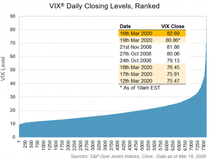
While ski resorts in the Northern Hemisphere were hampered by a mild end of winter, the downhill we are all experiencing has introduced a level of uncertainty and volatility beyond the slopes. The week of March 9, 2020, will go down in history as a time of unprecedented challenge and change. The spread of the COVID-19 virus globally led the World Health Organization to declare a global pandemic. Across the globe, governments and businesses have postponed or cancelled business travel, conferences, flights, festivals, sporting events, and political gatherings. Couple the pandemic with an oil price war between Saudi Arabia and Russia, and you’ve got your hands full.

The total return of the S&P 500® was down 22.9% YTD on March 12, 2020, at a value of 5,051.97, but it bounced back by 9.32% on Friday, March 13, 2020, returning -15.73% YTD. When comparing the total return equity performance to debt, investment-grade corporate bonds as measured by the S&P U.S. Investment Grade Corporate Bond Index returned -1.16% YTD, while the lower-rated S&P U.S. High Yield Corporate Bond Index was down 8.88% YTD.

For the month until March 13, 2020, the S&P 500 was down 8.13%, on a total return basis, while the S&P U.S Investment Grade Corporate Bond Index and S&P U.S. High Yield Corporate Bond Index returned -4.76% and -8.0%, respectively. Much of the return story can be found within the industry sectors of the underlying indices. The common theme among equity and fixed income sectors was the decline in energy. The S&P Global Oil Index lost 13.16% for the month as of March 13, 2020. WTI crude oil went from USD 61 per barrel on Jan. 1, 2020, to its current level of USD 30. Though the oil feud is between Saudi Arabia and Russia, the U.S. and its shale market are getting caught in the middle. U.S. shale firms announced a number of drilling and investment cuts that will negatively affect a number of energy businesses and their employees. Energy support companies that provide supplies, machinery, and exploration services will all be caught up in this downturn.

Exhibit 3 shows the option-adjusted spread (OAS) and the change in OAS year-to-date for each of the industry sectors for the S&P U.S. Investment Grade Corporate Bond Index and the S&P U.S. High Yield Corporate Bond Index. All 11 GICS® sectors for both indices widened out, resulting in higher yields and lower prices. The energy sector again clearly stands out among the sector comparison.

As the economy continues to suffer at the hands of the pandemic and oil shocks, fears of a recession increase with each day. The cancelling and postponing of global events should help curtail the spread of the virus, but the aftereffects experienced by small businesses, restaurants, retail, and employment will likely have a damaging effect for the foreseeable future.

The posts on this blog are opinions, not advice. Please read our Disclaimers.

29 Days Later

Contributor Image
Chris Bennett

Former Director, Index Investment Strategy

S&P Dow Jones Indices

On February 19th, the S&P 500® closed at an all-time high of 3386; last night, exactly one month later it closed at 2409, a 29% decline from the high.  Let’s take a moment to reflect on what’s happened over the last month.

We should first start by putting the decline into historical context. The peak-to-trough decline in the Dow Jones Industrial Average was 33%, comparable to its slide during the bursting of the Tech bubble from 2000 to 2001.  We are still off from the 54% decline in the Global Financial Crisis in 2008, and would need an even steeper drop to put this recent crisis on par with the Great Depression’s 89% market decline.  The unusual aspect of the current selloff has been its speed; the previous declines happened over multiple months and years; this recent drop happened in less than a month, with some days of trading echoing the extraordinary events of 1987.

Broadly, global equities have plummeted across the board.   Almost every major market is down more than 20% over the period.  China, which didn’t have quite the same run-up in early 2020 due to the coronavirus’ early spread there, offers a rare exception.

The S&P Global BMI is down 31% over the last month, wiping $19T off the market cap.  Central banks and governments have stepped in to help soften the blow, announcing both monetary (interest rate cuts, QE) and fiscal (bailouts, cash to citizens) measures.  While the ink is not yet dry, there have been a number of major commitments from central banks and governments, adding up to around $7.6T in total stimulus globally (and more to come).  Here’s our estimate of the current extent of the so-far announced measures, in comparison to the capitalizations lost by the Global BMI’s countries.

VIX® spiked to unprecedented levels.  In a history that stretches back over 7,500 trading days to January 1990, five of the eight highest closing levels for VIX occurred during the recent panic.  Only the peaks in volatility that occurred during the 2008 financial crisis saw anything similar.  The chart below comes from my colleague Tim Edwards’ most recent blog,  in which he explains that, with VIX near 80, 5% up or down is the “new normal” for the S&P 500.

It wasn’t only volatility in equity markets that shocked us, however; volatility measures spiked across nearly all asset classes, particularly oil.  After Saudi Arabia’s decision to flood the market with cheap oil following a disagreement with Russia on production cuts,  the price of oil plummeted, pulling the energy sector down sharply with it.  We saw all time-highs in several of the volatility indicators supported by S&P DJI; here are their current levels, versus their levels one month ago, and their highest close in the interim.

Interest rates have also been extremely volatile.  At one point, the U.S. 10Y Treasury yield dropped as low as 0.32% but has since rebounded to 1.04%.  While it may not sound like much, those are major moves for a developed market sovereign, particularly when you consider that yields jumped back up while equity markets dropped sharply.   Today the yield curve looks very different from one month ago, though it does now more closely resemble an actual curve.

What will be perhaps most interesting will be to see how active equity managers navigated the crisis.   According to recent dispersion readings, the opportunity to outperform the market has been as high as its been in a long while, which means that it’s showtime for active managers.

Regardless of where the market goes from here, or if active managers have indeed navigated the choppy seas, the last month will likely be one we’d all like to forget.

For more market commentary and perspective, register at www.bit.ly/spdjidd to sign up for our daily dashboard.  

The posts on this blog are opinions, not advice. Please read our Disclaimers.

The Importance of Asset Class Diversification: A Performance Analysis of the S&P MARC 5% Index

Contributor Image
Karina Tjin

Former Analyst, Strategy Indices

S&P Dow Jones Indices

Recent selloffs in the equity markets and a significant rise in volatility signal an end to the 11-year bull market (Bye Bye Bull Market: Reaction to Coronavirus). While most broad market domestic equity indices have declined, the performance of the S&P MARC 5% Index (ER) has held up (1.84%). The answer to its resiliency lies in its index construction, which attempts to maximize diversification benefits.

As the name implies, the index allocates the weight across multiple asset classes: the S&P 500® (ER), S&P 10-Year U.S. Treasury Note Futures Index (ER), and the S&P GSCI Gold (ER). Exhibit 1 shows the year-to-date performance of the S&P MARC 5% Index against its underlying components. Looking at the performance of the underlying assets, we can see that the index benefited from positive performance by the S&P 10-Year U.S. Treasury Note Futures Index (5.90%) and less negative performance by the S&P GSCI Gold (-0.27%).

Next, we look to see if asset class diversification provided similar benefits historically. Exhibit 2 shows the historical breakdown of asset classes during the past 12 months. We see that the index performance was driven primarily by higher allocations to fixed income and commodities. On average, the highest allocation was to fixed income, at 67.6%, followed by gold (26.2%) and equities (23.7%). The S&P MARC 5% Index was over 100% allocated to its underlying assets for approximately 91% of the period studied. There were only a few instances when the allocation dropped below 100%, the most recent one occurring last week, with the index allocating to its underlying assets rather than to cash.

Year-to-date, we see that the S&P MARC 5% Index (ER) typically had smaller drawdowns relative to its underlying asset classes (see Exhibit 3). The maximum drawdown from Jan. 1, 2020, to March 17, 2020, of the index was -3.3%. It is quite evident that higher allocations to Treasuries and gold mitigated the large movements in the equity sleeve. The S&P 10-Year U.S. Treasury Note Futures Index (ER) and S&P GSCI Gold (ER) were steadier, with drawdowns of -2.6% and -11.4%, respectively. Meanwhile, the S&P 500 (ER) saw more drastic movements, with a maximum drawdown of -29.5% for the period studied.

The performance of the S&P MARC 5% Index (ER) during the recent drawdown demonstrates the benefits of portfolio diversification. With the index allocating across multiple asset classes, returns were more stable with smaller drawdowns, especially during times of high volatility.

The posts on this blog are opinions, not advice. Please read our Disclaimers.

With VIX Above 80, Expect 5% Daily Swings in the S&P 500

Contributor Image
Tim Edwards

Managing Director, Index Investment Strategy

S&P Dow Jones Indices

Volatility – it is sometimes said – takes the elevator up but takes the stairs down.  Like seismic activity, volatility can rise precipitously, but tends to decay more slowly; aftershocks and tremors continue to roil markets after any major repricing occurs.  The practical consequence is that, once the markets become volatile, they tend to remain so for some time.  For the short term at least, outsized daily moves will be the new normal.

Exhibit 1: Large Swings Have Become Commonplace

Prior to this month, the last time that the Dow Jones Industrial Average® moved by 5% in a single day was almost 11 years ago.  However, the Dow has swung that much (or more) nearly every day in March, including a single-day decline of 12% on Monday that marked its worst day since the infamous “Black Monday” of 1987.  How long might this continue?

Sometimes called the market’s “fear gauge”, Cboe’s Volatility Index, better known as VIX®, gives an indication of how much volatility the market expects in the near term (or, more accurately, the level of volatility that would justify the current prices of S&P 500® options).  In a history that stretches back over 7,500 trading days to January 1990, five of the eight highest closing levels for VIX occurred in the past week.  Only the peaks in volatility that occurred during the 2008 financial crisis saw anything similar.

Exhibit 2: Five of the highest-ever closes in VIX occurred in the last week.

What does a VIX of 80 mean?  In the simplest possible terms, it means that the market expects daily moves in the equity markets to be around four times larger than normal.  Over its long history, the S&P 500 has moved a little under 1% each day, on average.  With VIX currently standing at four times its long-term average of 20, daily moves in the S&P 500 of around 4% are implied for the next month. 

Further, VIX is a forward looking measure, based on traded prices of listed options and with a 30-day horizon for its prediction.  VIX also encodes the expectation that volatility – once elevated – is likely to revert to its average, eventually.  Accordingly, in the very short term, moves of more than 4% should be expected.  Confirming the point, Cboe’s measure of volatility expectations for the next week (the VSXT index) has an index level of 96 (at time of writing), meaning that over the next few trading days, 5% moves in the S&P 500 are the “new normal”.

(For a more in-depth explanation of what information may be usefully discerned from a given VIX level, see our earlier paper, “A Practitioner’s Guide to Reading VIX”)

Beyond the U.S. equity market, indices using the same methodology that VIX uses to reflect S&P 500 volatility expectations have been developed for a range of global indices.  Many of these global volatility indicators are currently indicating similar levels of record-high uncertainty.  Volatility indicators for crude oil and U.S. Treasury bonds made record closing highs yesterday.  Check out the latest readings in S&P DJI’s most recent Risk and Volatility Dashboard.

Further Reading:

The posts on this blog are opinions, not advice. Please read our Disclaimers.

Showtime for Active Managers?

Contributor Image
Anu Ganti

U.S. Head of Index Investment Strategy

S&P Dow Jones Indices

The rapid spread of coronavirus and oil price concerns have whipsawed U.S. equities since the S&P 500® reached its all-time high on Feb. 19, 2020. On March 16, 2020, the index plummeted by 12%, its worst decline since October 1987; as of the close of trading on March 18, 2020, losses for the S&P 500 amounted to 29%. Market commentators have argued that in this environment, active management has an advantage over index funds.

At one level, this argument is correct. We are in precisely the environment in which active portfolio managers have the most potential to add value, since relative returns are easier to achieve when absolute returns are poor.

To understand this, we examine the rise in volatility that has accompanied the stock market’s decline. Higher volatility manifests itself as both higher dispersion and higher correlation; dispersion is a measure of magnitude, while correlation is a measure of timing. We have argued repeatedly that the value of stock-selection skill rises when dispersion is high: a larger gap between winners and losers means that active managers have a better chance of displaying their stock-selection abilities. Exhibit 1 illustrates that dispersion levels in the S&P 500 have jumped since early March 2020.

Higher dispersion also offers greater opportunities for skillful active managers to add value from selecting among sectors, countries, and asset classes. Exhibit 2 shows that dispersion among S&P 500 sectors almost doubled recently, with similar results across countries and asset classes.

Although more nuanced than the obvious advantage of high dispersion, active managers should also prefer high correlations to low correlations. This is because active portfolios are typically more volatile than their index benchmarks; active managers forgo a diversification benefit. When correlations are high, the benefit of diversification falls, as does the benefit forgone, making active management easier to justify.

Exhibit 3 shows that as macroeconomic risk has escalated, correlations have risen; in fact, the reading of 0.8 on March 16, 2020, is an all-time record.

Both high dispersion and high correlations are now working in active managers’ favor. Higher dispersion means that the value of selection skill rises, while higher correlation means that the volatility gap between active portfolios and index funds declines. However, high potential for active value added does not automatically translate into actual value added. Time will tell how active managers will perform in this environment, but at this time next year, when SPIVA® results for 2020 become available—it would not be shocking if active management performance has improved.

The posts on this blog are opinions, not advice. Please read our Disclaimers.