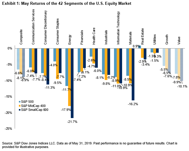
Despite the hovering cloud of geopolitical menace as we entered 2019, the U.S. equity market enjoyed an almost seamless rise through the first four months of the year. May’s retreat reacquainted investors with volatility and served as a reminder that the market is near all-time highs, having enjoyed a more or less sustained increase for 10+ years, and that any number of unpredictable circumstances could adversely affect the economy. Should investors accordingly reduce equity exposure?
Three years ago we introduced the dispersion-correlation map as a guide to understanding market dynamics. Exhibit 1 graphs each year’s average dispersion and correlation, along with the year’s total return for the S&P 500. Dispersion, as the graph shows, tends to cluster in the neighborhood of 20%. The exceptions to this rule are typically years of dramatic market action, including such meltdown years as 2000-03 or 2008. In our (admittedly limited) data history, very high dispersion has been a necessary, but not sufficient, condition for very bad markets. For the 12 months ended May 31, 2019, dispersion crept slightly higher than its long term median but is well below “very high” territory.
EXHIBIT 1: DISPERSION-CORRELATION MAPS (RETURNS)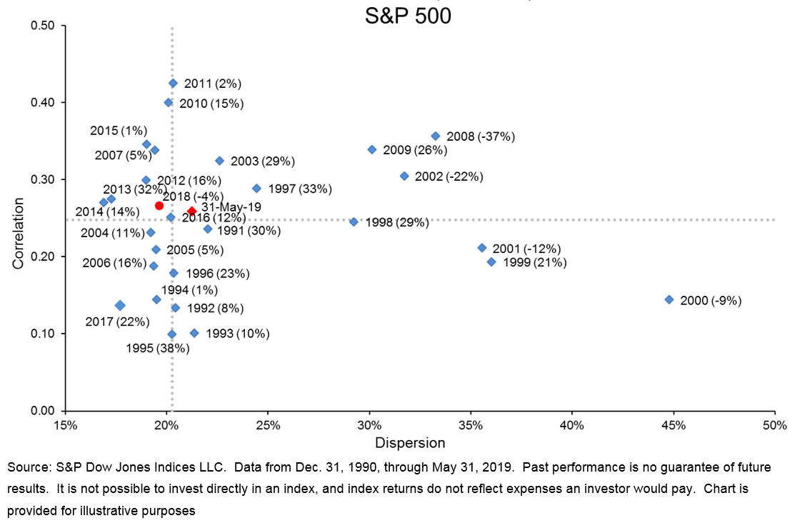
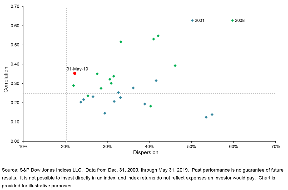
All of the data in Exhibit 1 are 12-month averages. Shifting to one-month data, Exhibit 2 compares May 2019 to the 24 months of two notably-bad years, 2001 and 2008. The conclusion is the same – today’s dispersion level is well below those typically found in market meltdowns.
EXHIBIT 2: S&P 500 MONTHLY DISPERSION & CORRELATION