Get Indexology® Blog updates via email.

In This List

Year-End 2018 Canada SPIVA®: Challenging Three Active versus Passive Misconceptions

Performance of Latin American Markets in First Quarter 2019

Spoiler Alert: Yes

How to Stop Worrying about Inflation

S&P 500® Closes at New Record High

Year-End 2018 Canada SPIVA®: Challenging Three Active versus Passive Misconceptions

Contributor Image
Hamish Preston

Head of U.S. Equities

S&P Dow Jones Indices

Our Year-End 2018 Canada SPIVA scorecard was released today.  In addition to showing that the majority of Canadian active equity managers failed to outperform their benchmarks, the scorecard’s results provide the opportunity to dispel some common misconceptions.  Here is a brief summary.

1) Higher volatility does not necessarily result in outperformance by active managers

A common view among market participants is that more volatile markets favor active management over passive solutions.  However, in a year when Canadian equities were caught up in global equity gyrations, 75% of Canadian active equity managers underperformed in 2018, as the majority of funds lagged in all categories.

Such underperformance by active managers in more volatile environments is consistent with other international regions, and perhaps speaks to a bias many active managers have for higher-beta stocks.  Indeed, these stocks are expected to be more heavily impacted by market corrections.

2) Smaller-cap stocks may not be better suited to active management

Another popular perception is that small- and mid-cap stocks are inefficient asset classes that are more suited to active management.  However, 80% of all small- and mid-cap managers failed to beat the S&P/TSX Completion (-12.85%) in 2018, suggesting they struggled to navigate the market turbulence as the equity benchmark recorded its worst calendar-year performance in a decade.

In fact, only once in the last eight calendar-year periods did the majority of small- and mid-cap managers beat the S&P/TSX Completion.  Hence, using an index-based approach to access smaller Canadian companies would have been beneficial, historically.

3) Get what you pay for? Not necessarily!

In many walks of life we are told that the cost of something is proportional to its quality.  But while some investors may believe higher-fee funds are illustrative of higher quality managers – as measured by their ability to outperform benchmarks – the data does not reflect this.

Exhibit 3 shows the relative performance of surviving active mutual funds in 2018.  Funds in each category are first grouped according to their expense ratio from the end of December 2017: “Q1” contains the 25% of funds in each category with the lowest expense ratio, while “Q4” contains the 25% of funds in each category with the highest expense ratio.  The average relative return in 2018 is then taken for each group; a negative number indicates the benchmark outperformed.

Quite clearly, higher expense ratios were typically associated with a greater degree of underperformance compared to their benchmarks.  Hence, market participants may find it useful to consider the impact of fees in determining relative performance.


The posts on this blog are opinions, not advice. Please read our Disclaimers.

Performance of Latin American Markets in First Quarter 2019

Contributor Image
Silvia Kitchener

Director, Global Equity Indices, Latin America

S&P Dow Jones Indices

As we close the first quarter of 2019, we see that Latin America did well for the period. The broad regional index, the S&P Latin America BMI, yielded nearly 9% and the S&P Latin America 40, representing the blue-chip companies in the region, generated returns just shy of 8%. These were in line with the returns for equity markets in Europe and Japan, where the S&P Europe 350® and the S&P/TOPIX 150 generated returns of 11% and 8%, respectively. The U.S. market did exceptionally well, with the S&P 500® gaining nearly 14% for the quarter.

All of the GICS® sectors in Latin American did well, except for Consumer Discretionary, which remained flat. The sectors that significantly contributed to the region’s performance in Q1 were Energy and Utilities, generating 19% and 14%, respectively.

At the country level, Argentina had a strong quarter, generating 10.5% in ARS as measured by the S&P MERVAL Index. The broad country index, the S&P Brazil BMI, gained around 9% in both USD and BRL. Chile’s S&P/CLX IPSA gained 3% in CLP. The S&P Colombia Select had a stellar quarter, gaining 19% in COP. Mexico’s headline index, the S&P/BMV IPC, returned over 4% in MXN. Finally, Peru’s blue-chip index, the S&P/BVL Peru Select, returned nearly 10% in PEN. Overall it was a great first quarter for markets in the region.

When we look at the other segments of each market, we find indices that not only did well in Q1 2019, but also have been consistently positive over longer periods. A good example of this is the S&P Dividend Aristocrats Brasil Index, which gained nearly 13% for the quarter but also had a strong yield of 6.1%, providing investors with double gains. Likewise, the S&P/B3 Enhanced Value had unsurpassed returns of 35% for the one-year period and 39% for the three-year period ending March 2019. In Chile, the S&P/CLX Chile Dividend Index outperformed the country’s flagship index in terms of both returns and yield. Mexico had a good quarter, but many of its core indices were still in the red for the year and longer time horizons. However, there are a few shining stars that have managed to remain on the positive side for the short- and mid-term periods. Some examples of these are the multi-factor S&P/BMV IPC Quality, Value & Growth, the S&P/BMV FIBRAS Index, and S&P/BMV China SX20 Index. In Peru, the Consumer Staples and Financials sectors have proven to be the most consistent performers over the years.

As we continue through the first half of the year with three months gone and nine more to follow, it’s an opportune time to get a feel for the economies of Latin American countries. For 2019, the general sentiment of global economists for the region is positive. 2018 was a year of elections and new governments for many Latin American countries. In 2019, we are starting to see some of these changes take effect, although it is too early to see the actual impacts. Brazil is now armed with new pro-reform leaders, and its GDP is estimated to grow to 2.4% in 2019. As the U.S. economy is expected to slow down, Mexico, which is partly dependent on its northern neighbor, may be seeing a GDP growth of just under 2%. Additionally, the still-pending ratification of the USMCA agreement (formerly NAFTA) and the uncertainty of the new Mexican government’s policies are dampening the economic outlook for 2019. On the positive side, the GDP of Chile, Colombia, and Peru is estimated to increase 3.3%, 3.1%, and 3.8%, respectively. Argentina, which will have presidential elections later this year, is the only country expected to contract by about 1% in 2019, but has a positive outlook for 2020.[1]

Will these positive economic expectations translate into positive market performance? The answer is maybe. Markets with strong economies do not always generate strong results, and vice versa. However, economic fundamentals help to measure the perceived value of companies. Supply and demand, consumer confidence, credit, and market psychology are all factors that affect the value of a stock directly and indirectly, so it is important to see how our markets’ policies and expectations are developing in order to have a sense of what’s to come.

For more information, check out the Q1 2019 Latin America Scorecard.

[1] FocusEconomics. www.focus-cconomics.com. Feb 12, 2019. Country reports.

The posts on this blog are opinions, not advice. Please read our Disclaimers.

Spoiler Alert: Yes

Contributor Image
Fei Mei Chan

Former Director, Core Product Management

S&P Dow Jones Indices

We recently updated our paper asking Is the Low Volatility Anomaly Universal? The alert reader (and we have no other kind) will have guessed that it is. This is an empirical conclusion, but a theoretical digression might help explain why this is so remarkable.

Low volatility strategies explicitly seek to lower the risk of a portfolio. We learn in basic finance that risk and return go hand in hand. We might therefore expect that with lower risk comes lower return. Except that it doesn’t, as Exhibit 1 below shows. In every market where we’ve developed a low volatility index, it has increased return as well as decreased risk — hence the academics’ description of low volatility’s performance as “perhaps the greatest anomaly in finance.

Exhibit 1: Universally, Low Volatility Strategies Have Outperformed Respective Asset Class Benchmarks with Lower Risk

Source: S&P Dow Jones Indices LLC.  Data through Dec. 31, 2018.  Data start date varies for each index (see Appendix A of Is the Low Volatility Anomaly Universal?).  Standard deviations are computed by annualizing the standard deviation of monthly returns.  Past performance is no guarantee of future results.  Chart is provided for illustrative purposes and reflects hypothetical historical performance.  Please see the Performance Disclosure at the end of this document for more information regarding the inherent limitations associated with back-tested performance.

Our paper explores the characteristics of low volatility strategies, the most important of which, by far, is that they attenuate the magnitude of market returns — in both directions.  Exhibit 2 below highlights the performance pattern of the S&P 500 Low Volatility Index®.

Exhibit 2: Low Volatility Strategies Tend to Offer Protection in Down Markets but Won’t Participate Fully in Up Markets

Source: S&P Dow Jones Indices LLC. Data from Dec. 31, 1990, to Dec. 31, 2018. Biggest declines were months when the benchmark was down more than 2.46%, moderate declines were months when the benchmark returned between -2.46% and 0%, moderate gains were months when the benchmark returned between 0% and 2.45%, and biggest gains were months when the benchmark gained more than 2.45%. Past performance is no guarantee of future results. Chart is provided for illustrative purposes and reflects hypothetical historical performance. Please see the Performance Disclosure at the end of this document for more information regarding the inherent limitations associated with back-tested performance.

When the market is down, Low Volatility is highly likely to outperform; if the market is up substantially, Low Volatility is likely to underperform.  Small positive months are close to a toss-up.  Exhibit 2 summarizes data with respect to the S&P 500 Low Volatility Index, but our paper documents nearly-identical patterns for every other index in our low volatility family.  Our claim that the low volatility anomaly is universal rests not only on its long-term performance, but also in its common response to moves in the underlying market.

The posts on this blog are opinions, not advice. Please read our Disclaimers.

How to Stop Worrying about Inflation

Contributor Image
David Blitzer

Former Managing Director and Chairman of the Index Committee

S&P Dow Jones Indices

Inflation in the US averaged 1.5% annually for the last five years with a peak of 2.9%. Despite today’s low and stable inflation numbers, anxiety that the price level will leap up is driving a search for the reasons it seems low. Today’s inflation is a bit lower than the average since 1914 of 3.2% but is certainly not extremely low.  Over the last 105 years, the inflation rate has been 5% or less about 80% of time. Months when prices rose faster than that were either wars, oil crises or rebounding from severe economic downturns.  In normal economic times, inflation has not been a problem.  In the decade of the 1970’s (1971-80) – everyone’s inflation nightmare – the average inflation rate was 7.9%. Moreover, that period included the last four years of the Vietnam War and two oil crises.

A review of the last 100 years of data shows that wars and oil crises were largely responsible for inflation rates beyond a range of about zero to 5%.  The first chart shows the Consumer Price Index since 1914 with the oil crises in 1973-4 and 1979, World War I, World War II, the Korean War and the Vietnam War all marked. Inflation tended to rise during and immediately after these events.

The highest inflation level shown was in June 1920. World War I ended in November 1918 and the economy rebounded from the War in 1919-1920 before falling into a deep recession in 1921 when inflation collapsed to -15.3% a year later.  Following World War II the economy paused briefly and then surged, pushing inflation to almost 20%. Since the end of the Korean War in 1953, oil crises more than war created spikes in the inflation rate.  The second chart adds shading showing recessions to show how inflation responds to business cycle movements.

Some analysts argue that inflation depends on growth in the money supply – that prices will rise whenever the Federal Reserve cuts interest rates and expands the money supply.  Classic studies on hyperinflation periods between the world wars reveal a strong link between money and prices.  However, the experience of the last ten years when the Fed pushed interest rates down to almost zero and measures of the money supply ballooned suggests that the price level-money linkage is not working.  The chart compares the growth in the M-2 money supply measure with the inflation rate since 1960. In the mid-1960’s to mid-1970’s inflation appears to follow growth in M-2 with a lag of about two to three  years. This pattern disappeared after the early 1980’s. Moreover, data before 1960 using the Monetary Base instead of M-2 does not show a consistent connection between prices and money.

The cost of housing – both rent and the cost of home ownership – together represent one-third of the Consumer Price Index.  With home prices rising since 2012 and recent data pointing to a rebound in housing activity, some are worried that housing will boost inflation beyond 5% in 2019 or 2020. Housing-related inflation rose from zero in 2009 to almost 4% in the beginning of 2017. Since then it has come down slightly.  Housing does not seem to threaten a surge in inflation.

Sources: Inflation and growth rates are calculated as the percentage change over the trialing 12 months for all the charts. Data are from the St. Louis Federal Reserve Bank FRED data bank. Inflation is measured as the Consumer Price Index for All Urban Consumers (CPI-U) published by the Bureau of Labor Statistics. The Money Supply (M-2) is published by the Federal Reserve. Recession dates are defined by the National Bureau of Economic Research.

The posts on this blog are opinions, not advice. Please read our Disclaimers.

S&P 500® Closes at New Record High

Contributor Image
Louis Bellucci

Senior Director, Index Governance

S&P Dow Jones Indices

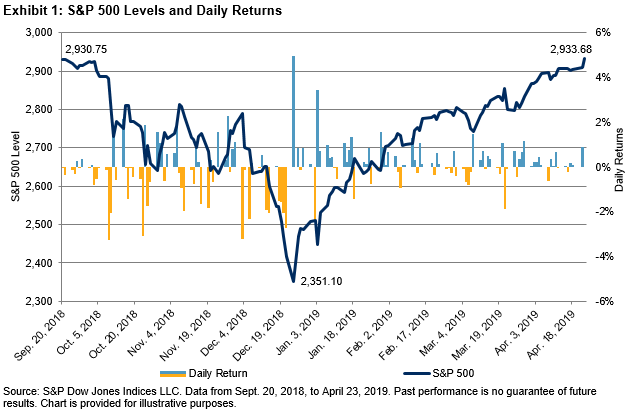
The S&P 500 closed April 23, 2019, at a new record high. The index’s closing value of 2,933.68 is the highest since the 2,930.75 posted on Sept. 20, 2018. From that previous high, the benchmark declined 19.86% to 2,351.10 by Dec. 24, 2018, narrowly avoiding bear market territory. December 2018 was the second-worst December in the history of the S&P 500, only better than December 1931.

In the first seven trading days of 2019, the S&P 500 marked its 12th best start on record since 1928 and its best since 2003. The index rebounded, posting three consecutive positive months to start 2019, pausing only briefly around 2,800 resistance levels. April is currently on pace to post the fourth consecutive month of gains. As of the close on April 23, 2019, the S&P 500 was just 2.26% away from reaching 3,000.

Market corrections are often short lived and the recovery swift—this most recent occurrence was no exception. Since the start of 1989, there have been 10 instances when the S&P 500 declined over 10% from a record high, which averages to about once every three years, and the average number of trading days it took for the S&P 500 to reach a new record high again was 428. Excluding the dot-com crash (March 2000-October 2002; 1,803 days to new high) and housing crisis (October 2007-March 2009; 1,376 days to new high), the average of the remaining eight instances was 138 trading days, or roughly six months. This most recent period, September 2018 to April 2019, had 146 trading days between new record highs.

Earnings season is underway and has helped push the S&P 500 to its new record close. Although far from complete, and with many noteworthy companies yet to report, earnings reported thus far have been solid overall, buoyed by modest expectations. Among other factors, the correction from the previous high in September was triggered by fears of slowing economic growth in China and Europe, the escalating U.S.-China trade dispute, expectations that the Federal Reserve would continue raising interest rates, and a softening housing market. These issues remain mostly unresolved, but sentiment has shifted with progress being made in U.S.-China trade negotiations and the Fed becoming more dovish to the point that it paused rate increases and unwinding its balance sheet for the foreseeable future.

The Dow Jones Industrial Average® is rebounding, but has not yet fully recovered from the correction. Closing at 26,656.39 on April 23, 2019, The Dow® sits just 0.65% below its all-time high close of 26,828.39 (Oct. 3, 2018). The mid- and small-cap core indices are also approaching—but have not yet surpassed—their pre-correction highs, and they could be considered to have lagged large caps in the rebound. The S&P MidCap 400® and S&P SmallCap 600® would need to rise by another 4.03% and 13.04%, respectively, in order to achieve new highs.

The posts on this blog are opinions, not advice. Please read our Disclaimers.