Get Indexology® Blog updates via email.

In This List

Using Trailing Dividend Yield Versus Indicated Dividend Yield

The S&P 600 Escapes Suffocation From Q4 Benchmark Hugging

What September Brings for the S&P/CLX Index Series

Introducing the S&P Global 1200 Communication Services Sector

India Targets Better Environmental Performance

Using Trailing Dividend Yield Versus Indicated Dividend Yield

Contributor Image
Qing Li

Director, Global Research & Design

S&P Dow Jones Indices

Over the past decade, the combination of low interest rate environments and shifting demographics has made income-focused investment strategies extremely popular. In constructing an income-producing equity index, the dividend yield of a security serves as a key criteria for eligibility and security selection.

Dividend yield is usually calculated as a percentage of a stock’s annual dividend-per-share relative to the stock’s current price. There are two ways to measure dividend yield: trailing dividend yield and indicated dividend yield. The difference lies in the numerator of the yield formula—using the trailing dividends or indicated dividends over a specified period. Trailing annual dividends are the sum of the dividends paid out over the last 12-month period, and indicated annual dividends are the sum of the dividends that are expected to be paid out over the next 12-month period. Indicated annual dividends are usually calculated as the most recent dividend payments multiplied by the frequency of dividend distribution. The key distinction between trailing annual dividends and indicated annual dividends is that the former is backward-looking whereas the latter is forward-looking.

The question then arises: In what kind of market is it suitable to use one type of dividend yield versus the other? The answer lies in the consistency of dividend payments. We find that the consistency of dividend payments varies from country to country and by region. In markets where companies lack stability in dividend payments, particularly when it comes to regular payout schedules or payout amounts, a trailing dividend yield measure is preferable. Since the dividends have already occurred, the calculation of trailing annual dividend yield reflects the realized information.

However, when the frequency and timing of dividend payments are known in advance or are stable, the use of indicated dividends can better capture any upcoming dividend increase or decrease. Therefore, the indicated dividend yield is more reflective of the future income an investor will receive at the end of a period. For a mature company that rarely changes its dividend policy, the dividend yield calculated by trailing or indicated methods may not differ by much. However, during periods of financial stress, when significant dividend cuts or eliminations occur, a company may have a trailing dividend yield but its indicated dividend yield could be 0%.

To examine dividend payment behaviors in different markets, we used S&P Global BMI companies, broken down by region (see Exhibit 1). In the developed Asia Pacific market, many countries chose to pay dividends semiannually, with the exception of South Korea where nearly 75% of the companies paid dividends once a year. In the emerging Asia Pacific market, there was no typical dividend payout pattern, with the exception of Taiwan where 92% of companies paid dividends annually.

In Europe, more than half of the countries paid dividends once a year, but the dividend payments in the UK and Ireland typically occurred twice a year. In addition, a handful of European countries did not have a universal payout schedule. In Latin America, over 60% of Brazilian companies and 70% of Colombian companies paid quarterly dividends, but the overall payout schedule for the rest of Latin American countries was less clear. In North America, companies normally issued dividends on a quarterly basis, so the widely accepted industry practice in the U.S. and Canada is to use the indicated dividend yield. In contrast, the trailing dividend yield is commonly used for the rest of the markets or when comparing across regions.

Understanding the timing and consistency of dividend payments in different markets can potentially help market participants make informed decisions on which dividend yield is an appropriate metric to use. As we highlighted above, while companies in certain markets have stable dividend policies, companies in other markets have less reliable dividend distribution schedules. Therefore, the use of dividend yield measure should adapt to reflect the characteristics of the local equity market.

The posts on this blog are opinions, not advice. Please read our Disclaimers.

The S&P 600 Escapes Suffocation From Q4 Benchmark Hugging

Contributor Image
Jodie Gunzberg

Former Managing Director, Head of U.S. Equities

S&P Dow Jones Indices

Small caps are outperforming large caps significantly in 2018, mainly from the tax cuts, growthstrong dollar and concern about international trade.  This has driven the S&P 600 (TR) 8.4% higher than the S&P 500 (TR) (year-to-date through Aug.31, 2018,) measuring the 5th biggest small cap premium in history since 1995, and is the biggest since 2008, when it reached 10.2%.  However, the premium has narrowed to 6.9% in the first two weeks of Sep. and has sparked some debate over whether small caps can continue to outperform.

Source: S&P Dow Jones Indices

In at least one recent article, the author’s opinion is to avoid small caps for the rest of the year.  The reason is justified mainly since benchmark hugging becomes prevalent in Q4.  In order to lock-in gains relative to stated benchmarks for compensation purposes, portfolio managers outperforming  their market cap weighted benchmarks through the first three quarters are likely to sell overweights of smaller stocks and trade into larger stocks to match the benchmark.  On the flipside, if a manager’s performance is lagging the market cap weighted benchmark, the manager may also move toward benchmark weights to avoid the bottom and prevent getting fired. The article proves its point by using the most widely adopted small cap benchmark, the Russell 2000, to show small caps underperform large caps in Q4.

So, what happens to small caps that comprise an index that is only used as a benchmark by 3% of managers? 

As shown in a prior note, and part of a larger paper, the S&P 600 is only used by 25 of 832 managers, representing just 3% of the manager universe and 5% of assets.

Source: eVestment Alliance, LLC. Data includes the eVestment US Small Cap Equity, US Passive Small Cap Equity, and US Enhanced Small Cap Equity Universes. The Russell 2000 and S&P SmallCap 600 rows include sub-indices such as Value and Growth. eVestment Alliance, LLC and its affiliated entities (collectively, “eVestment”) collect information directly from investment management firms and other sources believed to be reliable, however, eVestment does not guarantee or warrant the accuracy, timeliness, or completeness of the information provided and is not responsible for any errors or omissions. Performance results may be provided with additional disclosures available on
eVestment’s systems and other important considerations such as fees that may be applicable. Not for general distribution and limited distribution may only be made pursuant to client’s agreement terms. *All categories not necessarily included, totals may not equal 100%. Copyright 2012-2017 eVestment Alliance, LLC. All rights reserved. Table is provided for illustrative purposes.

This seems to insulate the S&P 600 index from larger benchmark hugging problems evident in historical fourth quarter performance for small caps.  Using data since Q1 1995, the earliest available for the S&P 600, it has outperformed the S&P 500 in each quarter on average.  The premium is 0.03% in Q1, 1.57% in Q2, 0.12% in Q3, and 0.56% in Q4, making Q4 seem relatively attractive on average for small caps when using the S&P 600.  On average, 6 sectors delivered positive premiums in Q4, including utilities, financials, information technology, industrials, health care and real estate, so there may be opportunities in sector rotation strategies, especially into industrials, information technology and real estate that typically have negative premiums in the third quarter.

Source: S&P Dow Jones Indices. Data from Q1 1995 through Q2 2018, except real estate is from Q4 2001, and growth and value are from Q2 1997.

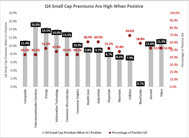
Another interesting observation is that when the small cap premium is positive in Q4, its premium is nearly double the positive premiums in other quarters. While on average the S&P 600 (TR) outperforms the S&P 500 (TR) by 0.6% in Q4, when the small cap premium was positive in Q4, it was 11.4%, which is much higher than the 4.0%, 6.9% and 6.4% observed during positive quarters, respectively, in Q1, Q2 and Q3.  Utilities, health care, industrials, real estate and financials were not only positive on average in Q4 but were also positive in Q4 in more than half the years.  Energy was also positive in Q4 more frequently than negative with an exceptionally large premium on average of 14.5%.

Source: S&P Dow Jones Indices. Data from Q1 1995 through Q2 2018, except real estate is from Q4 2001, and growth and value are from Q2 1997.

The conclusion is that small cap losses due to benchmark hugging in Q4 shouldn’t necessarily discourage investors from small cap indexing through the year’s end.  However, the split between the investable index and benchmark becomes ever more important for performance.  In the S&P 600 that is rarely used as a benchmark, performance is driven by the quality and fundamentals per sector such as the usage of utilities across other industries and its domestic focus – especially in small caps with 100% revenue from the U.S., or how small cap energy rises more than large cap energy from rising oil.

For more information about active versus passive performance in small caps, please visit our SPIVA report.  Notice 91% of small cap managers fail to beat the S&P 600 over a 5-year time period, a likely reason managers choose not to use it.  Also, please see our full report “Big Things Come In Small Packages” for a side by side methodology comparison of the S&P 600 versus the Russell 2000The quality screen in the S&P 600 is necessary to earn the small cap premium.


The posts on this blog are opinions, not advice. Please read our Disclaimers.

What September Brings for the S&P/CLX Index Series

Contributor Image
Silvia Kitchener

Director, Global Equity Indices, Latin America

S&P Dow Jones Indices

September is here. The entire Chilean investment community has been looking forward to this month for many reasons. For one, the transition of operations of the Chilean indices has been completed. S&P Dow Jones Indices (S&P DJI) is now the official index administrator of the Bolsa de Santiago’s indices. Secondly, the rebalancing and reweighting of many of the indices will be taking place in September. This means that many of the changes we previously announced will finally be implemented. Despite what appears to be a great disruption in the indices, the market overall seems to see these changes as a timely and positive step in the future development of the Chilean benchmarks.

Let’s be specific about what is happening in September. First, as previously announced, the indices will undergo their corresponding rebalancings or reweightings. What is the difference, you ask? A rebalancing, in the context of this document, refers to changes in the composition of the index, as well as the shares outstanding and float factors. A reweighting is an update of the weights, shares, and float factors. Normally, there are no changes to the composition of the indices during reweightings. Exhibit 1 shows all of the S&P/CLX Indices and their upcoming rebalancing effective dates.

In addition to their regular scheduled rebalancings, all indices are reviewed quarterly for reweighting adjustments. These happen every third Friday of March, June, September, and December. The S&P/CLX Chile 15 Index and S&P/CLX Chile Dividend Index are the exception to this rule. The S&P/CLX Chile 15 Index only has two rebalancings per year, and the S&P/CLX Chile Dividend Index has a reweighting on the last business day of July.

On Sept. 7, 2018, S&P DJI published the list of components for the S&P/CLX IPSA and their respective weights. These changes will be implemented after the close of business on Sept. 21, 2018. All of the changes previously announced that resulted from the public consultation conducted in April will be implemented. Based on the data published on Sept. 7, 2018, we calculated that the overall rebalancing turnover for the S&P/CLX IPSA is expected to be around 11%, one-way. However, the turnover not only considers the reduction of the index to 30 stocks from 40, but it also considers changes in the number of shares outstanding and in the float factors, which on average was reduced by 6% in the entire index. This resulted in changes to the float-adjusted market capitalization, which ultimately determines the weights.

The S&P/CLX IGPA will not have a full rebalancing, but it will have a reweighting. As mentioned, the composition of the index will not change at this time; however, all of the companies’ float factors and shares outstanding will be updated. Normally, this would not be a major event, since the changes during reweightings tend to be small, but this time the changes may be significant, particularly because the float factors are changing to align with S&P DJI policies and practices.

Besides the S&P/CLX IGPA and the S&P/CLX IPSA, the S&P/CLX INTER-10 and the size and the sector indices will also undergo share and float factor updates in September 2018. This ensures data consistency across all the core indices. Exhibit 2shows the structure of the new index series, with the S&P/CLX IGPA as the headline index. Stay tuned to see the development of the S&P/CLX Indices as we work closely with the investment community to launch new strategies that will measure the different aspects of the Chilean market.


The posts on this blog are opinions, not advice. Please read our Disclaimers.

Introducing the S&P Global 1200 Communication Services Sector

Contributor Image
John Welling

Senior Director, Head of Global Equity Indices

S&P Dow Jones Indices

The S&P Global 1200 can’t stay the same. Along with the S&P 500® and other headline indices from S&P DJI, many companies within the S&P Global 1200 will be given new sector assignments due to the upcoming Sept. 24, 2018, GICS® updates.

The most visible change will be the renaming of the Telecommunication Services sector to Communication Services. The sector will subsequently be expanded to reflect the evolving way that people communicate and access information. Media companies will no longer be part of Consumer Discretionary and will instead fall within Communication Services. Likewise, home entertainment and internet companies will also be moved from Information Technology in order to join the newly named sector. On the whole, the revised sector will more fully encompass companies that focus on communication infrastructure (internet, broadband, cellular, broadcast, cable, and land lines) and content (information, advertising, entertainment, news, and social media).

The S&P Global 1200 represents approximately 70% of global market capitalization as a composite of seven widely used headline indices including: the S&P 500, S&P Europe 350, S&P/TOPIX 150, S&P/TSX 60, S&P/ASX All Australian 50, S&P Asia 50, and S&P Latin America 40.

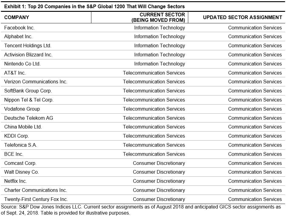
Taking a peek at the new GICS assignments that will take place on Sept. 24, 2018, Exhibit 1 shows the 20 largest companies within the S&P Global 1200 which are being reassigned sectors. Among current S&P Global 1200 constituents, 69 companies in total are being reassigned to Communication Services, while one company (EBAY) is being reassigned from Information Technology to Consumer Discretionary. The moves will affect the weights of the three sectors mentioned.

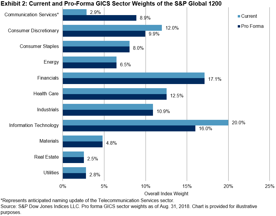
Exhibit 2 illustrates the current and pro-forma GICS sector weights of the S&P Global 1200, pointing to a 6% increase in the representation of Communication Services, a decline of just over 2% in the weight of Consumer Discretionary, and a 4% reduction in the representation of Information Technology.

Finally, in Exhibit 3 the pro-forma index level history of the Communication Services sector was created via a hypothetical back-test. A performance comparison of the current Telecommunication Services sector and the pro-forma results of the newly named Communication Services sector illustrates the performance contribution of the newly added constituents within the realigned GICS sectors of the S&P Global 1200.

For additional information on this topic, see recent blogs here and here by colleagues Jodie Gunzberg and David Blitzer.

The posts on this blog are opinions, not advice. Please read our Disclaimers.

India Targets Better Environmental Performance

Contributor Image
Neil McIndoe

Head of Environmental Finance

Trucost

India regained its status as the world’s fastest-growing major economy at the end of 2017, posting a growth in GDP of 7.2%. Its population of 1.3 billion is also growing fast, as the country added 15 million people last year.

Although welcome in their own right, these growth rates raise significant problems for the natural environment on which India’s people and economy depend.

According to the latest data from the World Health Organization,[1] 11 of the world’s 20 most polluted cities are in India, and poor air quality is the cause of almost 600,000 premature deaths annually. Reducing levels of groundwater is a serious threat to both food security and farming jobs. In May 2016, Phalodi in Rajasthan recorded a temperature of 51 degrees Celsius—the highest ever in the country.[2] The increasing strength of heat waves are a wakeup call to the real challenges that global warming engenders.

These environmental problems could have significant financial consequences. In India, the World Bank estimates that natural capital degradation costs USD 36 billion-USD 124 billion (equivalent to 2.6%-8.8% of the country’s 2009 GDP) annually.[3] The report considers the damage costs of urban air pollution, inadequate water supply, poor sanitation, and hygiene and agricultural damage—from soil salinity, water logging and soil erosion, rangeland degradation, and deforestation.

Research by Trucost[4] has found that Indian banks are financing business sectors with environmental costs equivalent to almost three times the credit provided to those sectors.

It is clear India’s present economic course is not sustainable and needs to change. Carbon emissions is one key area of focus.

India ratified the Paris Agreement, and its intended nationally determined contribution (NDC) is to reduce the emissions intensity of GDP by 33%-35% by 2030 to below 2005 levels.

This is an ambitious target, but as anyone who has tried dieting will know, setting targets is easier than achieving them. According to the Center for International Climate Research in Norway, India’s CO2 emissions actually grew by an estimated 4.6% in 2017.[5]

Currently, India does not apply a cost to carbon emissions, and while a number of leading companies employ shadow pricing, it is hard to see India’s NDC being achieved without a tax or emissions trading scheme.

In the absence of strong government action, it is important for financial institutions to step up to the mark. They should acquire more detail on sector exposure to natural capital risks as a priority. If banks and investors take account of natural capital in their decision-making processes, that in turn will encourage companies to measure, manage, and improve their environmental performance.

[1]   WHO Global Urban Ambient Air Pollution Database (update 2018).

[2] B.P. Yadav, a director of the Indian Meteorological Department

[3] The World Bank – Policy Research Working Paper 6219 An Analysis of Physical and Monetary Losses of Environmental Health and Natural Resources in India

[4]   Harvey, L., Colina, L., Ravi, A., and Tarin, M. “Natural Capital Risk Exposure of the Financial Sector in India.” (Trucost 2015)

[5]   India’s emissions, while growing, are low on a per capita basis. In 2012, they were only 1.5 metric tons per capita versus the UK at 8.4 (Source: HSBC, BP Statistical Review 2013)

The posts on this blog are opinions, not advice. Please read our Disclaimers.