Get Indexology® Blog updates via email.

In This List

Price-to-Rent as an Overvaluation Metric

Performance Trickery

The S&P Risk Parity Indices: Methodology

Other Strategies for Fixed Income in Brazil

The S&P Risk Parity Indices: Return Contribution and Leverage

Price-to-Rent as an Overvaluation Metric

Contributor Image
Frank Nothaft

Executive, Chief Economist, Office of the Chief Economist

CoreLogic

Market Conditions Indicator and price-to-rent can locate overheated metros

The S&P CoreLogic Case-Shiller Index has documented that home prices have risen in all metropolitan areas over the last few years.  While price gains vary considerably across urban markets, some places have had especially rapid appreciation that put values above their pre-Great Recession peak, even after controlling for inflation.  Examining the markets included in the 20-City Composite, all 20 markets are up substantially from their trough, 10 markets have surpassed their pre-Great Recession peak, and 5 have surpassed the earlier peak after inflation adjustment.[1]  With prices setting new records, it’s natural to wonder whether the housing market is on the verge of another valuation bubble.

The CoreLogic Market Conditions Indicator provides a gauge to identify urban areas that may be overheating.  The Indicator is based on straightforward intuition: home prices should generally rise in line with income growth of local residents.  If prices grow too fast, then homes are less affordable and price growth should slow while incomes catch up.

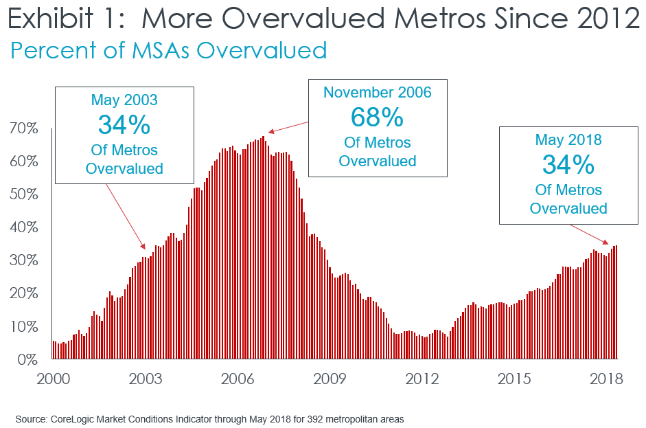
The Market Conditions Indicator found that 34 percent of MSAs in the U.S. were potentially ‘overvalued’ by this metric in May.  (Exhibit 1) The last time that one-third of metro areas were overvalued in a rising price environment was Spring 2003.  While many metros were frothy 15 years ago, the valuation bubble was still localized and not national; however, rapid price growth during the following three years led to 68 percent of markets overvalued by 2006.  Thus, while we do not have a national valuation bubble today, continued rapid price growth raises the specter of a new bubble forming within the next few years.  For metros that the Indicator has flagged as ‘overvalued’, it’s important to look at other metrics for confirmation.  A price-to-rent ratio can provide additional perspective on whether prices are out of sync with valuation fundamentals.

To construct a price-to-rent ratio we used the S&P CoreLogic Case-Shiller Index and the CoreLogic Single-family Rent Index, set the ratio equal to one in the first quarter of 2001 when homes were fairly valued in nearly all metros, and observed how the ratio has evolved to today.[2]  That ratio shows that home prices have grown more quickly than rent in most metro areas, which would provide confirmation of overheated values if cap rates had remained roughly the same, but they haven’t.

A cap rate is used by real estate professionals to convert net operating income on an investment property into a market value.[3]  While a cap rate is relatively stable over short time periods within a metro area, cap rates will vary across metros and over a long period will fluctuate based on the level of long-term interest rates, the perceived riskiness of real estate investments, and tax code changes that affect real estate profitability.  Of these three factors, the one that has changed the most between 2001 and today has been the level of long-term interest rates.  Consequently, cap rates for single-family rental homes are down significantly since then.  The cap rate decline implies that the price-to-rent ratio would need to grow by more than 60 percent since 2001 before today’s prices are disconnected with rental income fundamentals.

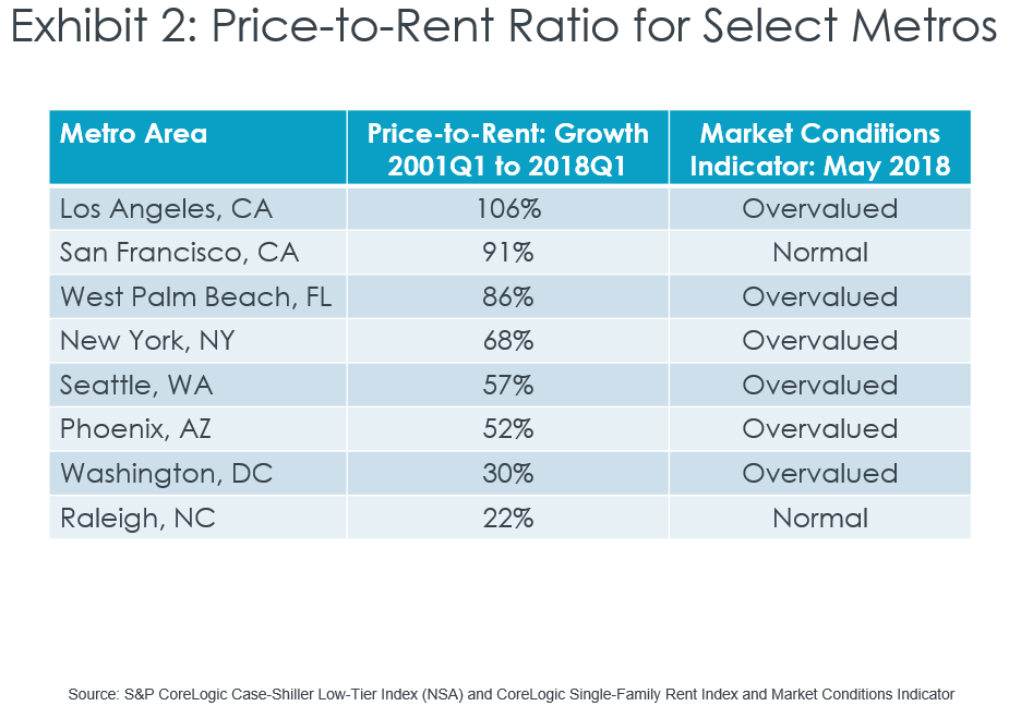
When we examined select metros that the CoreLogic Market Conditions Indicator found to be ‘normal’ in 2001, we found that price-to-rent ratios were up by more than 60 percent in the Los Angeles, San Francisco, West Palm Beach and New York metros; of these, all but San Francisco were places that the Indicator had flagged as overheated today (Exhibit 2).  Metro areas that the Market Conditions Indicator has tagged as ‘overvalued’ and have a high price-to-rent ratio are at heightened risk of a value correction, especially as long-term interest rates rise.

[1] The Bureau of Labor Statistics’ Consumer Price Index all items less shelter was used to adjust for inflation.  Of the places included in the 20-City Composite, Dallas, Denver, Portland, San Francisco and Seattle have real prices above their pre-recession peak, as measured by the S&P CoreLogic Case-Shiller Index.

[2] Because single-family rental homes have a median value that is less than the median value of all single-family homes, the calculations used the S&P CoreLogic Case-Shiller Low-Tier Index (not seasonally adjusted) for homes with a purchase price within the lowest one-third of the CBSA price distribution.

[3] Market value of a rental home = (Net operating income)/(Capitalization rate)

The posts on this blog are opinions, not advice. Please read our Disclaimers.

Performance Trickery

Contributor Image
Craig Lazzara

Managing Director, Index Investment Strategy

S&P Dow Jones Indices

Suppose you, as a hypothetical financial advisor, encounter a hypothetical marketer who presents the following hypothetical performance data:

Last Year

Trailing 3 Years Trailing 5 Years

Trailing 10 Years

Portfolio

25.0%

11.9% 16.0%

8.8%

Benchmark

21.8%

11.4% 15.8%

8.5%

Not only did the portfolio beat its benchmark handily in 2017, says our marketer, but it has outperformed consistently over the past decade.  As evidence of this consistency, notice that the portfolio has generated positive value added for the last 3 years, last 5 years, and last 10 years.

Or has it?

Let’s peel the onion a bit.  Here’s the performance of the same hypothetical portfolio for every year in the last 10:

Year Portfolio Benchmark

Value Added

2008

-36.0% -37.0%

1.0%

2009

26.0% 26.5% -0.5%

2010

15.0% 15.1%

-0.1%

2011 2.0% 2.1%

-0.1%

2012

16.5% 16.0%

0.5%

2013

32.0% 32.4%

-0.4%

2014

13.5% 13.7%

-0.2%

2015

1.0% 1.4%

-0.4%

2016

11.0% 12.0%

-1.0%

2017

25.0% 21.8%

3.2%

The portfolio’s value added has been reasonably consistent – it’s been consistently negative, having outperformed in only three years of the past ten.

What’s happening here is that a generally indifferent manager had a really good year in 2017.  The value added in that year compensated for a long history of mediocrity.  Our hypothetical marketer was clever to present his record through a lens that always included 2017.  His numbers were correct, but they were arguably misleading.

There’s a simple lesson in this simple example: If someone shows you trailing performance data, disaggregate.  Look at year-by-year numbers, not cumulative periods ending with the present.  A truly consistent active manager will welcome the scrutiny.

The posts on this blog are opinions, not advice. Please read our Disclaimers.

The S&P Risk Parity Indices: Methodology

Contributor Image
Berlinda Liu

Former Director, Multi-Asset Indices

S&P Dow Jones Indices

In earlier posts, we analyzed the historical performance, risk contribution versus capital allocation, and return attribution and leverage of the S&P Risk Parity Indices. The results demonstrate that this indices in this series could potentially serve as benchmarks to measure the performance of active risk parity strategies. In this post, we will dig deeper into the methodology and walk through our rationale behind the index rules.

Differences in risk parity strategies arise from the asset classes (and instruments) chosen in the strategy, the risk measurement used, and the handling of the assets’ risk contribution to the portfolio. To build a transparent risk parity benchmark, we use a bottom-up approach that employs long-term realized volatility to allocate across asset classes.

  • Underlying Asset Classes: The underlying asset classes are equity, fixed income, and commodities, as tracked by futures contracts.
  • Liquidity: For all futures contracts used, each has a minimum annual total dollar value traded of USD 5 billion to ensure replicability and tradability.
  • Risk Measurement: We use long-term realized volatility to measure risk. The look-back window has a minimum of a five-year history at the beginning of our back-tested period and is capped at 15 years as we accumulate more data. We use realized volatility rather than forecast volatility to avoid dependency on volatility forecasting models.
  • Weighting Mechanism: We target an equal amount of risk contribution from each asset class to the overall portfolio volatility. In order to do this, we calculate the position weight simply as the pre-defined target volatility divided by the long-term realized volatility for each asset class. Due to correlation among asset classes, the realized volatility of the risk parity portfolio would usually be lower than the target volatility. We then apply a leverage factor to achieve the target volatility. Within each asset class, futures are combined using the same approach to ensure equal risk contribution from futures to the asset class they belong to.
  • Rebalancing Frequency: The indices calculate target weights at month-end and apply them on the second trading day of the next month.

Here is a hypothetical example that illustrates the index construction process of the S&P Risk Parity Index – 10% Target Volatility (TV). In particular, we show how the weight of the S&P 500® futures is determined.

Hypothetical Weighting of the S&P Risk Parity – 10% TV

Suppose the long-term realized volatility of the S&P 500 futures contract is 15%. To reach the target volatility of 10%, we need to allocate 10%/15% = 67% to it and the rest to cash.

Next, we calculate the long-term realized volatility of the equity asset class using weights calculated in step 1. Since there are three futures in the equity asset class, we need to divide their weights by three to construct the equity portfolio.

Suppose the realized volatility of equities is 9%. To reach the target volatility of 10%, we need to apply a multiplier of 10%/9% = 111% to the three constituent futures contract within the asset class. As a result, the weight of the S&P 500 futures in the equity asset class is set to 67% * 1/3 * 111% = 25%.

Finally, we calculate long-term realized volatility of the portfolio using weights calculated in step 2. Since there are three asset classes in the equity asset class, we need to divide their weights by three to construct the multi-asset portfolio.

Let’s say the portfolio’s realized volatility turns out to be 8%. To reach the target volatility of 10%, we need to apply a multiplier of 10% / 8% = 125% to the 26 constituent futures contract. As a result, the weight of the S&P 500 futures is finalized as 25% * 1/3 * 125% = 10%.

The S&P Risk Parity Indices are constructed in a rules-based, transparent manner using tradable, liquid instruments to facilitate implementation. As we have seen in other parts of the blog series, the indices track the composite performance of active risk parity funds much closer than a traditional 60/40 equity/bond portfolio.

The posts on this blog are opinions, not advice. Please read our Disclaimers.

Other Strategies for Fixed Income in Brazil

Contributor Image
Jaime Merino

Former Director, Asset Owners Channel

S&P Dow Jones Indices

Over the past 10 years, the highest overnight reference rate from the Brazilian Central Bank has been 14.25% from July 2015 through September 2016. In an attempt to hold back the depreciation of the Brazilian real and to keep inflation within the target range, the reference rate dropped 775 bps to 6.50% at the end of August 2018, which is a record low. In addition, of the USD 1.8 trillion in outstanding debt, almost 60% are sovereign bonds. Because of these factors, a new surge of income has been necessary over the past couple of years.

One way to get exposure to fixed income other than typical bonds are derivatives, and S&P Dow Jones Indices, in partnership with B3, has created the S&P/BM&F One-Day Interbank Deposit 3Y Futures Index. The index is designed to measure the performance of a hypothetical portfolio holding a three-year One-Day Interbank Deposit (DI) Futures Contract. The DI contract is on the Brazilian one-day interbank rate, which is used by Brazilian banks to lend and borrow from each other. The contract provides a way to hedge for or speculate on short-term Brazilian interest rates.

The index offers a benchmark for financial institutions to measure the return on their holdings and can serve as the base of an investment vehicle, as the index is easy to replicate and was created with potential tax benefits in mind. It is also calculated in U.S. dollars, which makes it accessible to investors outside of Brazil. Exhibit 1 shows the performance of the indices calculated as excess return and total return.

For the first time, this index provides the opportunity for a local fixed income investment vehicle in the Brazilian market that would provide diversification and could be used to gain core fixed income exposure or to hedge current positions. Exhibit 2 shows the comparison of annual returns with other local indices. In the past 10 years, none of the local indices outperformed in particular, but kept steady. However, when comparing the risk/return profiles, the S&P/BM&F One-Day Interbank Deposit 3Y Futures Index significantly outperformed, meaning that it could help in the reduction of risk in a portfolio (see Exhibit 3).

The posts on this blog are opinions, not advice. Please read our Disclaimers.

The S&P Risk Parity Indices: Return Contribution and Leverage

Contributor Image
Berlinda Liu

Former Director, Multi-Asset Indices

S&P Dow Jones Indices

My earlier blog showed that equal risk allocation is different from equal capital allocation. The S&P Risk Parity Indices had roughly equal risk contribution from all three asset classes, while about 60% of the capital was allocated to fixed income.

The historical performance of each asset class also showed that equal risk allocation did not lead to equal return contribution (see Exhibit 1). Not surprisingly, fixed income had the highest return to the overall portfolio over the full period studied, as this low risk asset class has significant overweight in risk parity strategies.

The return decomposition of the S&P Risk Parity Index – 10% Target Volatility (TV) showed that the return contribution by asset classes varied significantly from year to year due to changes in the performance of individual asset classes and the correlation among them, affecting the overall portfolio performance. In 2008, equity and commodities experienced market drawdowns, and only the fixed income apportion had a positive return. As a result, the overall portfolio posted a loss.

Another key feature of risk parity strategies is leverage. Risk parity strategies tend to allocate heavily to less volatile asset classes, and managers usually use leverage on low risk asset classes to achieve an overall return that is similar to a market portfolio. The combination of equal risk contribution from multiple asset classes and leverage help a risk parity portfolio to meet the challenges of achieving market returns and reducing the risk of a multi-asset portfolio.

We can see this demonstrated by the S&P Risk Parity Index – 10% TV. For example, its leverage ranged between 1.32 and 2.24 in our back test (see Exhibit 2). Note that leverage is created so that the overall portfolio volatility matches the target volatility each month. As such, leverage rose in low volatility markets and dropped in high volatility markets. On average, the index had a leverage of 168% or 1.68.

The posts on this blog are opinions, not advice. Please read our Disclaimers.