The S&P DJI index strategy team has for several years produced a variety of monthly and quarterly index dashboards. Earlier this year, we began to provide a daily summary of what S&P DJI indices and research are telling us about the markets on a day-to-day basis. (The summary is e-mailed daily to subscribers; see the bottom of this blog post if you’d like to subscribe.)
Writing interesting market commentary can be a tough task. Let’s face it: while knowing what went up (and what went down) is easy, our hope is to find meaning in the data. Of course, randomness is a major factor in market movements; sometimes there is no overarching narrative. But, at other times, a single story or theme comes into focus through the lens of index performance across different asset classes, market segments or investment styles.
We’ve noticed, for example, that markets today are more idiosyncratic than they have been. A few years ago, commentary was easy: you just had to know whether it was a “risk on” or “risk off” period. VIX® had pride of place as a market indicator, while the principal underlying dynamic was the market’s interpretation of U.S. monetary policy. The sometimes-gnomic utterances from Federal Reserve chairman Ben Bernanke determined performance from commodities to equities. At the risk of exaggeration, an appreciation of changes in the Fed’s policy outlook was sufficient to summarize monthly, and sometimes daily, performance.
The present environment is quite different. So far this year, trade tensions have gone part of the way towards explaining the market environment, and some of the previous dynamics remain. But trade has not told the full story, nor do fluctuations in trade barriers affect all market segments similarly. Political uncertainty has returned, not least in Europe, as the fragile coalition in Germany competes with the rise of Eurosceptic parties in Italy for the headlines. Such uncertainty weighs on European equities, and has sent German and Italian bond yields higher, but the rest of the world has been largely unaffected. Latin America has also been buffeted idiosyncratically by political winds, without much in the way of shared consequences.
The exhibit below illustrates how national equity markets so far in 2018 have shown a wide range of performance. Rising oil prices might be associated to some of the green; trade or political uncertainty to some of the red, but the point of the exhibit is not so much to highlight the role of any driver in particular as to highlight the greater breadth of subject-matter that is required to explain performance.
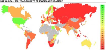 Source: S&P Dow Jones Indices. Data as of August 15, 2018. Past performance is no guarantee of future results. Chart is provided for illustrative purposes only.
Seeing what went up, what fell, what were the big movers, and how these changes reinforce or depart from recent trends is an important part of producing market commentary. But having lots of information readily available is only part of the process; the real trick is in how you synthesize the key points. Some journalists are better at this than others; while I still read plenty of articles – certainly more than my fair share – I have gravitated towards commentators who combine personality and, dare I say, a bit of humor when putting their points across. A bit of personality goes a long way. As robots conquer the workplace, it is nice to know that at least some areas of expertise still – for now – benefit from the personal touch of individual perspective.
If you would like to read our efforts at producing enjoyable and informative market commentary, e-mail hamish.preston@spglobal.com to be added to our daily dashboard distribution list. How else will you know what you’re missing?
The posts on this blog are opinions, not advice. Please read our Disclaimers.