Get Indexology® Blog updates via email.

In This List

Getting Smarter About Saving For College: Part 1

Asset Class Correlations Affect Portfolio Volatility and Return

Benchmarking Risk Parity Strategies

A Glance at the Performance of Emerging ASEAN Markets

Growth Is Still Hot Only In Small Caps

Getting Smarter About Saving For College: Part 1

Contributor Image
Jodie Gunzberg

Former Managing Director, Head of U.S. Equities

S&P Dow Jones Indices

Did you know there is now about $620 billion more of student loan debt than total U.S. credit card debt?

Here are some more astounding statistics highlighted in our new paper:

Costs associated with college tuition and fees, as measured by the U.S. Bureau of Labor Statistics, have far outpaced general U.S. inflation as measured by CPI (5.9% versus 2.6%, annualized from January 1987 to June 2018; see Exhibit 1). So for individuals saving for college, growing assets on pace with tuition inflation is possibly challenging without a college inflation protection security.

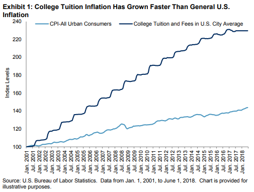
Unfortunately, most market participants saving for college only have some combination of the available investments today, perhaps in a 529 plan or “qualified tuition plan” that are made up of just traditional stock and bond funds.

In response to this, S&P Dow Jones Indices partnered with Enduring Investments to develop the S&P Target Tuition Inflation Index, which comprises underlying inflation bond, corporate bond, and equity indices and is designed to reflect changes in college tuition and fees over long term periods.

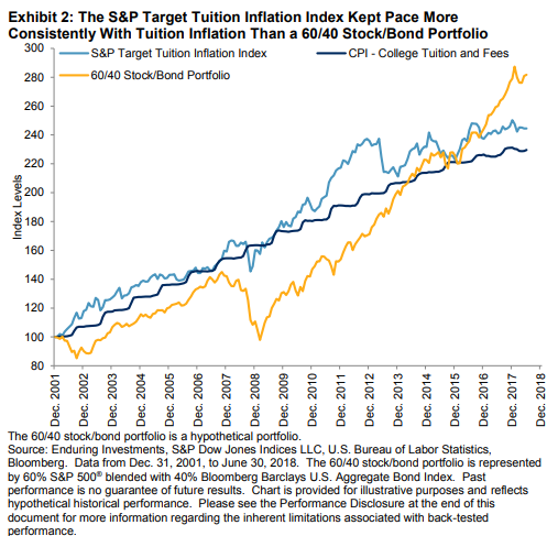
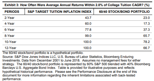
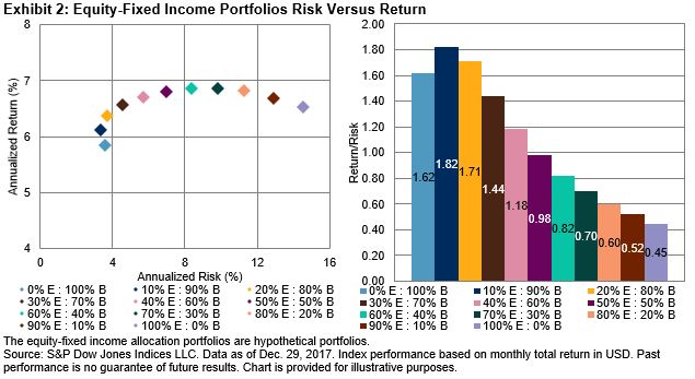
Over longer time periods, the likelihood of tracking tuition inflation with the S&P Target Tuition Inflation Index increased. For example, when two-year periods were measured, the index only tracked the College Tuition and Fees U.S. City Average CPI within 2% during 43.7% of the period studied.  When the time periods were lengthened to over eight years, the index tracked within 2% of tuition inflation nearly 100% of the time. This was a significant improvement over a typical 60/40 stock/bond mix that is usually intended to provide better risk-adjusted returns. Since most of the contribution to risk in the traditional 60/40 stock/bond allocation comes from equities, its tuition inflation matching capability was comparatively volatile.

Not only will the traditional mix by definition decline with falling equities, but an acceleration of general inflation may adversely affect the performance of equities and bonds. Also, in a declining equity environment, tuition inflation will likely accelerate, partly driven by rising general inflation plus demand growth for education, as well as endowment and appropriation underperformance.

Please stay tuned for Part 2 of this series that will describe the theory behind how the index keeps pace with tuition inflation.  If you can’t wait, it is all posted now in our research here.


The posts on this blog are opinions, not advice. Please read our Disclaimers.

Asset Class Correlations Affect Portfolio Volatility and Return

Contributor Image
Phillip Brzenk

Managing Director, Global Head of Multi-Asset Indices

S&P Dow Jones Indices

In recent years, the term “risk parity” has become a catch-all phrase to describe strategies that attempt to allocate based on risk. The launch of the S&P Risk Parity Indices last week is a testament to the proliferation and the popularity of the style. As we noted in a prior blog, there is a lack of proper benchmarks to measure the effectiveness of such strategies.

Therefore, it is worthwhile to take a step back and examine the empirical basis that gives rise to risk parity strategies (i.e., the notion of equal risk contribution). From there, we can dive deeper into the properties of risk parity strategies and the characteristics that one should be mindful of.

As a starting point, we looked at the historical correlations between different asset classes (see Exhibit 1).[1] [2] [3]

For the 18-year period, there were strong positive correlations between the equity regions, ranging from 0.75 to 0.87. Additionally, equities had moderately positive correlations to real estate, commodities, and high yield bonds. However, in contrast, equities were negatively correlated with investment grade bonds, which implies that adding investment grade bonds, particularly to an equity portfolio, could lower portfolio volatility and potentially deliver higher returns per unit of risk.

To evaluate the effect that asset-pair correlations have on portfolio volatility, we constructed a two-asset portfolio consisting of U.S. equity and investment grade bonds. In addition to the classic 60/40 equity/bond mix, additional portfolios were created in 10% weight increments, resulting in 11 total portfolios.

Equities outperformed bonds over the 18-year period, but that excess performance came with significantly higher volatility (left chart). The risk-adjusted return ratios (right chart) show the return per unit of risk for each portfolio—bonds had a significantly higher risk-adjusted ratio of 1.62 versus 0.45 for equities. Thus, on a risk efficiency basis, bonds fared better than equities. Given the low correlations and higher risk-adjusted return ratio for bonds, combining the two assets led to several allocation mixes with even higher risk-adjusted ratios (e.g., 10/90 equity/bond and 20/80 equity/bond). In fact, the 10/90 equity/bond portfolio had lower volatility relative to bonds along with higher returns—this led to the highest risk-adjusted return ratio (1.82) out of all the mixes. Starting from an initial 100/0 equity/bond portfolio and progressively increasing weight to bonds led to higher absolute returns (until 60/40) and higher risk-adjusted return ratios (until 10/90). These results show how effective combining low-correlated assets together in a portfolio could be.

In a future post, we will review the contribution to total risk of selected portfolio mixes, as the contribution to total portfolio risk for each asset class can be expected to be different from their portfolio weights.

[1]   Markowitz, H. “Portfolio Selection.” The Journal of Finance, Vol. 7, No. 1. (March 1952), pp. 77-91.

[2]   Modern Portfolio Theory states that non-perfect correlations between different assets underpins the notion of portfolio diversification—whereby increased diversification results in higher returns for a given level of risk.

[3]   The S&P 500 represented U.S. Equities, the S&P Developed Ex.-U.S. BMI represented International Equities, the S&P Emerging BMI represented Emerging Market Equities, the Dow Jones U.S. Real Estate Index represented Real Estate, the Dow Jones Commodity Index represented Commodities, the S&P U.S. Treasury Bond Index represented Investment Grade Bonds from Dec. 31, 1999, to April 30, 2002, and then it was represented by the S&P U.S. Aggregate Bond Index, the S&P U.S. High Yield Corporate Bond Index represented High Yield Bonds, and the S&P Global Developed Sovereign Ex-US Bond Index represented International Sovereign Bonds.

The posts on this blog are opinions, not advice. Please read our Disclaimers.

Benchmarking Risk Parity Strategies

Contributor Image
Berlinda Liu

Former Director, Multi-Asset Indices

S&P Dow Jones Indices

Since the launch of the first risk parity fund—Bridgewater’s All Weather fund—in 1996, many investment firms have begun offering risk parity funds to their clients. Risk parity funds became especially popular in the aftermath of the 2008 global financial crisis, when many investors witnessed the failure by traditional U.S. dollar-based asset allocation to provide downside protection.

Despite the popularity of risk parity funds, up to this point, the strategies have lacked an appropriate benchmark to measure their effectiveness and performance. Most market participants typically use a traditional 60/40 equity/bond portfolio[1] or a broad equity market index, such as the S&P 500®, to benchmark the performance.

The recent launch of the S&P Risk Parity Indices provides a suite of appropriate rules-based and transparent benchmarks for risk parity strategies. The indices also reflect the risk/return characteristics of strategies offered in this space.

Each S&P Risk Parity Index seeks to track the performance of a hypothetical portfolio that consists of 26 futures contracts from three asset classes (equity, fixed income, and commodities). Each index targets a constant level of volatility from each asset class, as well as each constituent futures contract. The series has three subindices, reflecting volatility targets of 10%, 12%, and 15%.

In this four-part blog series, we will use the S&P Risk Parity Index – 10% Target Volatility (TV) as an example to illustrate this index series’ performance, risk attribution, capital allocation, and methodology. In Part I, we will focus on the historical performance of the index.

Exhibits 1 and 2 show the cumulative returns of the index and key performance statistics. We compared it to a traditional 60/40 equity/bond portfolio. We want to point out that the latter does not completely reflect the risk/return characteristics of a risk parity strategy but is used ubiquitously in fund literature to benchmark. We also included the HFR Risk Parity Vol 10 Index as a proxy of active risk parity funds in the market. For reference, the HFR Risk Parity Indices represent the weighted average performance of the universe of active fund managers employing an equal risk contribution approach in their portfolio construction. These indices also have three volatility targets (10%, 12%, and 15%).

Historical performance shows that the S&P Risk Parity Index – 10% TV tracked the composite performance of risk parity active fund managers closer than a traditional 60/40 equity/bond portfolio did. The former had a higher correlation (0.89 versus 0.76) and lower tracking error (3.99% versus 6.54%). The overall annualized returns, realized volatility, and Sharpe ratio of the S&P Risk Parity Index – 10% TV were also close to the composite performance of active risk parity fund managers.

The S&P Risk Parity Index – 12% TV tracked the composite of risk parity active fund managers with a correlation of 0.85 and a tracking error 5.26%, and the S&P Risk Parity Index – 15% TV had a correlation of 0.87 and a tracking error of 6.09%.

The risk/return performance figures showed that the S&P Risk Parity Indices can be used as a benchmark in performance evaluation of active risk parity funds.

[1] The 60/40 equity/bond portfolio is hypothetically constructed by combining the S&P Developed BMI with 60% weight and the S&P Global Developed Aggregate Ex-Collateralized Bond Index with 40% weight, rebalanced monthly.

The posts on this blog are opinions, not advice. Please read our Disclaimers.

A Glance at the Performance of Emerging ASEAN Markets

Contributor Image
Utkarsh Agrawal

Associate Director, Global Research & Design

S&P Dow Jones Indices

In our previous blog, The Growth of Emerging ASEAN, we discussed why market participants are showing increased interest in this region. In this post, let’s take a deeper look at how the emerging ASEAN equity markets—consisting of Indonesia, Malaysia, Philippines, Thailand, and Vietnam—performed historically.

The emerging ASEAN equity markets collectively outperformed the Brazil, Russia, India, China, and South Africa (BRICS) equity markets as a whole on an absolute and risk-adjusted basis over the period from March 31, 2010, to Dec. 31, 2017 (see Exhibit 1).

The emerging ASEAN equity markets are much smaller than the BRICS markets. As of year-end 2017, their aggregate float market cap was approximately one-sixth of the size of the BRICS equity market. In general, smaller markets tend to have lower liquidity and efficiency. The largest companies in small markets tend be the most liquid. The top 100 largest and most liquid companies slightly underperformed the broad emerging ASEAN equity market over the period from March 31, 2010, to Dec. 31, 2017 (see Exhibit 2).

The portfolio of the top 100 largest companies weighted by float market cap was concentrated in stocks domiciled in Indonesia, Malaysia, and Thailand. A country-weight-capped portfolio may reduce the country-specific risk. The capped portfolio of the top 100 largest companies with a country weight capping of 25% and a stock weight capping of 8% outperformed the broad emerging ASEAN equity market over the same period (see Exhibit 3).

S&P Dow Jones Indices recently launched the Dow Jones Emerging ASEAN Titans 100 Index. It consists of companies from the emerging ASEAN equity markets based on composite rank by float market cap, revenue, and net income. The index constituents are weighted by float-adjusted market cap and subject to a country weight cap of 25% and a stock weight cap of 8% to reduce the country and stock concentration risk. It outperformed the top 100 capped portfolio purely selected by market cap over the period from March 31, 2010, to Dec. 31, 2017 (see Exhibit 4).

Historically, market participants in the emerging ASEAN equity markets tended to favor the companies with high revenue and income over other companies. The Dow Jones Emerging ASEAN Titans 100 Index outperformed the top 100 capped portfolio from the broad emerging ASEAN equity market trends in all the market cycles. The most significant outperformance was during the up market (see Exhibit 5).

Historically, the emerging ASEAN equity market outperformed the BRICS equity market. Revenue, income, or other fundamentals, along with weight limits to prevent excessive concentration in a particular country or stock, are also important when evaluating the markets for diversification purposes, in addition to market cap and liquidity.

The posts on this blog are opinions, not advice. Please read our Disclaimers.

Growth Is Still Hot Only In Small Caps

Contributor Image
Jodie Gunzberg

Former Managing Director, Head of U.S. Equities

S&P Dow Jones Indices

In July, the total return of the S&P SmallCap 600 Growth was 3.75%, which was 1.15% higher than the total return of 2.60% generated by the S&P SmallCap 600 Value.  This is interesting since typically growth does not outperform value in small caps when value outperforms growth in large and mid caps.  (In July, the total return of S&P MidCap 400 Growth, S&P MidCap 400 Value, S&P 500 Growth and S&P 500 Value was a respective 1.38%, 2.17%, 3.44% and 4.05%.)  In 255 months, going back to May 1997, there are only 17 times when growth outperformed value in only small caps.  It is even rarer to find growth performing better than value in just small caps with the current magnitude of outperformance.  It was in Sep. 2005, almost 13 years ago, when the outperformance of small cap growth over value was this big while value outperformed growth in large and mid caps.  It is also only the 5th biggest outperformance of growth over value in small caps in a month while value outperformed growth in large and mid caps in the entire history of the data. Source: S&P Dow Jones Indices

While all eleven sectors in the S&P 600 were positive in July, the best performing sectors were industrials, materials and health care, up a respective 6.6%, 4.4% and 3.7%.  Also industrials and health care are the two most overweighted sectors in small caps when comparing growth to value.  Health care has 13.2% more weight in growth than value in small caps, while small cap industrials weigh 3.6% more in growth than value.  The weights of growth over value in these sectors are bigger for small caps than large or mid caps.

Source: S&P Dow Jones Indices.

Also, in July, small caps outperformed large caps in materials by 1.4% and energy by 0.2%.  This helped contribute to the month’s small cap growth outperformance since although the growth weight was less than the value weight, it was by less than in the bigger stocks.

Overall, the total return for the S&P 500, S&P 400 and S&P 600 was 3.7%, 1.8% and 3.2%,  respectively, in July.  All sectors in large and small caps gained with industrials, health care and financials leading, likely from growth.  Historically financials and health care are the two sectors that benefit most from GDP growth, with small caps rising on average 6.9% and 6.4% with every 1% of growth.  Large caps in these sectors also benefit, each rising on average 4.5% for each 1% of GDP growth.  Also industrials benefit highly from rising interest rates with small caps and large caps gaining 8.6% and 8.2%, respectively, on average for every 100 basis point rise in rates.  Although rates didn’t increase, the market may be looking ahead to Sept. when there is a chance for an increase.  Lastly, industrials were also helped by the renewed trade negotiations between China and the U.S.

Source: S&P Dow Jones Indices

The posts on this blog are opinions, not advice. Please read our Disclaimers.