Get Indexology® Blog updates via email.

In This List

A Risk of the “Participate but Protect” Mentality

Active Management’s Dynamic Exposures to Size and Value Style Factors

Sector Volatility Conveys Most (But Not All) of the Story in the Latest S&P 500 Low Volatility Index Rebalance

A First Look Inside The Communication Services Select Sector Index

Inflation: Benign for Now

A Risk of the “Participate but Protect” Mentality

Contributor Image
Shaun Wurzbach

Managing Director, Head of Commercial Group (North America)

S&P Dow Jones Indices

I recently completed several meetings with financial advisors in Kansas and Tennessee. Traveling to meet with advisors in their offices or at events is something that I enjoy doing and informs my love of the work that our team does in advisor education. However, I am troubled by a reoccurring conversation that came up. In some of these conversations, advisors spoke of positioning for “participate but protect.” Having experienced a long bull market and higher-than-average gains in 2017, the positioning is “keep it between the guard rails” to describe how they are investing now.

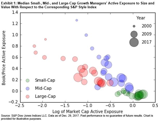
But are these same advisors really positioned to protect? What changes has a 10-year “age of Taurus” brought to their portfolios? That bull market has slyly and slowly encouraged some to allow equity allocations to creep back up to pre-global financial crisis (GFC) levels of 70% equity weighting or higher. While they should not feel comfortable with that, they shouldn’t feel alone. Some of the most well-known U.S. asset managers offering target date solutions are in that same place. Our most recent S&P Target Date Scorecard indicated that a majority of “To” target date funds were at 70% or greater equity allocation for the 2035 vintage, and the same was true for “Through” for the 2030 vintage. To get to a more conservative 60/40 allocation, one would need to be well within 10 years of retirement (see Exhibit 1).

As a simple and uncluttered way to consider the risk/return of the more conservative 60/40 allocation, I commend Jason Giordano for his recently published Elevating the Aristocrats: Pairing the S&P 500® Dividend Aristocrats® with the S&P 500/MarketAxess Investment Grade Corporate Bond Index. His analysis of combining the S&P 500/MarketAxess Investment Grade Corporate Bond Index and S&P 500 Dividend Aristocrats is timely for an asset allocation discussion. In Exhibit 2, he shows the historical hypothetical[1] benefit in risk/return comparison to holding only the quality equity exposure of the S&P 500 Dividend Aristocrats during three market dips that have occurred in the U.S. equity market since the GFC.

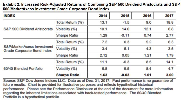
A conclusion one might draw from this simplified portfolio example of data and analysis? Rather than lightening up on fixed income exposure to anticipate Federal Reserve actions, the advisor with an eye to protecting the portfolio may want to be more mindful of a prudent balance in their asset allocation.

[1]   The S&P 500/MarketAxess Investment Grade Corporate Bond Index was launched on Jan. 9, 2017, so the data in his paper are back-tested data.

The posts on this blog are opinions, not advice. Please read our Disclaimers.

Active Management’s Dynamic Exposures to Size and Value Style Factors

Contributor Image
Ryan Poirier

Former Senior Analyst, Global Research & Design

S&P Dow Jones Indices

In prior blogs,[i] we discussed the return contribution of mega-cap securities in 2017, as well as the impact of style classifications that may give small-cap active managers more autonomy to invest in significantly different risk exposures. In this blog, we look at active factor risks taken by active managers across three market-cap ranges against the appropriate S&P DJI style benchmarks.

Using the aggregate holdings of the managers[ii] and the Northfield US Fundamental Equity Risk Model, we observed the managers’ active exposures to systematic risk and whether those factor bets were rewarded.

Exhibit 1 shows the median fund’s[iii] active exposure for both book/price and log of market cap, which serve as the proxies for value and size factors, respectively. Funds have noticeably shifted their exposures to those two factors over the past 18 years.

For example, across all three market-cap categories, the median fund started the 2000s with a negative active exposure to size. In other words, the median active fund was invested in companies that, in general, were smaller than that of the respective benchmark. However, over the years, the median active fund’s exposure to size has increased across all market-cap ranges, as shown by the increasing bubbles. By the end of 2017, active exposure to size for mid- and small-cap managers was roughly in line with that of the respective benchmark.

Undoubtedly, the longest-running equity bull market we have been experiencing since the 2008 global financial crisis influenced this gradual shift to neutral weight in the market-cap factor that we observed in actively managed funds. As market-capitalization-weighted benchmarks increased their index values, and with market beta responsible for 312% of average benchmark return (see Exhibit 2), active managers could not afford to have a sizable underweight to the market factor or a significant overweight to the size factor.

Similarly, active exposure to the value factor has also been converging to that of the benchmark. Both mid- and large-cap funds started the evaluation period with high active exposure to book/price. This equated to the median fund investing in companies that were more “value-like” or “cheaper” than their benchmark. By the end of 2017, however, they had a marginal positive active exposure to the value factor. 

It is worth noting that the value factor performed rather poorly over the period from Feb. 28, 2009, until Dec. 29, 2017. Based on the Northfield US Fundamental Equity Risk Model, book/price returned -12.84% over this period. Among the five Fama-French factors, the value factor—as represented by high minus low portfolios formed by book/price ranking—returned -12.83% over the same period, compared with 37.95% delivered by the profitability factor.

It remains to be seen whether the size factor or the value factor will continue their performance cycle. One thing we can be certain of, based on the factor exposures of actively managed funds, is that active managers have displayed dynamic exposures to size and value factors, gradually shifting from active underweight to a more neutral position over time. That dynamic shift was in line with the performance of those factors.

[i]   The Impact of Size on Active Management Performance in 2017: Part 1 and The Impact of Style Classification on Active Management Performance in 2017: Part 2.

[ii]   Fund holdings were sourced from FactSet’s Ownership database on a monthly basis for all available funds within the CRSP dataset. The funds that met the style criteria were then pulled out for this analysis.

[iii] On a monthly basis, the benchmarks’ factor exposures were subtracted from each fund’s factor exposures to arrive at the active exposure. The funds were then averaged across each factor and year to create an average yearly active factor exposure for each fund. The median within each market capitalization, year, and factor was then presented in Exhibit 1.

The posts on this blog are opinions, not advice. Please read our Disclaimers.

Sector Volatility Conveys Most (But Not All) of the Story in the Latest S&P 500 Low Volatility Index Rebalance

Contributor Image
Fei Mei Chan

Former Director, Core Product Management

S&P Dow Jones Indices

In January 2018, realized volatility (rolling 252-day) for the S&P 500 reached a 27-year low. Since then, volatility has been steadily creeping up and as of April 30, 2018, it sat at 12.1%—almost double the levels in January. Despite having increased significantly, volatility is still well below the historical average of 16%.

Rolling 252-Day Volatility for the S&P 500

The recent increase in volatility was more or less distributed equitably across sectors. In the comparable time frame, volatility increased for every sector of the S&P 500. Notably, volatility in Technology jumped the most in the last three months while Utilities was relatively more stable.

252-Day Volatility Jumped Across All S&P 500 Sectors Compared to Three Months Ago

In the latest rebalance, shifts in the sector weights of the S&P 500 Low Volatility Index® (the index tracks the 100 least volatile stocks in the S&P 500) mostly conform to the story that sector volatility conveyed. Real Estate, Consumer Staples and Utilities were the sectors that had the biggest increases. Most of those gains came at the expense of the Financials and Industrials. The biggest surprise was Technology, which had the biggest jump in volatility among S&P 500 sectors but only declined 1% in Low Volatility’s allocation. Historically, Low Volatility has typically held little to no weight in Technology so the sector’s recent prominence is certainly an anomaly. The negligible decline in Technology’s allocation despite experiencing the biggest increase in volatility points to pockets of stability at the stock level within this sector.

Real Estate Added the Most Weight in the Latest Rebalance for the S&P 500 Low Volatility Index

The posts on this blog are opinions, not advice. Please read our Disclaimers.

A First Look Inside The Communication Services Select Sector Index

Contributor Image
Jodie Gunzberg

Former Managing Director, Head of U.S. Equities

S&P Dow Jones Indices

In accordance with the announced upcoming communication services sector change, the new Communication Services Select Sector Index is now live.  The select sectors are based on the Global Industry Classification Standard (GICS®) but have different construction rules than the sectors of the S&P 500.  In the Select Sectors, each index is made up of all stocks in the GICS sector unless otherwise noted in the table below.Source: S&P Dow Jones Indices. S&P U.S. Indices Methodology. 1 The Communication Services Select Sector Index reflects the changes in the GICS structure effective in September 2018. For more information regarding the composition of the Communication Services Sector, please refer to Appendix D. S&P Dow Jones Indices has created back calculated history for the Communication Services Select Sector Index based on the securities in the headline S&P 500 that would have hypothetically been classified as GICS Code 50 at that time under this new structure. 2 In order to align with the GICS structure changes effective in September 2018, S&P DJI will remove stocks classified as Communication Services (GICS Code 50) from the Technology Select Sector Index.

Furthermore, the weighting of the constituents inside the select sectors follows the capped market capitalization weighting. In short, there is a quarterly rebalancing where each company is float adjusted market cap weighted with capping to limit companies to under 25% each, and to limit the sum of companies with weights greater than 4.8% to under 50% of the index (The full details of the weighting can be found in the methodology on pages 12-13).

The new sector map is discussed in detail in this post, but as a reminder is shown below:

Source: S&P Dow Jones Indices. For new definitions, please click here.

Now that the Communication Services Select Sector Index is launched, here is what it looks like on the inside with return results based on ten years of backtested history.  The index has 26 constituents with a total market cap of $2.35 trillion, average market cap of $92.5 billion and median market cap of $34.9 billion as of May 16, 2018.

Source: S&P Dow Jones Indices

The constituents are from the current GICS classification sectors of information technology (blue,) consumer discretionary (yellow) and telecommunications (green.)  There are 6 constituents from Information Technology with a total market cap of $1.24 trillion, 17 constituents from Consumer Discretionary with a total market cap of $856.6 billion and 3 constituents from Telecommunication Services with a total market cap of $254.2 billion.

Source: S&P Dow Jones Indices. Data as of May 16, 2018.

Lastly, the index level history and performance below uses data from Dec. 21, 2007 based from 100 that is backtested before the launch on April 30, 2018.  The Communication Services Select Sector Index returned a cumulative 143.5% through May 16, 2018 with annualized performance of 14.2% over 3 years, 12.7% over 5 years and 9.9% over 10 years.  The index also has a one year return of 11.6% and is up 3.8% year-to-date.

Source: S&P Dow Jones Indices. Launch date is April 30, 2018.  All prior data is backtested. 


The posts on this blog are opinions, not advice. Please read our Disclaimers.

Inflation: Benign for Now

Contributor Image
Kevin Horan

Former Director, Fixed Income Indices

S&P Dow Jones Indices

Having broken through 2% in January 2018, the 10-year U.S. Treasury breakeven rate (as measured by the difference between the S&P U.S. Treasury Bond Current 10-Year Index and the S&P U.S. TIPS 10 Year Index) has continued to increase, reaching a YTD high of 2.18% on April 23, 2018.

As of May 14, 2018, the breakeven level sat at 2.16%. These levels have not been seen since late August 2014. A rise in oil prices to around USD 70 per barrel has boosted inflation expectations, but not to the point of being “runaway” levels. A weak U.S. dollar has pushed oil prices up more in the U.S. than in other countries.

U.S. consumer prices rose less than expected for April 2018 (0.1% versus the prior 0.2%, Core CPI month-over-month), leading to speculation that the Fed will be gradual in its future rate increases. Two additional rate hikes have been the market’s expectation for 2018.

Though the U.S. Jobless Claims number was unchanged at 211,000, continued tightening in the labor markets, wage growth, and GDP (2.9%) growth will likely have an impact on inflation.

Housing prices continue to climb as the S&P CoreLogic Case-Shiller 20-City Composite Home Price NSA Index reported an increase of 0.7% for the end of February 2018. Seattle, Las Vegas, and San Francisco continue to report the highest year-over-year gains among the 20 cities. All of the cities reported increases before and after seasonal adjustment, and the index has eclipsed its July 2006 peak by 0.1%.

For now, the inflation picture seems to be a slow rise, with the breakeven rate hovering around the current level of 2.16%.

Exhibit 1: Breakeven Inflation Rate

Source: S&P Dow Jones Indices LLC. Data as of May 14, 2018. Past performance is no guarantee of future results. Chart is provided for illustrative purposes and reflects hypothetical historical performance. The S&P U.S. Treasury Bond Current 10-Year Index was launched on Sept. 13, 2013. The S&P U.S. TIPS 10 Year Index was launched on Sept. 3, 2013.


The posts on this blog are opinions, not advice. Please read our Disclaimers.