Get Indexology® Blog updates via email.

In This List

Decomposing Recent Volatility Events Part 1

Do Earnings Revisions Matter in India?

The Difference a Few Days Make

How Will It End?

What do inventories tell us about the economy?

Decomposing Recent Volatility Events Part 1

Contributor Image
Berlinda Liu

Former Director, Multi-Asset Indices

S&P Dow Jones Indices

After a strong January 2018, the U.S. equity market started February with a roller coaster ride. The CBOE Volatility Index® (VIX®), which has been relatively quiet over the past couple years, spiked up and crossed the 50 mark intraday on Feb. 5, 2018. On the same day, the S&P 500® VIX Short Term Futures Inverse Daily Index and its linked exchange-traded products (ETPs) lost more than 90% in value. In light of this significant drop, it is worthwhile to review the mechanics of an inverse volatility index, and how the index value is established. In this two-part blog, we examine factors potentially contributing to the recent spike in volatility and significant negative performance in the S&P 500 VIX Short Term Futures Inverse Daily Index. In this first part of the blog series, we demonstrate that an inverse volatility index is not a “true short” of the underlying reference index.

An Inverse Index Is Not a “True Short”

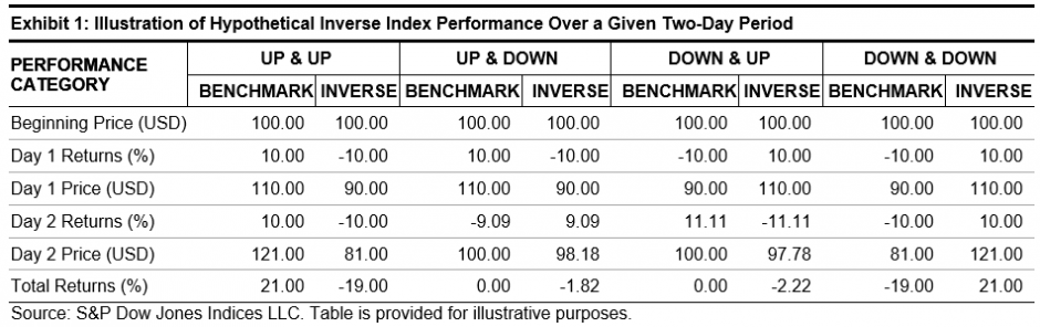
Before we look into the S&P 500 VIX Short Term Futures Inverse Daily Index, we need to understand that an inverse index is designed to provide daily inverse return to a benchmark. In other words, an inverse index is designed to deliver the opposite of the performance of the benchmark on a daily basis. Its performance over longer periods of time can differ significantly from the “true short” of the underlying benchmark during the same period of time. This effect can be magnified in volatile markets.

Exhibit 1 illustrates the performance of a hypothetical benchmark index and its inverse over a two-day period. As the examples demonstrate, an inverse index that is set up to deliver the inverse of the performance of a benchmark every day will not necessarily achieve that goal over weeks, months, or years due to the compounding effect. If the benchmark index moves around a lot and then ends up in the same place, an inverse index will lose value while a “true short” would not. However, an inverse index does not always underperform. If the benchmark index is trending down, an inverse index can possibly deliver better performance than -1x cumulative performance.

Due to the power of compounding as illustrated in Exhibit 1 and the low volatility regime we have had in the past a couple of years, the S&P 500 VIX Short Term Futures Inverse Daily Index has outperformed the “true short” of its benchmark, the S&P 500 VIX Short-Term Futures Index. In 2017 alone, the S&P VIX Short Term Futures Inverse Daily Index returned 186%, while the S&P VIX Short-Term Futures Index lost 72%. The underlying mechanism for an inverse index (not limited to this example) to achieve this outperformance over a “true short” is to increase its position while it’s rising and decrease its position while it’s dropping. In the case of the S&P VIX Short Term Futures Inverse Daily Index, this would theoretically translate to increasing the number of VIX futures to short, while its benchmark is dropping. Given that each VIX futures contract has a constant vega exposure of 1000, the S&P VIX Short Term Futures Inverse Daily Index has been gradually increasing its vega exposure over the past couple of years. Many market participants may not necessarily be aware of the jump in the vega exposure of the ETPs linked to this index. The size of the index-linked, short-volatility ETP market (which stood around USD 2.7 billion at the peak[1]) may call for even more hedging in light of this increased vega exposure should another VIX jump happen.

In the next blog, we will analyze how the mechanics of a VIX futures index, as well as hedging by market participants, may have contributed to the Feb. 5, 2018, after-hour spike of VIX futures.

[1] Source: Bloomberg.

The posts on this blog are opinions, not advice. Please read our Disclaimers.

Do Earnings Revisions Matter in India?

Contributor Image
Akash Jain

Director, Global Research & Design

S&P BSE Indices

Market participants have used common risk factors such as value, momentum, dividends, low volatility, quality, and size (small cap) to construct portfolios historically. Our recently published research paper, “Do Earnings Revisions Matter in Asia?,” explored the performance of earnings revision strategies as an alternative source of return drivers across seven markets in Pan Asia, including Australia, China, Hong Kong, India, Japan, South Korea, and Taiwan. In this article, we will take a closer look at the performance and characteristics of this strategy in India.

The study examined the EPS revision strategies based on two different measures: the first is based on the three-month change in the consensus EPS estimate[1] (EPS change), and the second is the three-month diffusion of the EPS estimates (EPS diffusion.)[2] The study concluded that stock prices tended to move in the same direction as their earnings revisions in the majority of Pan Asian markets. In India, an equal-weighted top quintile portfolio of EPS diffusion and EPS change strategy generated an excess return (against the base universe[3]) of over 8% and 4.5% (CAGR) over the 11 years ending December 2016 (see Exhibit 1).

Exhibit 1: Performance Characteristics of Equal-Weighted Earning Revision Portfolios Versus Base Universe in India
CHARACTERISTIC S&P INDIA BMI BASE UNIVERSE3 EPS DIFFUSION STRATEGY EPS CHANGE STRATEGY
Return (%) 11.9 12.4 20.5 17.0
Risk (%) 30.0 28.8 25.4 27.5
Return/Risk 0.40 0.43 0.81 0.62
Excess Return[4] (%) 0.5 8.1 4.6
Tracking Error (%) 2.5 9.7 8.3
Information Ratio 0.20 0.83 0.55

Source: S&P Dow Jones Indices LLC. All portfolios shown are hypothetical. Performance based on local currency total return from Dec. 31, 2005, to Dec. 31, 2016. Table is provided for illustrative purposes and reflects hypothetical historical performance. Please see the Performance Disclosure at the end of “Do Earnings Revisions Matter in Asia?” for more information regarding the inherent limitations associated with back-tested performance.

Some factor strategies such as value and low volatility witness pronounced sector biases, which could be the dominant driver for factor performance. For most markets in Pan Asia, sector compositions for EPS revision factor portfolios were correlated with the base universe, and therefore one may be able to conclude that sector revision strategies were free from sector allocation bias. Within these markets, however, India had a relatively higher sector bias, with the correlation between sector representation in the factor portfolio and base universe dropping below 70% in the majority of the periods covered in the study. In India, industrials was the most under-represented sector in the EPS revision portfolios compared to the base universe. Although some sector bias was observed in India, it was also observed that sector allocation bias wasn’t a dominant driver of alpha, as can be seen in the performance of sector-neutral stock selection quintiles. For example, the top quintile equal-weighted portfolios of EPS change and EPS diffusion delivered a monthly excess return of 0.31% and 0.52%, respectively, over the base universe. Sector-neutral, stock-selection-based EPS change and EPS diffusion strategies delivered monthly excess returns of 0.30% and 0.47%, respectively, over the base universe.[5]

The study also notes that size bias was not an important driver of excess returns for the earnings revision strategies in India. Over the back-tested period, the average weight of the small-cap factor in the equal-weighted base universe was 58.6%, whereas the factor’s weight in equal-weighted top quintiles of the EPS change strategy and the EPS diffusion strategy was 60.4% and 55.8%, respectively.

In India, market participants tended to penalize stocks with poor earnings revisions more during downward and neutral market periods.[6] In contrast, the portfolio of stocks with poor EPS change outperformed the base universe with significant excess return during upward market trends, indicating that market participants in India tended to disregard earnings downgrades when the market was bullish (see Exhibit 2).

Exhibit 2: Average Monthly Excess Returns of the Earnings Revision Portfolios Versus Their Respective Universes in Different Market Trends (%)
MARKET EPS DIFFUSION STRATEGY EPS CHANGE STRATEGY
TOP QUINTILE BOTTOM QUINTILE TOP QUINTILE BOTTOM QUINTILE
Up -0.09 0.24 0.11 0.75*
Neutral 0.63* -0.69 0.19 -0.96*
Down 1.44** -1.30** 0.67** -2.07**

Source: S&P Dow Jones Indices LLC. All portfolios shown are hypothetical. *Denotes statistical significance at 5% using one-tailed t-test. **Denotes statistical significance at 1% using one-tailed t-test. Figures based on monthly local currency total return from Dec. 31, 2005, to Dec. 31, 2016. Table is provided for illustrative purposes and reflects hypothetical historical performance. Please see the Performance Disclosure at the end of “Do Earnings Revisions Matter in Asia?” for more information regarding the inherent limitations associated with back-tested performance.

A potential challenge to implement this strategy is the relatively high average annualized turnover of 257% for the EPS diffusion top quintile portfolio and 263% for the EPS change top quintile portfolio over the entire back-tested period in India. The turnover for India was at the lower end of the spectrum when compared with other markets studied. A combination of an EPS revision strategy with other fundamental factors may help lower turnover and provide a practical approach to passively implement this strategy.


[1]   The three-month EPS change was calculated as the current median EPS estimate minus the prior three-month median EPS estimate, divided by the absolute value of the prior three-month median EPS estimate. EPS estimates are in INR.

[2]   EPS diffusion was computed as the number of upward revisions minus the number of downward revisions of EPS estimates divided by the total number of EPS estimates.

[3]   Constituents from the S&P India BMI with at least three analyst estimates at the time of rebalancing formed the base universe.

[4]   Excess returns and tracking error for the base universe was calculated against the S&P India BMI. Excess returns and tracking error for EPS diffusion and EPS change strategies were calculated against the base universe.

[5]   For a full comparison versus a sector-neutral portfolio, please refer to Exhibit 4 and 9 in the report.

[6]   Market trend was calculated based on S&P India BMI performance, with periods of monthly return greater than 1% representing up markets, periods of monthly return less than -1% representing down markets, and the rest of the periods representing neutral markets.

The posts on this blog are opinions, not advice. Please read our Disclaimers.

The Difference a Few Days Make

Contributor Image
Fei Mei Chan

Former Director, Core Product Management

S&P Dow Jones Indices

For investors, things looked very different between the end of January and the first part of February. Following a few days of market turmoil in February, volatility jumped to levels where it is once again at the forefront of investors’ consciousness. Volatility based on a 252-day lookback generally declined for S&P 500 sectors (Telecom excluded) through January 31 compared to three months prior.

252-Day Volatility Declined Across All S&P 500 Sectors Except Telecom Through January 31, 2018

Fast forward a little more than a week later and we see a very different picture. The same metric through February 9 shows that volatility has increased for all S&P 500 sectors, and by generally similar amounts.

252-Day Volatility Jumped Across All S&P 500 Sectors Through February 9, 2018 

These two charts provide some context around the latest rebalance for the S&P 500® Low Volatility Index, which tracks the 100 least volatile stocks in the S&P 500. Given recent market turbulence, one might be surprised to find that the latest rebalance has not shifted the composition much in terms of sector allocation within the S&P 500 Low Volatility Index. The biggest change (effective at the close today) was a 2% shift to Real Estate. Weight changes in other sectors were negligible.

The index methodology calls for the rebalance to take place on the third Friday of every third month (February, May, August and November); the reference date (the date from which we measure historical volatility) is the last trading day of the month prior. In this case, constituents’ volatility was measured as of January 31, before the recent spike in market volatility occurred. February’s volatility spike, along with whatever else happens between now and April 30, will help drive the next rebalance. It will be interesting to see what the next two and a half months bring.

Latest Rebalance for the S&P 500 Low Volatility Index

The posts on this blog are opinions, not advice. Please read our Disclaimers.

How Will It End?

Contributor Image
David Blitzer

Former Managing Director and Chairman of the Index Committee

S&P Dow Jones Indices

The Fed is raising interest rates, the yields on Treasury notes are climbing, the stock market just had a hyper-speed correct, VIX spiked and the inflation numbers are worrying.  Is there a message buried in all these data?

Maybe not a clear message, but one sure thing and some hints.  The sure thing is that there will be another recession.  Despite the hints, we don’t know when.

Which indicators are more useful?

Not the stock market until it is almost too late.  Paul Samuelson noted that the market “predicted nine of the last five recessions.” The chart shows the market with recessions marked – if there were any early warnings, they weren’t very early. A more accurate view might be that the market falls with the economy; it may turn upward slightly ahead of other things.

Interest rates, especially the Fed funds rate, are better signals than the stock market. The chart shows that since the 1950’s, the fed funds rate rose to a peak before each recession. In 1990-91, the Fed realized the economy was slipping and switched its policy before the fall. In 1975 the central bank mistakenly thought the recession would be mild and started increasing rates too soon and sent the economy into a tail spin. Even with varying time lags, the Fed funds rate is worth watching.

Longer term interest rates, like the ten year T-note, are less useful predictors.  The Fed has direct control of the Fed funds rate but much less ability to control or set the yield on longer term notes or bonds. Moreover, other factors such as the supply and demand for capital drive longer term interest rates. The ten–year Treasury note doesn’t reliably lead the economy.

Despite worry over inflation, it doesn’t tell us much about where the economy is headed. Recessions lower inflation, but inflation doesn’t warn of recessions.

We can extract some useful hints from these figures, if we realize that the last recession-financial crisis combination was not a typical recession. Fortunately was an extremely rare event.  The more typical lead-in to a recession is when rising inflation inspires the Fed to boost interest rates in order to dampen price gains. The push for higher rates is either too fast or lasts too long, and the economy stumbles.  Most recession, when examined carefully, were brought to us when the Federal Reserve System did its job.  Most likely the next recession will follow the pattern.

The Fed seems to have two worries: First, when the next recession comes they will need to dramatically lower interest rates; second, as the economy expands and the unemployment rate falls, inflation will eventually rise.  The solution to both of these is to raise the fed funds rate, as they are doing.  We will have to wait, and see.

The posts on this blog are opinions, not advice. Please read our Disclaimers.

What do inventories tell us about the economy?

Contributor Image
Nick Kalivas

Senior Equity Product Strategist

Invesco

Declining inventories and rising industrial production may create a strong backdrop for value and momentum strategies

  • Falling business inventory ratios have often been a positive economic indicator.
  • With business inventory levels on the decline, value and momentum strategies could be poised to outperform.
  • A strategy that combines value and momentum could serve as a useful way to position portfolios for economic expansion.

One benefit of factor investing lies in the cyclical nature of factors. Because various factors tend to perform differently depending on economic conditions, investors can harness these attributes to their advantage.

For example, value and momentum stocks have often been better-suited for periods of expansion. This is because value strategies tend to invest in cyclical stocks that may benefit from faster economic growth, while momentum strategies operate under the premise that stocks with strong recent performance may continue to outperform over the near term.

It’s my view that the current inventory cycle provides a favorable backdrop for equity prices and makes a compelling case for both value and momentum strategies.

Inventories as a gauge of economic expansion

In recent weeks, the year-over-year growth rates for two inventory-focused ratios have declined — the inventories-to-sales ratio and the durable goods inventories-to-shipments ratio. In my view, these declining ratios could point to an economic backdrop that supports profit growth.

Historically, a declining growth rate in the inventories-to-sales ratio has coincided with increased economic output, as we see in the chart below. Declining inventories relative to sales indicate that demand is outstripping supply — signaling companies to boost production. The opposite is also true. Rising inventories relative to sales can be interpreted as a sign that demand is weak — potentially signaling the need for companies to reduce production.

The chart below illustrates this relationship. I’ve inverted the inventory curve to highlight the close relationship between the two metrics, so what you’re seeing is an inverse relationship between growth in the inventories-to-shipments ratio (blue) and economic output (red), as defined by non-defense durable good shipments, excluding aircraft. 

The following chart shows a similar inverse relationship between growth in the inventory-to-sales ratio and economic output, as defined by industrial production. Here, I’ve also inverted the inventory-to-sales curve to highlight the relationship between the two metrics.

The takeaway from both graphs is that inventory levels and industrial production are closely tied. Thus, factors that perform well during periods of economic expansion could potentially outperform when inventories are falling.

Value or momentum? Why not both?

Despite recent signs of trade tensions with China and uncertainty over NAFTA negotiations, a potential elongation in the economic cycle could provide reason for economic growth. And a strategy that combines both momentum and value may provide a compelling means of positioning portfolios for these conditions.

Consider, for example, the S&P 500 High Momentum Value, which picks the 100 stocks within the S&P 500 with the strongest recent value and price momentum scores. The momentum overlay seeks to avoid value traps by gaining exposure to value stocks that are displaying relative price strength. (A value trap is a stock that appears to be cheap by traditional valuation metrics, such as price-to-book. The trap springs when investors buy into the company at low prices and the stock never improves.)

The posts on this blog are opinions, not advice. Please read our Disclaimers.