Get Indexology® Blog updates via email.

In This List

Selling Equity Options or VIX® Futures: Two Different Ways to Short Volatility

Sukuk Market in 2017: Year in Review

A Bit of Long History

Big Things Come In Small Packages - Part 3

Feliz Año Nuevo From Latin America

Selling Equity Options or VIX® Futures: Two Different Ways to Short Volatility

Contributor Image
Berlinda Liu

Former Director, Multi-Asset Indices

S&P Dow Jones Indices

2017 was a great year for shorting VIX futures strategies. The S&P 500® VIX Short-Term Futures Inverse Daily Index returned 186.39%.

Selling volatility does not rely on interest rates or dividends. Historically, investors have been selling options to generate income. Compared to selling equity options, selling VIX futures is an operationally simple strategy that can provide clean volatility exposure through exchange-traded liquid instruments. However, market participants should keep in mind the extra risk they are taking and the potential for sharply negative returns because of the mechanics of the VIX futures curve.

The VIX futures curve is in contango about 80% of the time, which creates the insurance-like premium that is paid by a long position and received by a short position. In a stressed market, the term structure can invert and create a negative roll return for the short position. This indicates the potential to capture significant returns over long horizons with infrequent sharp losses through a short VIX futures position.

To illustrate the pros and cons of short VIX futures strategies, we constructed a hypothetical, monthly rebalanced portfolio that allocates 80% to the S&P 500 and 20% to the S&P 500 VIX Short-Term Futures Inverse Daily Index. We then compared its performance to a pure equity portfolio and two popular option writing strategies, represented by the CBOE S&P 500 BuyWrite Index and the CBOE S&P 500 PutWrite Index, respectively. The results (from December 2005 to December 2017) are shown in Exhibits 1, 2, and 3.


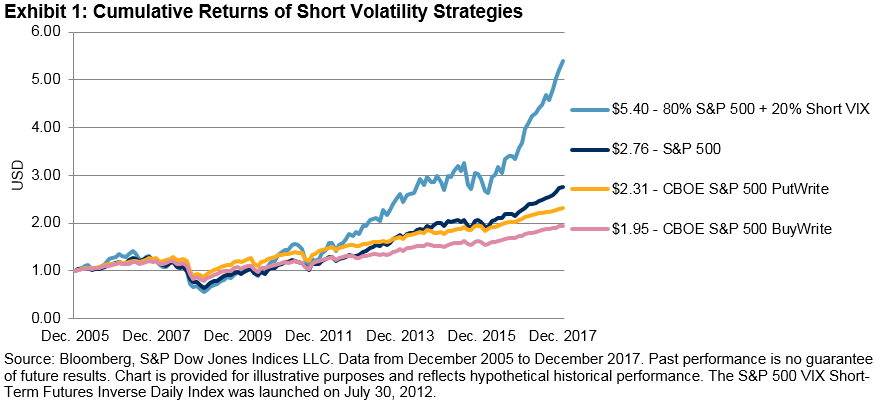
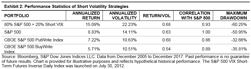
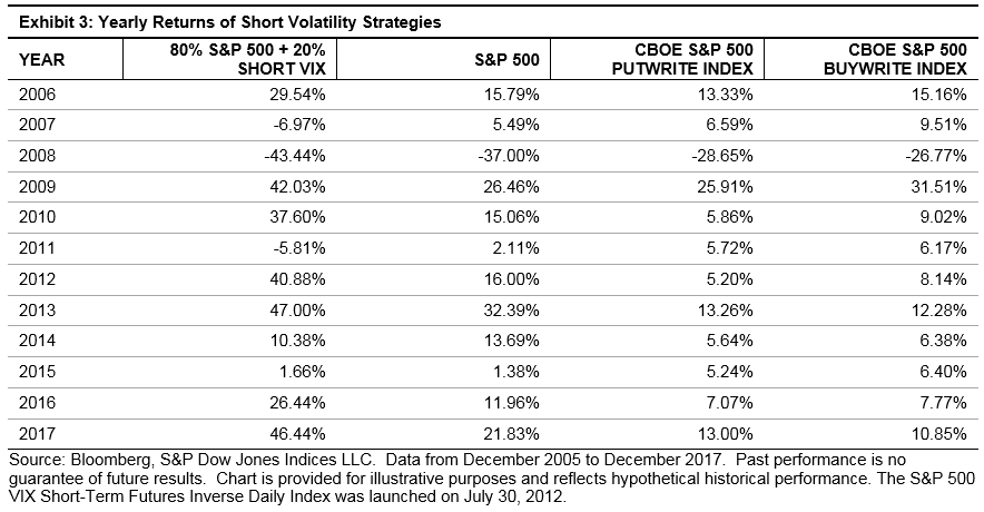
These exhibits show that selling VIX futures had a completely different impact than selling equity options on an equity portfolio in the back test period.

  • Selling VIX futures increased both annualized return and volatility, while writing put or call options tended to reduce portfolio volatility by forgoing part of the returns.
  • Despite its increased drawdown, shorting VIX futures significantly improved the long-term returns of the portfolio.
  • Risk-adjusted returns, as measured by return per unit of volatility, were comparable in all four portfolios.

Unlike a buy-write strategy that sells a covered call, shorting VIX futures tended to perform the best in a bull market and suffer the most in a bear market. This is because shorting VIX is selling volatilities across all strikes, and it is essentially longing the equity market due to the negative correlation between VIX (both the spot and the futures) and the equities. In contrast, a buy-write strategy limits the upside potential of the equity market and incurs a performance drag in a strong bull market. The option premium received, however, mitigates the loss and the buy-write index generally outperforms when the market goes down.

The posts on this blog are opinions, not advice. Please read our Disclaimers.

Sukuk Market in 2017: Year in Review

Contributor Image
Michele Leung

Former Director, Fixed Income Indices

S&P Dow Jones Indices

In 2017, the USD sukuk market expanded at its quickest pace in the past five years. As tracked by the Dow Jones Sukuk Total Return Index (ex-Reinvestment), which seeks to track U.S. dollar-denominated, investment-grade sukuk, the market added 13 new sukuk with a total par amount of USD 20.75 billion.

According to the index, sovereign sukuk contributed 75% to the issuance, including USD 9 billion from Saudi Arabia, USD 3 billion from Indonesia, USD 2 billion from Oman, and USD 1 billion from Hong Kong. Among the corporate issuers, the largest was IDB Trust, which raised USD 2.5 billion. For the country breakdown, 58% of the new issuances came from Saudi Arabia, followed by 14% from Indonesia and 12% from Oman.

Looking at the overall country exposure in the index, Gulf Cooperation Countries (GCC) remained the largest contributors, increasing their weight from 57% in 2016 to 65% in 2017. For the non-GCC countries, the three biggest were Indonesia, at 17%, Malaysia, at 10%, and Hong Kong, at 3%. Note that Turkey’s weight was reduced due to a change in methodology—the credit rating eligibility screening for sovereign bonds is now performed at the issuer level.

In terms of total return performance, 2017 returns showed similar trends as 2016. The Dow Jones Sukuk Total Return Index (ex-Reinvestment) rose 4.47% as of Dec. 29, 2017 (see Exhibit 1). The Dow Jones Sukuk Higher Quality Investment Grade Select Total Return Index, which seeks to track sukuk from specified countries of risk, gained 4.08% for the period. The S&P MENA Sukuk Index, which is designed to measure sukuk issued in the Middle East and African market, advanced 3.40%.

Among the ratings-based subindices, sukuk rated ‘BBB’ outperformed and rose 5.55%, while sukuk rated ‘A’ went up 4.97% in the same timeframe. The longer-maturity indices performed better than their shorter-maturity counterparts; the Dow Jones Sukuk 5-7 Year Total Return Index and the Dow Jones Sukuk 7-10 Year Total Return Index were up 3.98% and 7.36%, respectively.

Exhibit 1: Total Return Performance of the Dow Jones Sukuk Index Series

The posts on this blog are opinions, not advice. Please read our Disclaimers.

A Bit of Long History

Contributor Image
David Blitzer

Former Managing Director and Chairman of the Index Committee

S&P Dow Jones Indices

Houses or Stocks

Either could be an investment, if only we knew which would perform better?  We don’t, but a recently released academic paper, “The Rate of Return on Everything, 1870-2015” offers understanding and some unexpected facts from the past.  The paper covers 16 developed markets and compiles the real and nominal returns on equities, houses, bonds and short term bills or money market instruments. With a few exceptions, the data run from 1870 to 2015.

Across the entire sample – 16 countries and 100+ years, houses returned 7.05% annually after inflation, edging out equities which gave 6.89%. Moreover, volatility of houses was half of equities: 9.98% vs. 21.94%.  Stocks pushed ahead in more recent years; in the period since 1950, stocks returned 8.28% with volatility of 24.20% compared to houses returning 7.44% with volatility at 8.88%.  Of course, no one owns 16 houses, one in each country.  In the US across the whole history houses returned 6.03% while equities returned 8.39%, a 233 basis point margin. Since 1950 equities widened the margin to 313 basis points: houses returned 5.62% and stocks 8.75%. The spread was even wider from 1980 to 2015.  Houses appear to be better inflation hedges than stocks. However, this shouldn’t be an either-or-choice. The correlation between houses and equities is modest. Moreover, while equities over time appear to be becoming more correlated across countries, houses are not.

The data on the return from owning a house includes both the price appreciation and the imputed rent that accrues to the home owner. When ones owns and lives in a house, she benefits by not paying rent to a landlord – the savings is rent she pays to herself and is part of the return of owning a home much like a dividend is part of the return to owning a stock.

The Risk Premium

The paper reports the risk premium as the return on stocks and houses less the return on bills and bonds. As shown below, the risk premium for the US and for the combined 16 countries is consistently positive and usually large.

The low risk premium in the most recent period (right-most column) is due to the high interest rates prevailing for most of the last 35 years. Close to zero or negative real interest rates came with Quantitative Easing in the aftermath of the financial crisis. In the 1980s and 1990s interest rates were substantially higher than today. The risky returns in the US were higher in the recent period than over the entire period or the 1950-1980 time-frame.  The same pattern is seen among the other nations included in the data.  The charts below show nominal and real short and long rates in the US from 1870 to 2013. These data are from a data set compiled by the authors of the paper.  This confirms the implication of the risk premiums – the high rates of the 1980-2015 period were the anomaly, not the low rates (or negative real) rates that dominate most of the last 145 years.

Citations:

Oscar Jorda, Katherine Knoll, Dmitry Kuvshinov, Moritz Schularisk and Alan M. Taylor, “The Rate of Return on Everything 1870-2015”, National Bureau of Economic Research, December 2017

Data used for charts: Òscar Jordà, Moritz Schularick, and Alan M. Taylor. 2017. “Macrofinancial History and the New Business Cycle Facts.” in NBER Macroeconomics Annual 2016, volume 31, edited by Martin Eichenbaum and Jonathan A. Parker. Chicago: University of Chicago Press.

The posts on this blog are opinions, not advice. Please read our Disclaimers.

Big Things Come In Small Packages - Part 3

Contributor Image
Jodie Gunzberg

Former Managing Director, Head of U.S. Equities

S&P Dow Jones Indices

If you found a small-cap fund with a 23 year track-record that performed in the top 10th percentile of its peers over a 3-, 5-, 10-, and 15-year period, might you consider investing?  How about if you found out it was also a fraction of the price of its peer group?  Sounds pretty attractive, but unfortunately, there isn’t really “a fund” like this.

However, there is an index called the S&P SmallCap 600 that has performance like this, and it is possible to replicate it.   In fact some managers already do replicate it, and with far lower fees than the average small-cap mutual fund. The industry average fee for a small-cap mutual fund is 1.37%, but there are ETFs that offer products tracking the S&P SmallCap 600 with expense ratios as low as 0.07%.  (Here is a more complete list of S&P SmallCap 600 linked products from our website.)

This is the 3rd part of our blog series containing excerpts from our new paper where we discuss the outperformance of the S&P SmallCap 600 versus the Russell 2000, the performance of the indices compared with active managers, and the case supporting the performance.

SMALL-CAP INDEX PERFORMANCE VERSUS THE ACTIVE SMALL-CAP PEER GROUP
As mentioned in the introduction, the SPIVA U.S. Mid-Year 2017 Scorecard shows the S&P SmallCap 600 outperformed 93.8% of all small-cap funds over a five-year period. Moreover, the report calculates that over the 1-, 3-, 5-, 10-, and 15-year periods, the S&P SmallCap 600 beat 59.6%, 88.7%, 93.8%, 94.1%, and 94.4% of small-cap mutual funds in the University of Chicago CRSP database, respectively. This challenge in beating the index may contribute to why only 3% of funds are benchmarked to the S&P SmallCap 600.

To investigate the performance of small-cap benchmarks relative to institutional active managers, we utilized data from eVestment Alliance. In Exhibits 6-8, we compared the S&P SmallCap 600 and Russell 2000 with two S&P DJI small-cap factor indices that have exhibited strong relative performance over the past 20 years. The S&P SmallCap 600 Low Volatility Index is designed to measure the 120 stocks within the S&P SmallCap 600 with the lowest historical volatility, as measured by the standard deviation of daily price returns over the past 252 trading days. The S&P SmallCap 600 Quality Index is designed to measure the 120 stocks within the S&P SmallCap 600 that have the highest average z-score, which is based on three quality metrics: return on equity (ROE), balance sheet accruals ratio, and financial leverage ratio.

As shown in Exhibit 6, the S&P SmallCap 600 outperformed the Russell 2000 in all periods studied, ranging from one year to the entire period since the inception of the S&P SmallCap 600. The S&P SmallCap 600 also outperformed the median small-cap fund in the 1-, 3-, 5-, and 10-year periods ending Sept. 30, 2017.

Source: eVestment Alliance. Data from April 30, 1995 to Sept. 30, 2017. Chart and table are provided for illustrative purposes reflect hypothetical historical performance. Please see the Performance Disclosure at the end of this document for more information regarding the inherent limitations associated with back-tested performance.

Exhibit 7 compares the returns of the S&P SmallCap 600 and Russell 2000 to the eVestment U.S. small-cap equity universe from 2007-2016. The S&P SmallCap 600 ranked higher than the Russell 2000 in seven years and tied in one year. Only in 2009 and 2010 did the Russell 2000 rank higher, with a 74th percentile ranking versus a 79th percentile ranking for the S&P SmallCap 600 in 2009, and a 59th versus 62nd percentile ranking in 2010.  In 2014, 2015, and 2016, the S&P SmallCap 600 ranked even higher, in the 45th, 41st, and 24th percentiles, respectively.

Source: eVestment Alliance. Data from Dec. 31, 2006, to Dec. 31, 2016. Chart and table are provided for illustrative purposes reflect hypothetical historical performance. Please see the Performance Disclosure at the end of this document for more information regarding the inherent limitations associated with back-tested performance

The three-year rolling periods are shown in Exhibit 8. There were a total of eight three-year periods, and the S&P SmallCap 600 ranked higher than the Russell 2000 over every period. The S&P SmallCap 600 was also competitive with the active manager universe, scoring in the top half in five of eight three-year periods.

Source: eVestment Alliance. Data from Sept. 30, 2007, to Sept. 30, 2017. Chart and table are provided for illustrative purposes reflect hypothetical historical performance. Please see the Performance Disclosure at the end of this document for more information regarding the inherent limitations associated with back-tested performance.

The evidence of the S&P SmallCap 600’s outperformance over the Russell 2000 is clear, not just in plain comparison but juxtaposed to active managers. Conceivably, the S&P SmallCap 600 could be considered not just as a benchmark replacement, but rather it could more widely serve as the underlying index for investable passive funds.

We will explore the reasoning behind results this strong and steady in the next part of this blog series.

The posts on this blog are opinions, not advice. Please read our Disclaimers.

Feliz Año Nuevo From Latin America

Contributor Image
Jaime Merino

Former Director, Asset Owners Channel

S&P Dow Jones Indices

After Donald Trump became the 45th president of the U.S., the Dow® hit the 20,000 mark for the first time in history, there was a total solar eclipse, along with massive hurricanes, floods in Colombia, earthquakes in Mexico, a referendum in Catalonia, and the New England Patriots made an historic comeback in Super Bowl LI, the Houston Astros won their first World Series, and Star Wars Episode VIII opened in movie theaters. Meanwhile, we can take a look how inflation, the reference rate, and currencies from Brazil, Chile, Colombia, Mexico, and Peru moved over the past year and how the sovereign indices of these countries performed.

First, we will take a look at the reference rate from the countries’ respective central banks. The big winners from 2017, in terms of number of movements over the past year, were Brazil and Colombia, which changed their reference rate eight times. Brazil moved it down 600 bps, from 13.75% to 7%, and Colombia moved it in the same direction, from 7.5% to 4.75%. Mexico was the only country (from the observed) that moved the overnight rate on the upside year-over-year, with five changes amounting to an increase of 150 bps, as it closed at 7.25%. Chile and Peru moved theirs -75 bps and -100 bps, respectively. Exhibit 1 shows the reference rates over the year.

In terms of currencies, Chile had the greatest appreciation of the year with 8.16%, followed by Mexico with 5.15%, and Peru with 3.52%. Colombia stayed almost the same, with an appreciation only of 0.65%, and the only currency that depreciated was the Brazilian real, down 1.81%.

As for inflation, Peru hit its lowest inflation level in 10 years when the year-over-year CPI for November came at 1.54%. Inflation in Brazil and Chile was on target (as set by their central banks), with 2.77% and 1.91%, respectively through November. Colombia closed November with 4.12%, while Mexico ended with 6.63%, beyond the ~2% target inflation set by Banxico. Exhibit 2 shows how inflation moved in 2017.

Taking a look at the sovereign indices of the nominal and real rate bonds, the big winner in terms of index performance was Peru. The S&P Peru Sovereign Bond Index closed the year with a gain of 16.98% and the S&P Peru Sovereign Inflation-Linked Bond Index increased 13.02%. On the nominal side, Peru was followed by Colombia and Mexico with gains of 9.02% and 6.59%, respectively. As for the inflation indices, Brazil was second with 12.23%, while Chile was the only country with negative returns for 2017, with -1.47%. Exhibit 3 shows the YTD and quarterly performance of the indices.

I can assure one thing that all Latin America will be expecting this year… and that’s the World Cup!

The posts on this blog are opinions, not advice. Please read our Disclaimers.