Get Indexology® Blog updates via email.

In This List

The Growth of Small Caps in India

Rieger Report: Munis - "The Kids are Alright"

Inflation, Rising Rates Can Spark Oil's Rebound

Rieger Report: Muni Market's Moot Reaction to Bond Insurers Credit Watch Negative

Are Leveraged Loans Losing Their Luster...or Poised to Shine?

The Growth of Small Caps in India

Contributor Image
Ved Malla

Associate Director, Client Coverage

S&P Dow Jones Indices

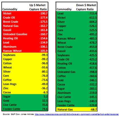
Over the past few decades, Indian capital markets have matured, and a large number of Indian market participants are now looking at capital markets as an investment avenue.  Investment in capital markets has grown substantially among all types of market participants—retail, institutional, and even government institutions, where recently the Employee Provident Fund Organization has started to invest in capital markets via exchange-traded funds.

Traditionally, the tendency of market participants has been to buy large-cap, blue-chip companies that form part of large-cap indices like the S&P BSE SENSEX.  However, there has been a paradigm shift in investment patterns—market participants are now going beyond traditional large-cap companies and venturing into companies in the mid-cap and small-cap segments.  This changing investment pattern has been reflected in equity volumes and performance of stocks in these segments.

Small-cap stocks outperformed large-cap stocks by significant margins in the three-year period ending May 31, 2017.  This significant outperformance by small-cap stocks has resulted in more market participants looking at the small-cap segment.

The S&P BSE Indices include two indices in the small-cap space—the S&P BSE SmallCap and the S&P BSE SmallCap Select.

The S&P BSE SmallCap is designed to represent the small-cap segment of India’s stock market; it seeks to track the bottom 15% of the total market cap of the S&P BSE AllCap.  The S&P BSE AllCap consists of over 900 stocks, and around 750 of those are the constituents of the S&P BSE SmallCap.

The S&P BSE SmallCap Select is designed to measure the performance of the 60 largest and most liquid companies in the S&P BSE SmallCap.

Let us now compare the returns of S&P BSE SmallCap and the S&P BSE SmallCap Select with the returns of large-cap indices like the S&P BSE LargeCap and the S&P BSE SENSEX.

Exhibit 1: Returns
PERIOD S&P BSE SMALLCAP SELECT (%) S&P BSE SMALLCAP (%) S&P BSE LARGECAP (%) S&P BSE SENSEX (%)
1-Year 30.89 36.22 20.78 18.22
2-Year 26.03 36.10 17.51 15.14
3-Year 66.86 72.11 38.56 34.24

Source: S&P Dow Jones Indices LLC.  Data from May 31, 2014, to May 31, 2017.  Past performance is no guarantee of future results.  Table is provided for illustrative purposes and reflects hypothetical historical performance.

In Exhibit 1, we see that in the three-year period ending May 31, 2017, the absolute returns of the S&P BSE SmallCap and S&P BSE SmallCap Select were significantly higher than those of the S&P BSE LargeCap and S&P BSE SENSEX.

Exhibit 2: Index Total Returns

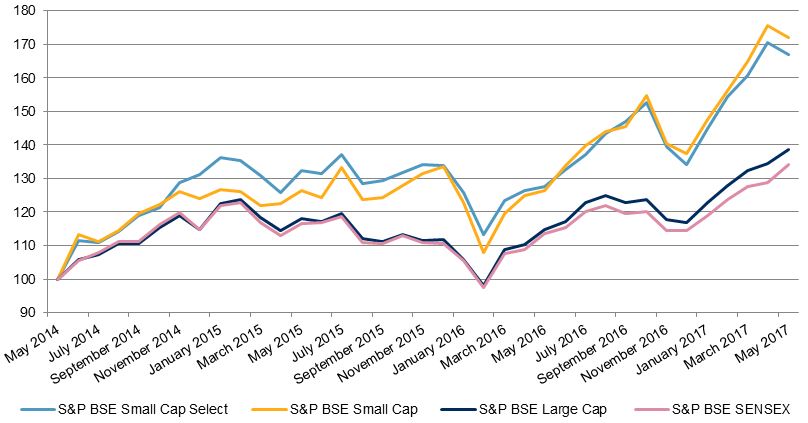
Source: S&P Dow Jones Indices LLC.  Data from May 31, 2014, to May 31, 2017.  Chart is provided for illustrative purposes.  Past performance is no guarantee of future results.

In Exhibit 2, we see that the S&P BSE SmallCap and S&P BSE SmallCap Select consistently outperformed the S&P BSE LargeCap and S&P BSE SENSEX during the three-year period studied.

The significant outperformance by the small-cap segment over the large-cap segment has resulted in an increase in interest in the small-cap segment.

The posts on this blog are opinions, not advice. Please read our Disclaimers.

Rieger Report: Munis - "The Kids are Alright"

Contributor Image
J.R. Rieger

Former Head of Fixed Income Indices

S&P Dow Jones Indices

As we approach the mid-year point of 2017 the muni bond market has not been shaken by a heavy news cycle of downgrades, negative watches and ever present Illinois and Puerto Rico downbeat press.  Technical factors play a big role in overcoming this pressure but there are other compelling rationale in support of munis in the current environment.

Technical factors: the muni market new issue supply / demand imbalance in place for some time is further out of kilter as we approach the summer months. Low new issue supply cannot keep up the pace of demand.  That demand in turn is historically higher in these months due to coupon reinvestment needs which is a phenomenon in the muni market due to large clusters of municipal bonds paying interest semi-annually in June.

Some additional factors: (not all factors discussed in this blog)

  • Yield: investment grade municipal bonds tracked in the S&P National AMT-Free Municipal Bond Index are yielding a tax-exempt 2.01%.  Converting that into a Taxable Equivalent Yield results in needing a 3.3% yield for corporate bonds to keep the same amount of return as tax-exempt munis provide. At this writing, the S&P 500 Investment Grade Corporate Bond Index is yielding 2.96% and the S&P U.S. Treasury Current 10 Year Index is yielding 2.14%.
  • Duration: investment grade municipal bonds currently have a shorter duration than investment grade corporate bonds which could make them an attractive option in the event rates begin to rise on the longer end of the curve.

Table: Select indices, their returns, yields & durations:

Source: S&P Dow Jones Indices, LLC. Data as of June 14, 2017. Chart is provided for illustrative purposes. It is not possible to invest directly in an index. Past performance is no guarantee of future results.

“The Kids are Alright” reference is to the song about troubled teens written by Pete Townshend of The Who and released by The Who in 1965.

For more information on S&P’s bond indices including methodologies and time series information please go to SPDJI.com.

Please also join me on LinkedIn .


The posts on this blog are opinions, not advice. Please read our Disclaimers.

Inflation, Rising Rates Can Spark Oil's Rebound

Contributor Image
Jodie Gunzberg

Former Managing Director, Head of U.S. Equities

S&P Dow Jones Indices

In anticipation of the Federal Reserve’s policy meeting starting Wednesday that may raise the federal funds target rate, here’s what you need to know about how the decision impacts commodities.

Historically rising interest rates are positive for commodities for two main reasons.  One is the return on collateral increases, pushing up the total return. The other reason is that producers may be disincentivized to produce and store as carrying costs increase.  This is fundamentally based on the futures relationship to the spot market.  In order for the market clear, the convenience yield must equal the opportunity cost, which is expressed in the formal relationship between buying the futures price today for delivery at time T and buying the commodity at the spot price today and storing it until time T.  The futures prices can be expressed in terms of the spot price, interest rate, cost of storage and convenience yield, through the central equation of the “theory of storage”.

Source: Working, H. 1933, “Price Relations between July and September Wheat Futures at Chicago Since 1885”, Wheat Studies of the Food Research Institute.

This is not just theoretical but is supported by the data.  On average in rising rate periods, the S&P GSCI Total Return index has gained 43.5% more than the spot index that has gained on average 31.3%, showing that rising rates can drive carrying costs higher, making it less beneficial to hold inventory.

The impact benefits some commodities more than others, and the ones that gain most tend to be the more economically sensitive energy and industrial metals.  For example, rising rates help oil more than gold.  In rising rate periods, (WTI) Crude oil gains on average 49.0% and Brent crude gains nearly double that up 90.0%. What’s even more interesting is that the term structures become backwardated, again as producers are disincentivized to produce and store amid higher interest rates since it is more expensive. The impact can be observed in the added return from the positive roll yield.  Brent on average adds an additional 22.9% and (WTI) Crude oil gains an additional 16.8%.  If rates rise, it can possibly be the catalyst to get U.S. inventories down, which is the key factor in the oil rebound.

Gold on the other hand only gains on average 27.7% in rising rate periods but remains in contango, losing 2.8% since it is so supplied, relatively cheap and easy to store.

Source: S&P Dow Jones Indices.

Another indicator the market is watching is the monthly consumer price index (CPI,) scheduled to be published early Wednesday by the Bureau of Labor Statistics.  Oil is the most sensitive commodity to inflation since energy is the most volatile component of CPI.  Historically going back to 1971, the inflation beta of the S&P GSCI is 3.4 which means for a 1% increase in inflation, it results in a 3.4% increase in return of the S&P GSCI during the period from 1971–2017.  However, when the time period is shortened to start in 1987, the inflation beta jumps substantially to 13.8.  This is since 1987 is the year oil was added into the index.  The impact is also observed by comparing the inflation beta between the S&P GSCI and Dow Jones Commodity Index (DJCI.) The inflation beta since 2000, which is when data for DJCI is available, the inflation beta of DJCI is 12.3 versus 16.5 for S&P GSCI.  This is since energy is only 1/3 of the equally weighted DJCI versus about 65% in energy in the world production weighted S&P GSCI.

SOURCE: S&P Dow Jones Indices (rolling 12-month calculations)
Inflation beta data are measured by CPI-U as listed on the website: ftp://ftp.bls.gov/pub/special.requests/cpi/cpiai.txt
R-squared signifies the percentage that inflation explains of the variability in commodity index returns
Inflation beta can be interpreted as: (using DJCI 2000-2017 as an example) A 1% increase in inflation results in 12.3% increase in return of the DJCI during the period from 2000–2017.
Time periods shown reflect first full year of returns for the S&P GSCI (1971), first year crude oil was included in the S&P GSCI (1987), first full year of returns for the DJCI (2000), 2004 and 2009 are 5-years and 10-years.

Not only is energy attractive from it’s inflation protection but many traders love it for its volatility.  However some market participants prefer the lower volatility of gold and the safety it may provide in this environment of a weak financial sector, uncertain economic growth and political unrest.  A mistake though is to assume gold will provide inflation protection because it doesn’t do a great job in that role.  Since the launch of the S&P GSCI index in 1991, the excess return of copper over inflation is 5.1% versus gold of 3.5%, and the inflation beta or sensitivity to inflation is far higher for copper at 9.2 versus just 3.5 for gold.  An investor can get almost triple the inflation protection from copper than gold.  Oil still is far better with an inflation beta of 16.5 and excess return over inflation of 5.6%.

Last, if the fed decides not to raise rates, the dollar may fall significantly.  In that case, every commodity may benefit, but again, the falling dollar doesn’t impact every commodity equally and the more economically sensitive copper and oil fare better than gold.  On average for every 1% the dollar falls, copper gains on average 5.3%, Brent crude gains 4.5%, (WTI) Crude oil gains 4.3% and gold just 3.5%. What is interesting though is that when the dollar rises, gold actually rises on average, gaining 33 basis points for every 1% the dollar rises.  A rising dollar also doesn’t hurt oil and copper as much as the falling dollar helps. For every 1% dollar rise, copper drops just 99 basis points and oil falls 1.8%.

Given the sensitivity difference, oil may better positioned than gold in the face of rising rates, the chance of a weaker dollar, and with concern about inflation.

The posts on this blog are opinions, not advice. Please read our Disclaimers.

Rieger Report: Muni Market's Moot Reaction to Bond Insurers Credit Watch Negative

Contributor Image
J.R. Rieger

Former Head of Fixed Income Indices

S&P Dow Jones Indices

So far, the municipal bond market has seen only a modest reaction to the recent negative credit watch being placed on the ratings of several bond insurers.

Month to date as of June 12, 2017, the S&P Municipal Bond Insured Index tracking over $148billion in par value of insured bonds has performed in sync with the overall market.  The insured bond index has an average yield that is higher than the broader S&P Municipal Bond Investment Grade Index which tracks over $1.5trillion in par value.  As an additional validation, the insured bond market performance as compared to larger more liquid bonds in the S&P National AMT-Free Municipal Index also seems to be at a parity, at least so far in June.

Year to date the higher yielding bonds in the S&P Municipal Bond Insured Index have contributed to outperformance verses the rest of the investment grade market place.

Table: Select municipal bond indices, their yields and returns:

Source: S&P Dow Jones Indices, LLC. Data as of June 12, 2017. Chart is provided for illustrative purposes. It is not possible to invest directly in an index. Past performance is no guarantee of future results.

For more information on S&P’s bond indices including methodologies and time series information please go to SPDJI.com.

Please also join me on LinkedIn

The posts on this blog are opinions, not advice. Please read our Disclaimers.

Are Leveraged Loans Losing Their Luster...or Poised to Shine?

Contributor Image
Jason Giordano

Director, Fixed Income, Product Management

S&P Dow Jones Indices

Leveraged loans (also called senior loans or bank loans) typically pay a two-part coupon—a market-driven base rate (30-90 day LIBOR) plus a contractual credit spread.  As shown in Exhibit 1, the weighted average credit spread of U.S. leveraged loans, as measured by the S&P/LSTA Leveraged Loan 100 Index, has fallen steadily and now sits at about one-half of where levels were just 16 months ago.

Against a backdrop of anticipated rising interest rates, demand for the senior secured floating-rate asset class has created an environment that has benefitted issuers of bank loans.  Given the high demand and relatively limited supply of new loan issuances, issuers have been able to renegotiate their credit terms (i.e., reduce the credit spread on the outstanding loan).  This has been done through two processes: refinancing and repricing.

As shown in Exhibits 2 and 3, volumes of both refinancing and repricing have skyrocketed in 2017.  Generally speaking, loan repricings involve issuers reaching out to market participants via an arranger to lower the interest rate on an existing facility, with no other changes to the loan agreement.  Refinancings, however, involve a new loan structure (i.e., new term, new agreements, etc.), which replaces the existing facility.  The existing loan that is refinanced is repaid at par, which could result in a further hit to yield if the loan was trading above par (as of May 31, 2017, approximately 60% of the S&P/LSTA Leveraged Loan 100 Index was bid at par or higher).

Exhibit 4 shows a sample of some of the larger facilities that have repriced in 2017.  As of May 31, 2017, over 300 facilities have repriced.  The repricing impact has ranged from 25 to 350 bps, with an average of 70 bps.

Despite the negative impact this activity has had on yields, there are several potential positives to take away from the current state of senior loans.  With the new, lower interest rates, most issuers have improved their fundamentals (i.e., stronger interest coverage ratios) and those issuers that have refinanced have extended their terms out with better financing rates.  Therefore, in addition to being secured and senior in the capital structure, many bank loans may now have improved credit profiles.

In addition, credit spreads are only one part of a bank loan’s coupon.  The second part, and perhaps the most appealing aspect, is the floating component, which is typically based on LIBOR.  As shown in Exhibit 5, three-month LIBOR currently sits at 1.22%, up 22 bps YTD as of May 31, 2017, and over 50 bps since June 2016.  Additionally, based on Fed Fund futures, the likelihood of a June 2017 rate hike currently stands at over 95%.

Finally, compared with high-yield corporate bonds, senior loans offer lower duration risk, given the floating-rate nature.  Rates on loans typically reset every 90 days, implying a duration of 0.25 versus a current effective duration of 4.18 on the S&P U.S High Yield Corporate Bond Index.  So, in addition to having lower default rates and higher recovery rates than high-yield corporate bonds, senior loans offer significantly higher yield-per-unit of duration.  Furthermore, as shown in Exhibit 6, option-adjusted spreads in ‘BB’/‘B’ corporate bonds have tightened to levels not seen since 2014.

To learn more about the senior loan market and hear why loans may be an effective asset class for income and diversification, please join us on Tuesday June 20, 2017, for our webinar: Will the FOMC Continue to Fuel Interest in Senior Loans?

The posts on this blog are opinions, not advice. Please read our Disclaimers.