Get Indexology® Blog updates via email.

In This List

P/E Ratios: Friend or Foe?

$60 Trillion – Yes, Trillion – Committed to Investing This Way

The Worst of Both Worlds

Rieger Report: "Belly of the Curve" Good for Muni & Corporate Bonds

Rieger Report: High Yield Domination

P/E Ratios: Friend or Foe?

Contributor Image
Philip Murphy

Former Managing Director, Global Head of Index Governance

S&P Dow Jones Indices

In a recent Financial Times column[1], Miles Johnson cautioned readers not to rely too heavily on index p/e ratios to gauge buying opportunities in the market. I wholeheartedly agree that investors should avoid over-reliance upon any single metric, but it is important to consider how p/e ratios are calculated, what their limitations are, and what they may convey about market conditions.

Mr. Johnson referred to an S&P 500 p/e of “more than twenty” around the market trough of the financial crisis, and he is looking for an answer to why “… the index appeared expensive at its bottom…” He poses a good question, but goes on to mistakenly confuse the inherent challenges of using p/e ratios to time markets with a misplaced critique of the method used by S&P DJI to calculate index earnings. I’ve discussed the calculation of index earnings before, so here I’ll address the nature of p/e ratios. The answer to why the market may have appeared expensive at its trough really has only to do with the nature of earnings cycles – particularly around inflection points.

What did we know, and when did we know it?

Consider data frequency of the numerator and denominator of a frequently cited p/e ratio, price to trailing earnings. Price is revised moment to moment during trading hours, and even after hours. Earnings, on the other hand, are accounting estimates updated quarterly (and sometimes historically restated) with a substantial lag of about 6-8 weeks for most S&P 500 companies.

Reviewing the Index Earnings file[2] compiled by Howard Silverblatt, Senior Index Analyst here at S&P DJI, reveals that the Q4 2008 reporting period saw S&P 500 losses of $.09 per share on an operating basis[3] and $23.25 per share on a GAAP basis. This was the trough of the financial crisis earnings cycle. However, the index did not record its daily closing low of 676.53 until March 9, 2009 – which is about the time when the full extent of Q4 losses would have become clear due to the reporting lag of financial statements. The chart below therefore lags GAAP index earnings by 2 months to reveal earnings for the previous quarter’s reporting period around the time they would have been known historically. The chart covers 5 years from June 2004 through June 2009.

spx-chart
Source: S&P Dow Jones Indices, LLC

The chart shows that when earnings grow, as they have tended to do most of the time, p/e ratios can serve as pretty reliable indicators of the richness of the market. As the market peaked at 1565.15 on October 9, 2007 its earnings multiple of 18.4 times trailing GAAP EPS was probably considered reasonable (or at least not unreasonable) by many observers. However, the earnings cycle was at an inflection point and about to turn down. Only forward looking p/e ratios could possibly take this into account, but consensus estimates of securities analysts also have several inherent weaknesses such as herding, short-term focus, hindsight bias, and potential conflicts of interest.

As the downturn in the earnings cycle played out, the index price noisily responded to expectations until the market convinced itself that the worst of the earnings news had been priced in. By this time the price level of the S&P 500 was more than cut in half and a backward looking GAAP p/e ratio looked horrific. The key to the buying opportunity was in recognizing that while the S&P 500 price had been cut in half its earning power had not been. The historic buying opportunity of early 2009 had nothing to do with p/e ratios, which only serve reliably when earnings are in a trend – not an infection point.

[1] Miles Johnson (September 20, 2016). Don’t be fooled by p/e ratios when the next big sell-off comes. The Financial Times Smart Money Column.

[2] Available at http://us.spindices.com/indices/equity/sp-500 in the “Additional Info” dropdown menu.

[3] Operating earnings in Howard Silverblatt’s file are defined as income from sale of goods and services excluding corporate transactions such as M&A, financing, and layoffs, as well as unusual items.

The posts on this blog are opinions, not advice. Please read our Disclaimers.

$60 Trillion – Yes, Trillion – Committed to Investing This Way

Contributor Image
Reid Steadman

Former Managing Director, Global Head of ESG & Innovation

S&P Dow Jones Indices

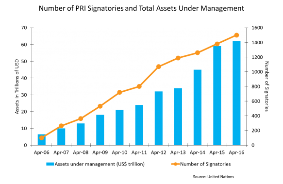
Index providers often work with large pensions and asset managers, so it’s difficult to surprise us with big numbers. Recently, though, I saw a chart with some staggering sums. I am pasting it below.

pri

What is the PRI?
This chart shows the investment world’s adoption of the “PRI”, the Principles for Responsible Investment. In 2006, the United Nations, under the leadership of Kofi Annan, established six principles to serve as standards for how to invest. These are:

  1. Incorporate ESG issues into investment analysis and decision-making processes.
  2. Be active owners and incorporate ESG issues into our ownership policies and practices.
  3. Seek appropriate disclosure on ESG issues by the entities in which we invest.
  4. Promote acceptance and implementation of the Principles within the investment industry.
  5. Work together to enhance our effectiveness in implementing the Principles.
  6. Report on our activities and progress towards implementing the Principles.

The term “ESG” refers to “environmental, social, and governance” issues. These have developed into major themes in the investment and corporate world, and the PRI has become a leading initiative defining what these concepts mean.

As the chart shows, the PRI has been a remarkable success by certain measures. Companies managing over $60 trillion have signed the PRI. A full list of signatories can be found here. It’s possible that the company you work for has signed.

Criticisms and Support
Support for the PRI has been nearly universal. When companies sign up, they typically issue an announcement to congratulate themselves and to publicly support the project (see here and here and here). But the Principles have some critics. In 2013, some large Danish investors backed out of the PRI, for – ironically – lack of good governance by the entity overseeing the project.

Other criticisms I have heard at conferences and in other settings are that the principles are (a) too broad, (b) don’t require sufficient accountability, and (c) don’t actually result in change. The large number of signatories also raises this question. If 1,500 institutions with $60 trillion in assets can quickly sign up, how demanding can these principles be?

Moving Forward
These criticisms shouldn’t be dismissed, but they shouldn’t make us turn our backs on these Principles either. As Harvard noted when it joined, the Principles for Responsible Investment are part of an evolution, a “step” in the right direction that will result in professional investors striving to do a little better.


The posts on this blog are opinions, not advice. Please read our Disclaimers.

The Worst of Both Worlds

Contributor Image
Craig Lazzara

Former Managing Director, Index Investment Strategy

S&P Dow Jones Indices

For active managers, investment results are partly a function of skill and partly a function of the environment in which that skill is exercised.  Even perfect foresight has only conditional value.  Imagine, for example, a manager who can always identify the top quintile of performers in a given market.  If the top quintile outperforms the index as a whole by 20%, that will make for spectacular value added.  If its outperformance is only 2%, the results are much less inspiring — but the manager’s skill is the same in both cases.

The value of a manager’s skill is influenced by the dynamics of the market within which he works — specifically, by the universe’s dispersion and correlation.  Correlation is a measure of timing.   Loosely stated, if correlations are high, it means that the components of an index are moving up and down at the same time; if correlations are low, gains in some stocks are being offset by losses in others.  Dispersion, in contrast, is a measure of magnitude.  If dispersion is high, it means that the gap between the best-performing stocks and the laggards is wide; if dispersion is low, it means that the gap between the best and worst performers is narrow.

Neither correlation nor dispersion tells us anything about a manager’s stock selection skill — but dispersion, in particular, has an important influence on the value of that skill.  When dispersion is high, good stock pickers can outdistance their less-talented or less-lucky competitors.  When dispersion is low, the gap between the best and worst managers narrows, and generating excess returns for clients becomes more difficult.  Correlation helps us to understand the benefits of diversification, but as a gauge of stock selection strategies, it is less important than dispersion.  Other things equal, however, lower correlation is better for active managers than higher correlation — especially for a strategy with rapid turnover.

In September, dispersion fell to below-average levels in every market we follow.  Correlations, though not terribly elevated in absolute terms, were typically well above average.  Neither of these developments is auspicious for active managers.  Unless the dispersion-correlation map changes, active alpha should continue to be elusive.


The posts on this blog are opinions, not advice. Please read our Disclaimers.

Rieger Report: "Belly of the Curve" Good for Muni & Corporate Bonds

Contributor Image
J.R. Rieger

Former Head of Fixed Income Indices

S&P Dow Jones Indices

Through October 3rd, the S&P Municipal Bond Index has returned 4.23% year-to-date and the S&P 500 Bond Index has returned 8.97%.  The 7 – 10 year maturity range has outpaced the overall benchmarks in both cases.

The average yield of bonds in the S&P 500 7-10 Year Investment Grade Corporate Bond Index has fallen by 94bps since year end as the yield thirsty market place has hunted yield oriented products.  As a result, the index has seen a year-to-date total return of 9.15%.

The 7 – 10 year range of the municipal bond market has kept pace with U.S. Treasury bonds and nominal yields remain comparable to U.S. Treasury bonds.  Meanwhile, taxable equivalent yields of the non-callable municipal bonds in that maturity range remain significantly higher and more in line with U.S. corporate bonds.  Municipal bonds are sensitive to new issue supply and retail investor sentiment which can change the yield relationships between municipals and other asset classes.

Table 1) Select indices, their year-to-date returns and yields as of October 3rd, 2016:

*Taxable Equivalent Yield assumes a 39.6% tax rate. Source: S&P Dow Jones Indices, LLC. Data as of October 3rd, 2016. Table is provided for illustrative purposes. It is not possible to invest directly in an index. Past performance is no guarantee of future results.

The posts on this blog are opinions, not advice. Please read our Disclaimers.

Rieger Report: High Yield Domination

Contributor Image
J.R. Rieger

Former Head of Fixed Income Indices

S&P Dow Jones Indices

High yield bonds have been marching along and putting up returns that are dominating the investment grade bond markets.

U.S. junk bonds continue to have no stink to them as demand for yield far outweighs the supply and seemingly the credit risks associated with these bonds.   The bonds of larger entities tracked in the S&P 500 High Yield Corporate Bond Index have returned 15.57% year-to-date modestly out performing the broader S&P U.S. High Yield Corporate Bond Index.  The S&P 500 High Yield Corporate Bond Index tracks the junk bonds of issuers of the S&P 500 and as the yields indicate, on average, they tend to be better quality than the bonds in the broader index.

Floating rate senior loans, as tracked by the S&P/LSTA U.S. Leveraged Loan 100 Index have returned over 8.5% year-to-date and are yielding just 110bps lower than fixed rate high yield bonds. Demand for yield combined with the benefits of floating rate interest payments and better security provisions than fixed rate junk bonds all helps to draw attention to this asset class.

High yield municipal bonds have also been in demand and also have benefited from a rally in Puerto Rico bonds. The S&P Municipal Bond High Yield Index, which includes Puerto Rico bonds has returned just about 9.5% year-to-date.  Without Puerto Rico bonds the index would have returned 8.19% year-to-date.

Table 1) Select indices, their year-to-date returns, yields and total market value as of September 30th, 2016:

Source: S&P Dow Jones Indices, LLC. Data as of September 30th, 2016. Table is provided for illustrative purposes. It is not possible to invest directly in an index. Past performance is no guarantee of future results.

The posts on this blog are opinions, not advice. Please read our Disclaimers.