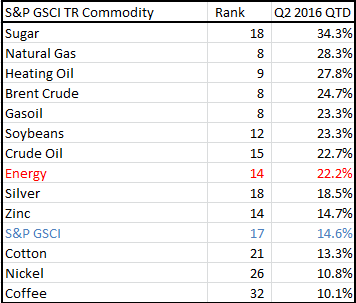
As the second quarter’s end nears, commodities are on pace to post their best quarter in seven years. The S&P GSCI Total Return is up 14.6% quarter-to-date (as of close on June 29, 2016,) the most since its quarterly gain of 19.2% in the second quarter of 2009. So far in q2 2016, 12 of 24 commodities have returned over 10% with energy gaining 22.2% QTD. The best performers for the quarter are sugar and natural gas up 34.3% and 28.3%, respectively. Natural gas, brent crude and gasoil are on track to record their 8th best quarter in history.
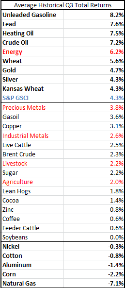
Despite, a record hot second quarter, commodties may continue on their streak into the summer given the 3rd quarter is historically the best one for the asset class. On average since 1970, the S&P GSCI TR has gained 4.3% in Q3 that is more than the average historical returns of 2.8%, 3.0% and -0.7% in Q1, Q2 and Q4, respectively.
For seven commodities, the 3rd quarter has historically been the best quarter but the 3rd quarter has been the worst for six commodities. Also, the 3rd quarter has been the best for both energy and precious metals with respect to their own histories. Based on the table below, commodities including cocoa, crude oil, gold, heating oil, wheat and lead may heat up this summer while aluminum, corn, cotton, natural gas, nickel and soybeans may cool off (though it is interesting to note that even in the worst quarter for soybeans, they still gained 3 basis points on average.)
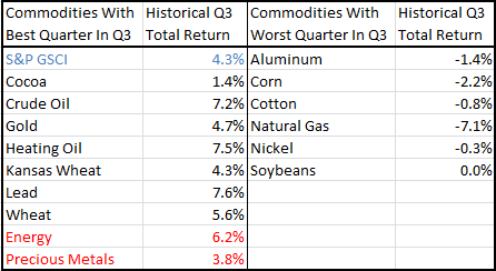
However, for relatively hot plays in the space, unleaded gasoline (q1 is historically its best quarter gaining 9.2% on average,) lead, heating oil, crude oil, wheat, gold and silver have outperformed the index in past 3rd quarters. SImilarly to the table above, the same commodities that have had the worst performance relative to themselves also have had the worst performance compared with other commodties. For a sector play, energy may be the best outperformer based on its summertime history.
Important fundamentals to watch are U.S. inventories and supply for oil, driving demand for unleaded gasoline, El Nino impacts for agriculture and natural gas, seasonal grilling demand, unexpected supply shocks that may bring inflation, dollar moves and Brexit.
The posts on this blog are opinions, not advice. Please read our Disclaimers.


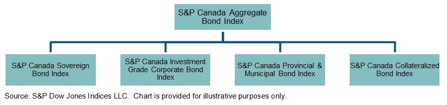
 Source: S&P Dow Jones Indices LLC. Data as of June 13, 2016. Chart is provided for illustrative purposes.
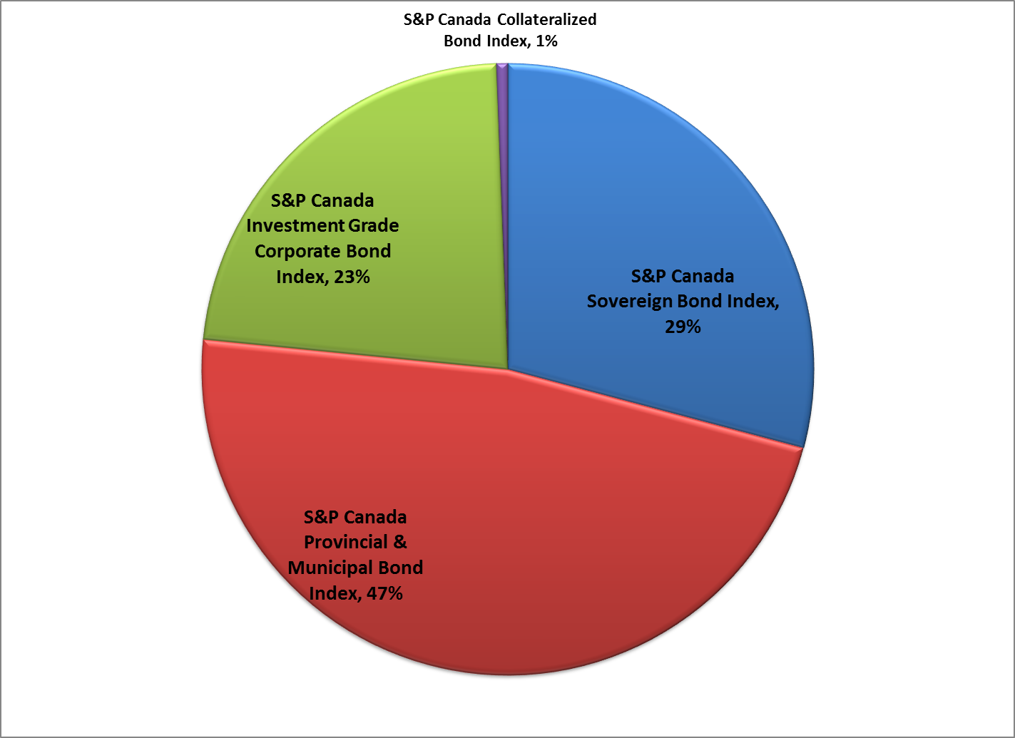
 The
The  The collateralized sector of the market accounts for a small percentage of the index, less than 1%. The