Get Indexology® Blog updates via email.

In This List

Rieger Report: Factors impacting bond liquidity

When Diversification Fails

Valuing Low Volatility: Does Timing Matter?

“Round Up the Usual Suspects”

How Cheap Gasoline Can Lead to Costly Insurance

Rieger Report: Factors impacting bond liquidity

Contributor Image
J.R. Rieger

Former Head of Fixed Income Indices

S&P Dow Jones Indices

Issuer name recognition and entity size seem to be factors in bond liquidity and as a result may be important considerations in index design.  Tracking the trade activity of corporate bonds issued by the ‘blue chip’ companies of the S&P 500 Index indicates liquidity is improved for these bonds over other bond issues.

Of course, when making decisions about depth of liquidity there are some important elements of the markets to consider:

  • There are many issuers of bonds and different types of issuers.
  • Some issuers borrow infrequently and others come to the bond markets with higher frequency.
  • Some issuers are well known entities to the investor community; others are smaller and less known.
  • Many  bonds can be issued from one entity, each with differing term structures (deal size, par amount, maturity, coupon, as well as redemption and security provisions to name a few).
  • Bonds are often buy and hold assets.
  • Bonds often represent long term obligations intentionally designed with maturities that match the useful life of the projects they fund.

Issuer name recognition and entity size as a factor can be illustrated by comparing the trade volume data of two indices: the S&P 500 Investment Grade Corporate Bond Index and the broader S&P U.S. Issued Investment Grade Corporate Bond Index.  Both have the same inclusion rules with the difference being the bonds in the S&P 500 Index must be bonds from the S&P 500 companies.

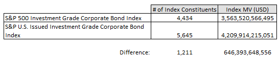
Table 1: Key index statistics as of December 2015:

Source: S&P Dow Jones Indices, LLC. Data as of December 31, 2015.

What the data is telling us:
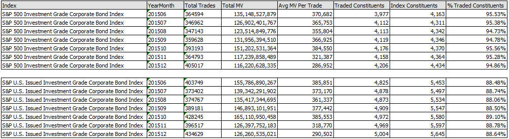
Table 2: Trade data statistics for June – December 2015

Source: S&P Dow Jones Indices, LLC and TRACE. Data as of December 31, 2015.

Please contact us to receive the time series referenced above.

The posts on this blog are opinions, not advice. Please read our Disclaimers.

When Diversification Fails

Contributor Image
Jodie Gunzberg

Former Managing Director, Head of U.S. Equities

S&P Dow Jones Indices

It has been the worst start in history for both stocks and commodities, and while rare, it is no accident.  Fundamentally, this environment is the worst ever.  It is like the demand crisis of 2008-9 combined with the supply war of 1985-6  – WITH a strong dollar. The oil drop from the peak in June 2014 is on the cusp of becoming the worst in index history, beating the 2008-9 drop.

Source: S&P Dow Jones Indices

What’s worse is the oil crisis has spilled into other classes. The jitters started with the Chinese stock market crash back in July that sent stock volatility soaring. The fears got worse when the Fed raised rates as evidenced by the spiking correlation between the risky assets, stocks and commodities.  The correlation now has quadrupled as stocks fall with commodities, erasing diversification benefits and making risk management difficult.

Source: S&P Dow Jones Indices

Today, there is a new risk-on/risk off based on rising interest rates. This is different than the risk on risk off we saw post the global financial crisis, since that one was from unprecedented quantitative EASING. One thing is the same – and that is the bi-modal view of either rising rates work – or they don’t. Right now it doesn’t seem like it’s working, so risk-off.

What are investors doing now?

Mostly 3 things that may diversify away from stocks and commodities. 1. Going to cash; 2. Going to gold – though not the same safe haven it once was, it does diversify. However, the rates need to be higher, the dollar needs to be weaker and inflation needs to kick in to support gold prices; 3. Including other real assets like infrastructure, property and inflation bonds to preserve capital while getting inflation protection.

The combination of real assets allows investors to get inflation protection without giving up portfolio efficiency. Since two of the worst oil drawdowns in history have happened in the past ten years, the inflation protection from commodities is no longer worth the performance losses from a diversification standpoint. The losses are so big that the low average correlation has not reduced the risk enough to justify the loss.

The inflation beta of natural resources (equities, fixed income and commodity futures) is 6.6 that is the highest of any single real asset. While the equity real assets composite has relatively high inflation beta, its correlation to inflation is relatively low. The S&P Real Assets Index that uses both stocks and bonds of infrastructure, property, natural resources plus inflation-linked bonds has the highest inflation protection combination.

source: S&P Dow Jones Indices
Source: S&P Dow Jones Indices

Now that is attainable without giving up on diversification. When natural resources are added to a portfolio of stocks and bonds, the Sharpe Ratio, a measure of risk-adjusted return, falls from the poor performance. On the other hand, infrastructure may provide a nice diversification benefit but fails to provide as significant inflation protection. The solution may be to combine them for stronger and more consistent inflation protection and diversification through risk management provided by the mix of not only real asset categories but by the asset class mix, including bonds and commodity futures in addition to stocks.

source: S&P Dow Jones Indices
Source: S&P Dow Jones Indices

Learn more about how this works by reading our paper at:

http://us.spindices.com/documents/education/lets-get-real-about-indexing-real-assets.pdf?force_download=true

For more information on real assets, I will be speaking  at Inside ETFs next Monday.


The posts on this blog are opinions, not advice. Please read our Disclaimers.

Valuing Low Volatility: Does Timing Matter?

Contributor Image
Fei Mei Chan

Former Director, Core Product Management

S&P Dow Jones Indices

If early January is any indication, 2016 should be another year when low volatility strategies will be in vogue. Popularized in the turmoil following the financial crisis in 2008, low volatility strategies, as the name denotes, serve well in times of equity upheaval. And despite bearing lower risk low volatility strategies have outperformed their benchmarks over time. The S&P 500 Low Volatility Index is an example of such a strategy. In the 25-year period ended in December 2015, Low Vol delivered an average annual return of 10.91% compared to 9.82% for the S&P 500 with less volatility (standard deviations of 11.04% and 14.44%, respectively). Year to date, Low Vol is outperforming the S&P 500 by approximately three percentage points.

However, as with any investment consideration, it’s prudent to look at a few fundamentals as a gauge of whether timing is opportune. Is it possible to isolate windows for which an entry point into Low Vol will offer most bang for the buck? To address this question, we look at the current S&P DJI Style model which utilizes book/price, sales/price, and earnings/price as value components. In the graph below, the red line (left axis) charts the performance spread between the S&P 500 Low Volatility Index and the S&P 500. The blue line (right axis) charts the value score of the low volatility index over time. Value scores are constructed relative to the overall market. By design, the S&P 500 has an average value score of 0. A positive value score reflects cheapness relative to the S&P 500. Conspicuously, Low Vol’s current value score has been hovering near all-time lows. If value is relevant, now would be an inauspicious time to get into Low Vol.

it's not always about timing

But, looking at history, Low Vol notched its highest value score (valuation was cheapest) in 1997 close to the onset of the technology bubble. Entry into Low Vol at that point would be followed by years of underperformance that would last through 2000. In contrast, one of the most expensive points of Low Vol was in the months following the financial crisis. That wasn’t too long ago but the red line in the chart above does a very good job illustrating what’s happened to Low Vol since then.  As a timing indicator, at least for Low Vol, value is not very valuable.

The posts on this blog are opinions, not advice. Please read our Disclaimers.

“Round Up the Usual Suspects”

Contributor Image
David Blitzer

Former Managing Director and Chairman of the Index Committee

S&P Dow Jones Indices

Movie fans may remember this as one of the closing lines in Casablanca. Though less artistic, market watchers have their own suspects for the stock markets turmoil of the last few weeks:

Corporate Earnings are always a good place to start and the latest projections point to 2015 EPS for the S&P 500 being down about 6% from 2014.  The price-earnings ratio is about 19.2 times, higher than average and getting close to levels where people worry. However, more suspects are probably needed to explain the turmoil than weakening earnings when the projections for 2016 and 2017 are for earnings to increase 15%-20% each year.

Oil would be a suspect except that there are far more consumers of oil than producers and the consumers are enjoying cheap energy.  The details matter: for oil consumers, expenditures on energy are a modest part of their budget. The price drop is welcome but not life-changing. For oil producers, revenue from energy is a major part of their income and the 75% drop is life changing:  layoffs, exploration cutbacks, turmoil in some petroleum exporting countries.  Fears that problems in the energy sector will spread to other parts of the economy cannot be completely eliminated.

Then there is China. China’s growth was the engine of global growth in recent years; now China’s growth slowing. Moreover, the government is trying to manage a shift from industrial development to a consumer led economy. Their efforts to let the Chinese yuan gently depreciate and to encourage the stock market have met with difficulties.  To be fair, government efforts to manage currency shifts are always fraught with difficulty. Successful government plans to influence stock markets are extremely rare. Achieving either in the midst of a major economic transition to a consumer led economy would be almost miraculous.  Japan tried as much in the 1990s – and hasn’t completely recovered yet.

Earnings are weak, the Fed says its raising interest rates and everything we knew about oil and China two or three years ago is no longer true. No wonder the market is in turmoil.

Something more positive: Debt levels in the US are modest – after the 2007-2009 recession businesses, households and the Federal government made efforts to reduce debts and deficits. This matters because high debt, along with falling stock and home prices, were the key causes of the Great Recession. The US is in better shape now than 2007.   Then there is history: the biggest stock market crash occurred on October 19, 1987 when the market fell over 20% in a day.  From the late August peak to the close on October 19th the market fell 33%. Then it closed up 2% for the full year.  If the numbers on the chart seem to be missing a digit or two, remember that was almost 30 years ago.

The posts on this blog are opinions, not advice. Please read our Disclaimers.

How Cheap Gasoline Can Lead to Costly Insurance

Contributor Image
Jason Giordano

Director, Fixed Income, Product Management

S&P Dow Jones Indices

With oil prices at 12-year lows, drivers are spending less money to fill their tanks.  However, investors looking to insure themselves against the default risk of energy bonds are being asked to pay up.  Rapidly decreasing oil prices have had a negative impact on the forecast operating cash flows of energy companies.  As uncertainty rises, the cost of credit protection (i.e., credit default swaps [CDS]) within the energy sector has skyrocketed, as evidenced by the S&P/ISDA CDS U.S. Energy Select 10 (see Exhibit 1).  The index, which seeks to track the performance of a select number of reference entities in the U.S. energy market segment, was up 20% YTD and over 110% for the one-year period as of Jan. 15, 2016.  Comparatively, CDS spreads within the energy sector are currently 280 bps wider than those of high-yield U.S. corporate entities, as measured by the S&P/ISDA CDS U.S. High-Yield Index.  This is especially noteworthy given the recent fears in the high-yield market.

Capture

High-yield bonds offer higher rates of interest, given the higher risk of default, than bonds issued by investment-grade corporations.  The S&P/ISDA CDS U.S. High-Yield Index is constructed using 80 equally weighted, five-year CDS contracts of the underlying reference entities.

While there is a strong correlation between CDS spreads and deteriorating credit, CDS spreads act more as a measure of the perceived risk of the underlying bond.  CDS spreads also depend on other factors such as market liquidity, counterparty risk, and interest rates.  It’s also worth mentioning that CDS buyers can seek insurance for credit events other than default.  For example, contracts can be written that protect investors against a credit downgrade from investment grade to below investment grade or “junk” status.

Looking further within the energy sector of the S&P 500®, performance of bonds and equity can be compared using the S&P 500 Energy Corporate Bond Index (TR) and the S&P 500 Energy (TR).  While the S&P 500 Energy Corporate Bond Index (TR) was down 10% over the one-year period, the YTD performance was fairly flat.  The S&P 500 Energy (TR), however, was down 24% and 6% across the same time horizons, respectively.

Capture

Why the difference?  Also, why are bond prices not falling as CDS spreads spike?  It’s a great example of how the equity, bond, and CDS markets react to information and price risk differently.  Between the CDS and bond markets, historically speaking, CDS spreads tend to lead, and sometimes by a significant length of time.

The posts on this blog are opinions, not advice. Please read our Disclaimers.