Get Indexology® Blog updates via email.

In This List

Applying a Laddering Strategy to Preferred Portfolios in Canada

Volatility, ya right

Putin Today, Shiller Tomorrow, Yellen on Wednesday

The Fed’s Next Move

Don't Put All Your Eggs In One Basket

Applying a Laddering Strategy to Preferred Portfolios in Canada

Contributor Image
Phillip Brzenk

Managing Director, Global Head of Multi-Asset Indices

S&P Dow Jones Indices

A laddered preferred portfolio uses the same concept as bond laddering, where a portfolio is constructed with instruments of staggering maturities so that a fixed portion of the portfolio matures each year. Rate-reset preferreds are used in a portfolio laddering strategy since they incorporate a reset date every five years. On the reset date, which can also be thought of as a maturity date, either the dividend is adjusted based on a spread above the current five-year government bond yield or the security is called for redemption.

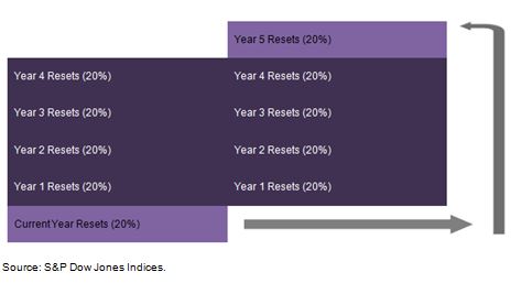
The S&P/TSX Preferred Share Laddered Index is an example of a laddered preferred strategy. The portfolio is broken out into five term buckets based on the reset date calendar year, with each bucket given an equal weighting at rebalancing. This implies that a portion of the portfolio resets each year based on the current interest rate levels. At the beginning of each year, the buckets are changed so that the previously current year term bucket becomes the last term bucket, the year 1 term bucket becomes the current year term bucket, year 2 becomes year 1, and so on.

Capture1

Benefits and Risks of a Laddered Preferred Portfolio

The potential benefits of a laddered preferred portfolio largely relate to addressing interest rate risk. Perpetual preferreds have high sensitivity to interest rate changes since they have a fixed dividend payment and no set maturity date. Rate-reset preferreds typically exhibit less interest rate risk as the maximum time to the next reset date, or maturity, is five years. In fact, when looking at duration, it is estimated that rate-reset preferreds have durations between 2 and 3 years whereas perpetual preferreds have durations between 11 and 15 years[1]. In a portfolio context, the laddering strategy helps dampen negative effects of interest rate changes, while still offering the opportunity to participate in increased yields. If interest rates are low in a given year, only a portion of the portfolio will be reset to the lower yields. Conversely, the portfolio can benefit from increased interest rates, as part of the portfolio would reset to higher yields.

Two risks related to rate-reset preferreds involve call risk and changes in the regulatory landscape. Call risk may increase in low interest rate environments; when interest rates are low, credit spreads generally decrease between risk-free assets such as government bonds and risky assets such as preferreds. A company may be able to reduce interest expense by calling an outstanding preferred share class and issuing a new share class at a lower spread above the benchmark yield. Changes to the regulatory landscape also pose a threat to rate-reset preferreds. Under Basel III regulations, most preferreds including rate-resets will no longer be considered part of Tier 1 Capital from 2013 onward. This particularly affects financial institutions, as they are required to hold a certain percentage of total capital in Tier 1 assets. To comply with the new regulations, financial institutions may shift from issuing preferreds to other assets still considered to be Tier 1 Capital.

For more on preferreds in Canada, read our recent paper, “Looking Under the Hood of Canadian Preferred Indices.”

[1] Source: National Bank Financial Product Review: BMO Laddered Preferred Share, Jan. 16, 2013.

The posts on this blog are opinions, not advice. Please read our Disclaimers.

Volatility, ya right

Contributor Image
Howard Silverblatt

Senior Index Analyst, Product Management

S&P Dow Jones Indices

The market was up 0.7% this morning, and down 0.7% in early afternoon trading, and is currently trending up from the red. So I keep hearing that volatility has returned to the market. Maybe, if you just started trading. Daily volatility, as measured by the daily high price divided by the low price, has increased to an average 0.95% from last year’s 0.85%. However, the prior year, 2012, was 1.07%, with the year before that, 2010 being 1.64%, and the 50-year average is 1.47% – 50% more than the current year. Compared to that data today’s market is tame (the VIX, while up today, is still under 15). The increased perception is due to last year’s low volatility, which was the lowest since 1995. If you truly want to see volatility look at 2008-2009, when it averaged over 2.4% a day, and we saw (many) days where the index was up 1% at 3 p.m. and closed down 1%. pic7Additionally, last year saw significant gains in the market, as 2013 posted a 29.6% gain, with 457 of the S&P 500 issues gaining, as compared to the 2014 year-to-date, which is up 0.81%, with 275 issues up. Also differentiating this year is the number of issues moving well outside the index return of up 0.81% YTD. To date, 103 issues are up at least 10% this year, with 51 declining at least 10%. While the index has been flat, it would appear the battle from within has been ranging, and that has added to the perception of volatility.

pic11

The posts on this blog are opinions, not advice. Please read our Disclaimers.

Putin Today, Shiller Tomorrow, Yellen on Wednesday

Contributor Image
Kevin Horan

Former Director, Fixed Income Indices

S&P Dow Jones Indices

Over the course of last week, yields on all on-the-run bonds moved lower.  The yield on the S&P/BGCantor Current 10 Year U.S. Treasury Index closed Friday 11 basis points lower at a 2.67%.  During the week the Treasury did auction $32 billion 2’s, $35 billion 5’s and $29 billion 7-year notes.  Though the 2-year auction was considered weak, flight-to-quality trades and overseas interest helped the 5 and 7 year auctions along.

This morning the focus has been on this week’s Federal Reserve meetings and the Ukraine crisis as the U.S. issued sanctions targeted seven individuals and seventeen Russian companies.  At the same time the European governments have named 15 individuals to the list.  In addition to political news, March U.S. Home Sales month-over-month was stronger than expected reporting 3.4% as only 1% was expected.  In addition to Home Sales, the Dallas Fed Manufacturing Outlook also reported a stronger 11.7 versus the expected 6.0.  The rest of the week is full of potential market moving triggers as the S&P/Case-Shiller Home Price Index along with Mortgage Applications, the ADP Employment Change (210k expected), 1st quarter GDP Price (1.6% exp.) and the FOMC Rate Decision are slated for tomorrow.

The FOMC Rate Decision being the highest priority of the bunch.  Tapering and other main policy targets of the Fed are expected to remain unchanged.  Beyond Wednesday of this week, Initial Jobless Claims (320k exp.), ISM Manufacturing (54.3 exp.), Nonfarm Payrolls (215k exp.) and Unemployment (6.6% exp.) potentially will shed more insight into the degree of strength to the economy.

This week the Treasury will auction $15 billion of a 2-year floating rate note maturing in 2016.  This is a new addition to the already existing $41 billion Jan. 31, 2016 floating rate notes which are returning 0.02% month-to-date as measured by the S&P Current 2-Year U.S. Floating Rate Treasury Index.

On the month and the year, investment grade corporate bonds are outperforming high yield.  The S&P U.S. Issued Investment Grade Corporate Bond Index has returned 1.06% month-to-date and 4.0% year-to-date.  While in comparison the S&P U.S. Issued High Yield Corporate Bond Index has only returned 0.5% and 3.48% respectively.  The OAS (Option Adjusted Spread) of the investment grade corporate rating sub-indices are tighter: AAA (-6 bps), AA (-2 bps), A (-3 bps) and BBB (-5 bps) while high yield’s BB and B are flat and the CCC & below are 22 bps wider.

The S&P/LSTA U.S. Leveraged Loan 100 Index still remains lackluster as the index is down -0.06% month-to-date and is only returning 0.94% year-to-date.  The index’s yield has risen 17 basis points since the beginning of the month and is presently at 5.62%.  The weekly review of this index gives it a floating rate quality.

Source: S&P Dow Jones Indices, Data as of 4/25/2014, Leveraged Loan data as of 4/27/2014.

The posts on this blog are opinions, not advice. Please read our Disclaimers.

The Fed’s Next Move

Contributor Image
David Blitzer

Former Managing Director and Chairman of the Index Committee

S&P Dow Jones Indices

The Federal Open Market Committee, the Fed’s policy makers, meet on Tuesday and Wednesday this week and will issue a statement on Wednesday afternoon around 2 PM.  As usual, both the fixed income and equity markets will be watching for some hint of things to come.  There is little doubt that the Fed will announce another round of tapering, reducing its monthly purchase of treasuries and mortgage backed securities by another $10 billion.

The bigger question is whether we will get any forward guidance on when the Fed funds rate might be raised.  The Fed, along with central banks in the UK, Canada and other countries, in the last year or so has been giving clear signals about its future plans so that the market doesn’t over-react to policy changes.  More recently the Fed found it necessary to revise its forward guidance when the unemployment rate came down faster and farther than expected.

Forward guidance is forecasting – first the Fed is forecasting what it will do if certain events take place.  This shouldn’t be a problem since the Fed controls what it does. But, the forecasts are dependent on economic events and forecasting the economy is difficult, even for the central bank.  While the unemployment rate fell, the economy did not improve as expected and the guidance tied to the unemployment numbers had to be abandoned.  Given these difficulties, one question is why was forward guidance even considered?  With interest essentially at zero, many investors are buying riskier securities in an effort to earn larger returns. Moreover, the usual spreads between high grade and junk bonds, and between fed funds and 10 year treasuries, have collapsed. The Fed’s concern is that an unexpected rate rise might spark a panic. Those with moderately long memories might remember the damage in the mortgage-back markets in 1994 when the Fed was more aggressive than expected. While the problem of an unexpected rate rise and ensuing panic remains, the Fed is likely to back away from forward guidance and stick to more general and less conditional comments in its formal statements.  This is a safer approach – a wrong forecast is worse than no guidance.

For most of its 100 year history, the central bank said almost nothing. In the last decade or so it has become more talkative.  While a return to silence is not expected, the forward guidance will be less specific. Wednesday’s statement is likely to confirm the tapering move and suggest that the Fed funds rate will remain between zero and 25 bp for the rest of this year.  But nothing like, “if this happens, then we will do that…”

The posts on this blog are opinions, not advice. Please read our Disclaimers.

Don't Put All Your Eggs In One Basket

Contributor Image
Jodie Gunzberg

Former Managing Director, Head of U.S. Equities

S&P Dow Jones Indices

It’s a little late for an Easter post but this saying is about one of the key investment principles, diversification.  Simply put, diversification happens when assets inside your portfolio move in opposite directions. The investment measure of diversification is correlation and it can range from -1.0 to +1.0. If correlation is -1.0 between two assets, then they have moved exactly opposite each other; conversely, if the correlation is +1.0, then they move exactly together.  Correlation of -1.0 is the holy grail of diversification to produce a more efficient portfolio – meaning for the same return, there is less risk, or for the same risk, there is higher return.

Commodities, which by definition of being the natural resources that are used to build society, are meaningfully different than financial assets like stocks and bonds. While they have been around since the beginning of time, most investors did not consider them a portfolio asset until about 10 years ago. They grew wildly popular with the institutional crowd as the major benchmark passed its 10-year track record, and with the advancement of ETFs, became popular (at least gold and oil) with retail investors.  At least for the institutions, the main reason for the attractiveness of the asset class was diversification.

Unfortunately for many, the diversification investors hoped for from their allocations to commodities fell flat as the correlation between commodities and commodities to other asset classes rose to almost 0.8 post the financial crisis.

There are two main reasons this happened:

1. The inventories were built up starting in the late 90’s to very high levels by 2005. Then the financial crisis hit, demand dropped and supply shocks (like the weather, war or pipeline bursts) lost their impact. This source of return from supply shocks or surprises, called expectational variance, that drives return patterns of commodities to be different from each other (gas to corn to gold) and to be different than other asset classes like stocks and bonds disappeared in the sea of excess inventory after the crisis.

2. The unprecedented quantitative easing caused a risk-on/risk-off environment where either the stimulus worked or didn’t work. If a commodity investor did not feel the insurance risk premium was high enough to supply to the producer, no investment was made. Without the supply of insurance, the incentive for producers diminished and the volatility of prices increased. This proved too much risk for the investors to bear that drove the game of risk transfer back to the producers. Now, not only is backwardation back from the diminished inventories, but the result of that in conjunction with the tapering of quantitative easing, is that diversification is back.

precrisis correlations 
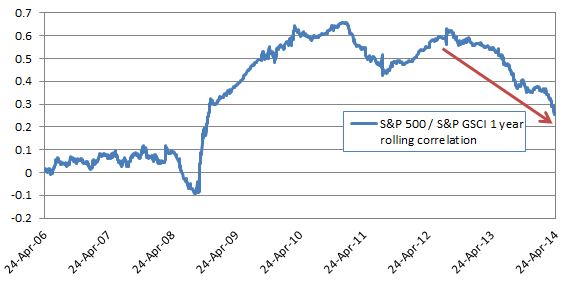
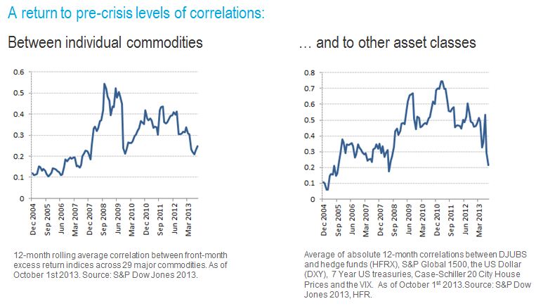
Notice in the charts above that both correlation of commodities to each other and to other asset classes has fallen to precrisis levels of about 0.2, indicating little movement together with stocks and bonds and little movement together with each other.  This makes commodities, once again, an asset class to provide diversification, and institutional investors are taking notice.

Last, the key question is… Will this diversification continue?

Based on the correlation patterns of the S&P 500 to the S&P GSCI, there is a compelling case this will continue.

Source: S&P Dow Jones Indices and/or its affiliates. Data from April 25, 2005 to April 24, 2014. Past performance is not an indication of future results. This chart reflects hypothetical historical performance. Please see the Performance Disclosure at the end of this document for more information regarding the inherent limitations associated with backtested performance.

The 12 month correlation between the S&P 500 and S&P GSCI at 0.26 is lower than at any point since November 2008 and heading down fast. Shorter term measures such as the 90 day and 30 day correlation are even lower at 0.17 and 0.01, suggesting that as correlation “catches up” with the history, it will head down further. 

Special thanks to my colleague, Timothy Edwards, who helped with this.

The posts on this blog are opinions, not advice. Please read our Disclaimers.