Get Indexology® Blog updates via email.

In This List

Coupon Type Counts In Regard To Preferred Index Performance

QE and Asset Prices

5 Risks Associated With Investing in Preferreds

How Much Popularity Can Low Volatility Stand?

The Fed’s QE Dilemma

Coupon Type Counts In Regard To Preferred Index Performance

Contributor Image
Kevin Horan

Former Director, Fixed Income Indices

S&P Dow Jones Indices

Preferred indices started the year with some very strong returns. First quarter 2013 saw the S&P U.S. Preferred Stock Index (TR) return 3.13%. By the end of April, the overall index was up 4.40% year-to-date while the floating rate component of the index, as measured by the S&P U.S. Floating Rate Preferred Stock Index (TR), was returning 10%. The reason a higher return is not reflected in the overall index is that floating rates only make up 4% of the index.

The summer months took their toll on the preferred indices as May returns for fixed (-0.57%) and variable (-1.69%) coupon preferreds sold off while floaters held on, returning just under 1% for the month. June was the month that delivered the damaging blow, as the markets became very concerned after the FOMC meeting hinted at the tapering of Fed stimulus. The yield-to-worst on the S&P/BGCantor Current 10 Year U.S. Treasury Bond Index rose 33 basis points throughout the month, from 2.12% to 2.47%, with the majority of the increase occurring after the June 19 FOMC announcement. The index was down 2.20% for the month as floaters dropped 5.91%, fixed coupons were down -2.16%, and variable coupons, as measured by the S&P U.S. Variable Rate Preferred Stock Index (TR), were down 1.04%.

Returns for July and August were not any better, and it was not until September that preferred returns began to recover. Though the overall index returned 0.26% for the month, the positive performance resulted from both fixed-rate and variable-rate coupons, while floaters remained in the red returning -1.57% for the month. October was the first month in which fixed-, variable-, and floating-rate coupons all had positive returns. The kicking of the can down the road on the U.S. debt ceiling and a stronger message from the Fed that stimulus will continue for the near future led to renewed confidence, not only in preferreds, but in all fixed income markets.

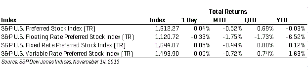
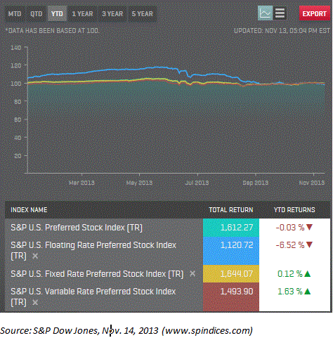
With November only half over, returns on the preferred indices are down (as seen in the table below). Rates, as measured by the S&P/BGCantor Current 10 Year U.S. Treasury Bond Index, have resumed their upward movement, going from a yield-to-worst of 2.55% at the beginning of the month to its present 2.73%. Markets are somewhat confident that the Fed will continue its stimulus, but other factors such as the pace of economic recovery, as measured by numerous economic indicators, will continue to determine the rest of the month’s performance.

For additional index information, please refer to www.spindices.com


Performance up to Nov. 14, 2013


US Preferred Indices Performance Chart up to Nov. 14, 2013


The posts on this blog are opinions, not advice. Please read our Disclaimers.

QE and Asset Prices

Contributor Image
David Blitzer

Former Managing Director and Chairman of the Index Committee

S&P Dow Jones Indices

In an earlier post on this blog, Bluford Putnam (of the CME Group) correctly points out that the Fed’s much-discussed three rounds of Quantitative Easing (QE 1-2-3) haven’t created either jobs or inflation.  While job growth has picked up somewhat this year, both payroll employment and the unemployment rate have not recovered to their pre-crisis levels.  Inflation seems to be a thing of the past; few, if any investors worry about rising prices or the falling value of their money.

QE 1-2-3 has, however, made a difference  The principal result of the bond buying and explosive balance sheet growth at the Fed is asset price inflation. Stocks, as measured by the S&P 500,  are up roughly 2.6 times from the bottom in March of 2009.  Home Prices have had far less time to recover but are up about 20% in 18 months. While some might argue that boosting asset prices is the wrong way to support the economy or that Fed policy should be aimed at economic growth with low inflation rather than encouraging higher price assets, QE 1-2-3 has done something.

Higher asset prices suggest that the Fed should look to unwind QE 1-2-3. Both stock prices and house prices are reaching levels where there may be cause for concern.   From the first quarter of 2009, when the market bottomed to the second quarter of this year earnings per share for the S&P 500 are up about 2.6 times, the same pace as the market. However, the rate of growth of earnings is slowing down, suggesting that either valuations will climb or stock prices will not. On the housing front, there are some cities where price gains look like the halcyon days of 2005 and 2006.  The question of bubbles is being asked more often. (for a picture, see here

Continuing asset price inflation is reason enough for the Fed to scale back the QE 1-2-3 program.  Since 2000 the economy has been rocked by two boom-bust cycles in the stock market and the largest boom-bust cycle in housing since the 1920s.  A little insurance against another cycle, even if the cost is somewhat higher interest rates, wouldn’t be a bad choice.

The posts on this blog are opinions, not advice. Please read our Disclaimers.

5 Risks Associated With Investing in Preferreds

Contributor Image
Aye Soe

Former Managing Director, Global Head of Core and Multi-Asset Product Management

S&P Dow Jones Indices

Due to their hybrid nature, the potential risks of preferred securities are related to the interest rate environment, issuer’s credit quality and liquidity.

  1. Interest Rate Risk: Due to their bond-like fixed dividend payments, preferreds are vulnerable to changes in interest rates.  There is an inverse relationship between preferred prices and changes in interest rates.  In a rising interest rate environment, preferred stock prices fall as the present value of future dividend payments decreases.
  2. Reinvestment Risk: A preferred investor who does not seek high current income in dividend payments would be faced with the risks and associated costs of reinvesting the regular dividend payments.  Callable shares carry an even greater reinvestment risk, as there is the potential for the company to redeem the shares.  This would force the investor to give up the shares at par, or a specified call price.
  3. Liquidity Risk: Preferred shares are less liquid than common shares.  Therefore, trading these securities may involve higher market impact costs and bid-ask spread costs.
  4. Credit Risk: If a company is facing liquidity problems or poor performance, it may not be able to pay out the dividend to investors.  Unlike bondholders, preferred shareholders have little recourse if a company does not pay the dividend.
  5. Sector Concentration Risk: Financial companies are the primary issuers of preferreds in the U.S.  A portfolio of preferred securities would be subject to the sector-specific risk factors of the financial sector.

Contributors:
Phillip Brzenk, CFA
Associate Director, Index Research & Design

Aye Soe, CFA
Director, Index Research & Design

For more on preferreds, read our recent paper, “Digging Deeper Into the U.S. Preferred Market.”

The posts on this blog are opinions, not advice. Please read our Disclaimers.

How Much Popularity Can Low Volatility Stand?

Contributor Image
Craig Lazzara

Former Managing Director, Index Investment Strategy

S&P Dow Jones Indices

The low volatility anomaly — i.e., the tendency for low-volatility or low-beta portfolios to outperform market averages — has been the subject of at least 40 years of academic research.  Given its challenge to what “everyone knows” about risk and return, it’s a fertile field for both professors and practitioners, some of whom recently characterized “the long-term outperformance of low-risk portfolios [as] perhaps the greatest anomaly in finance.”

But anomalies, especially ones that suggest higher return and lower risk, attract investor dollars, and enough investor dollars often spell the end of anomalies.  It’s been suggested that “the low-volatility anomaly may [be] eliminated by its popularization.”

So how much popularity can low volatility stand?  Before we can suggest an answer to this question, we have to understand the source of the low volatility anomaly.  Perhaps the simplest and most intuitive explanation comes from behavioral finance, specifically from the cognitive bias that behavioral economists call the “preference for lotteries.”  Their argument is that no rational person would ever buy a lottery ticket, since the expected return of such a purchase is negative.  But billions of lottery tickets are sold all over the world every day.  Why do so many people behave in a way that classical economics can only regard as completely irrational?  The behavioral argument is that some people are willing to risk a known amount of money in exchange for the possibility, however slim, of a gigantic payoff.

If this happens in a game of pure chance, how does it apply to financial markets?  The stock market’s lottery tickets are the stocks of highly volatile, often young and untested, companies.  Ultimately, they may not amount to much, but one of them could be the next Apple or Google.   Some investors are willing to pay up for the chance of that sort of large reward — in effect buying volatility for volatility’s sake.  Low volatility strategies benefit by avoiding other investors’ volatility-seeking behavior.  We can estimate the capacity of low vol if we can estimate the extent of of volatility seeking on the other side of the trade.

Last week witnessed the much-anticipated initial public offering of Twitter, Inc., a young and volatile company if ever there was one.  The IPO price was $26; the stock closed its first day of trading (November 7) at $44.90, which implied a total market value of approximately $25 billion.  For illustrative purposes, let’s assume that $26 is a sober estimate of TWTR’s fair value (after all, the presumably well-informed selling shareholders were willing to sell there).  Then arguably the $18.90 first day’s appreciation represents the action of volatility-seeking investors.  That’s 42% of TWTR’s closing first-day valuation, or better than $10 billion.

Granted, this is a simple example with some perhaps-unrealistic assumptions.  But it gives us at least a rough gauge with which to answer our question about the capacity of low volatility strategies.  One company, in one day, produced $10 billion in volatility-seeking market value.  That’s more than the total market value of the two largest U.S. low volatility ETFs.  Whatever the ultimate capacity of low volatility strategies is, we’ve got a long way to go.

The posts on this blog are opinions, not advice. Please read our Disclaimers.

The Fed’s QE Dilemma

Contributor Image
Bluford Putnam

Managing Director and Chief Economist

CME Group

The US does not have any measurable inflation pressure now nor has it had any over the last 20 years.  The core personal consumption price index, used as the benchmark for inflation by the Federal Reserve (Fed) has been in the 1.25% to 2.5% zone since 1994, averaging about 1.75% for the last 20 years, and drifting down to an average of about 1.25% over the last six months.  This has been true despite three bull markets in equities – the technology-led rally of the 1990s, the housing boom of the early 2000s, and the post-2008 financial crisis QE-induced bull market.  Not even the last five years of historically accommodative monetary policy with a near zero federal funds rate and massive central bank asset purchases has been able to kindle inflation pressure.  The same is true in Europe, where there are fears of sliding into deflation.  And in Japan, the Government is struggling to break the back of the country’s deflationary psychology and eke out a 2% inflation rate by 2015.

Even in the housing boom of 2003-2007, when US bank loans and leases were growing at around an 8% rate, core inflation never breached 2.5%.  With bank loans growing at only a 3% pace over the last several years, it is hard to see inflationary pressures gaining any traction.  The Fed may be buying assets at a record pace of over a trillion dollars per year at an annualized rate ($85 billion per month), but the Fed also pays 0.25% interest on both required and excess reserves, giving banks a tiny, yet positive premium over the effective federal funds rate in the open market.  Moreover, large corporations are sitting on record cash hoards in no small part because the long-run environment is so uncertain.  And, the US Congress with its brinkmanship over the debt ceiling and willingness to shut the government down probably should get a reasonably large share of the blame.  In short, much faster, probably +10% annual growth, in commercial and industrial bank loans is probably a pre-condition for the development of inflationary pressures in the US.

Then there is the matter of the reinforcing effect from the currency markets.  A weak dollar helped to feed inflation in the 1970s, and a strong dollar help cure it in the first half of the 1980s.  With all the major industrial countries in the same boat, with less than optimal economic growth, and near-zero short-term rates, no currency trends have developed to push inflation higher (or lower).  In Japan, round one of Abenomics saw the yen depreciate 20% from below 80 yen/$ to the 100 yen/$ range, but the yen has been quite stable since that early move ended last April.

The Fed’s dilemma is to reconcile the lack of evidence that its QE programs created jobs or moved the needle on inflation, with the fact that the size of the central bank’s balance sheet is getting quite worrisome.  Before the 2008 financial crisis, the size of the Fed was around 6% of nominal GDP, and now it is about 25% and climbing.  The next three FOMC meetings, on 17-18 December 2013, 28-29 January 2014, and 18-19 March 2014, are not only likely to see Ben Bernanke hand the gavel over to Janet Yellen, but also see the internal debate become much more rancorous concerning the appropriate size and role of the central bank.  More than a few Fed Governors and regional Fed Presidents are likely to argue that the central bank needs to recognize the limits of what it can accomplish, given the headwinds from fiscal tightening, Congressional-induced economic uncertainty, and a slower growing labor force that is aging as well.  All of these concerns will make for an exciting debate and are likely to lead to more volatility in both US Treasury bond and equity markets than have been the case during the QE era when volatility has been suppressed artificially.

All examples in this report are hypothetical interpretations of situations and are used for explanation purposes only.  The views in this report reflect solely those of the authors and not necessarily those of CME Group or its affiliated institutions.  This report and the information herein should not be considered investment advice or the results of actual market experience.

S&P Dow Jones Indices is an independent third party provider of investable indices.  We do not sponsor, endorse, sell or promote any investment fund or other vehicle that is offered by third parties. The views and opinions of any third party contributor are his/her own and may not necessarily represent the views or opinions of S&P Dow Jones Indices or any of its affiliates.

The posts on this blog are opinions, not advice. Please read our Disclaimers.