Get Indexology® Blog updates via email.

In This List

Indexing Multi-Asset Solutions

S&P 500 and Dow Jones Industrial Average

The Dog Days of Summer

The Fox and the Hedgehog

Good Calls and Bad Calls of Covered Calls

Indexing Multi-Asset Solutions

Contributor Image
Aye Soe

Former Managing Director, Global Head of Core and Multi-Asset Product Management

S&P Dow Jones Indices

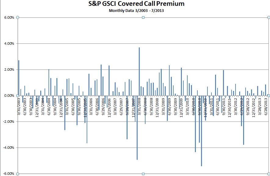
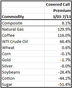
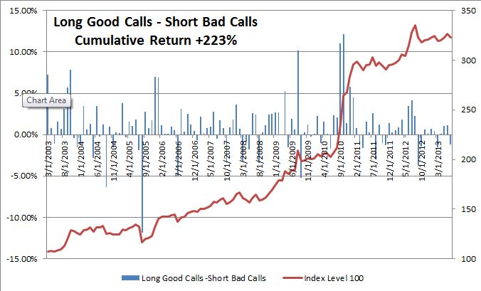
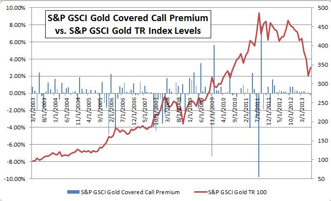
Multi-asset strategies have been traditionally offered via active management. Institutional and high net worth investors have used multi-asset strategies to meet their specific needs such as matching liabilities and achieving absolute returns. As the indexing industry evolves beyond asset class beta and systematic risk premia, we are starting to see multi-asset investment solutions offered in a pre-packaged index format. S&P Dow Jones Indices offers a suite of multi-asset strategies ranging from target date to target volatility indices. The table below highlights examples of multi-asset solutions that have been indexed or can potentially be indexed.

In our recent paper, The Role of Multi-Asset Solutions in Indexing, we cover a number of multi-asset solutions that can be indexed. We discuss three case studies in detail: risk parity, income generation and inflation protection. Our analysis shows that portfolio risk can be mitigated by diversifying across asset classes while meeting the specific investment objective, whether it’s income, inflation protection or balanced asset class risk exposure.


The posts on this blog are opinions, not advice. Please read our Disclaimers.

S&P 500 and Dow Jones Industrial Average

Contributor Image
David Blitzer

Former Managing Director and Chairman of the Index Committee

S&P Dow Jones Indices

SPX-INDU

The two best known and most widely followed stock indices in the world are the S&P 500 and the Dow Jones Industrial Average.  While both follow large cap US stocks and both have long histories, they are quite different in some important ways. The Dow is the oldest regularly calculated stock index dating back to 1896.  It began as 12 stocks, became 30 in 1928 after a series of changes and continues that way today. The Dow was created by Dow Jones & Company, the published of the Wall Street Journal and is now owned and maintained by S&P Dow Jones Indices.  It is price-weighted meaning that the index is calculated by adding up the prices of the 30 stocks and dividing by the divisor. The divisor is used to prevent the index from changing when the stocks are changed. With price weighting, the highest price stock, IBM carries about 23 times more weight in the index than the lowest price stock, Alcoa.  In fact, IBM has twice as much weight and a bigger impact on the index than ExxonMobil even though ExxonMobil is almost twice as large as IBM measured by market value.

The S&P 500 is a relative new comer.  It took its present form of 500 stocks in 1957 when the Standard Statistics 90 Stock Index, created in 1926, became the S&P 500.  The 500 is value-weighted (sometimes called cap-weighted).  The market value of all 500 companies is totaled and divided by a divisor. The divisor serves the same function for the 500 as it does for the Dow, preventing jumps when stocks are replaced. Since not every share of every stock is readily available in the market – some shares are closely held and rarely traded – the index is float adjusted to exclude closely held shares. Each company’s weight in the index is proportional to its size.  For instance, ExxonMobil’s weight will be twice that of IBM in the S&P 500 unlike the price-weighted DJIA.  Because of the different weighting methods and the much larger number of stocks in the S&P 500 than the DJIA, the range from largest to smallest company, or highest to lowest price, is much greater for the S&P 500.  The larger number of stocks in the 500 also makes it possible to divide the index and compare the performance of different parts of the market using sectors (technology, utilities, health care, financials, etc.) or styles (growth and value). Further, because the market is value weighted, the returns and volatilities measured with the S&P 500 give returns and volatility for the market.

Overall both indices are widely followed and both are used to analyze and predict the market and to invest or manage risk through investment products based on the indices.

The posts on this blog are opinions, not advice. Please read our Disclaimers.

The Dog Days of Summer

Contributor Image
David Blitzer

Former Managing Director and Chairman of the Index Committee

S&P Dow Jones Indices

Markets and investors both seem to be thinking about August vacations and little else these days. As we enter the second full week of August – or the third week before Labor Day for the pessimists and workaholics – things seem to be going quiet.  The Dell buyout, just about the only contested M&A action, is postponed until next month. Trading volumes are down, VIX is in the low teens or less, and even the European debt problems seem to be on vacation with most of the continent. Lest we all go to sleep, a few reminders about things to come and where we are now may be in order.

The New York Times noted that the S&P 500 is on a strong streak – it started in 2012 and 2013 with first day gains and hasn’t revisited those starting points since in a demonstration of staying power. Actually the bull market began on March 9th 2009 with the S&P 500 at 676.53 about 56 months ago. On Friday August 9th the index closed at 1691.42, a rise of 150%.  This is a touch below the average bull market gain of 163%; the average life for a bull market is 56 month.  By either measure we could keep going for quite some time; but also by either measure an end in the near future wouldn’t look unusual compared to history.  There are two places to look for possible answers to the question of what might happen next to the market.

First, returns depend on three interrelated factors: earnings growth, PE expansion and dividends.  Most analysts expect continued earnings growth; the dividend yield at 2% currently is a small positive while the PE at 17x on trailing earnings is a bit high but not frightening.  All this suggests that most investors should feel comfortable during this August vacation. 

The second answer to what might happen to upset the apple cart? Several things: sooner or later the Fed will shift policy, QE3 will fade out and interest rates will rise. Those who doubt these matters should remember May and June this year.  That experience showed that the damage can come quickly and at any hint of a shift at the central bank.  Sometime this fall the President will nominate a new Fed chairman.  Either of the two most discussed candidates – Janet Yellin and Larry Summers – is qualified for the job.  But changing the leadership in any organization means slower decision making, shifting people and positions and readjustments. It raises the risks that things don’t run as smoothly as we’re accustomed to.  Besides the Fed there is fiscal policy — either Congress will raise the debt ceiling in the next few months or the US government will default. The debt ceiling will be raised but probably not without a lot of politics and nervousness which won’t play very well in the markets or anywhere else. 

Washington DC isn’t the only source of post-Labor Day market anxiety.  There’s a long list of slowing growth in China, those unresolved European debt crises, turmoil in Egypt, war in Syria, and nuclear issues in various countries.  For this bull market to beat the averages by a large margin we have a high wall of worry to climb.

The posts on this blog are opinions, not advice. Please read our Disclaimers.

The Fox and the Hedgehog

Contributor Image
Craig Lazzara

Former Managing Director, Index Investment Strategy

S&P Dow Jones Indices

The ancient Greeks tell the story of the fox and the hedgehog.  The fox, it is said, knows many things, but the hedgehog knows one big thing.

Anyone who reads the Wall Street Journal or listens to CNBC will recognize the vulpine nature of much of the financial world.  One key to investment success is to emulate the hedgehog and remember one big thing.  That big thing is that index portfolios typically perform better than active managers operating within the same market segment.

We were reminded of this recently when we came across a paper analyzing the returns of state pension funds.  It concluded that “State pensions showed mixed results in their ability to exceed U.S. and non-U.S. stock returns over the 10 year period.  Median excess returns centered near zero, with fairly modest upside returns, topping off at 0.7%.  Furthermore, there was material downside (negative excess return) for engaging in active management…”

Of course, this problem is not unique to institutional investors.  Actively-managed mutual funds have had an equally-challenging time outperforming their benchmarks, and there’s little evidence that relative success in one year persists into the next.  Forming portfolios of active funds increases the likelihood of underperformance relative to indices — illustrating that there are at least some situations in which diversification is a bad idea.

Investors do well to emulate the hedgehog and remember one big thing: those who place indices at the core of their portfolio have had an above-average chance of earning above-average returns.


The posts on this blog are opinions, not advice. Please read our Disclaimers.

Good Calls and Bad Calls of Covered Calls

Contributor Image
Jodie Gunzberg

Former Managing Director, Head of U.S. Equities

S&P Dow Jones Indices

Generally investors use covered calls to earn extra income from investments they think might not have much upside potential.  For example, if a CEO has a very large stock holding in his or her company but doubts the stock price will increase (or decrease much), writing (selling) options on the stock to collect a premium may be a good solution to earn some extra income.

In the past few years, one of the index innovations has expanded on this concept for commodities in the S&P GSCI Covered Call Select. The index is an equally weighted composite of 10 single covered call commodity indices based on the liquidity in the options market, where the annual options volume must be at least 10% of the underlying commodity futures volume. The commodities included in the index currently are: coffee, corn, cottonWTI crude oilgold, natural gas, silver, soybeans, sugar, and wheat. The index intends to produce income and reduce volatility as well as negative roll yield from contango.

Overall, the option risk premium for the S&P GSCI Covered Call Select was 8.1% in the time frame from Mar 2003 – Jul 2013 (the period we have data for).  See the chart below for the monthly premiums. 63% or 79/125 of the months had positive premiums where in 60% of months prior to 2008, 79% of months between 2008-9, and 58% of months post 2009 had positive premiums.

Source: S&P Dow Jones Indices.  Data from Mar 2003 to July  2013.  Past performance is not an indication of future results.  This chart reflects hypothetical historical performance.  Please see the Performance Disclosure at the end of this document for more information regarding the inherent limitations associated with backtested performance.

Source: S&P Dow Jones Indices. Data from Mar 2003 to July 2013. Past performance is not an indication of future results. This chart reflects hypothetical historical performance. Please see the Performance Disclosure at the end of this document for more information regarding the inherent limitations associated with backtested performance.

While the broad index result is in-line with expectations, the results vary for single commodities, creating potential opportunity for positive alpha if the “calls” are correct. So, which covered calls were “good calls” and which were “bad calls”?  During the entire time frame, the “good calls” were natural gas, coffee and WTI crude oil, and the “bad calls” were sugar, cotton, and soybeans.

Source: S&P Dow Jones Indices. Data from Mar 2003 to July 2013. Past performance is not an indication of future results. This chart reflects hypothetical historical performance. Please see the Performance Disclosure at the end of this document for more information regarding the inherent limitations associated with backtested performance.
Source: Same as above. 

If one had created an alpha strategy by going long an average of the top 3 “good calls” and going short an average of the bottom 3 “bad calls”, the cumulative return over the period would have been 222.9%. Not too bad for a time frame where the S&P GSCI TR returned 5.0% and the S&P GSCI Covered Call Select TR returned 30.5%.  Source: S&P Dow Jones Indices. Data from Mar 2003 to July 2013. Past performance is not an indication of future results. This chart reflects hypothetical historical performance. Please see the Performance Disclosure at the end of this document for more information regarding the inherent limitations associated with backtested performance.

Source: S&P Dow Jones Indices. Data from Mar 2003 to July 2013. Past performance is not an indication of future results. This chart reflects hypothetical historical performance. Please see the Performance Disclosure at the end of this document for more information regarding the inherent limitations associated with backtested performance.

What does this mean about the behavior of covered call indices of single commodities?  Let’s examine gold and WTI crude oil since they are popular commodities and represent a trend and a choppy market.

Notice in the chart below that plots the monthly covered call premiums versus the index levels of the commodity that there was a pretty clear uptrend until Aug 2011 that later reversed.  This is the kind of behavior we would expect not to have a great result, and sure enough, the S&P GSCI Gold Covered Call Premium was negative slightly, down 1.7% over the period.

Source: S&P Dow Jones Indices. Data from Mar 2003 to July 2013. Past performance is not an indication of future results. This chart reflects hypothetical historical performance. Please see the Performance Disclosure at the end of this document for more information regarding the inherent limitations associated with backtested performance.

Now let’s look at WTI crude oil, which had much less of a trend despite a large spike and drop in the 2007-8 period. The covered call premium was significant, up 66.4% over the period, as we might expect of a covered call strategy in a relatively flat and choppy market, especially apparent in the 2004-6 and post 2009 periods. Source: S&P Dow Jones Indices. Data from Mar 2003 to July 2013. Past performance is not an indication of future results. This chart reflects hypothetical historical performance. Please see the Performance Disclosure at the end of this document for more information regarding the inherent limitations associated with backtested performance

Source: S&P Dow Jones Indices. Data from Mar 2003 to July 2013. Past performance is not an indication of future results. This chart reflects hypothetical historical performance. Please see the Performance Disclosure at the end of this document for more information regarding the inherent limitations associated with backtested performance

Let me know if there is analysis on other covered call commodities that you would like to see. Curious about what might be trending or choppy?  Thanks for reading.


The posts on this blog are opinions, not advice. Please read our Disclaimers.