Get Indexology® Blog updates via email.

In This List

The Hunt for Consistent Income

Dividend Volatility and Correlations

The Most Tranquil of Times

Risk and Active Management

Flying ETFs...a tenuous link

The Hunt for Consistent Income

Contributor Image
Aye Soe

Former Managing Director, Global Head of Core and Multi-Asset Product Management

S&P Dow Jones Indices

The hunt for stable income is an increasingly challenging task.  Bond yields across major fixed income markets are at historically low levels, with some of the central banks in developed countries even going as far as adopting a negative rates policy.  Together with an aging population that is living longer and relies predominantly on fixed income, it is no surprise that dividends have become a major source of yield.

Not all dividends are the same.  In a quest for yield, it is important to distinguish between stable yield versus absolute high yield.  The S&P Dividend Aristocrats® Series fall into the former camp.  Since the early 1970s, S&P Dow Jones Indices has been identifying stocks with a long history of consistent dividend increases, which we call “dividend aristocrats.”  The S&P 500® Dividend Aristocrats is an index that consists of dividend-paying securities of the S&P 500 that have followed a payout policy of increasing dividends for at least 25 consecutive years.

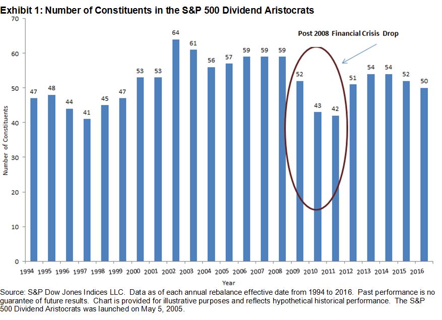
As shown in Exhibit 1, not every dividend-paying stock in the S&P 500 can become a dividend aristocrat.  Between 1994 and 2016, the number of stocks that qualified to be part of the index ranged from 41 to 64, representing approximately 8% to 13% of the underlying S&P 500 universe.  One can argue that the dividend aristocrats symbolize the tier-one, blue-chip companies with solid balance sheets, and therefore, they can weather market cycles.  We can see what a difficult feat that is by observing the number of constituents from 2009-2011, the years following the 2008 financial crisis, when many dividend-paying companies either cut or omitted their dividends altogether.

capture

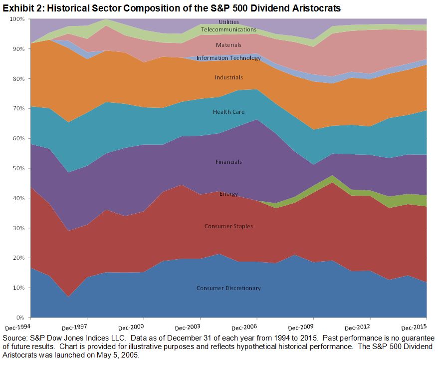
A portfolio that is constructed solely on the basis of highest-yield securities can potentially run the risk of overloading on the financials and utilities sectors, as those two sectors typically have stocks that pay high dividends.  This exposes the portfolio to sector-concentration risk arising from sector-specific risk factors, such as adverse interest rate movements.

Since companies across all sectors may follow an increasing dividend-payout policy and can exhibit consistent dividend growth, the S&P 500 Dividend Aristocrats draws its constituents from a broad spectrum of industries (see Exhibit 2).  The index is sector diversified, thereby reducing the risk of being overexposed to a particular sector and taking on large active sector risk relative to the underlying benchmark.

Join us for a webinar tomorrow discussing the importance of dividend growers and their characteristics.  We will be highlighting the importance of dividends in generating total equity return in addition to the risk/return characteristics of the S&P 500 Dividend Aristocrats.

capture

The posts on this blog are opinions, not advice. Please read our Disclaimers.

Dividend Volatility and Correlations

Contributor Image
Erik Norland

Executive Director and Senior Economist

CME Group

Equity markets are notoriously volatile, at least when compared to fixed income. Dividend payments, by contrast, while not fixed like many bond coupons, offer  market participants a much less volatile and more fixed income-like risk and return profile.  For the 25 years from 1990 to 2015, the annual variation in S&P 500® dividend points has been 7.65%, compared to 17.4% for the S&P 500® itself.  Similarly, since the inauguration of the S&P 500® Dividend future, the realized volatility of the December 2020 contract has been 6.5%, annualized, compared to 15.8% for the E-Mini S&P 500® Index future.

Dividends and GDP Correlation
Although payout ratios and corporate earnings as a percentage of GDP change over time, S&P 500® dividend payments have correlated with changes in nominal GDP at around 50% since 1990 (Figure 1). This contrasts sharply with the S&P 500® itself, whose correlation with annual changes in GDP is only 0.1% over the same period.  This is largely because equities anticipate future changes in GDP whereas dividends are more apt to reflect present conditions.

capture

Bottom Line

  • The main drivers of dividends are corporate profit growth and payout ratios.
  • Corporate profits vary as a percentage of GDP, and payout ratios can be influenced by the economic cycle and tax policy.
  • While corporate earnings are challenged by the low inflation and sluggish global growth environment, which may lead to more stock price volatility, dividends are far less volatile than equity indices, displaying slightly less than half of the annualized variation.
All examples in this report are hypothetical interpretations of situations and are used for explanation purposes only. The views in this report reflect solely those of the author and not necessarily those of CME Group or its affiliated institutions. This report and the information herein should not be considered investment advice or the results of actual market experience.
S&P Dow Jones Indices is an independent third party provider of investable indices.  We do not sponsor, endorse, sell or promote any investment fund or other vehicle that is offered by third parties. The views and opinions of any third party contributor are his/her own and may not necessarily represent the views or opinions of S&P Dow Jones Indices or any of its affiliates.

The posts on this blog are opinions, not advice. Please read our Disclaimers.

The Most Tranquil of Times

Contributor Image
Fei Mei Chan

Former Director, Core Product Management

S&P Dow Jones Indices

In step with the July, global markets calmed further in August. Based on the dispersion-correlation map, which provides a framework through which we can assess market volatility, equities have entered a very tranquil environment.

It wasn’t too long ago that correlation spiked in equity markets due to geopolitical events. That heightened correlation was resolved swiftly and benignly last month. Current dispersion for the S&P 500 is near a historical 25-year low (which means the environment remains inauspicious for active management to add value), while correlations are also well below their historical average.

Both dispersion and correlation also declined for the S&P Europe 350. For the S&P Pan Asia BMI, dispersion increased slightly but correlation remains well below average.

Dispersion-Correlation Maps

the most tranquil of times

the most tranquil of times2

the most tranquil of times3


The posts on this blog are opinions, not advice. Please read our Disclaimers.

Risk and Active Management

Contributor Image
Tim Edwards

Managing Director, Index Investment Strategy

S&P Dow Jones Indices

Regular readers of this blog will be familiar with industry-wide comparisons made between the returns of active funds and their passive equivalents.  Studies comparing the risk of active funds are rarer, but have the potential to provide actionable insights:  at the very least, examinations of fund risk can help to evaluate the a claim that active funds offer superior risk management to passive alternatives.

A recent examination of the risk profiles of active funds provides support for several interesting conclusions:

  • Within a given fund category, the most volatile active funds are likely to remain more volatile than their peers, and the least volatile funds similarly.  So while, as the saying goes, a fund’s historical returns offers “no guide to future performance”: past volatility may provide a useful indication of future volatility in active funds.
  • U.S. large-cap funds with consistently high volatility appear to generate that volatility through holdings of high-beta stocks; funds with the lowest volatility get there through significant cash allocations.
  • There is no obvious relationship between a fund’s category risk and return ranking – additional risk in funds does not appear to have been rewarded.
  • We found categories and time periods where funds did, on average, reduce risk, but the evidence suggests that fund managers do not provide risk reduction in the aggregate.

Our paper suggests several important conclusions for active fund managers and their investors. First, a higher risk fund should not be expected to offer a higher return.  Second, the relative risk profile of a fund may be sensibly evaluated with reference to history.   And finally, given that the outperformance of low-beta and low-volatility stocks may be a persistent phenomenon, the active fund industry might be missing a simple trick to improve the performance of defensive managers: allocations to less volatile stocks may be a better way to reduce risk than simply moving to cash.

The posts on this blog are opinions, not advice. Please read our Disclaimers.

Flying ETFs...a tenuous link

Contributor Image
John Davies

Former Managing Director, Global Head of Exchange Traded Products

S&P Dow Jones Indices

The month of August fills me full of joy every year as (a) it’s my birthday, (b) it’s the Summer in London (at least 1 week of Sun!) and (c) I don’t get on a plane to support our many ETF partners around the world.

Aeronautically speaking though, August is a notable month – way back in August 1783 we had the 1st hydrogen-filled balloon flight. Almost 150yrs later, August 1929 saw the 1st round the world airship flight by the Graf Zeppelin. After becoming the 1st woman to complete a solo transatlantic flight in May 1932, August 1932 saw Amelia Earhart also become the 1st woman to complete a flight across the US non-stop.

Now here comes the tenuous link – Amelia made her historic US flight in 1932 on August 24th, in 1937 in her fateful last attempt to circumnavigate the globe, the last continent Amelia took off from was Australia…..roll the clock forward to August 24th, 2001 and we witnessed the take-off of the Australian ETF market with the inception of the SPDR® S&P®/ASX 200 Fund, more commonly known by its’ ticker, STW.

If you think that’s a stretch, how about this – Amelia Earhart was heading towards Howland Island in the Central Pacific Ocean when she disappeared. Howland Island lies almost halfway between Australia and Hawaii and is an unincorporated unorganized territory of the United States………which is where the most commonly accepted 1st ETF, as we know them today, was launched, the SPDR® S&P 500® ETF, otherwise known as SPY.

STW is 15yrs old and is just over US$2.2bn which makes it roughly 16% of the US$14bn total Aussie ETF market. When SPY was the same age, it was around US$70bn and it made up approximately 10% of the then US$700bn US ET market. SPY is now 23yrs old and has SPY has recently touched US$200bn making it still ~10% of the US ETF market. However, more interesting is the fact that whilst SPY’s relative weight hasn’t changed, the market has trebled in size and SPY has grown along with it.

Now, if you look at the Aussie ETF market, it took nearly 11yrs for the 1st US$6bn to be raised but only a further 2yrs for it to double to US$12bn back in 2014 and is already up to US$14bn as at the end of Jul’16. Furthermore, the 10yr CAGR for the Aussie ETF market is 40.1% which is almost double that of the US figure of 21.2%.

Therefore, with the implementation of FOFA and the further embracing of ETFs by FA’s, Supers and Retail investors alike, one could argue that this is just the beginning for the ETF market in Australia – after all, it has been a 23yr Global “overnight success”.

Caveat Emptor – in the spirit of balance, August 24th 2015 was not a good day for the US ETF market (plenty of articles out there on this event) but the assets under management have increased by just over 10% a year later.

The posts on this blog are opinions, not advice. Please read our Disclaimers.