Get Indexology® Blog updates via email.

In This List

Commodities Post 3rd Worst July Ever

Rieger Report: Puerto Rico's Weight on the Muni Market

The Consequences of Concentration: 5 - Genuine Skill?

Home Prices Rising

The Consequences of Concentration: 4 - More Underperformers

Commodities Post 3rd Worst July Ever

Contributor Image
Jodie Gunzberg

Former Managing Director, Head of U.S. Equities

S&P Dow Jones Indices

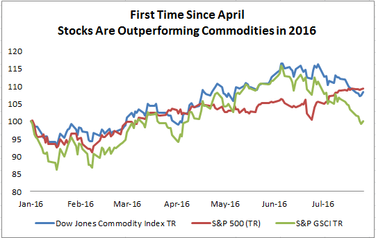
July was a bloodbath for commodities in the Dow Jones Commodity Index (DJCI) losing 6.0% and in the S&P GSCI losing 9.6% in total return. Although the equally weighted DJCI is still up 7.4% YTD through July 29, 2016, the S&P GSCI that is world-production weighted gave up all its gains from Q2 and is now negative 65 basis points for the year, allowing stock performance in 2016 to overtake commodities for the first time since April.

Source: S&P Dow Jones Indices.

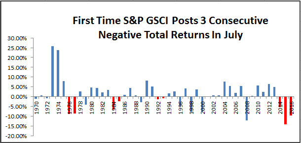
For the S&P GSCI with history going back to 1970, this is the 3rd worst July on record, only after July in 2008 and 2015 when the index lost 12.2% and 14.1%, respectively. This is also the first time ever there have been 3 consecutive negative July’s (July 2014 lost 5.3%.) It is pretty unusual to even see two consecutive negative July’s (1976-77, 1984-85 and 1992-93) given it is mostly a seasonally positive month, posting gains about 2/3 of the time.

Source: S&P Dow Jones Indices.

In total, 16 of 24 commodities lost in July, which is the most since November’s Nightmare in 2015 when 22 were down. The month’s performance was highly segmented by sector with major losses from energy (-13.6%,) agriculture (-6.5%) and livestock (-7.4%.) Brent crude and (WTI) crude oil each declined notably -13.5% and -15.3%, respectively, in their 2nd worst July and 13th worst month ever on declining Chinese demand and rising supplies. Further, lean hogs posted its 4th worst month on record, -17.5%, and its biggest loss since Aug. 2002. Also, gasoil posted its 6 worst month on record, -16.8%, only the worst since Dec. 2015, but its worst July ever.  All the single commodities in these sectors lost except cocoa +0.4% and cotton, the best performer of all, gained 15.4% from plunging inventories due to drought.  This is cotton’s 13th best month and fifth consecutive positive month, driving its longest winning streak since Nov. 2013 – Mar. 2014.

However, cocoa and cotton weren’t the only bright spots in commodities in July. Both industrial and precious metals performed well, gaining 2.0% and 3.1% for the month in the S&P GSCI, respectively.  Aluminum was the only loser, down slightly, shaving off 79 basis points from oversupplied markets and excess capacity.  Nickel gained 12.4%, the most of any metal in the month on stainless steel production, though zinc’s gain of 6.5% brings its 2016 performance up to an impressive 38.5%, surpassing gold’s 2016 gain of 27.1%.

While gold held onto its record gain post Brexit vote, silver showed its sensitivity, adding 9.3% in July more than quadruple gold’s monthly gain of 2.3%.  This may indicate real fear hasn’t gripped investors into holding gold instead of silver yet and that they are willing to take some economic risk from industrial applications of silver.  On average when gold rises, silver rises about 2.7 times as much, but when gold falls, silver falls about twice as much.  Though in crisis times, gold often gains while silver falls. This last happened in Aug. 2015 around the Chinese stock market volatility, but also occurred in the global financial crisis, tech bubble burst, Black Monday and the early 80’s recession.

Last, one more potentially positive note is that nine commodities are showing positive roll returns, measuring shortages. This is happening in corn, cotton, feeder cattle, lean hogs, live cattle, natural gas, soybeans, sugar and wheat, It is the most since Mar. 2015 when 11 commodities were in this condition, and is particularly rare for natural gas which hasn’t seen a positive roll in 18 months.  Overall, it is a complete turn around from the commodity conundrum experienced in April despite the record positive performance just 3 months ago.

Our 10th Annual Commodities Seminar takes place in London on 29th September. Additional information and registration are available online now. #SPDJICommods

The posts on this blog are opinions, not advice. Please read our Disclaimers.

Rieger Report: Puerto Rico's Weight on the Muni Market

Contributor Image
J.R. Rieger

Former Head of Fixed Income Indices

S&P Dow Jones Indices

Puerto Rico remains a puzzle unsolved.  The large amount of Puerto Rico debt continues to weigh on the municipal bond market with the heaviest exposure in the high yield (below investment grade) segment.  Puerto Rico municipal bonds have over 27.1% market value weight in the S&P Municipal Bond High Yield Index and represent over $26.7billion in market value of bonds in that benchmark.

The broadest municipal bond index S&P publishes, the S&P Municipal Bond Index ,  tracks over $1.7trillion in market value of municipal bonds.  The sum of all Puerto Rico bonds in that index represents 1.77% of the total market value of the index.  This total includes bonds that are in default, insured, prerefunded as well as bonds that are escrowed to maturity.

The S&P National AMT-Free Municipal Bond Index is an investment grade index that excludes Puerto Rico bonds as well as bonds from other U.S. Territories. There is no Puerto Rico exposure in that index.

There are $9.7billion in market value of insured Puerto Rico bonds that are tracked in the S&P Municipal Bond Insured Index .  The insured Puerto Rico bonds represent slightly over 5.5% of the total market value of that index.

Table 1) Select S&P municipal bond indices and the percentage of Puerto Rico bonds by market value in each index

Source: S&P Dow Jones Indices, LLC. Data as of July 29, 2016. Table is provided for illustrative purposes. It is not possible to invest directly in an index. Past performance is no guarantee of future results.

Please join me on Twitter @JRRieger  and LinkedIn

The posts on this blog are opinions, not advice. Please read our Disclaimers.

The Consequences of Concentration: 5 - Genuine Skill?

Contributor Image
Craig Lazzara

Former Managing Director, Index Investment Strategy

S&P Dow Jones Indices

Should active managers shift away from well-diversified portfolios and concentrate only on “high conviction” holdings in hope of generating higher returns?  We have suggested four consequences — higher risk, greater dominance of luck over skill, higher costs, and fewer outperforming funds — that are likely and logical outcomes of higher concentrationAll four apply even for active managers with genuine stock selection skill.  Once we consider the nature of skill, however, the case against greater concentration becomes even more compelling.

The argument for concentration relies on two assumptions: that manager skill exists, and that it is particularly acute at the extremes of conviction.  Not only, e.g., must a manager be able to build a 100-stock portfolio that will outperform, he also must be able to identify which 20 stocks of the initial 100 are the best of the best.  For concentration to work, both assumptions — that skill exists, and that it is acute at the extremes — must be true simultaneously.  There is no evidence that either of them is.  If it exists at all, the requisite skill must be quite rare.  If this were not so, active funds would not be facing a performance challenge in the first place.

On the contrary, the evidence that manager skill is ephemeral is strong:

  • The only source of excess return, or positive alpha, for the market’s winners is the negative alpha of the losers.  In aggregate, professional active management is a zero-sum game.
  • Because passive investors own a pro-rata slice of the market, their aggregate portfolio is identical to the aggregate portfolio of all active managers. But passive investment is intrinsically cheaper than active management, so that the average passively-managed dollar is arithmetically certain to outperform the average actively-managed dollar.
  • In support of these conceptual points, the empirical evidence is unequivocal.  Most active managers underperform benchmarks appropriate to their investment style, and the comparisons become more arduous as the timeframe for evaluation lengthens.  Moreover, when above-average performance occurs, there is scant evidence that it persists.

Skillful managers sometimes underperform; unskilled managers sometimes outperform.  The challenge for an asset owner is to distinguish genuine skill from good luck.  The challenge for a manager with genuine skill is to demonstrate that skill to his clients.  The challenge for a manager without genuine skill is to obscure his inadequacy.  Concentrated portfolios will make the first two tasks harder and the third easier.

The posts on this blog are opinions, not advice. Please read our Disclaimers.

Home Prices Rising

Contributor Image
David Blitzer

Former Managing Director and Chairman of the Index Committee

S&P Dow Jones Indices

This morning’s S&P CoreLogic Case-Shiller Home Price Indices report showed prices rising at about a 5% annual rate over the last 12 months.  Across the country the pattern varies with strong price gains in the Pacific Northwest and small price increases in New York and Washington DC.  The press release and data are available at LINK.

One factor in rising home prices is rising incomes as seen from the chart of the S&P CoreLogic Case-Shiller National Index and Disposable Personal Income per capita. Currently home prices appear to be running ahead of income.

Home-DPI

The table shows the peaks and troughs, index levels and changes for the 20 cities and composite indices.

Part of the price increases in home is inflation. This chart shows the National Index and compares it to the inflation-adjusted version of the National Index. The inflation adjustment is based on the Consumer Price Index,

The posts on this blog are opinions, not advice. Please read our Disclaimers.

The Consequences of Concentration: 4 - More Underperformers

Contributor Image
Craig Lazzara

Former Managing Director, Index Investment Strategy

S&P Dow Jones Indices

Can active managers improve performance by moving from relatively diversified to relatively concentrated portfolios?  Doing so is likely to increase risk, shift the relative importance of luck and skill, and raise trading costs.  A fourth consequence is that the probability of active underperformance is likely to increase.

A simple example provides some insight.  Imagine a market with five (equally weighted) stocks, whose performance in a given year is shown below.  The market’s return is 18%, driven by the outstanding performance of stock E.Hypothetical five stock market
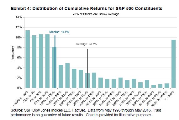
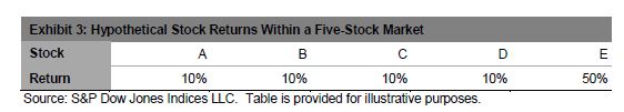
We can form portfolios of various sizes from these five stocks.  There are five possible one-stock portfolios, four of which underperform the market as a whole.  Alternatively, there are also five possible four-stock portfolios, four of which outperform the market as a whole.  The expected return of the complete set of one-stock and four-stock portfolios is the same 18%, but the distribution of portfolio returns is different.  In this case, holding more stocks increases the likelihood of outperformance.

Of course, this stylized example only “worked” because our hypothetical returns were skewed to the right; formally, the average return was greater than the median return.  A different return pattern among the individual stocks would have produced a different result at the portfolio level — so the usefulness of our example hinges on an empirical question: to what degree are real-life stock returns skewed to the right?

We might suspect that there is a natural tendency toward a right skew in equities — after all, a stock can only go down by 100%, while it can appreciate by more than that.   We confirmed this intuition by plotting the distribution of cumulative returns for the constituent stocks of the S&P 500 for the 20 years ended May 2016.  The median return was 141%, far less than the average of 377%.Cumulative returns for S&P 500 constituents

This positive skew in equity returns is not simply a long-term phenomenon: in the 25 years between 1991 and 2015, the average S&P 500 stock outperformed the median 21 times.

If stock returns are skewed to the right, portfolios with fewer stocks are more likely to underperform than portfolios with more stocks, because larger portfolios are more likely to include some of the relatively small number of stocks that elevate the average return.  Indeed, the logic of skewed returns is that it is more sensible to focus on excluding the least desirable stocks than on picking the most desirable — the opposite of what a concentrated portfolio will do.

The posts on this blog are opinions, not advice. Please read our Disclaimers.