Get Indexology® Blog updates via email.

In This List

One Commodity Conundrum Despite 2nd Best April Ever

Preferences of Preferred Stock

Why This New Way To Invest In Oil In Hong Kong Matters

Are employers' efforts to control healthcare costs futile?

Performance Analysis of Unconstrained Bond Funds

One Commodity Conundrum Despite 2nd Best April Ever

Contributor Image
Jodie Gunzberg

Former Managing Director, Head of U.S. Equities

S&P Dow Jones Indices

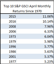
The Dow Jones Commodity Index and S&P GSCI total return indices gained 9.1% and 10.1%, respectively, in April. For the S&P GSCI, it was the best month in a year, and the second best April ever in history since 1970, only after last year’s April, when it gained 11.1%. Further, the S&P GSCI is up 15.5% since Feb 29, 2016, making this the first consecutive positive two months in two years, since Mar-Apr 2014, but marks the biggest consecutive two months in almost seven years since May-Jun 2009 when it gained 20.4%.

Source S&P Dow Jones Indices.

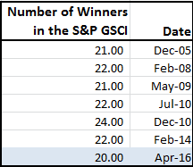
There has never been an April with this many positive commodities, posting 20 of 24 winners (coffee, Kansas wheat, live cattle and feeder cattle lost.) Only six months in history have had more positive commodities and April 2016 had the most winners since Feb. 2014, when 22 commodities were positive.

Source: S&P Dow Jones Indices.
Source: S&P Dow Jones Indices. May 2004, Feb. 2010 and Sep. 2010 also had 20 winners.

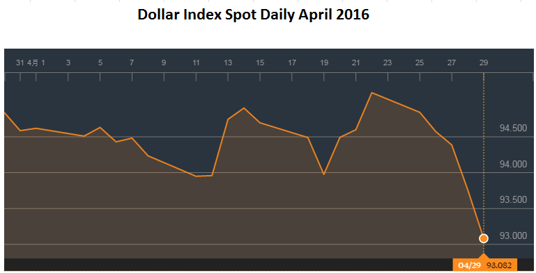
It is not surprising to see the S&P GSCI deliver strong returns in April given that historically on average it is the best month. However, it is concerning that only four commodities (copper, gold, cotton and lean hogs – and the lowest count since November’s Nightmare) are in backwardation, a condition that generally reflects a shortage.  There have been 24 months with better returns than in Apr. 2016, but the backwardation count this low concurrently with the high returns hasn’t happened since 1974, when there were only six commodities in the index. What it means is the supply/demand fundamentals may not be in place to support this commodity rally and that it may be driven more by the falling dollar.

Source: Bloomberg
Source: Bloomberg

The posts on this blog are opinions, not advice. Please read our Disclaimers.

Preferences of Preferred Stock

Contributor Image
Jason Giordano

Director, Fixed Income, Product Management

S&P Dow Jones Indices

Preferred stock is a hybrid security that has characteristics of both stocks and bonds.  In the capital structure, preferred shares are subordinate to bank loans and senior corporate bonds, but they are senior to common stock.  If a company had to file for bankruptcy and the assets of the company were liquidated, preferred shareholders would get paid after bond holders and before common stock holders.  This leads to higher recovery rates than common stock, while at the same time offering much lower default rates compared to high-yield bonds.

In low interest rate environments with narrow credit spreads, preferred stocks behave similarly to bonds.  In periods of high volatility, they behave more closely to stocks.  Exhibit 1 shows the performance of the S&P U.S. Preferred Stock Index compared to both the S&P US Issued BBB Investment Grade Corporate Bond Index and the S&P US Issued BB High Yield Corporate Bond Index.

Capture

Unlike common stock, most preferred dividends are cumulative, meaning dividend payments accrue even if not paid when scheduled.  If a firm suspends paying dividends, it must pay preferred shareholders in full before paying any dividends to common shareholders.

The energy sector has had a significant effect on preferred stocks.  The impact of depressed oil prices is easily visible by comparing the performance of the S&P International Preferred Stock Index to that of the S&P U.S. Preferred Stock Index.  Exhibit 2 shows the dramatic effect that exposure to the energy sector has had on preferred stocks.  The S&P International Preferred Stock Index has over 20% exposure to companies in the energy sector; meanwhile, the S&P U.S. Preferred Stock Index has no exposure.  As a result, the U.S. index has significantly outperformed its international counterpart.  Since August 2014, the S&P U.S. Preferred Stock Index was up 10.0%, while the S&P International Preferred Stock Index was down -27.5% as of March 2016.

Capture

The posts on this blog are opinions, not advice. Please read our Disclaimers.

Why This New Way To Invest In Oil In Hong Kong Matters

Contributor Image
Jodie Gunzberg

Former Managing Director, Head of U.S. Equities

S&P Dow Jones Indices

Now, there has been a long bull market where stocks have outperformed commodities for eight consecutive years, ending in 2015. It’s a record. If markets behaved just as they have in the past, then some investors might say it’s time to switch asset classes. However, the high correlation between risky assets experienced recently like during the recession of 2001-2003 and the global financial crisis in 2007-2009 has caused many investors to reconsider allocating by traditional asset classes defined by security type like stocks, bonds and real estate or commodities.

Instead, many investors are moving towards new techniques that define asset classes by their similarities in risk type.  For example, a risk-based allocation may use risk-buckets defined by growth, income, inflation and liquidity.  In the analysis of which assets protect against various risks, commodities, and in particular oil, float to the top of the inflation protection list.

Following the last time equities outperformed commodities for nearly as long from 1980-86, seven consecutive years, U.S. CPI year-over-year rose from 1.1% in Dec 1986 to 6.3% in Nov 1990, and commodities, as measured by the S&P GSCI Total Return index, returned almost 300% through that period.

The inflation sensitivity is high for commodities with an inflation beta near 15 for world production weighted indices (near 70% in energy) and closer to 10 for equally weighted indices with about 1/3 weighted in energy. This makes sense given it is the same food and energy in the indices that is in the CPI and that energy is the most volatile component so the more energy, the higher the inflation protection. Notice the big jump after 1987 – that came from adding energy into the index.

Source: S&P Dow Jones Indices

The need for inflation protection and diversification has created high demand for investment in oil. Especially since many emerging markets or newer ones to commodities feel more comfortable with a single commodity rather than the basket. For example, last August, the first ETF (exchange traded fund) on oil was launched in all of greater China out of Taiwan and now has over $300 million.

This is important since now their investors can benefit from the inflation protection and diversification provided by oil. The correlation to oil of many stock markets is only moderate at best.

Oil Correl Milken

Now is an exciting time for investors to gain this diversification and inflation protection in Hong Kong too.  On April 29, 2016, the very first ETF (exchange traded fund) on commodity futures will be listed in Hong Kong. Using monthly year-over-year data since 1987, the S&P GSCI Crude Oil has an inflation beta of 13.8 while the S&P 500 and Hang Seng Index only have inflation betas of 1.5 and 5.8, respectively. Also, the excess return of oil over the Hong Kong CPI is 7.2%, which is about the same as the excess return of their stock market but almost double the excess return from the S&P 500.

The oil can also offer some downside protection. For example, since 1987, on average when the HSI was negative in a month, it fell 5.6% but during those months, crude oil was basically flat, only dropping 0.2% and that’s not much worse than gold, the one considered the safe haven. Also, oil protects in many famous stock market drops like the Persian Gulf War and Black Monday.

Source: S&P Dow Jones Indices

Not only does this mark a new era of investment alternatives from traditional assets like stocks and bonds for investors to use in order to protect against portfolio risks but as investors allocate to commodities in local Asian markets, the futures growth may help standardize the quality of energy and food to make prices less volatile and their environment cleaner.


The posts on this blog are opinions, not advice. Please read our Disclaimers.

Are employers' efforts to control healthcare costs futile?

Contributor Image
Glenn Doody

Vice President, Product Management, Technology Innovation and Specialty Products

S&P Dow Jones Indices

The question for the future of the private insurance system is this: are employers’ efforts to control healthcare costs futile?  Recent data from the S&P Healthcare Claims Indices would suggest that this may actually be the case.  According to the indices, costs for self-insured employers, known as Administrative Services Only (ASO) in the healthcare industry, are starting to increase again after showing declining cost trend levels from the 9% annual cost increases experienced in 2010.  To illustrate this concern, when we peer deeper into the recent data and look at hospital inpatient charges, we see an alarming trend.

Capture

According to Exhibit 1, which looks at hospital inpatient costs, utilization, and average cost per day, employers have done remarkably well in controlling the utilization of services.  This decline in utilization can be attributed to many things, including increasing participant costs for inpatient services, the ongoing substitution of outpatient facilities for services formerly done on an inpatient basis, as well as better education among the users of these services.  However, what is evident is that even though utilization has declined since 2012, we have seen that average costs on the inpatient side have remained steady between USD 120 and USD 140 per member per month.  How is it that utilization or use of healthcare services could be falling, while at the same time average costs are holding steady?  The answer is evident in the average cost per inpatient per day index (unit cost) numbers.  Unit costs have been mirroring in reverse the drop in utilization.  This is a clear indication that as utilization drops, there is less revenue for service providers, and to compensate they have been increasing the fees charged for services to offset the revenue loss.  If this is the case, employers must ask themselves if future efforts to instill cost control are going to be met with the same results.

The posts on this blog are opinions, not advice. Please read our Disclaimers.

Performance Analysis of Unconstrained Bond Funds

Contributor Image
Hong Xie

Former Senior Director, Global Research & Design

S&P Dow Jones Indices

Most unconstrained bond funds claim to offer the following potential benefits:

  • Low correlation to core fixed income;
  • Attractive risk-adjusted returns; and
  • Actively managed downside risk mitigation.

We examined each of these claims for the average performance of unconstrained bond funds since 2011 and noted that fund performance varied among them.

Persistently Higher Correlation to the Global Aggregate Bond Index Than the U.S. Aggregate Bond Index

Exhibit 1 shows the rolling two-year correlation of the average monthly return of unconstrained bond funds to that of the U.S. and global aggregate bond indices.  Though unconstrained bond funds do show periods of low, or at times negative, correlation to the U.S. Aggregate Bond Index, they also tend to demonstrate persistently high correlation of above 0.50 to the Global Aggregate Bond Index, though only until 2014.

Capture

Lower Risk-Adjusted Returns Than the U.S. Aggregate Bond Index on Average

Exhibit 2 shows the risk/return profile of unconstrained bond funds versus the U.S. and global aggregate bond indices.  On average, unconstrained bond funds delivered lower return and lower return per unit of volatility than the U.S. Aggregate Bond Index and higher return than the Global Aggregate Bond Index.  As average returns across funds tend to smooth out performance volatility due to the imperfect correlation between these funds, we also charted the performance statistics for quintile portfolios by return for the 36 funds that had full performance data for our analysis period.  Only one out of the five quintiles demonstrated a higher annualized return than the U.S. Aggregate Bond Index, and none outperformed the U.S. Aggregate Bond Index in terms of return per unit of volatility.

Capture

Improved Drawdown

Exhibit 3 shows the maximum drawdown for unconstrained bond funds versus the core fixed income indices for the analysis period.  On average, unconstrained bond funds experienced a maximum drawdown of 3.02%, which was better than the U.S. Aggregate Bond Index and the Global Aggregate Bond Index.  Exhibit 3 demonstrates the variance in maximum drawdown across all funds.  On average, at least 60% of funds experienced worse maximum drawdown than the U.S. Aggregate Bond Index.

Capture

The posts on this blog are opinions, not advice. Please read our Disclaimers.