Get Indexology® Blog updates via email.

In This List

Rieger Report: Bond Market Malformation, Trouble Ahead?

Commodities Return Best 3-Months Since 2009

Home Prices Continue to Rise

Inflation or Why Raise Interest Rates

Industrial Metals On Pace For Worst Month In 4 Years

Rieger Report: Bond Market Malformation, Trouble Ahead?

Contributor Image
J.R. Rieger

Former Head of Fixed Income Indices

S&P Dow Jones Indices

There is no doubt about it the bond markets are malformed due to quantitative easing (QE). The possibility of a Fed change of short term rates in June or July is on the minds of many. Are the investment grade municipal and corporate bond markets primed for a near term correction as a result? Only time will tell.

However, there are factors that would argue against such a proposition:

  • A rise in rates is most likely ‘baked in’ to each of these markets.
  • The technical imbalance that overhangs both of these markets is supply vs. demand:
    • While investment grade corporate bonds were issued in record numbers, that issuance has slowed, demand however has not. That demand is driven by the need for low risk but incremental yield over risk free yields. Please see yield spread chart below of the bonds of the companies in the S&P 500 (the S&P 500 Bond Index is approximately 92% investment grade) vs. the 10 year U.S. Treasury Bond Index.
    • Municipal bond issuance has seen periods of increased issuance as well as relative ‘dry spells’. The net effect is new issue supply remains below historical norms. Demand for quality tax-exempt bonds remains firm yet still historically cheap relative to U.S. Treasury bond yields.
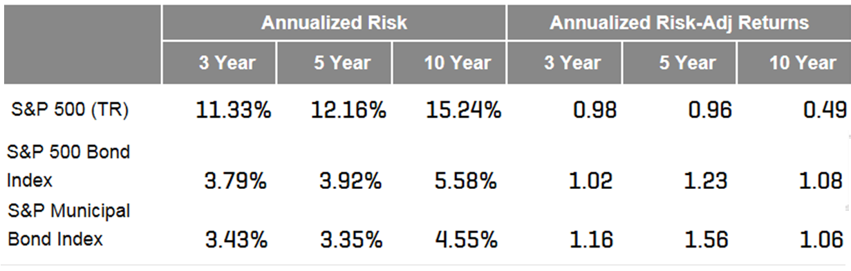
  • While setting record highs, the equity markets have also seen periods of high volatility. The lower volatility seen in the investment grade corporate and municipal bond markets may continue to be seen as a value proposition for risk averse or ‘risk off’ investor mind sets. The volatility and risk adjusted returns for the S&P 500, S&P 500 Bond Index and the S&P Municipal Bond Index for 3, 5 and 10 year periods ending May 2016 can be seen in the table below.

For a discussion on the U.S. Treasury bond market there is a good read in the recent article “I wouldn’t buy a bond with your money” by Jared Dillian at Mauldin Economics which is focused on the U.S. Treasury bond market, particularly the 10 year bond.

Chart 1: Select indices and their yields (Yield to worst):

Source: S&P Dow Jones Indices, LLC. Data as of June 2, 2016. Chart is provided for illustrative purposes. It is not possible to invest directly in an index. Past performance is no guarantee of future results.

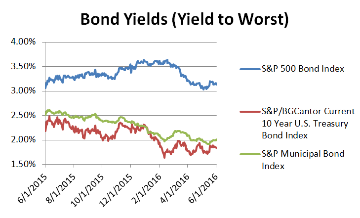
Table 1: Risk and Risk Adjusted Returns of Select Indices as of May 31, 2016:

Source: S&P Dow Jones Indices, LLC. Data as of May 31, 2016. Table is provided for illustrative purposes. It is not possible to invest directly in an index. Past performance is no guarantee of future results. Risk is defined as standard deviation calculated based on total returns using monthly values.

The posts on this blog are opinions, not advice. Please read our Disclaimers.

Commodities Return Best 3-Months Since 2009

Contributor Image
Jodie Gunzberg

Former Managing Director, Head of U.S. Equities

S&P Dow Jones Indices

Commodities are starting summer hot and early. Ending May, the Dow Jones Commodity Index (DJCI) was flat, but the S&P GSCI gained a total return of 2.2%, making it the third consecutive positive month for the index. This is the first time commodities have gained three months in a row since the period ending in Apr. 2014, and this is the biggest three month gain, 18.1%, for commodities since the period ending in July 2009 when they returned 20.9%.

Although the industrial metals sector lost 7.1%, posting its worst month in a year, and the precious metals sector lost 6.3% in its first negative month of 2016, the energy sector, currently comprising near 70% of the index, gained 4.6% in May, for a three month return of 30.4%. It’s the biggest three month gain for energy since the period ending in Jun. 2008 when it gained 37.5%. Also, livestock and agriculture gained 3.2% and 1.3%, respectively in May. However, what is interesting is the roll return (measuring backwardation in the sector) turned positive in agriculture for the first time since May 2015 and has improved in energy from -5.6% in Feb. to just -1.5% in May. There has not been an increase in roll yield this quickly in energy in seven years, since May 2009.

Year-to-date, the total return of the S&P GSCI is positive 9.8%, and has gained 26.2% off its bottom in Feb. Commodities are now outperforming stocks for the first year since 2007.

Source: S&P Dow Jones Indices.

If this outperformance holds through the year’s end, it will break the longest number of consecutive years that stocks outperformed commodities. Following the last time equities outperformed commodities for near as long in 1980-86, seven consecutive years, commodities returned almost 300% through 1990 when the trend reversed. (The bottom index level of the S&P GSCI Total Return on April 16, 1986 was 716.51. The index returned 299.8% to reach a high level of 2864.40 on Oct 9, 1990.) 


The posts on this blog are opinions, not advice. Please read our Disclaimers.

Home Prices Continue to Rise

Contributor Image
David Blitzer

Former Managing Director and Chairman of the Index Committee

S&P Dow Jones Indices

Charts from the latest S&P/Case-Shiller Home Price Indices released this morning.  Full data available here.

Nationally home prices continue at a about a 5% annual rate.  Price gains vary across the 20 cities covered with the Pacific Northwest region showing the largest gains.

The posts on this blog are opinions, not advice. Please read our Disclaimers.

Inflation or Why Raise Interest Rates

Contributor Image
David Blitzer

Former Managing Director and Chairman of the Index Committee

S&P Dow Jones Indices

The minutes of the Fed’s April 26-7 meeting convinced almost everyone that the Fed will raise interest rates at its next meeting in June, but left them wondering why.  Most of the subsequent discussion centered on the labor market and how close the economy is to full employment. There was also some whispering about inflation.

The Fed has two sometimes conflicting goals: full employment and low inflation. It defines low inflation as 2%. The definition of full employment is less specific — an unemployment rate in the neighborhood of 4.5%-5% seems right. Since 2009 the Fed has moved towards full employment by bringing the unemployment rate down from 10% to 5% currently. It has had less success with inflation unless you really want price increases of zero to 1% instead of the Fed’s 2% target.

Inflation used to be thought of as a monetary phenomenon – the growth rate of the money supply drove the rate of inflation. Despite consistent money growth, inflation remains comatose. The competing inflation theory is a combination of expectations and the Phillips curve.  Expectations is the idea that when everyone expects prices to rise, they will push for higher wages and prices; but be satisfied with  current wages and prices if they expect stability to continue. The Phillips curve was first suggested in 1958 by A. W. Phillips, a New Zealand economist, who described an inverse relation between inflation and unemployment: when unemployment drops and an economy reaches full employment, inflation tends to rise. While the details of the links among inflation, unemployment and expectations have changed, the links are still there and the Fed believes that full employment can lead to rising inflation.  The FOMC doesn’t know how far or fast unemployment can fall before inflation picks up. However, waiting to raise interest rates until inflation is climbing would mean needing to push interest rates up much farther and faster. A small step or two in interest rates this year may be prudent risk control.

Concern over inflation and the Phillips curve is not the only argument for a June-July rate hike. Over the last year the Fed has discussed normalization – moving interest rates above the zero lower bound and returning to open market operations and the Fed funds rate as the principal tools of monetary policy.  If the Fed funds rate is still 0.5% at the start of the next recession, there won’t be much room to ease and the Fed would immediately be looking at quantitative easing, negative interest rates and an expanding balance sheet. A better plan would be further economic growth and gradually moving the Fed funds rate to 2%-3% before faced with the next downturn.  That plan needs to start sometime.

One other aspect of a Fed move is more speculative.  While the Fed’s policy mandate for low inflation and full employment is domestic, the Fed’s action is felt around the globe. An increase the Fed funds target may boost the dollar against other currencies include the euro and the yen.  A stronger dollar would stimulate some foreign economies while dampening activities for US manufacturing and exporting. This should be viewed as a side effect rather than disguised stimulus to other economies.

The posts on this blog are opinions, not advice. Please read our Disclaimers.

Industrial Metals On Pace For Worst Month In 4 Years

Contributor Image
Jodie Gunzberg

Former Managing Director, Head of U.S. Equities

S&P Dow Jones Indices

While most of the markets have calmed as investors wait for Brexit and the Fed rate decision, industrial metals are crashing. The S&P GSCI Industrial Metals Total Return is down 8.7% month-to date (through May 23, 2016,) and on pace to record its worst month since May 2012, when it lost 9.7%. At this rate, the sector is having not only its worst month in four years but its 7th worst May since 1978, when the index history started.

Source: S&P Dow Jones Indices.

There has been little correlation of Chinese GDP growth to industrial metals, even copper, but two other factors may be causing the recent drop.  The first is the rising dollar.

Source: http://www.bloomberg.com/quote/DXY:CUR

Industrial metals are some of the most sensitive commodities to the US dollar.  In fact, of all 24 commodities, nickel tops the list of the single most susceptible to the rising dollar, dropping 1.9% for every 1% rise in the US dollar. Sure enough nickel is the biggest loser in the index so far in May, down 12%.  The other industrial metals are pretty sensitive too. For every 1% rise in the US dollar over the past ten years, lead, aluminum, copper and zinc lost 1.3%, 1.1%, 1.0% and 0.4%, respectively. Month-to-date in May, lead, aluminum, copper and zinc lost 8.5%, 8.0%, 9.6% and 5.1%, respectively.

The other reason for the loss in the industrial metal sector is from rising inventories. It is difficult for producers to supply exactly the amount needed.  After some mining closures and supply reductions, prices rose to cause suppliers to bring more of the metals to the market. This month inventories rose significantly for copper and lead that together comprise about half the weight in the sector.

Source: http://www.infomine.com/investment/warehouse-levels/

As for the interest rate decision, all else equal, if rates rise, the dollar may strengthen so will likely hurt the sector but suppliers may adjust again to limit the price drops. On the other hand, if the dollar strengthens, its power to lift the industrial metals is far greater. In the past 10 years, for every 1% move down in the US dollar, gains in lead, nickel, copper, zinc and aluminum have been 7.2%, 6.1%, 5.3%, 4.6% and 2.2%, respectively. That’s a pretty strong upside potential to downside risk from the US dollar.

The posts on this blog are opinions, not advice. Please read our Disclaimers.