Get Indexology® Blog updates via email.

In This List

The Fed’s Rate Increase Is Looking Like a Game of Kick the Can

Tax-Aware Australia: An Idea Whose TAIM Has Come?

So Alpha is a Myth? A Mix of Skepticism and Conviction on our Passive vs Active Research

The Effects of the Affordable Care Act on the S&P Healthcare Claims National Index

The Hottest El Niño Yet

The Fed’s Rate Increase Is Looking Like a Game of Kick the Can

Contributor Image
Kevin Horan

Former Director, Fixed Income Indices

S&P Dow Jones Indices

Continued lackluster U.S. economic activity right up until today’s slower personal consumption expenditures (PCE) report may have pushed rates lower during the last week of the month and into June’s start.  The yield of the S&P U.S. Investment Grade Corporate Bond Index moved lower by 8 bps during the last week of the month to close at 2.89%.  The May closing yield was still 6 bps higher than the April closing yield of2.83%.  The index fell 0.47% for the month, and returned 1.10% YTD.  With the move down in Treasury rates, corporate issuance continued at an active pace as new issue deals from Home Depot (USD 2.5 billion), PNC Bank (USD 3 billion), Time Warner (USD 2.1 billion), UBS (USD 3 billion), and many more were launched.

Vigorous issuance also occurred in the high-yield market, as ArcelorMittal (USD 1 billion), CommScope Tech (USD 2 billion), MarkWest Energy (USD 2.45 billion), and WellCare Health (USD 0.3 billion) all issued last week.  The yield of the S&P U.S. High Yield Corporate Bond Index closed May lower by 6 bps, at 6.11%, compared with 6.16% at the start of the month.  Year-to-date, the yield of the index is 73 bps tighter than the Dec. 31, 2014, yield of 6.84%.  The index returned 0.51% for the month and returned 4.8% YTD.  Outside of a slightly negative March (-0.19%), the high-yield index continues to provide positive monthly performance.  The continued “kick the can down the road” approach to the Fed’s rate hike may have caused yield-craving investors to bide their time in the sector.  High-yield bonds appear likely to return 5% in 2015, according to Martin Fridson, a veteran follower of the asset class and CIO of Lehmann Livian Fridson Advisors.[1]

In the shadow of the high-yield index’s YTD performance, the S&P/LSTA U.S. Leveraged Loan 100 Index returned 2.64% YTD.  For May, the index returned 0.05%.  Like the investment-grade and high-yield markets, issuance activity ramped up after the long Memorial Day weekend with 10 issuers tapping the market for a combined USD 8.72 billion.

After an increase of 11 bps in April 2015, the yield of the S&P/BGCantor Current 10 Year U.S. Treasury Bond Index continued its upward trend throughout most of May.  The 10-year U.S. Treasury Bond regained support during the last week of the month as yield came back down to 2.13% after being as high as 2.29% during the month.  Post month-end trading continues to move yields lower as the Fed’s preferred measure of inflation unexpectedly slowed in April (Core PCE year-over-year, 1.2% versus 1.3% prior).  Overall for the month, the S&P/BGCantor Current 10 Year U.S. Treasury Bond Index closed 9 bps wider than its start of 2.04%.  For the month, the return of the index was -0.62%, while YTD it returned 1.61%.

U.S. TIPS, as measured by the S&P U.S. TIPS Index, fell by 0.95% for May, as the YTD return closed out the month at 0.97%.  Like nominal Treasuries, the TIPS index gained 0.27% the last week of May to help offset some of the prior three weeks of losses.  The report of a slower PCE index makes it harder for the Fed to begin raising rates as inflation remains low.

Source: S&P Dow Jones Indices LLC.  Data as of May 29, 2015, leverage loan data as of May 31, 2015.


[1] The Street: High-Yield Bonds May Outperform Stocks in 2015 Despite Oil Price Fears, Jan. 16, 2015.

The posts on this blog are opinions, not advice. Please read our Disclaimers.

Tax-Aware Australia: An Idea Whose TAIM Has Come?

Contributor Image
Harry Chemay

Co-Founder & CEO

Clover.com.au

This is the first blog in a series on the evolution of Australia’s tax-aware investment management (TAIM) landscape.  

In 1999, a new method of calculating Capital Gains Tax (CGT) was introduced in Australia, with assets acquired after its commencement taxed on the basis of time held and type of taxpayer. Assets held for less than 12 months are subject to CGT on the full gain at the taxpayer’s individual rate of tax.  Assets held for longer than 12 months have CGT applied at a discount of between 0% and 50%, depending on the type of taxpayer.

Prior to 1987, Australian companies were taxed on corporate earnings, and from these after-tax profits, would pay dividends.  Those dividends were then taxed in the hands of recipient shareholders at marginal rates as high as 60%.  The combined effect was a tax rate on dividends that could, in certain cases, exceed 78%.

The introduction of dividend imputation in 1987 removed the double taxation of dividends, with tax-resident Australian companies receiving a ‘franking credit’ for tax paid at prevailing corporate tax rates. Shareholders could then use these credits to offset tax on their dividends.  The imputation system was introduced to ensure that taxpayers in effect only paid ‘top up’ tax on dividends, being the difference between the corporate rate and the shareholder’s higher tax rate.

Under the original dividend imputation system, a shareholder with a lower tax rate than the prevailing corporate rate effectively received no value for the franking credits attached to their dividends. For Australia’s superannuation funds this was highly material.  In 1988, a tax rate of 15% had been introduced on the taxable income (including legislated employer contributions) of these pension vehicles.  Among the nation’s largest institutional investors, super funds could not take advantage of the ‘excess’ franking credits they were receiving.  This situation was remedied in 2000 when the tax laws were amended to allow excess franking credits to be claimed by low rate (and tax exempt) taxpayers.

To learn more about how to weigh your after-tax benefits, visit www.spdji.com/tax-aware.

The posts on this blog are opinions, not advice. Please read our Disclaimers.

So Alpha is a Myth? A Mix of Skepticism and Conviction on our Passive vs Active Research

Contributor Image
Shaun Wurzbach

Managing Director, Head of Commercial Group (North America)

S&P Dow Jones Indices

I recently moderated a global webinar for financial advisors on the topic of S&P DJI research on passive versus active investing.  Presenters on the webinar included Aye Soe, our Head of Global Research & Design, Rick Ferri, Founder and Managing Partner of Portfolio Solutions, and Antoine Lesne, Head of ETF Sales Strategy in EMEA for State Street Global Advisors.  Aye is the author of the U.S.-focused SPIVA® (S&P Indices Versus Active) research.  Rick’s firm is a registered investment advisor (RIA) with over $USD 1.4 billion in assets under management, and the firm uses ETFs (index- tracker funds) and indexed mutual funds for asset allocation.  Antoine described the growing adoption of indexing in Europe and talked about how and why this is happening.  In case you missed it, the webinar replay is available on spdji.com.

Some of the questions we received during the webinar were from audience members who were skeptical of our research.  Other comments and questions showed conviction, including the question, “So alpha is a myth?”  Some advisors we meet with state that part of their value proposition as financial advisors and wealth managers is selecting good managers for their clients.  So our research, combined with  Rick and Antoine’s comments and analysis detailing how hard it has been for managed mutual funds to beat index benchmarks, may be perceived by some as questioning the industry’s business practice.

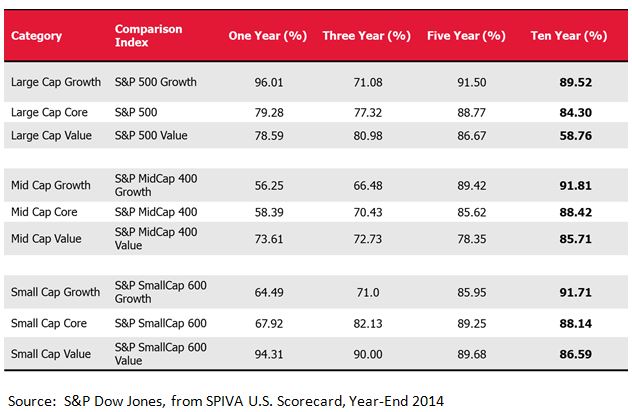
Critical questions we received asked why we don’t address the reason index funds and ETFs also underperform the benchmark indices.  One would generally expect them to underperform, since index funds have management costs that an index does not. Many of the questions sought to clarify how we address costs in our research and I have asked our panelists to help me cover these answers.  You can read some of those questions and our panelist answers in the next post I write.  We saw the highest degree of conviction from our audience in the 10-year findings from our latest SPIVA report, one example of which I have shown below.  To interpret this Exhibit, using the first line example, we see that 89.52% of active mutual funds with a 10-year track record and following a large cap growth strategy failed to outperform the S&P 500 Growth (the benchmark index for the group) over the same 10-year measurement period.

Capture

This webinar attracted a global audience.  Appropriately, Antoine Lesne and Aye Soe both spoke about how our SPIVA results, now calculated for several countries and for Europe, increasingly underpin a global trend towards indexing.  Our research and research from State Street Global Advisors which Antoine shared indicate that active managers have a hard time beating index benchmarks regardless of where in the world they are domiciled.

The posts on this blog are opinions, not advice. Please read our Disclaimers.

The Effects of the Affordable Care Act on the S&P Healthcare Claims National Index

Contributor Image
Glenn Doody

Vice President, Product Management, Technology Innovation and Specialty Products

S&P Dow Jones Indices

On May 21, 2015 an article appeared in the Wall Street Journal stating that health insurance providers are seeking hefty rate increases for individual health plans in 2016.  Industry analysts had already expected the cost for individual polices to increase because of two changes made by the Affordable Care Act.

  1. The elimination of medical underwriting, meaning that any individual can be covered, regardless of their health status.
  2. The expansion of covered benefits, meaning that individual policies will cover more types of services than before.

Capture

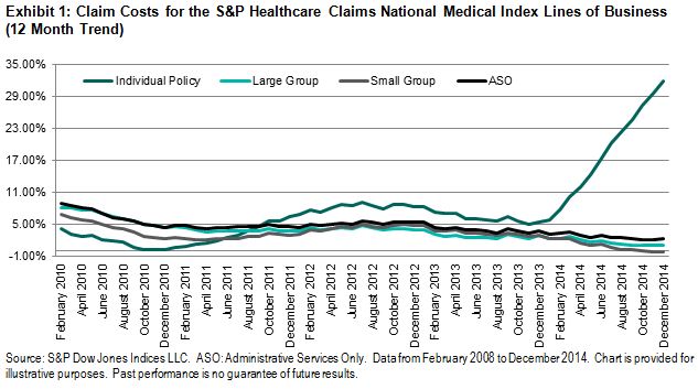
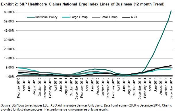
The S&P Healthcare Claims Indices demonstrate that average claim costs per member have increased under the new requirements.  Exhibit 1 shows the trend in claim costs for the individual policy line of business in comparison with the corresponding employer-based medical plans that were not directly affected by the Affordable Care Act provisions.  Compared with cost increases generally ranging between 0%-4% in 2014 for the employer groups, the cost of claims for individual polices rose over 30%, on average.  If we look closer at the costs incurred under individual policies, we can see that Rx expenses increased over 80% in 2014 and may continue to move higher in 2015.  We can expect that much of this increase in cost will be attributed to higher enrollment from populations with greater health needs.  When this less-healthy population obtains insurance coverage and utilizes healthcare services under its plan, both utilization and overall costs could increase substantially.

Capture

In the upcoming months, if the covered population in the Individual market is stable, the average per-member per-month costs could stabilize at a new level, reflecting the changes under the Affordable Care Act.  Based on the change in costs that has already been seen, it is not surprising that health plan providers are seeking increases in rates by an average of 25%-50%, depending on costs increases by state.

The posts on this blog are opinions, not advice. Please read our Disclaimers.

The Hottest El Niño Yet

Contributor Image
Jodie Gunzberg

Former Managing Director, Head of U.S. Equities

S&P Dow Jones Indices

Catastrophic weather events are happening now as we are experiencing deadly heat in India, floods in Houston, Oklahoma and Mexico, and the drought in California.  The ENSO (El Niño Southern Oscillation): Recent Evolution, Current Status and Predictions report prepared by the Climate Prediction Center / NCEP of NOAA (National Oceanic and Atmospheric Administration) stated on May 26, 2015 that El Niño conditions are present and there is an approximately 90% chance that El Niño conditions will continue through Northern Hemisphere summer 2015, and a greater than 80% chance it will last through 2015.

In some cases as in California where the El Niño may bring much wanted rain, the elevated ocean temperatures are welcome. However, the consistency in temperature increases hasn’t been enough to shift growing seasons, so is more destructive to crops in general than helpful and may disrupt the global food market.

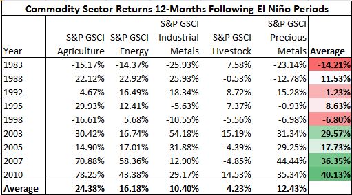
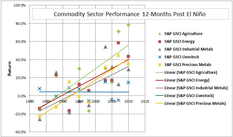
In a post last year, spikes in agriculture following El Niño periods were shown to be significant. Now the study has been expanded to measure all of the five sectors 12 months performance post the El Niño periods. The result is that the global food market is not the only market that may get disrupted. Notice on average that all sectors have positive returns in the 12 months following the El Niño periods.

Source: S&P Dow Jones Indices and http://ggweather.com/enso/oni.htm

What is most interesting is commodity sector returns have increased through time in each of the 12 months following the temperature rise since the El Niño of 1982-1983. This is true for every sector except livestock. On average the annual increase using El Niño periods for agriculture is 2.6%, energy 2.0%, industrial metals 1.8% and precious metals 2.4%.

Source: S&P Dow Jones Indices and http://ggweather.com/enso/oni.htm

This El Niño may be just another potential boost with a little more octane than in history that can act as a catalyst for commodities.


The posts on this blog are opinions, not advice. Please read our Disclaimers.