Get Indexology® Blog updates via email.

In This List

A Misconception about the Asian Bond Markets

Eliminate Money!?

Using an independent measure of healthcare costs in labor negotiations

Lose Money In The Bank: The ECB Announces Negative Interest Rates

El Niño: ¿Dónde Está El Dinero?

A Misconception about the Asian Bond Markets

Contributor Image
Michele Leung

Former Director, Fixed Income Indices

S&P Dow Jones Indices

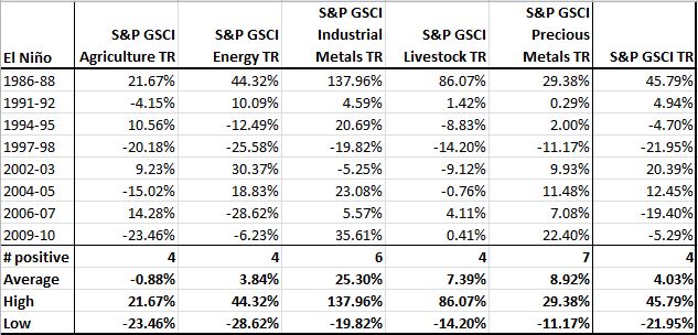
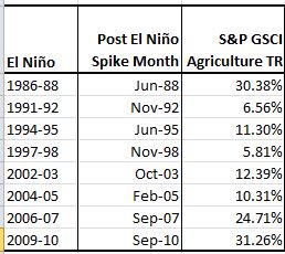
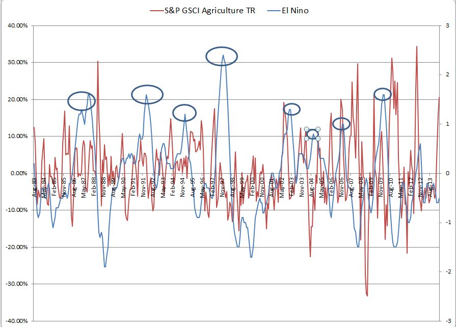
Recently at a panel discussion that I participated, one topic we talked about was if the bond price volatility in Asia is an obstacle to the investors. I believe it is a common misconception in the market.

A volatility analysis was run on the local currency denominated bonds of the 10 countries that tracked by the S&P Pan Asia Bond Index, which are China, Hong Kong, India, Indonesia, Korea, Singapore, Malaysia, Philippines, Taiwan and Thailand. Excluding the relatively high volatilities in Indonesia and Philippines, most countries have an annualized volatility around the 2% level. Interesting to note, while Indonesia and Philippines bond markets are more volatile, they also have the strongest growth in size among the 10 countries, as they expanded more than fourfold and threefold since December 2006.

We also compared the five-year annualized volatilities of the S&P Pan Asia Bond Index (denominated in USD) with other major bond markets, such as the U.S. treasury, U.S. investment grade corporate, U.S. high yield corporate, Eurozone sovereign and Australian bond markets, see the exhibit below. It is observed that the bond price volatility in Asia (even accounting for foreign currency fluctuations) is not necessarily higher than the other major markets. In fact, the S&P Pan Asia Bond Index has been historically less volatile than the S&P U.S. Issued Investment Grade Bond Index for the periods of one-year, five-year and since December 2006.

Comparison of Major Bond Markets’ Annualized Volatility
Source: S&P Dow Jones Indices. Data as of May.30, 2014. Charts are provided for illustrative purposes. This chart may reflect hypothetical historical performance. Please see the Performance Disclosures at the end of this document for more information regarding the inherent limitations associated with back-tested performance. Past performance is no guarantee of future results. The light teal bar represents an index calculated in EUR and light grey bar represents an index calculated in AUD.

Want to take a closer look at Pan Asian Fixed Income? Please continue to read http://www.spindices.com/documents/education/practice-essentials-closer-look-at-pan-asian-fixed-income.pdf

The S&P Pan Asia Bond Index is designed to provide a broad and independent benchmark for the local-currency denominated bond markets. Country-level and sector-level indices are available.

The posts on this blog are opinions, not advice. Please read our Disclaimers.

Eliminate Money!?

Contributor Image
David Blitzer

Former Managing Director and Chairman of the Index Committee

S&P Dow Jones Indices

The announcement by the European Central Bank that it would charge negative interest rates to banks for their deposits at the central bank – effectively a fee for having the central bank hold the money – raises arguments for eliminating paper currency and going digital.  The pros and cons were summarized in the Financial Times and in some blogs.

Digital money need not mean bitcoins – these suggestions are electronic currency maintained by the central bank.  One would trade the greenbacks in your pocket for the credit and debit cards you already have or an app on your phone. For many people there would be little difference.

There would be one advantage for the Fed: if the economy was weak and they wanted you to spend your money, they could encourage banks to charge negative interest (a fee) for keeping money in the bank.  You could pay the interest fee, spend your money or invest it.  You couldn’t take the cash and keep it in your  bottom bureau draw.  While this might be efficient monetary policy, most of us wouldn’t like it.  Lest this sound completely impossible, it was tried with little result in Denmark recently.  It’s not much different than a checking account where you pay service fees for writing checks.

Leaving aside monetary policy, eliminating cash would have other effects.  No one knows how much tax evasion and other illegal activity depends on using cash, but most believe the number is substantial.  About three-quarters of the total value of US currency is in $100 bills. Stated differently, there are about 30 one hundred dollar bills in existence for each person in the US – that’s $3000 in cash. Most people don’t carry that much lunch money. One offsetting factor is a lot of that circulates outside the US.  Eliminating paper currency would curtail some illegal activity by making anonymous or secret transactions more difficult.

Lest this look like a bonanza for the government, they would pay as well.  Currently the government benefits from the seigniorage from money creation.  It doesn’t cost $100 to print a hundred dollar bill, so the government “earns” the difference between the printing cost and the face value of the currency.

Despite some apparent arguments for eliminating cash, it doesn’t seem very likely in the near future, if for no other reason that it would be unpopular and difficult to accomplish.

The posts on this blog are opinions, not advice. Please read our Disclaimers.

Using an independent measure of healthcare costs in labor negotiations

Contributor Image
Glenn Doody

Vice President, Product Management, Technology Innovation and Specialty Products

S&P Dow Jones Indices

On May 27th, 2014 an article appeared in the Wall Street Journal titled “New Costs From Health Law Snarl Union Contract Talks”. This article provides an interesting insight into the challenges both employers and Unions face under the Affordable Healthcare Act as they try to determine the future cost of health plans that have been in place for decades in many cases. Putting a specific financial value on the cost of a health plan for a period of 3 to 5 years, particularly a known plan covering a known group, should be a relatively routine task. However, under our current insurance/ASO structures, there is no way to lock in such a cost over a multi-year period. Either the employer is at risk if actual costs exceed the projections, or the union must accept a very high risk charge to cover the worst case cost of the health plan. Regardless of how the issue is resolved, the situation is a lose-lose environment for both parties.

This is a situation for which the S&P Healthcare Claims Indices can be utilized. With the introduction of the S&P Healthcare Claims Indices both employers and labor now have a common measure of the average market rate of healthcare cost changes (trend) for any time period. By utilizing the indices, the two parties can now take advantage of several options to structure solutions to resolve the problem. Consider a couple of relatively simple examples:

  • The employer and union could agree that the contract will use the index as a neutral measure of market cost changes. By comparing the plan’s financial trend to the market’s trend (in essence “marking to market”) both the employer and the union have a shared goal of improving the plan’s financial results. If the plan’s actual trend was lower than the S&P trend for the same period (meaning that the plan’s financial performance was better than the market average measured by the index) then the plan would have a surplus which could be used to reduce future contributions from the union employees. Likewise, if the plan’s actual trend was higher than the index, then the employee contributions might be increased to cover the shortfall. Under this approach, both parties have an incentive to manage the cost of the health plans as carefully as possible – an incentive that typically does not exist currently.
  • An employer could use the S&P Healthcare Claims Indices as the basis to negotiate a financial contract with a third party, such as an insurance carrier, reinsurer or bank, that limits the employer’s liability for healthcare costs in excess of a set trend over the period of union contract. In effect, the employer has entered into a futures contract for healthcare costs. The contract would function as a hedge, in much the same manner as a futures contract is used to hedge commodity costs, or investment performance. The result is that both the employer and the union could determine the cost of health care benefits under the union contract with a high level of confidence. Both the union and the employer would understand the value of the healthcare program – and they could then decide whether to make changes to the plan provisions in order to change that cost.

Futures contracts are a well understood mechanism and have demonstrated their value across any number of markets. Is their utilization as to hedge against future health care costs just the next step in this financial structure’s evolution? The index linked approach would also work much the same way as reinsurance or catastrophic insurance in other insurance markets, with the indices being used as the final settlement value to the cost guarantee.

The posts on this blog are opinions, not advice. Please read our Disclaimers.

Lose Money In The Bank: The ECB Announces Negative Interest Rates

Contributor Image
David Blitzer

Former Managing Director and Chairman of the Index Committee

S&P Dow Jones Indices

The European Central Bank (ECB) announced negative interest rates. The rates apply only to certain funds that banks keep on deposit at the central bank. Negative interest rates do not apply to individuals’ bank accounts. If a bank has one million euros on deposit with the central bank, a year later it will have a thousand euros less – it will have paid interest to leave the money in the central bank.  And that is exactly why the ECB is charging for holding the money – it wants banks to loan the money to businesses to encourage investment and economic recovery.

This unusual move – tried once or twice before in other countries with little result – is because the European economy is weak and prices are on the edge of falling into deflation.  The ECB describes this as the logical extension of normal monetary policy: when inflation is too high, the central bank raises interest rates in an effort to deter borrowing by making it more expensive. When inflation is too low, prices are close to falling and the economy is weak, the central bank cuts interest rates.  The latest reductions announced today (June 5th) pushed interest rates down with the rate for refinancing operations, similar to the Fed Funds rate in the US, at 15 bps. To keep a 25 bp spread above the rate paid on bank deposits at the ECB; the deposit rate was reduced to -10bps.

This isn’t likely to create a surge of bank lending overnight. First, the drop into negative numbers seems as much a symbolic statement as a serious plan to charge banks.  Second, there are not too many immediate options for banks. They could withdraw deposits from the central bank and hold the funds as currency.   The amounts are sufficiently large that where it is stored, and how it is protected, are real issues. A bank could try to deposit the funds in another bank, but this just means a lot of liquidity looking for a home.  Hopefully the news of negative interest will encourage business to spend or invest once they realize that money is (almost) free, for the moment.

Deflation is both a sign of economic weakness and a real danger.  In a weak, no growth economy there is no pressure on prices, little demand for most goods or services and flat to falling wages as unemployment rises.  Falling prices signal spreading economic malaise.  Deflation can be a greater danger – when prices fall, just about everything except for cash is worth less; cash is worth more because each dollar buys more.  In effect, dollars are more expensive.  A borrower needing money to repay a loan must work longer and harder to repay the loan because his labor is worth less. This debt-deflation spiral can send an economy into a deep recession or worse.  This is why the ECB and others fear deflation.

The posts on this blog are opinions, not advice. Please read our Disclaimers.

El Niño: ¿Dónde Está El Dinero?

Contributor Image
Jodie Gunzberg

Former Managing Director, Head of U.S. Equities

S&P Dow Jones Indices

Climate scientists are predicting record breaking global temperatures from an El Niño expected this year that could boost commodity prices from further disruptions in the supply chain.  This year has already been chock-full of supply shocks across many commodities such as nickel, natural gas, coffee and hogs, creating critically low inventories that will be extremely difficult to replenish – especially in volatile weather conditions.   

Already climate change has impacted the agriculture sector, so an El Niño may have an even greater impact amid the global warming. Does this mean there may be an opportunity for outsized returns from agriculture or other sectors?

The Oceanic Niño Index has indicated eight historical El Niño periods in the time frame since 1983, when sector data is available for the S&P GSCI. Surprisingly, it’s not the agriculture sector that benefits, at least right away. Notice only 4 of 8 periods resulted in positive returns for the S&P GSCI Agriculture with a slightly negative average return of 88 basis points.  However, livestock fared better with premiums of 7.4%, and the metals showed positive performance in most of the periods with average returns of 25.3%  and 8.9% from industrial metals and precious metals, respectively. The super high return in 1986-88 is interesting since the commodity stock cycle was at a similar turning point as today.

Source: S&P Dow Jones Indices and http://ggweather.com/enso/oni.htm. Data from Jun 1983 to May 2014. Past performance is not an indication of future results. This chart reflects hypothetical historical performance. Please note that any information prior to the launch of the index is considered hypothetical historical performance (backtesting).  Backtested performance is not actual performance and there are a number of inherent limitations associated with backtested performance, including the fact that backtested calculations are generally prepared with the benefit of hindsight.
Source: S&P Dow Jones Indices and http://ggweather.com/enso/oni.htm. Data from Jun 1983 to May 2014. Past performance is not an indication of future results. This chart reflects hypothetical historical performance. Please note that any information prior to the launch of the index is considered hypothetical historical performance (backtesting). Backtested performance is not actual performance and there are a number of inherent limitations associated with backtested performance, including the fact that backtested calculations are generally prepared with the benefit of hindsight.

Despite the average positive returns in all sectors except agriculture during El Niño, this does not mean there are no opportunities to profit in agriculture from the crazy weather.  The spikes in the sector happen with a lag, so it could take up to a year or more to feel the impact though usually at least one spike happens very soon after.  On average the first spike month has returned 16.6% with several possible high spikes following. Please see the table and chart below.

Source: S&P Dow Jones Indices and http://ggweather.com/enso/oni.htm. Data from Jun 1983 to May 2014. Past performance is not an indication of future results. This chart reflects hypothetical historical performance. Please note that any information prior to the launch of the index is considered hypothetical historical performance (backtesting).  Backtested performance is not actual performance and there are a number of inherent limitations associated with backtested performance, including the fact that backtested calculations are generally prepared with the benefit of hindsight.

Source: S&P Dow Jones Indices and http://ggweather.com/enso/oni.htm. Data from Jun 1983 to May 2014. Past performance is not an indication of future results. This chart reflects hypothetical historical performance. Please note that any information prior to the launch of the index is considered hypothetical historical performance (backtesting).  Backtested performance is not actual performance and there are a number of inherent limitations associated with backtested performance, including the fact that backtested calculations are generally prepared with the benefit of hindsight.
Source: S&P Dow Jones Indices and http://ggweather.com/enso/oni.htm. Data from Jun 1983 to May 2014. Past performance is not an indication of future results. This chart reflects hypothetical historical performance. Please note that any information prior to the launch of the index is considered hypothetical historical performance (backtesting). Backtested performance is not actual performance and there are a number of inherent limitations associated with backtested performance, including the fact that backtested calculations are generally prepared with the benefit of hindsight.


The posts on this blog are opinions, not advice. Please read our Disclaimers.